Editorial commissioned by Rosebud Magazine. This custom illustration appeared in the magazine as a full page, accompanying an article about hydroponic tubing. The editors gave me a lot of freedom with the design. There only direction was that they wanted a robot made of tubing attacking a city. Looking forward to working with them again soon.
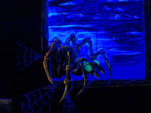
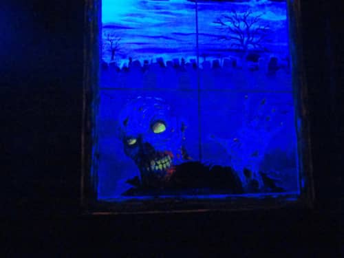
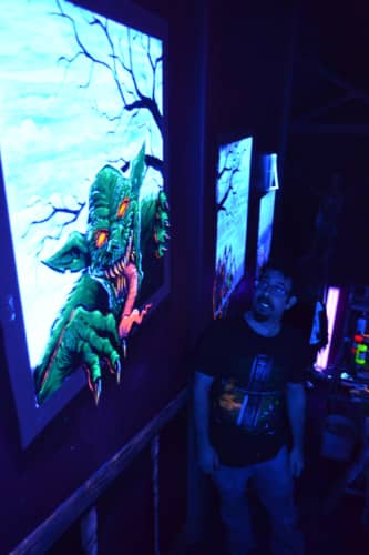
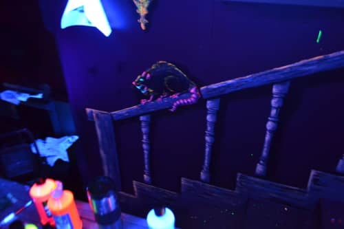
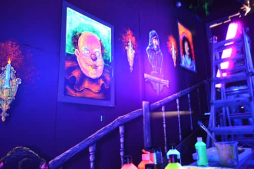
Earlier this year, I was commissioned to paint a black light mural in the Haunted Mansion ride in Funland of Rehoboth Beach, Delaware. I can’t tell you how much of a privilege this was for me, because I have been visiting Rehoboth Beach several times a year since I was two-years old. So I have vivid memories of the Haunted Mansion terrifying me from a very young age. It was such a fun challenge to be able to add my own touch to the iconic ride.
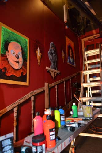
If you’re familiar with the ride, there was a steep ramp at the very beginning of the ride that was too narrow to hold any mechanized props. It was decided that the best way to add some interest to the otherwise blank area was to have me use blacklight paints and dress it up a little. I presented them with concept sketches with the idea of painting the ramp as if it were a staircase in the mansion.
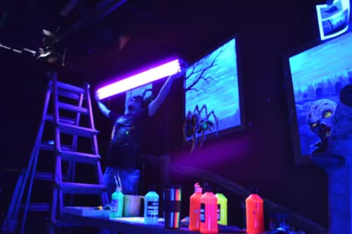
The entire mural took about a week. I was often the only one there in the entire park, which made for some cool exploring, and also became pretty creepy at night.
I was very pleased with the final result, and so far it’s gotten great feedback. The blacklight paints give the mural a 3D effect (something that doesn’t come across in these snapshots). Painting with warm colors pops out at you, while cool colors recede.
The project was a challenge for a couple of reasons:
The painting was done on a steep incline, so moving scaffolding around proved to be a little precarious.
Blacklight paints look very, very different in the dark. Yellow, Orange, and Red blacklight paints look almost identical under normal light, but very different with the blacklights on. So I painted in the dark with one blacklight spot I had to move around, pretty much the entire time.
Limited time: the park was opening for business very soon, and I had to get in there and get out quickly. There was a lot of square-footage to cover, so I unfortunately had to spend less time on some aspects.
Objects had to be to scale. Because we wanted to make this look like a real staircase, I had to paint the railing, picture frames, and window frames at a believable size and placement. Just measuring out the railing and all the bannisters took hours.
Special thanks again to the Funland staff for choosing me for this awesome project, and for being so cool to work with.
Please note: The videos and pictures did not turn out as well as I had hoped. It proved to be very difficult to photograph blacklight paints. I only had one blacklight (the permanent blacklights were installed later after I was finished) which made it difficult to light the whole mural at once for the photos and video. You’ll just have to Funland yourself!
Wow. I can’t express my gratitude enough. Last month, we ran a Kickstarter campaign to fund our comic book anthology, UGLI Studios Presents #2, and we raised over $3000, exceeding our goal!
We’ve already mailed out all the rewards, and are getting great feedback from the sponsors. Again, just thrilled and grateful to have so many people come out and fund our crazy idea with their hard-earned cash.
Or you can purchase The Courier mini-comic from my site here.
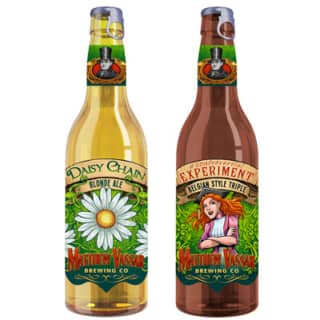
Beer label designs created for the Matthew Vassar Brewing Company. I created the layout and illustrations for these labels, based on the historic figure, Matthew Vassar. The labels are currently in production – there will be at least 6 more varieties when we are finished.
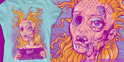
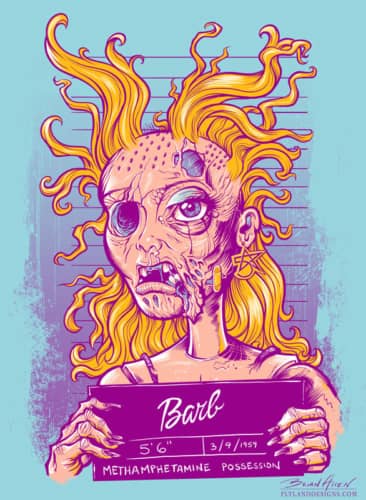
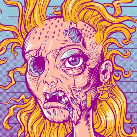
T-Shirt illustration for 5-Star Apparel. The client asked me to create a parody of a Barbie who has lost her way. We decided on a mugshot photo of a strung-out, meth-head version. Set up for silk-screening, 4 colors.
Detailed digital painting I created of a zombie cowboy for Invision Artworks. This dude will most likely be uses on dirtbikes and quads. I’m really excited to have my artwork added to their already impressive lineup of cool graphics. This was created mainly in Manga Studio, but I had some help from Photoshop as well. The guns were a particularly challenging, but I’m happy with how they turned out.
The guys from Straying From Madness contacted me to create an illustration for their new album, Shadowlands. They wanted a colorful representation of themseleves battling a horde of zombies during the apocalypse. The illustration was designed for the album cover, and a poster for promotion as well.
https://www.flylanddesigns.com/wp-content/uploads/FlyLand-Designs-Web-Logo.png00Brian Allenhttps://www.flylanddesigns.com/wp-content/uploads/FlyLand-Designs-Web-Logo.pngBrian Allen2013-10-03 20:55:252013-09-21 20:57:18Straying From Madness CD Cover
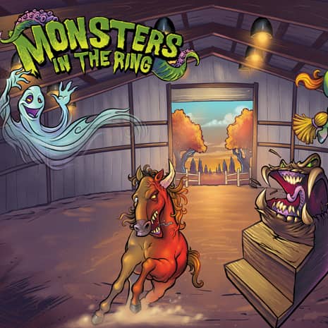
SmartPak Equine hired me to create these two spreads for their Fall product catalog. To help sell their calming supplements for horses, the client asked me to create a fun illustration showing the world through a horse’s eyes. To show how horses can get spooked by the simplest things, we turned ordinarly training equipment into monsters. I designed and illustrated the monsters, backgrounds, and the logo for the ad. The client later placed a description of each product by a different monster.
https://i0.wp.com/www.flylanddesigns.com/wp-content/uploads/SmartPak-Spread-English.jpg?fit=800%2C606&ssl=1606800Brian Allenhttps://www.flylanddesigns.com/wp-content/uploads/FlyLand-Designs-Web-Logo.pngBrian Allen2013-10-02 20:54:182013-09-21 21:43:40Monsters In The Ring