Freelancing solo can be a pretty lonely gig. I try to keep in touch with other artists I’ve met to exchange tips and guidance (and also a lot of complaining and whining) – but everyone has a pretty busy schedule, and it can be hard to make time.

So I started listening to art and design podcasts, which are packed with useful direction and inspiration. I’ve learned more from listening to these shows about contracts, agents, clients, technique, pricing, copyrights, and more than I probably had ever known.  You can listen to these in iTunes, or straight from their websites.

Here are my top three favorites:
adventures

1. Adventures in Design

http://www.aidpodcast.com/

Easily my favorite podcast in general, not just about design.  I have learned so much from these guys.  They are also incredibly funny, so it really makes the time fly while working listening to their commentary.  Their focus goes far beyond just gig posters (which both artists got their start in), and branches into illustration, graphic design, and most of all, the business of freelancing.  They are also brutally honest and candid.  They often interview very talented artists on the show as well, which brings in a lot of different perspectives.

And finally, you get the feeling that these guys are leaders in fighting for freelance artist’s rights –  defending against the horrors of design contests, spec work, low-pay, and other naughty things.
I highly recommend this – I recently discovered it, so I’m still catching up (I’m on episode 25).  The show is still ongoing.

tumblr_static_bipt_blog_banner

2. Big Illustration Party Time

http://illustrationparty.tumblr.com/

The format of this show is actually similar to Adventures in Design:  two talented artists with different but complimentary personalities talking shop about freelance illustration and design.  Unfortunately, the show is no longer ongoing, but there are 54 episodes which cover everything from artist agents, pricing, contracts, and other important things.  I find it so helpful because these are things that as freelancers we all need to know – yet they are difficult things to discuss with your peers because we are all at the same time colleagues and competitors.  What I take away the most after listening to this show is that no matter what level you are at currently, all freelance artists are fighting the same battles.

header_1000

3. Art & Story

This podcast is also no longer on-going, but there are almost 200 episodes in the archives.  This podcast explores freelance illustration from the comic book market perspective.  I don’t work much in that market, however, I still found their interviews and tips very helpful.

What are your favorites?

Please let me know in the comments – I’m sure I’m missing some good ones.

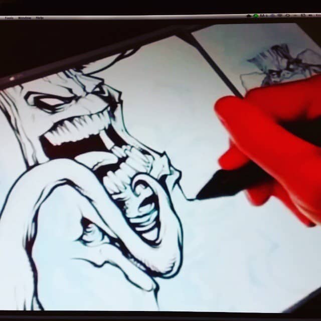
Logo design I created for Kush Canvas, an a printer specializing in canvas and paper made from hemp. Had a lot of fun with this one.Www.flylanddesigns.com #MANGASTUDIO #ART #DIGITAL #drawing #instaart #logo #mascot Work in progress from the desk of illustrator Brian Allen
Logo design I created for Kush Canvas, an a printer specializing in canvas and paper made from hemp. Had a lot of fun with this one.Www.flylanddesigns.com #MANGASTUDIO #ART #DIGITAL #drawing #instaart #logo #mascot

http://youtu.be/0MRZ4ytSkIQ here's a snippet of my youtube review of Manga Studio 5, showing the features that are better than adobe photoshop. Please check it out! Work in progress from the desk of illustrator Brian Allen
http://youtu.be/0MRZ4ytSkIQ here's a snippet of my youtube review of Manga Studio 5, showing the features that are better than adobe photoshop.  Please check it out!

Drawing i did in Manga studio 5 of an airbrushing skeleton. Check out my youtube review of Manga Studio 5: http://youtu.be/0MRZ4ytSkIQ#art #skull #instaart #mangastudio #skeleton #ink #drawing #airbrush Work in progress from the desk of illustrator Brian Allen
Drawing i did in Manga studio 5 of an airbrushing skeleton.  Check out my youtube review of Manga Studio 5: http://youtu.be/0MRZ4ytSkIQ#art #skull #instaart #mangastudio #skeleton #ink #drawing #airbrush

Finished zombie illustration I created for #virusvodka to advertise their cool new product. Www.flylanddesigns.com Work in progress from the desk of illustrator Brian Allen
Finished zombie illustration I created for #virusvodka to advertise their cool new product.  Www.flylanddesigns.com

Coloring a poster I designed for Virus Vodka. Www.flylanddesigns.com #MANGASTUDIO #ART #DIGITAL #VIRUSVODKA # ZOMBIES Work in progress from the desk of illustrator Brian Allen
Coloring a poster I designed for Virus Vodka.  Www.flylanddesigns.com #MANGASTUDIO #ART #DIGITAL #VIRUSVODKA # ZOMBIES

Pencil sketch for an illustration I created for the new vodka brand, virus vodka. Www.flylanddesigns.com Work in progress from the desk of illustrator Brian Allen
Pencil sketch for an illustration I created for the new vodka brand, virus vodka. Www.flylanddesigns.com

Having fun with some skulls. #digital #art #skull #ink #mangastudio Work in progress from the desk of illustrator Brian Allen
Having fun with some skulls. #digital #art #skull #ink #mangastudio

I’ve been using Manga Studio 5 for over a year now, and I love it.  I set out to make a quick YouTube review of it, and “quick” quickly turned into over 15 minutes of me rambling.  There are so many cool new tools and features in MS5, that it was really hard to fit them all in.

If you’re considering purchasing new art software, you’ll definitely want to check this out.

 Watch the Full Video Review:

In Summary:

Manga Studio 5 Compared to Adobe Photoshop:

There are a TON of things that Manga Studio does better than Adobe Photoshop.  Can it replace it?  Maybe someday – but for now I think Adobe Photoshop is irreplaceable.  That being said, I use Manga Studio for 90% of all the artwork I create.  I usually use Adobe Photoshop for any work involving text, and for certain filters.

Manga Studio 5 sets out to out-shine Adobe Photoshop as a digital painting and drawing software, and in my opinion, it does that beautifully.

I find it far more enjoyable to use than Photoshop at painting, drawing, and especially inking.  It blends the intuitive painting and blending engines of Corel Painter with Adobe Photoshop’s intuitive interface and power.

Here’s a sample of some of the artwork I created in Manga Studio 5:

What’s Totally Freaking Awesome About Manga Studio 5

Features that you won’t find in Adobe Photoshop

  1. It’s CHEAP!

    1. It’s hard to compile a benefits list without mentioning the fact that it’s butt-loads cheaper than Adobe Photoshop.
    2. I’m currently using the Adobe Creative Cloud, Photographer’s bundle, which is only $10 a month (hard to complain about that).  But even at that price, it still ends up being $120/year.
    3. Manga Studio 5 is currently only $35 on Amazon.com:  Purchase it Here
  2. Paint with Transparency – my favorite feature

    1. Manga Studio 5 easily lets you switch to transparency as a color on the fly, making any brush instantly into an eraser.  Great for cleaning up linework, inking with “white,” and “erasing” away paint strokes that you laid on too heavy.
  3. Reference layers – extremely helpful tool when coloring

    Reference layers are an incredible concept, that I’ve never experience before in any other program.  It works like this:

    1. Choose any layer (or even a group of layers) to act as the Reference Layer by clicking the lighthouse icon in the layer menu.
    2. Now select a different layer.
    3. Choose a tool such as the magic wand, paintbucket, or eye-dropper, and make sure it is set to “Refer To Reference Layer.”
    4. Now, watch in amazement as the paint bucket fills, the wand selects, the eyedropper… uh, drops using data not from the layer you are editing, but from the reference layer!So what is this useful for?  I use it all the time when coloring artwork.  I create a flat color layer under my lineart, with no shading.  Comic book artists refer to these as “Flats.”  Then I create a new layer above the Flats, and set the Flats as a reference layer.  Now, as I color, I can quickly switch between the magic wand and my brush, and the magic wand makes selections based on the Flat layer.
      In Adobe Photoshop, I would have to constantly hide my color layer, switch to my flats layer, make the selection, unhide my color layer, switch back to the color layer, and paint.  Reference Layers in Manga Studio save me so much time.  And the same concept works for the paint bucket, along with other tools.
  4. Lasso Fill Tool

    This tool can be a free-form lasso, a polygon lasso, or a specific shape.  As soon as you are done drawing the shape, it fills with your foreground color automatically onto the canvas.

    1. Great for making smooth, irregular shapes when the Stabilization is set very high.
    2. Great for blocking in large areas of black or color.
    3. Great for quickly deleting large areas (when painting with transparency).
  5. Selection Pen Tool

    1. This is a special brush that instantly makes your stroke (or strokes if you hold down shift) into a marquee selection.  Great for painting lots of tiny highlights (when coloring with comic book style).
    2. You can configure this brush just like any other, with different brush shapes and pressure settings.
  6. Symmetrical Rulers!

    Similar to Autodesk Sketchbook Pro, Manga Studio 5 has some great symmetrical rulers.

    1. Draw a ruler anywhere that will mirror the image in real-time.  This doesn’t appear to slow down my machine at all.
    2. You can even draw up to 8 symmetrical rules at once, which can create some really cool Spiral-Graph-style designs (warning: this will probably slow down your machine a bit).
    3. Huge time saver (50%!).
  7. Gradient Layers

    1. This tool allows you to create a gradient that you can edit and resize (similar to Adobe Illustrator) in real-time even after you’ve laid it down.
    2. Change the size, add/remove colors, and change the spacing of the colors easily until you rasterize the gradient.
    3. You can also use gradients the traditional way if you choose.
  8. See flipped canvas in mirrored window

    1. One of my favorite features.  A trick I learned a while back was to constantly flip my canvas horizontally or vertically, which will make any errors you’ve made stick out like a sore thumb.  But flipping the canvas in Photoshop can take a little while to load (especially if you’re working with a large file), because it actually is transforming and flipping all the pixels on the canvas.
    2. Manga Studio does this in a much cleaner way – it is flipping the view, not the canvas itself.  So the result is instantaneous, and the result isn’t saved in the file.
    3. What’s even better, is that you can draw with one window in the original orientation, while having a second window open with the view flipped, and it’s updated in real-time.  This way you can spot errors as you make them.
  9. Half-tone Layers

    1. Easily editable at any time.  Great for setting up silk-screening artwork.

    2. In Adobe Photoshop, it’s very tedious creating halftones for silk-screening.  You have to output the layer, convert it to a bitmap, then choose a halftone pattern and size (if you don’t like it, you have to repeat the process), then copy and paste the pattern back into Photoshop for each screen.
    3. In Manga Studio, you can instantly change any layer in your document to a half-tone layer, and continuously adjust the size and shape of the halftone pattern, again and again.  You can even paint directly onto this layer, and watch it convert your airbrush strokes into solid dot goodness, with no lag at all.
    4. When you’re done, just rasterize the layer, and you’re all set!
  10. 3D poses

    1. Manga Studio comes with a library of 3D objects and mannequins which can be posed for reference, and dropped right into your artwork.
    2. I find the 3D engine in Manga Studio much more flexible and responsive (although it is suitable for reference only, not rendering – Photoshop takes the cake on that one).More Illustrations I created using Manga Studio 5:
  11. Can create full-color brushes

    1. Similar to Painter and Adobe Illustrator, the brushes you create can have full-color (not just a black and white imprint).
    2. In Adobe Photoshop, all the brushes you create can only be one solid color.
    3. This is great for creating custom textures, repeating icons and elements.
    4. There are also many ways to make the image curve with your stroke, so creating things like chain and rope brushes is very easy and effective.
  12. Better (in my opinion) organization and customization of brush palettes

    1. You can easily create and organize your own groups of brushes on the fly, and add them to your menu, or as a tabbed list.  I find this much easier than saving each brush group, and then replacing or appending it to the current list of brushes (as in Photoshop).
    2. HOWEVER – exporting brushes from Manga Studio is very cumbersome, and definitely needs an update.  While you can upload many brushes at once, you can only export one at a time.
  13. Color Wheel

    1. I have never liked Photoshop’s color picker, and have always preferred Corel Painter’s color wheel.  Manga Studio’s color picker is almost identical to Painter’s.  I find it much easier to quickly pick and adjust colors.
    2. In Adobe Photoshop, I use a plugin called Magic Picker (http://anastasiy.com/colorwheel) which is a great way to emulate a Corel Painter style color picker.  But it would be nice if this feature was built into Photoshop.
    3. NOTE:  Adobe Photoshop CC 2014 finally introduced a Color Picker palette that is similar, but I think it still falls short, because there is no color wheel.
  14. Image movement isn’t LOCKED in a window

    1. When working with two or more windows at once, Photoshop won’t allow you to pan beyond the document bounds unless you are zoomed in to the point that the document bounds exceeds the size of the window.
    2. This is very annoying when working with a Cintiq, because I often like to have the part of the image I’m working on in the center (where it’s most comfortable to draw), so I pan the canvas around a lot.
  15. Smart Paint Bucket

    In Adobe Photoshop, the paint bucket in my opinion was so useless that I simply forgot about it.  In Manga Studio, I actually use it quite frequently, because it’s so much more effective and customizable.

    1. You can make the fill area expand or shrink by a certain number of pixels, which is very helpful when coloring underneath lineart to avoid ghost outlines where the anti-aliasing of the lineart meets the color fill.
    2. You can control the sensitivity of what the bucket considers a closed area.  This is the Close Gap feature.  This is extremely useful, because I often don’t enclose my shapes completely with lineart.  If there is just a tiny gap, it will still fill the area as if it were closed.
    3. Very useful when set to reference layers, because you can use data from a layer that is out of sight.
  16. Smart Magic Wand

    The same goes for the magic wand.  It’s extremely customizable and flexible compared to the two parameters Adobe Photoshop offers.

    1. Can also be set to automatically expand or shrink the selected area immediately after clicking.  This is useful because I would often make a selection in Adobe Photoshop, and then go to Expand Selection by a couple pixels to make sure my color and lineart overlapped.
    2. Can also close gaps.
    3. Can select from layers other than the one you are currently editing.
  17. Layer Property menu

    1. You can change the entire color of a layer’s contents easily.  This is particularly useful when designing artwork for silk-screen applications.  Each layer can be painted with black, but it can appear on screen as a different color.  You can apply this effect to an entire group – which allows a quick way to make sure every layer in your group is the same color.

    2. Great for turning pencils into “non-photo” blue when inking.
  18. Edit/delete from multiple layers at once

    This is something that I’ve waned in Photoshop for quite some time.  If you make a selection in Manga Studio 5, and then OPTION+CLICK each layer that you want to delete from, and then hit delete, it will delete content in that selected area from ALL those layers at once.  In Adobe Photoshop, you’d have to hit delete individually for each layer you want to delete from.

    1. Can even make a whole group into a clipping mask.
    2. Easily delete a selection from a multiple layers at once.
  19. Copy/Paste from multiple layers

    Even better is the ability to copy and paste from multiple layers at once.

    1. You can make a selection with the lasso tool, then highlight multiple layers, and copy (or cut) and paste the artwork into new layers in one action.
    2. The only way to do this in Adobe Photoshop would be to put the layers into a group, and mask the group.
    3. Copy Merged is also a solution, but this is only useful if you don’t mind the layers being merged.
  20. Smaller File Size

    1. A PSD saved in Manga Studio is about 30% smaller than the same exact file saved in Photoshop.  I’m not sure why this is – perhaps Photoshop is saving a lot of extra data that I don’t usually use.
      More Illustrations I created using Manga Studio 5:
  21. Subview window for reference and color picking

    This is a cool tool that I think is exclusive to Manga Studio.

    1. It’s a palette that opens a preview of any image without actually opening the file, and keeps in on display for reference or color picking.

    2. Also, you can open many files at once in this window, and just flip between them.
    3. Your cursor instantly becomes an eye-dropper tool when you hover over it, making it a virtual palette.
    4. This is very useful when working on something like a children’s book or comic book when there are a lot of the same characters that you need to redraw with the same colors.
  22. Mesh Transform multiple layers at once

    1. Manga Studio’s mesh transform tool is better (in my opinion) than Photoshop’s Warp Transform tool, because you can transform an entire grouping of layers at once.  In Photoshop, you can only Warp Transform one layer at a time.  This usually forced me to merge layers when I didn’t want to.
    2. You can also add mesh points (similar to Adobe Illustrator) to give you more precise control over your transformations.
    3. However, it falls short when compared to Adobe Photoshop’s liquify tool.
  23. Periodic Backups

    1. The program automatically saves iterations of you file as you work on it, just in case the unthinkable happens.  If, for example, you accidentally flatten your image, you can then go into the Manga Studio Library folder (on Mac) and find your file.
    2. It only keeps a certain number of backups total as temporary files, so you don’t have to worry about managing these files to manage space.
    3. Adobe Photoshop CC saves backups – however, these are only saved and accessible if the program has crashed.
  24. Undo whole group of strokes in one “Undo” action

    1. Often, you might make a whole series of quick strokes with the brush (say for example, 10 brushstrokes), and then decide you don’t like what you’ve done.  In Adobe Photoshop, you’d have to hit Undo 10 times.  In Manga Studio, it sees these quick strokes as one action, so it will undo the whole series.
    2. You can adjust how Manga Studio groups the brushstrokes (as well as turning this feature off).
  25. Convert Brightness To Opacity

    1. In one step (accessed from the Edit menu), you can cleanly remove the “white” or light areas and turn them into transparency.
    2. This is very useful for extracting flattened lineart from scans.
    3. In Adobe Photoshop, I normally did this in the Channels palette – but I find that Manga Studio does a much more accurate job.
  26. Draw straight lines while holding shift

    1. Unlike Photoshop, this feature shows you a preview of where your line will be as you hold shift, which is very useful.
    2. Stroke is unaffected by pen pressure (won’t get smaller toward the end), unlike Adobe Photoshop (which I always found annoying, because if I’m drawing a straight line, I usually want it to be the same thickness throughout).
  27. Rulers!

    1. There is an incredible number of rulers you can use in real-time on your canvas.
      1. Curves
      2. Parallel lines
      3. Ellipses
      4. Concentric circles
      5. Focus line
      6. Perspective Rulers (awesome!)
    2. The rulers are easily moveable, adjustable, and resizable, just by holding the CMD key as you hover over a ruler.  No need to switch tools.
    3. You can also easily toggle them on and off just with a keyboard shortcut – so it’s easy to flip back and forth between free-hand drawing and ruled-drawing.
    4. You can even draw your own rulers using the Ruler Pen!

Improvements made from Manga Studio 4

  1. Overall better User Interface
    1. The MS4 interface was a bit clunky, and felt like Windows 2000, with palettes floating everywhere.
    2. The new interface combines the best things of both Adobe Photoshop and Corel Painter.
    3. You can now rearrange and dock palettes, and collapse menus.  This is the most customizable interface of all the other software I’ve mentioned so far.
    4. You can now save different Workspaces.
  2. Improved file-handling

    1. Fixed strange file saving structure (used to be in a folder)

    2. You can now work on documents as large as 166 inches square (the limit was only 16 inches in MS 4).

  3. Much improved brush engine

    1. Tons of options (maybe too many)

    2. Lock editability of brush

  4. Much less limited image size

    1. In EX4, you were limited to 16 inch documents, which becomes tricky when designing T-Shirts.

  5. Ruler system greatly improved.

    1. EX4’s rulers were complicated, and difficult to edit.

    2. Now you can easily turn on and off a ruler, or move it to other layers.

    3. Perspective rulers also seem easier to use.

  6. Coloring greatly improved

    1. Import color swatches from Photoshop, and save them.

    2. Tons of new painting tools similar to Painter

    3. Active color wheel like Painter

  7. Added blending modes similar to Adobe Photoshop
    1. Nearly all the blending modes (for both layers and brushes) you’d come to expect are now here.  There are a few additions too that Photoshop doesn’t have, such as Glow Dodge (which is similar to Linear Dodge in Photoshop).
    2. My only complaint is that a Color blending mode appears to be missing – Soft Light works well as a substitute.
  8. Much improved layer and layer group system
    1. I found MX4’s layer system to be too complicated.  The new system mirrors Adobe Photoshop in all the good ways.


Thanks for reading!  If I’ve missed any features, or if you have any questions, please leave them in the comments section.

To check out more of my work, or to hire me:

https://www.flylanddesigns.com

Hockey Themed Website Background Illustration

Hockey Themed Website Background Illustration

Hockey Themed Website Background Illustration

Hockey Themed Website Background Illustration

I was hired to illustrated this custom website background for a sports review outlet called 2BC. The client wanted a detailed illustration of a huge hockey fight in an arena. The illustration was set up so that the different hockey players and refs in the brawl could move along with the content of the site, independently of the background. I created the artwork in Manga Studio, and colored it in Adobe Photoshop.

Skull T-Shirt Design for MMA Apparel Brand

I was hired to illustrate this T-Shirt design for one of my favorite clients, Darkhorse Fightwear, for their new line of MMA apparel. The design was set up for silk-screen using three colors, and illustrated in Manga Studio and Adobe Photoshop. The design was inspired by a previous illustration I created a few years ago – it was fun to revisit it and test out some new skills while illustrating it. The design features a skull in the center with wings and chains surrounding.

Evil Gargoyle Illustration for Dye-Sublimated Uniform

Evil Gargoyle Illustration for Dye-Sublimated Uniform

Evil Gargoyle Illustration for Dye-Sublimated Uniform

Evil Gargoyle Illustration for Dye-Sublimated Uniform

Bluechip Athletics hired me to design and illustrate graphics for their Aggression apparel line for wrestlers. The first design was this evil gargoyle perched on a rooftop in a storm. Since the wrestling singlets are printed with dye-sublimation, I could design in full-color, and cover every inch of the fabric.

Comic Book Vehicle Wrap

Comic Book Vehicle Wrap

Comic Book Vehicle Wrap

Comic Book Vehicle Wrap

Comic Book Vehicle Wrap

I created this full graphic wrap for a company that manufactures office scanning equipment in conjunction with Twist Creative Parners. The client wanted to wrap their hummer in a design that would attract attention, and make their product look cool. We came up with the idea of having an alien invastion blasting a hole through an office cubicle, with the office scanners sitting in a pile of wreckage, perfectly in tact. I drew up two comic book style office characters to tie everything together.

The finished graphics were printed on vinyl and will be wrapped to cover every inch of the black humvee. It was a pleasure working on this!

Superhero Bar Poster

Custom illustration I created for a bar in the UK called The Parish. We designed their superhero mascot to be present on all their advertising, posters, and signage at the bar. In this poster advertising their food selection, I illustrated the hero lifting a large tray of food for an attractive waitress. It was a lot of fun to draw all the details for the pile of food.

Drawn and inked in Manga Studio, and colored in Adobe Photoshop.