Client:
Zion Train
Description:
Album cover I created for the artist Brian Blake of Zion Train for his album entitled True Love. I was hired to draw the likeness of the artist driving a train hauling hemp and other goodies through a colorful landscape.
Click here to see more of my custom album cover designs.
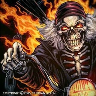
Making some progress on this album cover illustration for Hang The Jester – sketching digitally in Manga Studio, and planning on inking this on paper.#art #illustration #albumcover #skull #metal #freelance #FlylandDesigns New Artwork From Instagram
Client:
Russ Logo
Description:
Russ logo design I created of the Bugs bunny and the Looney Tunes gang standing in front of the Looney Tunes University.
Description:
T-Shirt illustration I created for a poker apparel company, featuring a tribute of Darth Vader force-choking out two Kings – the shirt is called Flopped a Sith, which is a play on words – if you’re into Poker, you’ll get it. Set up for direct-to-garment printing.
Click here to see more of my Dark Illustrations
Inking a skeleton plant playing a ukulele for a organic fabric pot brand called Grass Roots#art #illustration #tshirt #grass #weed #skull #freelance #FlylandDesigns New Artwork From Instagram
Client:
Butterscotch Shennigans
Description:
I was hired by the app developer Butterscotch Shenanigans to create a silk-screen t-shirt celebrating their insanely popular adventure game Crashlands. My art style fit perfectly with the brand’s over-the-top style and freaky characters. It was a fun challenge to try to find a way to replicate the colorful style of the game while using only a small number of silk-screen colors.
You can purchase it here:
Butterscotchshennigans.com
Click here to see more of my Illustrations.
Check out more of my T-Shirt designs here.
Client:
Eternal Life and Fitness
Description:
Silk-screen t-shirt illustration I created of an angry wolf for a fitness brand of apparel to be sold at their gyms and front their website.
Check out more of my T-Shirt designs here.
Here’s my final tribute artwork to Peace from the animated film Wizards – really happy with how this turned out. I created this for a three-part YouTube tutorial on Manga Studio 5, in case you missed it. Going to be officially rolling out my new brushes this week – thanks for the great feedback so far!#mangastudio #tutorial #wizards #fantasy New Artwork From Instagram
Client:
Determined 2 Prevail
Description:
Parody illustration I created of Godzilla lifting weights made of the city he just destroyed. Originally created for a fitness brand called Determined 2 Prevail – set up for silk-screening using limited colors.
You can purchase it here:
Check out more of my T-Shirt designs here.
I’m a member of this really great private freelance artist group on Facebook – if you’re interested in joining, please comment or DM me. I’ve learned a ton of really helpful info from these talented folks. New Artwork From Instagram
TUTORIAL 3 0f 3 – COLORING
VIDEO 3: https://youtu.be/10FCEL_Nv90
-
Flats
- “Flatting” a piece consists of coloring the basic shapes of the illustration in random, unique colors to differentiate the different elements from each other in order to make quick selections when coloring.
- Once finished, you set this Flats layer as a Reference layer in Clip Studio Paint.
- Using reference layers makes coloring much faster, because you can use the magic wand tool to select quick masks of certain areas, without having to switch the layer you are working on.
-
Create a Color Comp
- I always experiment with color BEFORE I begin working on the final piece.
- Duplicate your document and reduce to 72 dpi.
- Gather reference of great color schemes and environments for inspiration.
- On a layer set to overlay above all other artwork, experiment with different color schemes.
- Quickly (for just about 15 minutes) use a large soft airbrush to block in colors.
- Don’t worry about staying in the lines or coloring small portions of the illustration. Just focus on making color choices for the most important parts of the illustration.
- Because the image is small, and because you are being very loose and rough, this encourages you to take risks and experiment with color schemes you may not have considered.
- Once you’re happy with a color scheme, save the document as a flat jpg.
- Load the color scheme into Clip Studio Paint’s SubView pallette.
- This will now be a handy pallette you can use when coloring the real thing.
-
Colors
- SETUP
- Open up your original document.
- Resize your main illustraiton to 300 dpi (previously set at 600 dpi for inking).
- Duplicate your Flats Layer and name it Colors (this is the layer you actually paint on), and keep it below your Line Art layer.
- Make sure Lock Transparency is turned on to prevent you from painting outside of the layer area and onto the background.
- Fill the Colors layer with one solid color
- Usually I like to use a desaturated blue with a neutral value.
- You don’t want the random colors you used for Flatting to distract you.
- Color in background with a solid color behind all other layers.
- COLORING
- Rough in background colors
- It’s important to block them in, because it sets the tone and contrast for the figure.
- I used my custom textured watercolor brushes to fill in the background quickly.
- Block in colors on character
- Attack the Local Colors first. Objects with a Local Colors are things such as an apple, which is generally accepted to be red when shown in white light. Local Colors will still be influenced by the color of the lighting, but identifying them early can help calibrate the color balance of your piece.
- Put in large gradient color fades to areas that fade from one color to another.
- Use a large soft brush or the gradient tool to put in large color transitions in the piece.
- I like to use a soft brush with a little texture in it, so that the color transition blends look more natural.
- Add hard edged cast shadows
- Set new layer above Colors layer, and set to Multiply
- Paint with a very desaturated, light value purple/blue color to paint the hard shadows.
- Follow the lineart, and add volume to the forms by hugging the edges with your brush.
- Don’t introduce a lot of rendering information at this point. Just paint in some of the midtones – let the line-art do the work for you and just compliment it.
- Use hard-edged brushes when cast shadows are more intense.
- Add Highlights
- The illustration at this point should look rendered, but a little dull and desaturated and a bit flat.
- The highlights and rim lights will do the final rendering, and help tell the viewer what to look at.
- Zoom in a bit closer now
- Merge the Multiply Shadows layer down with the color layer
- We will be painting over top of the shadows.
- Always be mindful of the direction and color of the lighting.
- Use the “Lasso Cut and Gradient” method to color sharp, high-contrast areas.
- Make a selection with the lasso tool, and use a soft brush to paint inside that area.
- The brush should be touching one edge of the marquee, but the fade should not touch the opposite end.
- Add Rim Light around the edges of the figure.
- Create new layer above color and line-art
- The rim light will be a slightly darker, desaturated shade of the color of the lighting itself
- Start with a soft brush around the edges of the form, and then use a harder edged brush with a brighter highlight along the edge.
- Finish background
- Keep it blurry and less sharp than the foreground figure.
- Create glow effects
- Add separate layer on top of all artwork and set layer to Screen Blending Mode.
- Punch up selected areas of the piece that need to be brighter and in focus.
- Use a darker, desaturated color when doing this, and press very softly so you don’t blow out the area and make it too bright.
- Lineart Knockouts
- “Knockouts” are when you color parts or all of the lineart so it isn’t just black.
- This is a really effective way to make areas appear brighter and to make the piece as a whole appear less flat.
- Set your line art layer to Lock Transparency to prevent you from painting outside of the lineart.
- Find the areas closer to the lightsource, and color the line art with a darker version of that color.
- Especially effective on background elements that you want to appear some distance away.
- Add Texture
- To add character to the piece, use grungy brushes and textures on a layer set to screen, multiply, or overlay (depending on the piece) and lightly paint textures in some areas.
- Adjust colors
- Take a step back and make final tweaks to the color scheme if needed
- Make slections with your Flats layer, and use Edit>Tonal Correction> Hue/Saturation to adjust colors.
- Add Atmospheric Effects
- Create a new “Effects” layer above all others.
- To add even more depth to your piece, find areas of your figure that would be farther back, and lightly paint over them with the color of the background.
- This creates the illusion that more atmosphere is between you and the object, and pushes it into the background, similar to the way mountain ranges appear to have less and less contrast as they go back farther into the distance.
And we’re done!
Thank you so much for following my tutorial. If you have any questions, please feel free to comment on my YouTube videos.
Brushes used:
If you would like to purchase any of the brushes I used in this tutorial, they are available at http://ClipStudioPaintBrushes.com
Follow Brian and check out more of his work:
—
https://www.flylanddesigns.com
Follow me on Facebook:
https://www.facebook.com/brianallen.flylanddesigns
On Instagram:
http://instagram.com/flylanddesigns_brian_allen
On YouTube:
https://www.youtube.com/user/flylanddesigns
TUTORIAL 2 0f 3 – INKING
VIDEO 2: https://youtu.be/r6kHk6nG2Io
-
Inking
- Setup
- Lower opacity on blue line pencils layer so you can just barely see it.
- Setup
- Change resolution of document to 600 dpi
- Makes linework sharper and more expressive
- Change shortcuts so you can quickly access your inking tools
- I have a shortcut on my mouse reel to quickly change between my two favorite inking brushes – one for outlines, and one for details.
- Warm up
- Create a new practice layer
- Begin by setting aside 15 minutes or so where you just start inking different parts of the illustration and experiementing with different brushes and strokes.
- This layer will be deleted when it’s time to begin. Having a practice layer can take a lot of pressure of you in the beginning, and really helps you loosen up before diving in.
- Start with outlines and keylines
- Avoid focusing on rendering or detail in the beginning
- Just outline the outside of all the basic shapes and forms.
- Fill in large areas of black first
- Saves time by filling the piece quickly and preventing you from mistakintly rendering things that are in deep shadow.
- Helps build forms quickly
- Helps you keep your piece balanced and with an appealing contrast from the foundation
- Using the curve tool, elliptical rulers, and perspective rulers when neccessary.
- Use this in situations when you would traditionally use a ruler, french curve, or other stencil tool when drawing traditionally on paper.
- Don’t try to force it freehand! What are you trying to prove!?
- Avoid Zooming in too close
- I generally try not to zoom in more than 50% of the illustration, or put another way, 1.5 to 2X the actual size of the printed illustration.
- You’re going to waste time and you might be in danger of muddying up the illustration with details that are too closely packed together.
- Ink with the coloring method in mind
- High Rendering with Color: Use fewer, thinner lines if you plan on doing a lot of rendering and shading in the coloring stage.
- Allow space for them to be seen.
- Better for cartoonish work
- Let the lines suggest and outline the form only.
- High Rendering with Ink: Use more, thicker, and more detailed lines if you plan on letting the inks do the work of rendering.
- Great for t-shirt and comic book artwork.
- Saves a lot of time in the coloring stage.
- High Rendering with Color: Use fewer, thinner lines if you plan on doing a lot of rendering and shading in the coloring stage.
- Create quick strokes to give them life and avoid a shaky hand.
- Move your arm at the elbow like a seismograph drawing lines on paper.
- Push and pull the lines in the direction that hugs the form.
- Like an object in a wind tunnel, imagine the ink lines flowing around the form.
- Use stippling and/or textured brushes sparingly to add life and variation to the artwork
- When you are about 75% done, Turn off pencil layer once key lines are drawn.
- This allows you to see the piece anew, without the pencil layer.
- You will discover mistakes at this point, and discover areas that need more rendering.
- If you wait until the end to turn this layer off, it may interfere with your overall contrast of the piece.
Next I’ll show you how I ink artwork in Manga Studio 5 (Clip Studio Paint)
Brushes used:
If you would like to purchase any of the brushes I used in this tutorial, they are available at http://ClipStudioPaintBrushes.com
Follow Brian and check out more of his work:
—
https://www.flylanddesigns.com
Follow me on Facebook:
https://www.facebook.com/brianallen.flylanddesigns
On Instagram:
http://instagram.com/flylanddesigns_brian_allen
On YouTube:
https://www.youtube.com/user/flylanddesigns
Client:
Personal
Description:
This t-shirt design is going to be HUGE!
Nothing can stop The Drumpf – not even death!
Make your wardrobe GREAT AGAIN with this killer Trump tribute (Trumpute?) and be the coolest kid at your next rally! If you are sued while wearing this shirt, Donald will pay your legal fees.
This zombified billionaire was illustrated in Clip Studio Paint and silk-screened in 6 glorious colors that will make you win every time.
This t-shirt design is going to be HUGE!
Nothing can stop Trump – not even death!
Make your wardrobe GREAT AGAIN with this killer Trump tribute and be the coolest kid at your next rally!
You can purchase it here:
Client:
Joe Graham
Description:
A series of character designs I created for an adventure/strategy card game for a developer. I had a grand old time working on this – all of the characters were a bit extreme and over-the-top, so it fit my style well. We also created the card design and other moving parts of the game as well.
Check out more of my Mascot designs here.
The Artwork:
For this tutorial, I decided to create a tribute illustration to one of my favorite animated movies, Wizards by Ralph Bakshi. I chose to illustrate the iconic poster from the movie, featuring the character Peace. I thought a rendering my own stylistic approach to an existing piece of artwork would be a great vehicle for a tutorial, because the foundation has already been set, and we can focus instead on the technique.
Ralph Baksi’s original classic poster art. | Tribute illustration we will be creating in this tutorial. |
TUTORIAL 1 0f 3 – PENCILING
-
Document Setup
- I set up most documents at 300 dpi 20×20.
- It’s very important that anything you are hoping to print be set up at 300 dpi. 72 dpi will print out pixelated, and will get too distorted if you ever need to increase the size.
- Create a New Window and shrink it to about 25% the size of your main window.
- This is a smaller live preview of your image that will help you keep an eye on your composition as a whole.
- VIEW>ROTATE/INVERT>Flip horizontal window.
- This will help you spot errors by having a view of your illustration mirrored.
- Better than photoshop because you’re not actually flipping the artwork, just the view of it, without m
- Set up separate layer groups for the sketch, pencils, inks (with pre-made action)
- Encourages me to take the time to rough and plan the piece first
- The Layer Color effect of each group is set to magenta, non-photo blue, and black respectively, so everything I draw in those layers will appear as that color.
- I set up most documents at 300 dpi 20×20.
- TOOLS
- Full list of tools https://www.flylanddesigns.com/faq-for-artists/
- Wacom Cintiq 24HD
- iMac 5K 27”
- Nostromo Razer Gamepad
- For keyboard shortcuts
-
Gather Reference
- Do plenty of research before you start drawing
- Especially technical items that you may not have drawn before
- Getting them right adds a lot to your piece
- Do research on settings, environments, and lighting
- Gather inspiration for color schemes and styles
- You often won’t take essential risks unless you see that it’s been successful in another piece
- Encourages you to try things you wouldn’t have otherwise
- Reference is a tool
- Don’t become overly dependant on it, but don’t go without it either.
- Do not copy – use only for inspiration
- Do plenty of research before you start drawing
-
Drawing the Thumbnail sketch
- Stay way zoomed out
- This will help you focus on just the overall shape of the design and avoid getting sucked into detail work
- Focus on skeletal structure and main shapes
- Make sure that your figure has a strong sillhouette
- This means, if your character was filled entirely with black, you should still be able to differentiate it’s parts, and it should look interesteding. If it looks like a big blob, you may need to make adjustments.
-
Pencils
- Turn your thumbnail opacity down
- Begin drawing in the Pencils Layer group
- Flesh out the details and shapes, making sure to use a lot of circles and curved strokes.
- This drawing can still be really rough – main details will be accomplished in the inking stage.
- Don’t focus on the style of the lines yet, or line weights – just focus on the outlines of the different shapes.
- Once you have cleaned up your pencil drawing and constucted the main shapes, go in with hard pencil and clean up details
- You do not need to trace over everything – just the focus points that need work.
- This drawing is only a guid to help you in the inking stage. So you can skip over parts that you think you can handle confidently in the ink stage.
- Shading layer
Quickly rough in the mid tones with a broad shading brush on a layer above set to Multiply.
TeeVillain is featuring my artwork all day today! If you were a fan of this, today is the best chance to grab it on a t-shirt super cheap. Thanks so much for all the kind words on this design!#tshirt #teevillain #skeleton #disney #halloween #funny #mickey #goofy #art #illustration New Artwork From Instagram
Happy Halloween! #Inktober is over, and I made it all 31 days! Thanks so much to everyone who followed along and encouraged me. Here's Sam from Trick R Treat, one of my favorite halloween movies.#inktober #ink #sketch #brush #blackandwhite #art #instaartist #brianallen New Artwork From Instagram
My disney skeleton design was picked to be featured on Tee Villain tomorrow November 1st! So thrilled about this, it's my first shirt to be picked by that site. You can grab it tomorrow but ONLY tomorrow at TeeVillain.com. #teevillain #tshirt #disney #halloween #skeletons #funny New Artwork From Instagram
Client:
Hot Rod Power Tour
Description:
Custom T-Shirt illustration I created for the Hot Rod Power Tour in the Southwest I was hired to design.
I haven’t had a lot of opportunities to illustrated cars, so this was a particular challenge. But I hope I pulled it off accurately. If not, I made sure to cover it up with plenty of flames to distract, and threw a steer skull in their for good measure.
Check out more of my T-Shirt designs here.
Inktober 27th – Duckface Freddy Selfie – It's pretty hard to draw a character who traditionally doesn't have lips doing duckface. I want to do a couple of these. Which horror character should I do tomorrow?#freddy #selfie #duckface #inktober #ink #sketch #brush #blackandwhite #art New Artwork From Instagram
Client:
Kellen Garey
Description:
Here is another T-Shirt I designed in a series of marijuana strain related illustrations – this one celebrates Grand Daddy Purps, by illustrating him as a purple magical old man wearing suspenders. Drawn in Manga Studio, and separated for limited color silk-screen using halftones.
Check out more of my T-Shirt designs here.
Here's an ink drawing of my favorite character from one the coolest animated movies of all time, Wizards, named Peace. I was using the iconic poster art as reference, just tried to put my own style and spin on it. It's pretty hard to imagine an animated film like that being made today – it had some pretty dark themes.#inktober #wizards #peace #ink #sketch #brush #blackandwhite #art #instaartist #brianallen New Artwork From Instagram
Client:
Kismet
Description:
Twitch.tv dragon logo design I created for a channel on video games, hosted by a broadcaster who’s getting a pretty large following.
The logo was packed with symbols that relate to the client in different ways. Created as a vector graphic in Adobe Illustrator.
Description:
Illustration I created of the Norse God Odin sitting on a throne with his crows.The design was for apparel and a vehicle wrap for the russefeiring tradition. If you haven’t heard of it, basically russefeiring involves an entire class of Norwegian students renting a bus (a Russebuss), painting every inch of it with really cool street art, and then partying in it night and day for an entire month during graduation. The different classes wear their designs ever where they go as they clash with rival classes. I’ve done a bunch of these now, and really enjoy it.
I had some bad words thrown at me because of my Trump Zombie shirt, so I wanted to make something for my fans on the other side of the aisle to show that I love you all regardless. Check out my Mech America Great Again design at https://www.rageon.com/a/users/TheArtofBrianAllen#trump #patriotic #rageon #apparel #alloverprint #dtg New Artwork From Instagram
Client:
Listenable Records
Description:
Listenable Records hired me to illustrated this Black Sabbath tribute album cover of their red winged demon.
I tried to pump as much of my style into it, while still keeping the pose close enough that fans of the early Black Sabbath material would get it. We put some headphones on the demon for fun. Always a pleasure working with these guys!
Click here to see more of my custom album cover designs.
Client:
Pineapple Willy’s
Description:
Fun t-shirt design I created for a resort bar called Pineapple Willy’s – their mascot is so much fun to work with. Being from land-locked Central PA, I feel like some of my clients are showing off a little with the beautiful beaches they ask me to draw.
Check out more of my T-Shirt designs here.
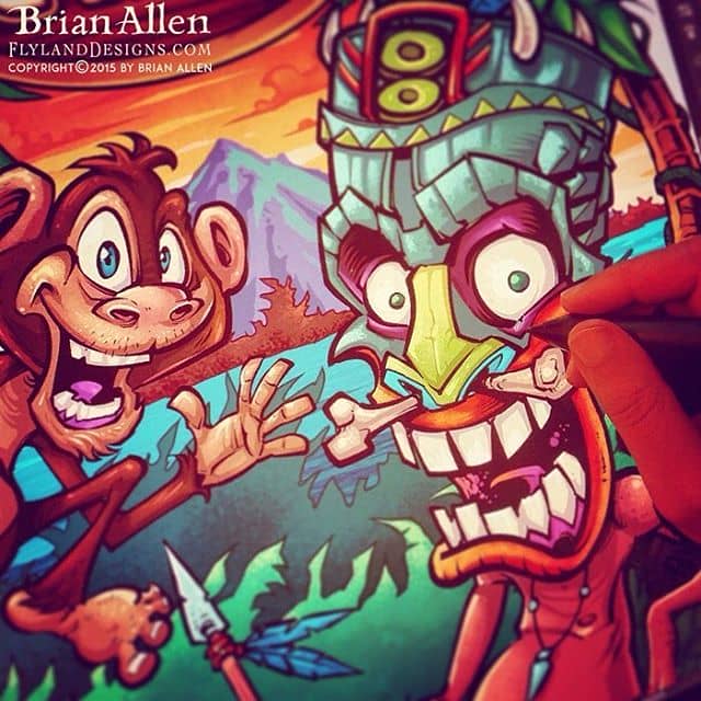
Inktober is half over – or half empty, whatever your thing is. Ran short of time again and had to ink a pencil sketch I have laying around of a tiki head. I'm really going to try to make a serious effort to carve out more time to work on these in the remaining weeks.#tiki #inktober #ink #sketch #brush #blackandwhite #art #instaartist #brianallen New Artwork From Instagram
Inktober 14th – Man it's been so much fun seeing what my friends are coming up with this month. I definitely need to set aside more time to step it up. Need to step out of my comfort zone a bit more. Though sometimes you just need to draw a zombie!#zombie #inktober #ink #sketch #brush #blackandwhite #art #instaartist #brianallen New Artwork From Instagram
Client:
Low Voltage Customs
Description:
Mad scientist character I created for a t-shirt design created for a really cool business that soups up kid’s power wheel cars.
They detail them, add stereos, fake engine blocks, and more – makes them into a work of art. We thought it best to portray the shop as a mad scientist’s laboratory. Illustrated in Manga Studio, set up for full color.
Check out more of my T-Shirt designs here.
Client:
LX
Description:
Mascot illustration I created for a DJ called LX. We designed this character wearing a gas mask for his marketing materials, flyers, and website.
Click here to see more of my Dark Illustrations
Client:
Big Ass Diesel
Description:
I illustrated this mascot for a new trucking apparel brand called Big Ass Diesel. We thought it would be cool to make the Donkey part machine with glowing eyes. I created this as a vector graphic in Adobe Illustrator so we could blow this thing up on the side of some of their trucks.
Click here to see more of my Logo Designs
Inktober 10th – salesman demon – kind of disappointed in this one, I was excited about the idea but thought it fell a little flat. Onwards!Illustrated by Brian Allen, FlylandDesigns.com#demon #mangastudio #photoshop #illustration #tshirt #art #instaart #instaartist #picoftheday #igdaily #followme New Artwork From Instagram
Contact Me:
814.571.6141
brian(at)flylanddesigns.com
Product Reviews
- Wacom Cintiq Pro 24″ ReviewSeptember 1, 2023 - 12:30 pm
Professional Illustrator Brian Allen reviews the new Wacom Cintiq Pro 24″ (non-touch). I have been using the new Wacom Cintiq Pro 24″ extensively since early April 2018 and I love it! I upgraded from the Wacom Cintiq 24HD, which I used for over 6 years. I had high expectations for this digital drawing tablet and […]
Categories
Artwork Licensing
Visit my licensing page to check out the artwork I have available for licensing