The IAFF recently commissioned me to create a poster for an upcoming rally in Ottawa, IL, the location of the historical Lincoln v. Douglas debates. I thought it would be fun to draw Lincoln and Douglas speeding through time on two motorcycles swinging chains and pipes at each other. I’m a historian at heart. The IAFF Motorcycle Group mascot is seen far back in the historic streets of Ottawa.

Abraham Lincoln and Douglas riding motorcycles through Ottawa and fighting.

The IAFF recently commissioned me to create a poster for an upcoming rally in Ottawa, IL, the location of the historical Lincoln v. Douglas debates. I thought it would be fun to draw Lincoln and Douglas speeding through time on two motorcycles swinging chains and pipes at each other. I’m a historian at heart. The IAFF Motorcycle Group mascot is seen far back in the historic streets of Ottawa.
To see more of my work, or hire me for freelance projects, please visit my website: www.flylanddesigns.com

Click here to see more of my Dark Illustrations

You know, for kids.Illustration by Brian Allen www.flylanddesigns.com #art #evilclown #clown #illustration #instaart #instaartwork #instaartist #instaartpop #artist #artshow #creative #artwork #followme Work in progress from the desk of illustrator Brian Allen
You know, for kids.Illustration by Brian Allen www.flylanddesigns.com #art #evilclown #clown #illustration #instaart #instaartwork #instaartist #instaartpop #artist #artshow #creative #artwork #followme

I was thrilled to be hired to create artwork for a new line of apparel for Smith & Wesson, featuring silk-screen illustrations of big angry eagles. It was a really fun challenge drawing the eagles, which I’ve always found difficult. Need to invest in a pet eagle for reference. The designs all needed to stay under six colors, which is always a challenge as soon as you introduce an american flag into the design (which eats up three colors right away). I used halftones wherever I could to limit the total number of colors.

The designs will be available in Smith & Wesson’s catalog, as well as in many retailers, such as Cabela’s.

Patriotic eagle silk-screen t-shirt design.

I was thrilled to be hired to create artwork for a new line of apparel for Smith & Wesson, featuring silk-screen illustrations of big angry eagles. It was a really fun challenge drawing the eagles, which I’ve always found difficult. Need to invest in a pet eagle for reference. The designs all needed to stay under six colors, which is always a challenge as soon as you introduce an american flag into the design (which eats up three colors right away). I used halftones wherever I could to limit the total number of colors.
The designs will be available in Smith & Wesson’s catalog, as well as in many retailers, such as Cabela’s.
To see more of my work, or hire me for freelance projects, please visit my website: www.flylanddesigns.com

Check out more of my T-Shirt designs here.

Click here to see more of my Dark Illustrations

I just put up my most comprehensive drawing/inking/coloring tutorial yet on my YouTube channel. People were asking me to slow the video down and talk more. Not used to people asking me to talk MORE. We'll see if they ask again!http://youtu.be/nbLuHItstyU#art #tutorial #mangastudio #tiki #digitalpainting #inking #drawing #wacom Work in progress from the desk of illustrator Brian Allen
I just put up my most comprehensive drawing/inking/coloring tutorial yet on my YouTube channel.  People were asking me to slow the video down and talk more.  Not used to people asking me to talk MORE.  We'll see if they ask again!http://youtu.be/nbLuHItstyU#art #tutorial #mangastudio #tiki #digitalpainting #inking #drawing #wacom

Review of Vinyl Disorder Custom Stickers

After trying several other sticker printers, I found that Vinyl Disorder was the best by far.

I recently set out to make custom stickers of my artwork made for promotion, and decided to try Vinyl Disorder, because some of my favorite artists were using them.

I did a mid-air jump-kick when a giant box of stickers came from Vinyl Disorder recently.  The kiss-cut vinyl stickers had great color reproduction, came super-quick (not a single sticker damaged), and the cuts were perfect.  Great customer service as well – I couldn’t be more pleased.

I tried a lot of other sticker companies, and they are clearly the best in my opinion.  I highly recommended them for any artist looking to get stickers made of their work!

Here are some more features I loved about Vinyl Disorder:

  • I received a quote the same day I contacted them, even though my request was a little different than anything on their site.
  • They printed 100s of kiss-cut vinyl stickers of over 30 different designs of my artwork in a really short period of time
  • The stickers are extremely high quality.  Really tough, thick vinyl.
  • Great color reproduction
  • Each set was individually wrapped with a sample sticker stuck to the bag so it was easy to see which stack was which design.
  • None of the stickers arrived bent or tarnished
  • They sent the order to me very quickly – especially considering how large my order was
  • One of the lowest prices I found (I got quotes from five other sticker companies)
  • Unlike other sticker shops, I really liked that I could order a really low run of each design (in this case, just 50).
  • Worked with my PSD files, with minimum setup on my part.

Thanks to Vinyl Disorder, I’m able to offer delightfully stickable sets of my artwork – take a look!

Check out Vinyl Disorder at http://www.vinyldisorder.com/ !

Stickers are available in volumes from my shop at https://www.flylanddesigns.com/shop/ for only $5 for a set of 3 different stickers.
These stickers, and many other cool designs are also available for sale from http://www.bongstickers.com/

I was recently hired to conceptualize and illustrate a team of Superhero zombies to be laser-engraved into skateboards by Revenga. It was challenging to pump a ton of detail in the board, while making sure to keep the lines bold enough as to not cause much trouble in the engraving process.

While designing, I also had to structure the design so the layout could be changed to fit a T-Shirt as well. I made sure to keep the characters masked on separate layers, that way moving them around at the end was relatively easy.

We also created a silk-screen color version for boards and shirts, using around 6 colors.

Client Testimonial:
They look just as amazing! Everyone is giving compliments about the graphic because it’s very cool!
-Martina Ieffa
Revenga Skateboards

You can purchase it here:
http://www.revengaskateboards.com

Laser-engraved skateboard design of a team of zombie superheroes

I was recently hired to conceptualize and illustrate a team of Superhero zombies to be laser-engraved into skateboards by Revenga. It was challenging to pump a ton of detail in the board, while making sure to keep the lines bold enough as to not cause much trouble in the engraving process.To see more of my work, or hire me for freelance projects, please visit my website: www.flylanddesigns.com

Click here to see more of my Dark Illustrations

Check out more of my T-Shirt designs here.

I just released this set of 100 Manga Studio brushes I created, available in my shop: https://www.flylanddesigns.com/shopfor $2.99.I'm really excited about how many people have already downloaded them, and I'm getting great feedback. That means a lot to me, because I put a ridculous amount of work into these, and use them every day. Happy to share them!#mangastudio #brushes #presets #art #digital #clipstudiopaint #illustration #instaart #instaartwork #instaartist #instaartpop #artist #artshow #creative #artwork #followme Work in progress from the desk of illustrator Brian Allen
I just released this set of 100 Manga Studio brushes I created, available in my shop:  https://www.flylanddesigns.com/shopfor $2.99.I'm really excited about how many people have already downloaded them, and I'm getting great feedback. That means a lot to me, because I put a ridculous amount of work into these, and use them every day.  Happy to share them!#mangastudio #brushes #presets #art #digital #clipstudiopaint #illustration #instaart #instaartwork #instaartist #instaartpop #artist #artshow #creative #artwork #followme

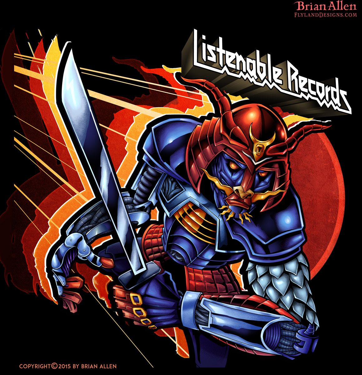
Always a pleasure working with my friends at Listenable Records. For this year’s sampler featuring the labels best tracks, we chose to pay tribute to the classic Defenders of the Faith album cover from Judas Priest. I thought it would be cool to draw a samurai in the same art style and color scheme as that record, and really give it a nice retro theme, with bright primary colors. Really dig the way this came out – might make a great sticker.

Client Testimonial:
I love it, colours are perfect , there’s a vintage feel too in the logo and overall colours, it’s great!
-Laurent Merle
Listenable Records

Robot samurai album cover illustration.

Always a pleasure working with my friends at Listenable Records. For this year’s sampler featuring the labels best tracks, we chose to pay tribute to the classic Defenders of the Faith album cover from Judas Priest. I thought it would be cool to draw a samurai in the same art style and color scheme as that record, and really give it a nice retro theme, with bright primary colors. Really dig the way this came out – might make a great sticker.
To see more of my work, or hire me for freelance projects, please visit my website: www.flylanddesigns.com

Click here to see more of my Dark Illustrations

Click here to see more of my custom album cover designs.

Working on something a little grim for an album cover. Ink in manga Studio 5.Illustration by Brian Allen www.flylanddesigns.com #art #digital #mangastudio #illustration #instaart #instaartwork #instaartist #instaartpop #artist #artshow #creative #artwork #followme Work in progress from the desk of illustrator Brian Allen
Working on something a little grim for an album cover. Ink in manga Studio 5.Illustration by Brian Allen www.flylanddesigns.com #art #digital #mangastudio #illustration #instaart #instaartwork #instaartist #instaartpop #artist #artshow #creative #artwork #followme

I was digging through some old stuff and found this logo I designed for an MMA fighter that I wanted to share with you.I've got a set of Manga Studio brushes I created that I'll have available tomorrow!Illustration by Brian Allen www.flylanddesigns.com #honeybadger #MMA #logo #art #digital #mangastudio #illustration #instaart #instaartwork #instaartist #instaartpop #artist #artshow #creative #artwork #followme Work in progress from the desk of illustrator Brian Allen
I was digging through some old stuff and found this logo I designed for an MMA fighter that I wanted to share with you.I've got a set of Manga Studio brushes I created that I'll have available tomorrow!Illustration by Brian Allen www.flylanddesigns.com #honeybadger #MMA #logo #art #digital #mangastudio #illustration #instaart #instaartwork #instaartist #instaartpop #artist #artshow #creative #artwork #followme

This is a detailed series of illustrations I created for a children’s book teaching kids about construction. Each double-page spread was packed with animal characters, vehicles, tools, and activities. The book challenges kids to hunt out objects and solve problems within the illustration, so I had to draw everything in a way that certain elements were intentionally hard to find. I had a lot of fun with this, because I had a lot of freedom to design the characters and draw them in my style.

Client Testimonial:
….turned out great! Awesome job!
-Chris Kane
Animal Kingdom Construction Co.

Detailed children’s book illustration of animals at a construction site.

This is a detailed series of illustrations I created for a children’s book teaching kids about construction. Each double-page spread was packed with animal characters, vehicles, tools, and activities. The book challenges kids to hunt out objects and solve problems within the illustration, so I had to draw everything in a way that certain elements were intentionally hard to find. I had a lot of fun with this, because I had a lot of freedom to design the characters and draw them in my style.
To see more of my work, or hire me for freelance projects, please visit my website: www.flylanddesigns.com

Check out more of my Children’s Book illustrations here.

Click here to see more of my Illustrations.

All-over-print dye-sublimated wrestling singlet design I created for BlueChip wrestling. This design is easily my favorite in the seires, and also the most time-consuming. I illustrated these giant skulls made up of probably a hundred smaller skulls, and lit the whole thing up by their glowing eyes. It was challenging, but I’m thrilled with how it turned out.

I created this as part of a series of wrestling singlet designs for BlueChip’s summer catalog. The designs will also be available on fight shorts. I find it so enjoyable working with dye sublimation, because the color and detail reproduction is fantastic, and I don’t have to worry about the head-scratching that comes from working with silk-screen.

Client Testimonial:
Thank you very much, I think everything turned out great!
-Andy Michaels
BlueChip Athletics

You can purchase the design on a singlet here:
http://www.bluechipwrestling.com/

Giant skull made of smaller skulls illustration for dye-sublimated wrestling singlets.

All-over-print dye-sublimated wrestling singlet design I created for BlueChip wrestling. This design is easily my favorite in the seires, and also the most time-consuming. I illustrated these giant skulls made up of probably a hundred smaller skulls, and lit the whole thing up by their glowing eyes. It was challenging, but I’m thrilled with how it turned out.
I created this as part of a series of wrestling singlet designs for BlueChip’s summer catalog. The designs will also be available on fight shorts. I find it so enjoyable working with dye sublimation, because the color and detail reproduction is fantastic, and I don’t have to worry about the head-scratching that comes from working with silk-screen. To see more of my work, or hire me for freelance projects, please visit my website: www.flylanddesigns.com

Click here to see more of my Dark Illustrations

This is a fun album cover illustration I created for a hard rock band called the Jokers for their new album, Hurricane. The idea was to have the band in a classic-looking car flying through the air to their next gig, and causing a hurricane behind them, destroying London below them. I tried to hide a lot of detail into the design swirling around them in the hurricane, like roadies, amps, guitars, and british artifacts. The band needed the album art in a really short amount of time, but we pulled it off in time, and they were quite happy with the result.

Client Testimonial:
…it all looks amazing, we are really really happy with the final product.
-Paul Hurst
The Jokers

Album cover illustration of The Jokers in a hurricane and rock and roll.

This is a fun album cover illustration I created for a hard rock band called the Jokers for their new album, Hurricane. The idea was to have the band in a classic-looking car flying through the air to their next gig, and causing a hurricane behind them, destroying London below them. I tried to hide a lot of detail into the design swirling around them in the hurricane, like roadies, amps, guitars, and british artifacts. The band needed the album art in a really short amount of time, but we pulled it off in time, and they were quite happy with the result.
To see more of my work, or hire me for freelance projects, please visit my website: www.flylanddesigns.com

Click here to see more of my custom album cover designs.

Description:
T-Shirt illustration I created of a crazed A-10 Thunderbolt warplane come to life in a dog-fight. This was done for a series of shirts celebrating different marijuana strains. The shirt is printed on 100% hemp, and available in a variety of groovy colors.

It was a pleasure working with the folks at #Bongjour. They gave me a lot of freedom with the design, and I’m really happy with how it turned out. Set up for direct-to-garment, full-color printing.

You can purchase the shirt here:
http://www.bongjour.com/

T-Shirt of a A-10 Thunderbolt warplane in a dogfight for Jet Fuel marijuana strain

T-Shirt illustration I created of a crazed A-10 Thunderbolt warplane come to life in a dog-fight. This was done for a series of shirts celebrating different marijuana strains. The shirt is printed on 100% hemp, and available in a variety of groovy colors.
It was a pleasure working with the folks at #Bongjour. They gave me a lot of freedom with the design, and I’m really happy with how it turned out. Set up for direct-to-garment, full-color printing.
To see more of my work, or hire me for freelance projects, please visit my website: www.flylanddesigns.com

Click here to see more of my Illustrations.

Just got this incredible letterpress in the mail from the Great @godmachine today. I'm trying to purchase something from every one of my favorite artists each month to fill up the studio. His work is so inspirational.He was also just on @aidpodcast – such a humble dude. There's so much to learn from artists like this.If you're not familiar with his work (you are), go check it out.#godmachine #letterpress #art Work in progress from the desk of illustrator Brian Allen
Just got this incredible letterpress in the mail from the Great @godmachine today.  I'm trying to purchase something from every one of my favorite artists each month to fill up the studio.  His work is so inspirational.He was also just on @aidpodcast - such a humble dude.  There's so much to learn from artists like this.If you're not familiar with his work (you are), go check it out.#godmachine #letterpress #art

I created this mad scientist character for an auto-repair shop whose specialty is custom built choppers and hotrods. The brand wanted a dark but playful design that illustrated them as a blend of mechanic and mad scientist. I thought it would be cool to show a frankenstein-ed hotrod on the operating table behind the mad scientist, as he raises his creation up to the lightning. This design was created for direct-to-garment printing.

Client Testimonial:
Testimonial
-Client Name
Position

This design is available for licensing:

I created this mad scientist character for an auto-repair shop whose specialty is custom built choppers and hotrods.  The brand wanted a dark but playful design that illustrated them as a blend of mechanic and mad scientist.  I thought it would be cool to show a frankenstein-ed hotrod on the operating table behind the mad scientist, as he raises his creation up to the lightning.  This design was created for direct-to-garment printing.  To see more of my work, or hire me for freelance projects, please visit my website:  www.flylanddesigns.com

I created this mad scientist character for an auto-repair shop whose specialty is custom built choppers and hotrods. The brand wanted a dark but playful design that illustrated them as a blend of mechanic and mad scientist. I thought it would be cool to show a frankenstein-ed hotrod on the operating table behind the mad scientist, as he raises his creation up to the lightning. This design was created for direct-to-garment printing.
To see more of my work, or hire me for freelance projects, please visit my website: www.flylanddesigns.com

Mad scientist mechanic working on a frankenstein hotrod monster car

I created this mad scientist character for an auto-repair shop whose specialty is custom built choppers and hotrods. The brand wanted a dark but playful design that illustrated them as a blend of mechanic and mad scientist. I thought it would be cool to show a frankenstein-ed hotrod on the operating table behind the mad scientist, as he raises his creation up to the lightning. This design was created for direct-to-garment printing.
To see more of my work, or hire me for freelance projects, please visit my website: www.flylanddesigns.com

Click here to see more of my Dark Illustrations

Check out more of my T-Shirt designs here.

Sometimes you just never know what the heck I'm going to be working on from day to day. Here's a pretty weird jacked – up cow MMA fighter that I'm quite fond of at the moment.Illustration by Brian Allen www.flylanddesigns.com #art #digital #MMA #mangastudio #illustration #instaart #instaartwork #instaartist #instaartpop #artist #artshow #creative #artwork #followme #wacom Work in progress from the desk of illustrator Brian Allen
Sometimes you just never know what the heck I'm going to be working on from day to day.  Here's a pretty weird jacked - up cow MMA fighter that I'm quite fond of at the moment.Illustration by Brian Allen www.flylanddesigns.com #art #digital #MMA #mangastudio #illustration #instaart #instaartwork #instaartist #instaartpop #artist #artshow #creative #artwork #followme #wacom

T-Shirt illustration I created of an evil Tiki man surrounded by smoke and pot leaves for the Hemp apparel brand Bongjour. The shirt is printed on 100% hemp, and available in a variety of groovy colors.

It was a pleasure working with the folks at #Bongjour. They gave me a lot of freedom with the design, and I’m really happy with how it turned out. Set up for direct-to-garment, full-color printing.

You can purchase the shirt here:
http://www.bongjour.com/product/hemp-native-apparel/

To see a process video of me inking this design, visit my YouTube channel:

To see a process video of how I colored this design, please visit:

Tiki head t-shirt illustration with marijuana leaves and pot smoke

T-Shirt illustration I created of an evil Tiki man surrounded by smoke and pot leaves for the Hemp apparel brand Bongjour. The shirt is printed on 100% hemp, and available in a variety of groovy colors.
It was a pleasure working with the folks at #Bongjour. They gave me a lot of freedom with the design, and I’m really happy with how it turned out. Set up for direct-to-garment, full-color printing.
To see more of my work, or hire me for freelance projects, please visit my website: www.flylanddesigns.com

Check out more of my T-Shirt designs here.

Click here to see more of my Illustrations.

I designed and illustrated this angry gargoyle busting out of its stone skin for a line of ATV and sled wraps put out by 393 Components. It was a challenge to position everything and design it in a way to make the design look interesting on as many different vehicle types and shapes as possible. I kept all the elements in layers so that the design could be modified if necessary to fit different wraps. I needed to make it look as different as possible from a previous gargoyle design I had done, so I came up with the idea of having the gargoyle a green-skinned creature bursting from stone, as if it was coming to life.

It was really cool to be working with graphic decals again for ATVs, because my first full-time position as an artist was at a custom decal shop called XGX Racing.

Client Testimonial:
Just wanted to thank you again for an outstanding job
– 393 Components
Shawn Alexander

This design is available for licensing:

Gargoyle graphic in stormy sky for vehicle wraps.

I designed and illustrated this angry gargoyle busting out of its stone skin for a line of ATV and sled wraps put out by 393 Components. It was a challenge to position everything and design it in a way to make the design look interesting on as many different vehicle types and shapes as possible. I kept all the elements in layers so that the design could be modified if necessary to fit different wraps. I needed to make it look as different as possible from a previous gargoyle design I had done, so I came up with the idea of having the gargoyle a green-skinned creature bursting from stone, as if it was coming to life.
It was really cool to be working with graphic decals again for ATVs, because my first full-time position as an artist was at a custom decal shop called XGX Racing.
To see more of my work, or hire me for freelance projects, please visit my website: www.flylanddesigns.com

Click here to see more of my Dark Illustrations

Here’s an easy way to use the Adobe Photoshop Extract Assets feature to create multiple drafts for a clients review from one file.


To check out more of my work, or to hire me:

Follow me on Facebook:
https://www.facebook.com/brianallen.flylanddesigns

On Instagram:
http://instagram.com/flylanddesigns_brian_allen

On YouTube:
https://www.youtube.com/user/flylanddesigns

On Twitter:
https://twitter.com/flylanddesigns

On Behance:
https://www.behance.net/flylanddesigns


This is a T-Shirt illustration I created for a new brand called The Reno Life, which celebrates and promotes the work of several DIY TV personalities. The illustration features caricatures of DIY celebrities Anitra Mecadon, Jason Cameron, Chris Grundy, Jeff Devlin, and Stephen Fanuka on the beach. It was a challenge to fit all of these characters into such a tight space, while still keeping them recognizable.

Caricatures of DIY TV celebrities on the beach

This is a T-Shirt illustration I created for a new brand called The Reno Life, which celebrates and promotes the work of several DIY TV personalities. The illustration features caricatures of DIY celebrities Anitra Mecadon, Jason Cameron, Chris Grundy, Jeff Devlin, and Stephen Fanuka on the beach. It was a challenge to fit all of these characters into such a tight space, while still keeping them recognizable.
To see more of my work, or hire me for freelance projects, please visit my website: www.flylanddesigns.com

Click here to see more of my Illustrations.

I wanted to create a an illustration as a sample to try to get work from young-adult fantasy book publishers, a market that I’d like to do more work in. I chose a scene with an adventurer in an Aztec-like jungle temple so I could draw some funny and creepy totems – and I even got to sneak a skull in there too! I like to try different styles and themes whenever I can – keeps things from getting stale. I’m happy with how this turned out, and would like to do more in this genre.

This design is available for licensing:

Young adventurer in a dark temple with golden skull and tiki totems.

I wanted to create a an illustration as a sample to try to get work from young-adult fantasy book publishers, a market that I’d like to do more work in. I chose a scene with an adventurer in an Aztec-like jungle temple so I could draw some funny and creepy totems – and I even got to sneak a skull in there too! I like to try different styles and themes whenever I can – keeps things from getting stale. I’m happy with how this turned out, and would like to do more in this genre.
To see more of my work, or hire me for freelance projects, please visit my website: www.flylanddesigns.com

This video is about Importing Manga Studio Brushes from Manga Studio 4 into Manga Studio 5.

For a full review on Manga Studio 5, check it out at:
https://www.youtube.com/watch?v=v2YLNa22gEo
Thanks for watching, please post any questions in the comments.

To check out more of my work, or to hire me:

FREQUENTLY ASKED QUESTIONS

–What software do you use?
Manga Studio 5 EX and Adobe Photoshop CC

–What tablet do you use? Wacom Cintiq 24HD, and sometimes a Wacom Companion 1

–What computer do you use?
iMac

–What brushes do you use?
I use variants I created from the stock brushes in Manga Studio 5, as well as brushes I purchased from Ray Frenden.

–How much time does an illustration take?
Projects vary greatly, but I would say a good average would be 8 hours.

–People actually pay you to do this all day?
I know, right?

—————————

Follow me on Facebook:
https://www.facebook.com/brianallen.flylanddesigns

On Instagram:
http://instagram.com/flylanddesigns_brian_allen

On YouTube:
https://www.youtube.com/user/flylanddesigns

On Twitter:
https://twitter.com/flylanddesigns

On Behance:
https://www.behance.net/flylanddesigns

I was hired by Strange Kids Club Magazine to illustrated a promotional poster featuring characters from their upcoming magazine. I loved every second of working on this. If you’re strange like me, and born in the 80s, then I don’t need to explain what’s going on here. The concept revolved around a fictional character called Bronarr, Space Barbarian (!) – loosely based on 80s Saturday morning cartoons like Masters of the Universe, as well as camp classic 70s retro sci-fi/fantasy films like Hell Comes To Frogtown.

Client Testimonial:
Simply put, you nailed it!
-Rondal Scott III
Strange Kids Club Magazine, owner

You can view a video of the inking process here:


Sci-fi fantasy poster illustration with mutant frogs and strange heroes

I was hired by Strange Kids Club Magazine to illustrated a promotional poster featuring characters from their upcoming magazine. I loved every second of working on this. If you’re strange like me, and born in the 80s, then I don’t need to explain what’s going on here. The concept revolved around a fictional character called Bronarr, Space Barbarian (!) – loosely based on 80s Saturday morning cartoons like Masters of the Universe, as well as camp classic 70s retro sci-fi/fantasy films like Hell Comes To Frogtown.
To see more of my work, or hire me for freelance projects, please visit my website: www.flylanddesigns.com

Speed-Inking Tutorial video I created for the process of digitally inking an album cover for the Brazillian band John Wayne in Manga Studio 5 (Clip Studio Paint) with a Wacom Cintiq 24HD.

The album cover I illustrated was for the Brazilian heavy metal band John Wayne (named after John Wayne Gacy – not the other guy). It was a great pleasure working on this with the band, as they gave me a lot of freedom, and I set upon the design without much planning, and tried to let it flow. This album cover is the first in a set of two albums, that when placed together will form one cohesive image. This album represents the dark side, while the following album will have a similar design, but mirrored, and “lighter.”
You can purchase the album here:
https://www.facebook.com/BandaJohnWayne


To check out more of my work, or to hire me:

Follow me on Facebook:
https://www.facebook.com/brianallen.flylanddesigns

On Instagram:
http://instagram.com/flylanddesigns_brian_allen

On YouTube:
https://www.youtube.com/user/flylanddesigns

On Twitter:
https://twitter.com/flylanddesigns

On Behance:
https://www.behance.net/flylanddesigns

Album cover I illustrated for the Brazilian heavy metal band John Wayne (named after John Wayne Gacy – not the other guy). It was a great pleasure working on this with the band, as they gave me a lot of freedom, and I set upon the design without much planning, and tried to let it flow. This album cover is the first in a set of two albums, that when placed together will form one cohesive image. This album represents the dark side, while the following album will have a similar design, but mirrored, and “lighter.”

Client Testimonial:
We are very happy with your great work!
-Rogerio Torres
John Wayne (Brazilian Heavy Metal Band)

You can purchase the album here:
https://www.facebook.com/BandaJohnWayne

Dark illustration of a skull, crow, and zombie for an album cover

Album cover I illustrated for the Brazilian heavy metal band John Wayne (named after John Wayne Gacy – not the other guy). It was a great pleasure working on this with the band, as they gave me a lot of freedom, and I set upon the design without much planning, and tried to let it flow. This album cover is the first in a set of two albums, that when placed together will form one cohesive image. This album represents the dark side, while the following album will have a similar design, but mirrored, and “lighter.”
To see more of my work, or hire me for freelance projects, please visit my website: www.flylanddesigns.com

Click here to see more of my Dark Illustrations

Click here to see more of my custom album cover designs.

This is a video tutorial with commentary on how to create a complex illustrated pattern in Adobe Photoshop CC for an all-over print T-shirt.
The design features a zombie Captain Crunch, and zombie crunch berries created for a direct-to-garment all-over print T-shirt I designed for rageon.com of a zombie Captain Crunch.

I take you step by step in the process using Smart Objects and Smart Filters to form a repeatable pattern from a complicated illustration.

To purchase this shirt follow the link below:
http://www.rageon.com/products/capn-dead-t-shirt

Thanks for watching, please post any questions in the comments.

To check out more of my work, or to hire me:

—————————

Follow me on Facebook:
https://www.facebook.com/brianallen.flylanddesigns

On Instagram:
http://instagram.com/flylanddesigns_brian_allen

On YouTube:
https://www.youtube.com/user/flylanddesigns

On Twitter:
https://twitter.com/flylanddesigns

On Behance:
https://www.behance.net/flylanddesigns

Cap'n Dead T-shirt Design


This is an illustration I created recently of a client’s boat in a coastal scene with a big marlin jumping out of the water. The design was set up for full-color direct-to-garment printing. I tried to handle the waves and water in my own style and played with adding a lot of detail and color variation.

This design is available for licensing:

Client Testimonial:
Once again thank you for all your hard work and effort and I’m sure we will be doing more work in the future.
-Merton Oxha

Boating illustration of a marlin jumping out of the water

This is an illustration I created recently of a client’s boat in a coastal scene with a big marlin jumping out of the water. The design was set up for full-color direct-to-garment printing. I tried to handle the waves and water in my own style and played with adding a lot of detail and color variation. To see more of my work, or hire me for freelance projects, please visit my website: www.flylanddesigns.com

Click here to see more of my Illustrations.

Check out more of my T-Shirt designs here.

Here’s a inking tutorial for a hot-rod t-shirt for Commando Racing. Check out the shirt at (http://commandoracing.com/t/shirts)

I created this fun t-shirt design for Commando Racing Gear – a hardcore skeleton! We went through a couple different [and equally exciting] designs but eventually settled on this one. I had a lot of fun with this!

Thanks for watching, please post any questions in the comments.

FREQUENTLY ASKED QUESTIONS

–What software do you use?
Manga Studio 5 EX and Adobe Photoshop CC

–What tablet do you use? Wacom Cintiq 24HD, and sometimes a Wacom Companion 1

–What computer do you use?
iMac

–What brushes do you use?
I use variants I created from the stock brushes in Manga Studio 5, as well as brushes I purchased from Ray Frenden.

–How much time does an illustration take?
Projects vary greatly, but I would say a good average would be 8 hours.

–People actually pay you to do this all day?
I know, right?

—————————

Follow me on Facebook:
https://www.facebook.com/brianallen.flylanddesigns

On Instagram:
http://instagram.com/flylanddesigns_brian_allen

On YouTube:
https://www.youtube.com/user/flylanddesigns

On Twitter:

On Behance:
https://www.behance.net/flylanddesigns

Illustration of an angry Firefighter leprechaun wielding a fire axe on a maltese cross I illustrated for a St. Patrick’s Day Parade. This design is available for licensing for apparel and other uses. Please contact flylanddesigns@gmail.com for information. Set up for Direct-To-Garment printing, or full-color simulated process silk-screen.

This design is available for licensing:

Firefighter leprechaun with axe on a maltese cross

Illustration of an angry Firefighter leprechaun weilding a fire axe on a maltese cross illustrated for a St. Patrick’s Day Parade. This design is available for licensing for apparel and other uses. Please contact flylanddesigns@gmail.com for information. Set up for Direct-To-Garment printing, or full-color simulated process silk-screen.

Click here to see more of my Dark Illustrations

Check out more of my T-Shirt designs here.

This illustration was for a private commission for a fan’s husband (I believe as an anniversary present). She needed a large illustration to fit on two facing panels in a hallway, and wanted it to be fun and creepy at the same time. We came up with this idea of drawing a giant killer bee wielding a chainsaw in a ruined city as bystanders flee in fear. I chose colors that would compliment the existing scheme in their home. She was thrilled with how it turned out. I printed them out on two large 36 inch square panels. I’m thinking about making stickers of the chainsaw-bee.

Client Testimonial:
We just got them in the mail yesterday and they look FANTASTIC! I can’t wait to get them in a frame!
-Katie Boyle

Parts of this illustration are available for licensing here:

Humorous and dark Illustration of a killer bee with a chainsaw

This illustration was for a private commission for a fan’s husband (I believe as an anniversary present). She needed a large illustration to fit on two facing panels in a hallway, and wanted it to be fun and creepy at the same time. We came up with this idea of drawing a giant killer bee wielding a chainsaw in a ruined city as bystanders flee in fear. I chose colors that would compliment the existing scheme in their home. She was thrilled with how it turned out. I printed them out on two large 36 inch square panels. I’m thinking about making stickers of the chainsaw-bee.
To see more of my work, or hire me for freelance projects, please visit my website: www.flylanddesigns.com

Click here to see more of my Dark Illustrations

Click here to see more of my Illustrations.

Here’s a video of how to ink for a laser-cut skateboard.

I was recently hired to conceptualize and illustrate a team of Superhero zombies to be laser-engraved into skateboards by Revenga (www.revengaskateboards.com).

While designing, I also had to structure the design so the layout could be changed to fit a T-Shirt as well. I made sure to keep the characters masked on separate layers, that way moving them around at the end was relatively easy.

We also created a silk-screen color version for boards and shirts, using around 6 colors.

Thanks for watching, please post any questions in the comments.

To check out more of my work, or to hire me:

FREQUENTLY ASKED QUESTIONS

–What software do you use?
Manga Studio 5 EX and Adobe Photoshop CC

–What tablet do you use? Wacom Cintiq 24HD, and sometimes a Wacom Companion 1

–What computer do you use?
iMac

–What brushes do you use?
I use variants I created from the stock brushes in Manga Studio 5, as well as brushes I purchased from Ray Frenden.

–How much time does an illustration take?
Projects vary greatly, but I would say a good average would be 8 hours.

–People actually pay you to do this all day?
I know, right?

—————————

Follow me on Facebook:
https://www.facebook.com/brianallen.flylanddesigns

On Instagram:
http://instagram.com/flylanddesigns_brian_allen

On YouTube:
https://www.youtube.com/user/flylanddesigns

On Twitter:
https://twitter.com/flylanddesigns

On Behance:
https://www.behance.net/flylanddesigns

I created this mascot and logo design for a team of drag-racer’s new line of merchandise and apparel. The client wanted a tough, dark, militant mascot character that could later be drawn in other situations and shenanigans. We went through a few sketches at the beginning that were a bit too light, and eventually arrived at RAD, the skeletal, drag-racing warrior you see before you! The mascot and logo was prepared for both limited color silk-screening and full-color printing, to maximize the usage.

Client Testimonial:
If you were closer, I’d hug you!!! We absolutely love it.
-Steve Kanner
Commando Racing Gear

Angry militant skeleton mascot with army helmet for drag racing.

I created this mascot and logo design for a team of drag-racer’s new line of merchandise and apparel. The client wanted a tough, dark, militant mascot character that could later be drawn in other situations and shenanigans. We went through a few sketches at the beginning that were a bit too light, and eventually arrived at RAD, the skeletal, drag-racing warrior you see before you! The mascot and logo was prepared for both limited color silk-screening and full-color printing, to maximize the usage.
To see more of my work, or hire me for freelance projects, please visit my website: www.flylanddesigns.com

Click here to see more of my Dark Illustrations

Click here to see more of my Logo Designs

I created this illustration of a skeleton with a sledgehammer for a new apparel brand showcasing the work of DIY television personalities, called The Reno Life. I tried to add a lot of my own style to the skeleton, and keep it tough while not scaring the kiddies away. We did a female version as well – and I found drawing skeletons to look female is a bit challenging when you don’t have many… parts…. to work with. This design was set up for full-color direct-to-garment printing.

This artwork is available for licensing:

Skeleton holding a sledgehammer wearing a hard-hat.

I created this illustration of a skeleton with a sledgehammer for a new apparel brand showcasing the work of DIY television personalities, called The Reno Life. I tried to add a lot of my own style to the skeleton, and keep it tough while not scaring the kiddies away. We did a female version as well – and I found drawing skeletons to look female is a bit challenging when you don’t have many… parts…. to work with. This design was set up for full-color direct-to-garment printing.
To see more of my work, or hire me for freelance projects, please visit my website: www.flylanddesigns.com

Click here to see more of my Dark Illustrations

Check out more of my T-Shirt designs here.

This is a very detailed illustrated album cover I created for the heavy metal band called DemonHead. The idea was to have a troubled kid rolling a 12-sided die that causes catastrophe behind him. With each roll bring a different type of destruction. I tried to have fun with it and cram in as much chaos as I could.

Client Testimonial:
Thanks so much for the work I think it came out really well and will look awesome. It was a pleasure working with you. Couldn’t be happier with the end result!
-Dave Lowes, DemonHead

You can purchase the album here:
https://demonheadaus.bandcamp.com/releases

Check out this speed-painting tutorial on how this artwork was inked:

Check out this speed-painting tutorial on how the artwork was colored:

Album cover illustration of kid rolling dice in destroyed city with monsters.

This is a very detailed illustrated album cover I created for the heavy metal band called DemonHead. The idea was to have a troubled kid rolling a 12-sided die that causes catastrophe behind him. With each roll bring a different type of destruction. I tried to have fun with it and cram in as much chaos as I could.
To see more of my work, or hire me for freelance projects, please visit my website: www.flylanddesigns.com

Click here to see more of my Dark Illustrations

Click here to see more of my custom album cover designs.

Revco, a welding apparel and supply company hired me to illustrate a new t-shirt for their catalog with the America cranked up to 11. Waving flag. Check. Giant screaming eagle. Check. The shirt was printed direct-to-garment, so I could really unleash the colors. Really happy with how this turned out, even though I struggled a bit at first to get the eagle right.

This design is available for licensing for uses other than apparel:

Patriotic illustration of an eagle and flag t-shirt design.

Revco, a welding apparel and supply company hired me to illustrate a new t-shirt for their catalog with the America cranked up to 11. Waving flag. Check. Giant screaming eagle. Check. The shirt was printed direct-to-garment, so I could really unleash the colors. Really happy with how this turned out, even though I struggled a bit at first to get the eagle right.
To see more of my work, or hire me for freelance projects, please visit my website: www.flylanddesigns.com

Click here to see more of my Dark Illustrations

Check out more of my T-Shirt designs here.

I was recently hired by Ring Thip to reinvent their packaging for their Thai Tea.  They wanted a bolder and more contemporary design, as they make a push to reach more retail markets.

I found this project to be very challenging, because the subject matter was so different, and I had limited space to make an impact.

Each flavor will have a different illustration emerging from the ring.

Bottle label design for tea featuring illustration.

I was recently hired by Ring Thip to reinvent their packaging for their Thai Tea. They wanted a bolder and more contemporary design, as they make a push to reach more retail markets. I created the label for their showcase Thai Tea product, as well as labels for the rest of their line.
I found this project to be very challenging, because the subject matter was so different, and I had limited space to make an impact.
Each flavor will have a different illustration emerging from the ring.

Click here to see more of my Illustrations.

Check out this video of my process of the coloring for DemonHead’s album cover

Here is a video showing the process I use to color my drawing for DemonHead’s new album cover “Bring On The Doom.”

The idea was to have a troubled kid rolling a 12-sided die that causes catastrophe behind him. I tried to have fun with it and cram in as much chaos as I could.

I used Adobe Photoshop to color this, and a Wacom Cintiq 24HD.

Check out the band, they rule! The music in the video is from their new album “Bring On the Doom” used with permission. https://www.facebook.com/demonheadband

Thanks for watching, I’m happy to answer any questions, just post them in the comments on my YouTube page.

If the video is not playing correctly, you can also view it here: https://youtu.be/Q_yZjCJynDc

Also follow me on YouTube for more tutorials (http://www.youtube.com/flylanddesigns)

Hi everyone!
I was recently hired to illustrated the cover for DemonHead’s newest album.

The idea was to have a troubled kid rolling a 12-sided die that causes catastrophe behind him. I tried to have fun with it and cram in as much chaos as I could.

I used Manga Studio 5 to ink this, and a Wacom Cintiq 24HD.

Check out the band, they rule! The music in the video is from their new album “Bring On the Doom” used with permission. https://www.facebook.com/demonheadband

Thanks for watching, I’m happy to answer any questions, just post them in the comments on my YouTube page.

If the video is not playing correctly, you can also view it here: https://youtu.be/zWd_aIaSjlA

Also follow me on YouTube for more Manga Studio tutorials (http://www.youtube.com/flylanddesigns)

This is the process I used for coloring a direct-to-garment t-shirt illustration in Manga Studio 5, sped up about 8x. Had a lot of fun with this.

I use a Wacom Cintiq 24HD, and a lot of coffee.

The illustration was for a brand new clothing line called Bongjour.

Purchase this 100% Hemp shirt from www.bongjour.com

Thanks for watching, I’m happy to answer any questions, just post them in the comments on my YouTube page.

If the video is not playing correctly, you can also view it here: https://youtu.be/fvRHCw_SaHw

Also follow me on YouTube for more Manga Studio tutorials (http://www.youtube.com/flylanddesigns)

Check out this video of my process of Inking for a mini-poster

I was humbled to be hired to illustrate a limited edition mini-poster for Strange Kids Club Magazine’s upcoming Issue #5, now on Kickstarter.

https://www.kickstarter.com/projects/228158145/strange-kids-club-magazine-5

Thanks for watching, I’m happy to answer any questions, just post them in the comments on my YouTube page.

If the video is not playing correctly, you can also view it here: https://youtu.be/FdIVvLlPfnA

Also follow me on YouTube for more Manga Studio tutorials (http://www.youtube.com/flylanddesigns)

Check out this video of my process for inking a Tiki t-shirt 

This is the process I used for inking a t-shirt illustration in Manga Studio 5, sped up about 8x. I had a lot of fun with this.

I use a Wacom Cintiq 24HD, and a lot of coffee.

The illustration was for a brand new clothing line called Bongjour.

Purchase this 100% Hemp shirt from www.bongjour.com

Thanks for watching, I’m happy to answer any questions, just post them in the comments on my YouTube page.

If the video is not playing correctly, you can also view it here: https://youtu.be/TrslISXXeBU

Also follow me on YouTube for more Manga Studio tutorials (http://www.youtube.com/flylanddesigns)

Fire-fighter Leprechaun with an axe standing on a Maltese Cross for T-Shirts for St. Patrick's Day

This image is available for licensing, please contact flylanddesigns@gmail.com for details.


Illustration of an angry Firefighter leprechaun weilding a fire axe on a maltese cross illustrated for a St. Patrick’s Day Parade.  This design is available for licensing for apparel and other uses.  Please contact flylanddesigns@gmail.com for information.  Set up for Direct-To-Garment printing, or full-color simulated process silk-screen.

Every illustrator/Graphic Designer should listen to this podcast episode.  A friend referred it to me – it explains how to copyright your artwork cheaply.  Human Tree (one of my favorite artists), has mastered this process, and actually makes a significant income from suing those who steal his artwork.

Seriously has changed the way I look at everything involving my rights.  Turns out I’ve been doing it all wrong.  CHECK THIS OUT.
http://www.aidpodcast.com/copyfight/


Here’s another great video on copyrights for artists by the talented Will Terry:

Favicon for Freelance Illustrator Brian Allen of Flyland Designs

Great anatomy book I just picked up from mastersofanatomy.com. The book takes up over 100 different gorgeous and have them drop the same person in multiple views. It’s really cool to see all the different styles applied to the same picture. Highly recommended.

My tribute illustration to one of my favorite Iron Maiden album covers originally by the great Derek Riggs. I drew this in Manga studio and tried to add a bit of my own style to it. Failed miserably of course when compared the original, but it was fun.Illustration by Brian Allen www.flylanddesigns.com #art #digital #mangastudio #ironmaiden #killers #instaart # albumcoverart #albumcover Work in progress from the desk of illustrator Brian Allen
My tribute illustration to one of my favorite Iron Maiden album covers originally by the great Derek Riggs. I drew this in Manga studio and tried to add a bit of my own style to it.  Failed miserably of course when compared the original, but it was fun.Illustration by Brian Allen www.flylanddesigns.com #art #digital #mangastudio #ironmaiden #killers #instaart # albumcoverart #albumcover

Pencil sketch of an illustration I created for a tribute to Iron Maiden 'Killers' album, one of my favorites. I'll post the finished piece tomorrow, I rhino it turned out really cool.Illustration by Brian Allen www.flylanddesigns.com #art #digital #mangastudio #zombies #ironmaiden #killers #sketch # pencil Work in progress from the desk of illustrator Brian Allen
Pencil sketch of an illustration I created for a tribute to Iron Maiden 'Killers' album, one of my favorites.  I'll post the finished piece tomorrow, I rhino it turned out really cool.Illustration by Brian Allen www.flylanddesigns.com #art #digital #mangastudio #zombies #ironmaiden #killers #sketch # pencil

Here's the finished Rasta lion t-shirt design I illustrated for #concentratedapparel. Love how this turned out. Illustration by Brian Allen www.flylanddesigns.com Work in progress from the desk of illustrator Brian Allen
Here's the finished Rasta lion t-shirt design I illustrated for #concentratedapparel.  Love how this turned out. Illustration by Brian Allen www.flylanddesigns.com

Rasta lion illustration I created for #concentratedapparel. Had a lot of fun working on this. Silk screen T-shirts available from Concentrated apparel. Www.flylanddesigns.com Work in progress from the desk of illustrator Brian Allen
Rasta lion illustration I created for #concentratedapparel. Had a lot of fun working on this. Silk screen T-shirts available from Concentrated apparel.  Www.flylanddesigns.com

Drawing a Rasta lion on a Wacom Cintiq for my friends at concentrated apparel.#digital #art #lion #pot #weed #concentratedapparel Work in progress from the desk of illustrator Brian Allen
Drawing a Rasta lion on a Wacom Cintiq for my friends at concentrated apparel.#digital #art #lion #pot #weed #concentratedapparel

Playing freestyle Legos with Michael. Taking the day off like the Lord intended. #art # Lego #dayofrestbullshit #vivavideo Work in progress from the desk of illustrator Brian Allen
Playing freestyle Legos with Michael. Taking the day off like the Lord intended. #art # Lego #dayofrestbullshit #vivavideo

Freelancing solo can be a pretty lonely gig. I try to keep in touch with other artists I’ve met to exchange tips and guidance (and also a lot of complaining and whining) – but everyone has a pretty busy schedule, and it can be hard to make time.

So I started listening to art and design podcasts, which are packed with useful direction and inspiration. I’ve learned more from listening to these shows about contracts, agents, clients, technique, pricing, copyrights, and more than I probably had ever known.  You can listen to these in iTunes, or straight from their websites.

Here are my top three favorites:
adventures

1. Adventures in Design

http://www.aidpodcast.com/

Easily my favorite podcast in general, not just about design.  I have learned so much from these guys.  They are also incredibly funny, so it really makes the time fly while working listening to their commentary.  Their focus goes far beyond just gig posters (which both artists got their start in), and branches into illustration, graphic design, and most of all, the business of freelancing.  They are also brutally honest and candid.  They often interview very talented artists on the show as well, which brings in a lot of different perspectives.

And finally, you get the feeling that these guys are leaders in fighting for freelance artist’s rights –  defending against the horrors of design contests, spec work, low-pay, and other naughty things.
I highly recommend this – I recently discovered it, so I’m still catching up (I’m on episode 25).  The show is still ongoing.

tumblr_static_bipt_blog_banner

2. Big Illustration Party Time

http://illustrationparty.tumblr.com/

The format of this show is actually similar to Adventures in Design:  two talented artists with different but complimentary personalities talking shop about freelance illustration and design.  Unfortunately, the show is no longer ongoing, but there are 54 episodes which cover everything from artist agents, pricing, contracts, and other important things.  I find it so helpful because these are things that as freelancers we all need to know – yet they are difficult things to discuss with your peers because we are all at the same time colleagues and competitors.  What I take away the most after listening to this show is that no matter what level you are at currently, all freelance artists are fighting the same battles.

header_1000

3. Art & Story

This podcast is also no longer on-going, but there are almost 200 episodes in the archives.  This podcast explores freelance illustration from the comic book market perspective.  I don’t work much in that market, however, I still found their interviews and tips very helpful.

What are your favorites?

Please let me know in the comments – I’m sure I’m missing some good ones.

Logo design I created for Kush Canvas, an a printer specializing in canvas and paper made from hemp. Had a lot of fun with this one.Www.flylanddesigns.com #MANGASTUDIO #ART #DIGITAL #drawing #instaart #logo #mascot Work in progress from the desk of illustrator Brian Allen
Logo design I created for Kush Canvas, an a printer specializing in canvas and paper made from hemp. Had a lot of fun with this one.Www.flylanddesigns.com #MANGASTUDIO #ART #DIGITAL #drawing #instaart #logo #mascot

http://youtu.be/0MRZ4ytSkIQ here's a snippet of my youtube review of Manga Studio 5, showing the features that are better than adobe photoshop. Please check it out! Work in progress from the desk of illustrator Brian Allen
http://youtu.be/0MRZ4ytSkIQ here's a snippet of my youtube review of Manga Studio 5, showing the features that are better than adobe photoshop.  Please check it out!

Drawing i did in Manga studio 5 of an airbrushing skeleton. Check out my youtube review of Manga Studio 5: http://youtu.be/0MRZ4ytSkIQ#art #skull #instaart #mangastudio #skeleton #ink #drawing #airbrush Work in progress from the desk of illustrator Brian Allen
Drawing i did in Manga studio 5 of an airbrushing skeleton.  Check out my youtube review of Manga Studio 5: http://youtu.be/0MRZ4ytSkIQ#art #skull #instaart #mangastudio #skeleton #ink #drawing #airbrush