Gecko cartoon character I created dressed as elvis for a hospitality company.
Client:
Anders Borg
Description:
Logo design I created for a russefeiring team in Norway of a cathedral and stone statues. I really enjoyed working on this because it was such a different theme than what I normally work with for Russ. The logo will be used on the team’s apparel, and painted on their bus.
Client:
Gaute Haansnar
Description:
I was hired to design this logo of Zeus among two ordinary mortals in togas for apparel and a vehicle wrap for the russefeiring tradition. If you haven’t heard of it, basically russefeiring involves an entire class of Norwegian students renting a bus (a Russebuss), painting every inch of it with really cool street art, and then partying in it night and day for an entire month during graduation. The different classes wear their designs ever where they go as they clash with rival classes. I’ve done a bunch of these now, and really enjoy it.
I was hired to design this logo paying tribute to the Phantom, or Fanotmet as he’s known in Norway, for apparel and a vehicle wrap for the russefeiring tradition. If you haven’t heard of it, basically russefeiring involves an entire class of Norwegian students renting a bus (a Russebuss), painting every inch of it with really cool street art, and then partying in it night and day for an entire month during graduation. The different classes wear their designs ever where they go as they clash with rival classes. I’ve done a bunch of these now, and really enjoy it.
Client:
Christian Kleven
Description:
I was hired to design this King Kong inspired logo for apparel and a vehicle wrap for the russefeiring tradition. If you haven’t heard of it, basically russefeiring involves an entire class of Norwegian students renting a bus (a Russebuss), painting every inch of it with really cool street art, and then partying in it night and day for an entire month during graduation. The different classes wear their designs ever where they go as they clash with rival classes. I’ve done a bunch of these now, and really enjoy it.
I was hired to design this illustration of the Big Bad Wolf and the three little pigs, or Storeulv, as he’s known in Norway. I created the characters to pay homage to the classic three little pigs cartoons, but with a twisted look to them. The design was for apparel and a vehicle wrap for the russefeiring tradition. If you haven’t heard of it, basically russefeiring involves an entire class of Norwegian students renting a bus (a Russebuss), painting every inch of it with really cool street art, and then partying in it night and day for an entire month during graduation. The different classes wear their designs ever where they go as they clash with rival classes. I’ve done a bunch of these now, and really enjoy it.
Client:
Golden Gate
Description:
Looney Tunes parody illustration of the classic characters Bugs, Sylvester, Tweety, Taz, and Daffy as thugs, created for a logo for a Russefeiring team. The design will be wrapped on vehicles, printed on apparel, and used on the class’ website. If you haven’t heard of Russefeiring, basically it involves an entire class of Norwegian students renting a bus (a Russebuss), painting every inch of it with really cool street art, and then partying in it night and day for an entire month during graduation. The different classes wear their designs ever where they go as they clash with rival classes. It’s cool to be a part of it, in the best way I know how!
Client Testimonial:
This is absolutely amazing! You work in a very professional manner which we greatly appreciate.
Thank you for this masterpiece!
–Dag Nicolai Bjerke
Golden Gate
Client:
Sander Nygard
Description:
Evil Mad Hatter character illustration I, created for a logo for a Russefeiring team. I thoguht it would be fun to have an eyeball floating in the tea cup. The design will be wrapped on vehicles, printed on apparel, and used on the class’ website. If you haven’t heard of Russefeiring, basically it involves an entire class of Norwegian students renting a bus (a Russebuss), painting every inch of it with really cool street art, and then partying in it night and day for an entire month during graduation. The different classes wear their designs ever where they go as they clash with rival classes. It’s cool to be a part of it, in the best way I know how! Drawn in Manga Studio 5.
Client:
Elvind Vinsand
Description:
Logo design I created for a russefeiring team in Norway of Julias Caesar enjoying a glass of wine in front of his palace. I really enjoyed working on this because it was such a different theme than what I normally work with for Russ. The logo will be used on the team’s apparel, and painted on their bus.
Description:
I was hired to design this logo inspired by the Norwegian television show Olsenbanden for apparel and a vehicle wrap for the russefeiring tradition. I had to illustrate caricatures of each of the three iconic characters from the show. If you haven’t heard of Russ, basically russefeiring involves an entire class of Norwegian students renting a bus (a Russebuss), painting every inch of it with really cool street art, and then partying in it night and day for an entire month during graduation. The different classes wear their designs ever where they go as they clash with rival classes. I’ve done a bunch of these now, and really enjoy it.
Client:
Personal
Description:
This is a personal piece I did for myself recently of a biker skeleton riding through flames on a motorcycle. Pretty cutting edge stuff, I know! I experimented with some new techniques here that I’m happy with – combining a bit of digital painting with comic book lineart. I’m hoping to license this artwork for other uses, and print it on some apparel.
You can purchase it here:
https://www.rageon.com/products/skeleton-rider
Available for Licensing:
https://www.flylanddesigns.com/licensing/
Client:
Philip Cerreta, Lights Camera Triva
Description:
Book cover illustration of a zombie usher enjoying a fresh box of buttered brains in a movie theater I illustrated for Phillip Cerreta’s new movie trivia book, “The Monster Book of Movie Monster Trivia.” The client came to me with the idea of having a zombie in a theater enjoying a box of brains as if it were popcorn, and I thought it would be funny to dress him up in a tattered usher’s uniform. I love finding new ways to draw zombies!
Client:
Pulsafeeder
Description:
I was hired to design and illustrate a series of comic book characters for a promotional series advertising a line of industrial pumps. It was a challenge finding a way to take a piece of industrial equipment and turn it into something that could be used to tell a story. We decided to create a pair of super heroes that used the pumps as tools that transform into things like jetpacks, weapons, and other gadgets. We first explored the idea of having the characters be robots that were actually made from the pumps themselves, but we decided that it would be harder to tell a story this way.
Client:
Scholastic
Description:
The nice folks at Scholastic hired me to draw concept illustrations for characters in a redesign of an educational app called Sushi Monster, in which kids solve math problems with a friendly but terrifying sushi chef. I explored a lot of different character sizes, shapes, and attitudes. We initially thought the best direction would be to create the main characters as zombies, and the supporting characters as other types of monsters. Unfortunately, due to a gypsy curse, the project was cancelled in the early stages before we had a chance to really get going.
Client:
The News Junkie
Description:
The News Junkie, a news blog and radio show, hired me to illustrated a silk-screen t-shirt design to be used in their marketing and giveaways. They wanted an illustration that fit the slogan “Dangerous to Listen To,” to play on the idea that their news stories are often filled with chaos and danger. After sketching a couple of concepts, we came up with this idea to have a flood of dangerous items like swords, knives, and rabid dogs bursting from a guy’s headphones. Silk-screened with four colors and a whole lot of death and destruction.
Client Testimonial:
Your final product is amazing and you were the easiest, most on-schedule, most creative designer we have worked with
-Shawn Wasson
The News Junkie
Client:
Spiral Direct
Description:
Digitally painted t-shirt illustration of an evil skull with wings and barbaric weapons I created for the dark apparel company Spiral Direct. This was inspired by a similar design I had done in the past, but taken in a more realistic rendering direction. It was a lot of fun exploring the same subject matter in a different style – it’s a great way to discover the limitations and strengths of a particular method.
Client:
Pål Firat Yildirim
Description:
I was hired to design this illustration of Uncle Sam for apparel and a vehicle wrap for the russefeiring tradition. If you haven’t heard of it, basically russefeiring involves an entire class of Norwegian students renting a bus (a Russebuss), painting every inch of it with really cool street art, and then partying in it night and day for an entire month during graduation. The different classes wear their designs ever where they go as they clash with rival classes. I’ve done a bunch of these now, and really enjoy it.
Client:
Studio Eleven
Description:
Stylized illustration of a bucket utility truck for a power company’s brand of apparel I created in Manga Studio. This was fun to take on a subject matter that I don’t deal with much, and practice drawing vehicles for a bit. I find it tricky inking vehicles because every line has to be right – and it’s tricky to not slip into drawing something that looks too rigid. The client was happy with the final result, which was set up for full-color printing on t-shirts.
Client Testimonial:
Wow! The owner’s expectations have been exceeded!
-Mark Hill
Studio Eleven
Client:
Talos Security
Description:
I created this mascot character for the internet securtiy firm Talos, of a cyborg cyber-crime-fighter. The brand approached me with the task of designing a character that would be used on their website and other marketing materials. We went through a few sketches in the beginning, exploring different options, and eventually arrived at the idea of having a realistic looking, futuristic cyborg, projecting the
Client:
The Grille Restaurant
Description:
T-Shirt and character design illustration I created for the beach resort restaurant The Grille. The client wanted a French Bulldog character designed to represent the brand, and we plan on creating a line of apparel and marketing materials with the character in different situations. This design was created for full-color direct-to-garment printing.
Client:
V & R Publishing
Description:
This is a book cover I created for a series of fantasy/horror novels featuring a the strong female lead Allison Hewitt. She goes on adventures slaying zombies with her trusty hatchet. The cover was really fun to work on, because the author loved my style and wanted the cover to have a pop art/ serial horror magazine look.
<h4>Client:</h4>
Personal Artwork
<h4>Description:</h4>
I created this series of four halloween illustrations of classic movie monsters vacationing at the beach for a Halloween festival I attended. I drew a witch surfing a wave on her broomstick, a kid building a sandcastle on top of a buried zombie, a vampire getting a moon-tan, and a mummy being unravelled by a seagull exposing a little mummy butt. I tried to keep the theme and layout from piece to piece consistent, while using a Fall Halloween color scheme.
You can purchase signed prints of the artwork here:
<a href=”https://www.flylanddesigns.com/shop/”>https://www.flylanddesigns.com/shop/</a>
These images are available for licensing at <a href=”https://www.flylanddesigns.com/licensing/”>https://www.flylanddesigns.com/licensing/</a>
A Parody of the Jackass Characters I did for a Russ Bus Group. The design was for apparel and a vehicle wrap for the russefeiring tradition. If you haven’t heard of it, basically russefeiring involves an entire class of Norwegian students renting a bus (a Russebuss), painting every inch of it with really cool street art, and then partying in it night and day for an entire month during graduation. The different classes wear their designs ever where they go as they clash with rival classes. I’ve done a bunch of these now, and really enjoy it.
A parody Illustration of Rapper Travis Scott in front of Six Flags Astroworld.
The design was for apparel and a vehicle wrap for the russefeiring tradition. If you haven’t heard of it, basically russefeiring involves an entire class of Norwegian students renting a bus (a Russebuss), painting every inch of it with really cool street art, and then partying in it night and day for an entire month during graduation. The different classes wear their designs ever where they go as they clash with rival classes. I’ve done a bunch of these now, and really enjoy it.
Client:
Dominic Boshell – 2BC Sports
Description:
Hockey fight of ghouls and zombies for a halloween themed website background I illustrated for 2BC Sports’ website. I was recently hired to modify a previous illustration I had made for the website’s background – changing all the characters from normal human hockey players to zombies, to celebrate the halloween season. The client wanted a detailed illustration of a huge hockey fight in an arena. The illustration was set up so that the different hockey players and refs in the brawl could move along with the content of the site, independently of the background. I created the artwork in Manga Studio, and colored it in Adobe Photoshop.
Client Testimonial:
Thank you for an awesome job once again!
-Dominic Boshell
Owner, 2BC Sports
You can view the website here:
http://2bcsports.com/
Client:
Adrenaline Vapors
Description:
Mascot and logo design of a big angry face for packaging design I created for the vaping eJuice brand, Adrenaline Vapors. My client contacted me with only the name of their business established, , and wanted an identifiable mascot and logo that could be printed on packaging. I provided a series of rough sketches, moving forward with this concept of an angry face with smoke coming from his head. After several color iterations, the client chose this color scheme which they thought showed up really nicely on the packaging.
Client Testimonial:
People love the artwork you did for me! Thank you again. I couldn’t be happier!
-Adrenaline Vapors
Position
Client:
Arian Assadi
Description:
Character design of Ivan The Terrible I created for a Russ Bus logo for apparel and a vehicle wrap. If you haven’t heard of Russefeiring, basically it involves an entire class of Norwegian students renting a bus (a Russebuss), painting every inch of it with really cool street art, and then partying in it night and day for an entire month during graduation. The different classes wear their designs ever where they go as they clash with rival classes. It’s cool to be a part of it, in the best way I know how!
Client:
Bar Rags
Description:
T-Shirt design I create for Bar Rags, featuring a drunk zombie lounging inside a giant beer mug in a graveyard, titled “Night of the Walking Drunk.” I had a lot of fun with this design, playing with a creepy, but light-hearted style. We created this just in time for their halloween catalog.
This design is available for licensing (for uses other than apparel):
Client:
Bogardpress
Description:
I created these concept illustrations of a steampunk family of adventurers for an educational publisher called Bogardpress. The character designs will be used to illustrate their educational materials and lessons. Each year the team uses a different theme and concept to tie their lessons together. I really enjoyed the whole process, from developing the characters in sketches, to coloring and rendering the final versions. I tried to add a bit of style into the characters to keep them from becoming generic. I especially enjoyed creating the robot character.
Client Testimonial:
Everyone was very happy with what you have done. Very impressed.
-Shawn Blase
Bogardpress
Client:
Bryce Anderson
Description:
Children’s Book illustrations about ant detectives solving a crime the I created for a new young adult story by Bryce Anderson, called Ant CSI. I had the pleasure of illustrating over 20 pages for this really cool book about a colony of ants battling against an army of devious fire ants. With the client’s help, I conceptualized and designed all the characters, and illustrated the pages in pen and ink, and then colored them in Manga Studio and Adobe Photoshop.
Client Testimonial:
Your illustrations are outstanding, and your choice of colors are fantastic. Many, many thanks again for working on this- I’m grateful for what you’ve done.
-Bryce Anderson
Ant CSI, Creator
Client:
Commando Racing Gear
http://commandoracing.com/
Description:
T-Shirt illustration for a racing apparel brand called Commando Racing Gear. I designed the mascot and artwork for this brand, and we created a series of t-shirts showing the mascot skeleton in a bunch of funny situations.
Client Testimonial:
If you were closer, I’d hug you!!! We absolutely love it.
-Steve Kanner
Commando Racing Gear
Client:
eSmoke
Description:
This is a series of character designs of crooks and criminals I illustrated for a line of vaping labels for a series of eJuice sold by Crooks Vapors.
The client gave me complete freedom in choosing a different criminal caricature for each of the four label designs. I drew the characters in pen and ink, and colored them in Adobe Photoshop.
Client:
Coin Munchers Arcade
Description:
Logo design I created of an evil pac-man for an arcade’s logo design and branding. The client wanted something identifiable to the retro gaming crowd, while putting a hard and extreme edge on the style. I thought it would be fun to turn the lovable yellow disc into a rabid, coin-munching psychopath.
Client:
Great Lakes T-Shirt Company
Description:
I created this t-shirt illustration of a surfing cartoon shark for a children’s line of beach themed clothing. The shirt uses special inks that only appear in the sunlight – so when indoors, the shirt appears as just the lineart. Once you take the shirt outside, the colors magically appear. It’s a really cool effect.
Client Testimonial:
Looks great, Look forward to getting it printed!
-Matt Whelpton
Great Lakes T-Shirt Company
This design is available for licensing (but not for apparel)
Client:
Lawrence James
Description:
Illustration of a zombie police officer I created in Manga Studio and Adobe Photoshop for a motorcycle club of state troopers for their club seal and apparel. This was based on a similar design I created a couple years ago with a digitally painted zombie gunslinger. It was a lot of fun to revisit the same concept, but in a different style, and with my skills improved a little.
Client:
M.A.S. Productions
Description:
I illustrated this dark detailed illustration of an epic battle between Freddy, Leatherface, Nosferatu, The Excorsist, Frankenstein, Kirk Hammet, Ozzy, Alice Cooper, Corey Taylor, and more for a documentary on the history of Metal and Horror.
I was hired by Producer Mike Schiff of M.A.S. Productions to create an illustration of some of the most iconic figures in horror and heavy metal engaging in an epic battle. The image was used to promote a documentary they produced which explores the history of heavy metal music, horror films, and how the two genres have merged together over time.
The documentary features interviews with Alice Cooper, Kirk Hammett, Corey Taylor, plus a ton of other heavy metal stars, along with huge names in the horror industry. It was so great getting the chance to illustrate these iconic figures, including Freddy, Leatherface, Nosferatu, Ozzy, Alice Cooper, Kirk Hammet, and more. Pieces of the illustration were also used for an animation promoting the documentary.
Client Testimonial:
Incredible job on this. I knew you’d create something amazing , and holy crap is this good.
-Mike Schiff
Mas Productions
See clips from the documentary here:
http://www.metalhorror.com/
Support their Iniegogo campaign:
https://www.indiegogo.com/projects/the-history-of-metal-and-horror#/story
YouTube Video:
Purchase Die-Cut Stickers of the Design:
Client:
Tom Malzacher
Description:
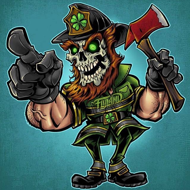
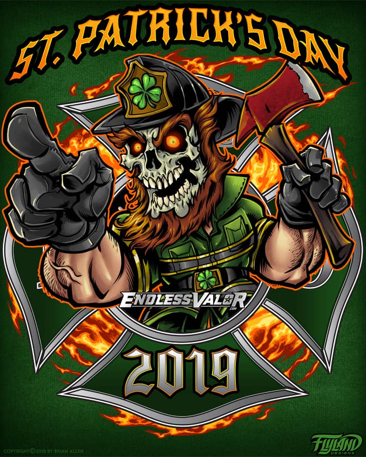
T-Shirt illustration of an American Bald Eagle and a fire-fighter helmet I created for a brand of apparel for fire-fighters. I set up this design for full-color printing, and kept everything in separate layers so we could customize the design in the future for each troop of firemen who purchase the shirt. I chose to illustrate this in a more realistic style than I typically do, and we’re really happy with how it turned out.
Client:
Unik Sovaj (Wild and Crazy)
Description:
T-Shirt illustration of a mad cow MMA fighter in fight shorts I created for the apparel brand Unik Sovaj.
T-Shirt illustration of a hip-hop singer gripping a mic spewing bad breath fumes I created for a hip-hop apparel brand called Unik Sovaj.
I created these two wild and unique t-shirt designs for the hip-hop apparel brand Unik Sovaj. The illustrations were set up for full-color printing. The client had a few rough ideas, but really wanted to see what I came up with when totally unrestrained. I also created a fresh new logo type for the brand.
Client Testimonial:
You have really out done yourself this time!!!!!!! WE LOVE IT!!!!
-Dominic Mann
Unik Sovaj, Creator
Client:
Weed Enforcer
Description:
This design is meant to subtly resemble a yin and yang, as the grim reaper reaches out to a woman emerging from a swirling portal to hell. I had a great time working with the creative people behind the music on this album, and I’m really happy with how this turned out.
Client Testimonial:
“Hey, i’m going to say a word i never thought i’d say…PERF
-Allan Edward
Weed Enforcer
You can purchase signed prints of this artwork here:
https://www.flylanddesigns.com/shop/
Client:
Wendy Knuth
The 2nd book in a chidren’s book series about Zombies I illustrated for Wendy Knuth. I’m very proud of this 32 page story featuring a whole family of creepy but fun zombies driving around town and getting into trouble. I had a lot of fun drawing zombies in a very different way than I typically do. Can’t wait to read this to my kids!
Client:
M.A.S. Productions
Description:
I illustrated this dark detailed illustration of an epic battle between Freddy, Leatherface, Nosferatu, The Excorsist, Frankenstein, Kirk Hammet, Ozzy, Alice Cooper, Corey Taylor, and more for a documentary on the history of Metal and Horror.
I was hired by Producer Mike Schiff of M.A.S. Productions to create an illustration of some of the most iconic figures in horror and heavy metal engaging in an epic battle. The image was used to promote a documentary they produced which explores the history of heavy metal music, horror films, and how the two genres have merged together over time.
The documentary features interviews with Alice Cooper, Kirk Hammett, Corey Taylor, plus a ton of other heavy metal stars, along with huge names in the horror industry. It was so great getting the chance to illustrate these iconic figures, including Freddy, Leatherface, Nosferatu, Ozzy, Alice Cooper, Kirk Hammet, and more. Pieces of the illustration were also used for an animation promoting the documentary.
Client Testimonial:
Incredible job on this. I knew you’d create something amazing , and holy crap is this good.
-Mike Schiff
Mas Productions
See clips from the documentary here:
http://www.metalhorror.com/
Support their Iniegogo campaign:
https://www.indiegogo.com/projects/the-history-of-metal-and-horror#/story
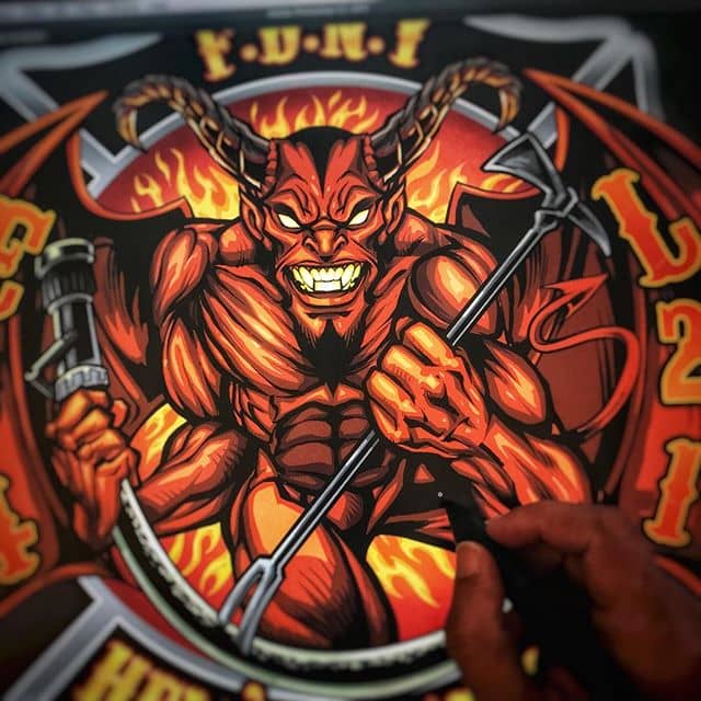
I created this fun t-shirt design for Commando Racing Gear – a hardcore skeleton! We went through a couple different [and equally exciting] designs but eventually settled on this one. I had a lot of fun with this!
Client Testimonial:
If you were closer, I’d hug you!!! We absolutely love it.
-Steve Kanner
Commando Racing Gear
Click here to see more of my Dark Illustrations
Check out more of my T-Shirt designs here.
I was hired by an apparel brand creating a series of T-Shirts featuring the unofficial football mascot of Stanford, the Stanford Tree! I was asked to design the mascot sitting in a pose inspired by The Thinker, with the rock replaced by a crumpled Notre Dame mascot. If you want a drawing challenge, try making a tree look mean. It’s not easy! Trees are usually pretty pleasant.
All-over-print dye-sublimated wrestling singlet design I created for BlueChip wrestling. This design was inspired by futurustic combat like in Gears of War. We created this future soldier character standing in front of a ruined cityscape. I reached out to a talented digital painter named Luciano Fleitas to help me with the background because I was in a crunch. I’m really happy with how this came together.
I created this as part of a series of wrestling singlet designs for BlueChip’s summer catalog. The designs will also be available on fight shorts. I find it so enjoyable working with dye sublimation, because the color and detail reproduction is fantastic, and I don’t have to worry about the head-scratching that comes from working with silk-screen.
Client Testimonial:
Thank you very much, I think everything turned out great!
-Andy Michaels
BlueChip Athletics
You can purchase the design on a singlet here:
http://www.bluechipwrestling.com/
Click here to see more of my Dark Illustrations
All-over-print dye-sublimated wrestling singlet design I created for BlueChip wrestling. This design was for their patriotic catalog, featuring a big angry eagle clutching a banner in front of a textured American Flag. I tried to give it a lot of depth, and fit a lot of different singlet sizes.
I created this as part of a series of wrestling singlet designs for BlueChip’s summer catalog. The designs will also be available on fight shorts. I find it so enjoyable working with dye sublimation, because the color and detail reproduction is fantastic, and I don’t have to worry about the head-scratching that comes from working with silk-screen.
Client Testimonial:
Thank you very much, I think everything turned out great!
-Andy Michaels
BlueChip Athletics
You can purchase the design on a singlet here:
http://www.bluechipwrestling.com/
Click here to see more of my Illustrations.
All-over-print dye-sublimated wrestling singlet design I created for BlueChip wrestling. The design is meant to be a reimagining of the classic bold shapes and pin striping that is common in singlets. I tried to give it a lot of depth, and keep it very customizable to different team colors.
I created this as part of a series of wrestling singlet designs for BlueChip’s summer catalog. The designs will also be available on fight shorts. I find it so enjoyable working with dye sublimation, because the color and detail reproduction is fantastic, and I don’t have to worry about the head-scratching that comes from working with silk-screen.
Client Testimonial:
Thank you very much, I think everything turned out great!
-Andy Michaels
BlueChip Athletics
You can purchase the design on a singlet here:
http://www.bluechipwrestling.com/
Click here to see more of my Dark Illustrations
All-over-print dye-sublimated wrestling singlet design I created for BlueChip wrestling. The design is meant to be a reimagining of the classic bold shapes and pin striping that is common in singlets. I tried to give it a lot of depth, and keep it very customizable to different team colors.
I created this as part of a series of wrestling singlet designs for BlueChip’s summer catalog. The designs will also be available on fight shorts. I find it so enjoyable working with dye sublimation, because the color and detail reproduction is fantastic, and I don’t have to worry about the head-scratching that comes from working with silk-screen.
Client Testimonial:
Thank you very much, I think everything turned out great!
-Andy Michaels
BlueChip Athletics
You can purchase the design on a singlet here:
http://www.bluechipwrestling.com/
I created these concept illustrations of a steampunk family of adventurers for an educational publisher called Bogardpress. The character designs will be used to illustrate their educational materials and lessons. Each year the team uses a different theme and concept to tie their lessons together. I really enjoyed the whole process, from developing the characters in sketches, to coloring and rendering the final versions. I tried to add a bit of style into the characters to keep them from becoming generic. I especially enjoyed creating the robot character.
Client Testimonial:
Everyone was very happy with what you have done. Very impressed.
-Shawn Blase
Bogardpress
Click here to see more of my Illustrations.
Check out more of my Mascot designs here.
The IAFF recently commissioned me to create a poster for an upcoming rally in Ottawa, IL, the location of the historical Lincoln v. Douglas debates. I thought it would be fun to draw Lincoln and Douglas speeding through time on two motorcycles swinging chains and pipes at each other. I’m a historian at heart. The IAFF Motorcycle Group mascot is seen far back in the historic streets of Ottawa.
Click here to see more of my Dark Illustrations
I was thrilled to be hired to create artwork for a new line of apparel for Smith & Wesson, featuring silk-screen illustrations of big angry eagles. It was a really fun challenge drawing the eagles, which I’ve always found difficult. Need to invest in a pet eagle for reference. The designs all needed to stay under six colors, which is always a challenge as soon as you introduce an american flag into the design (which eats up three colors right away). I used halftones wherever I could to limit the total number of colors.
The designs will be available in Smith & Wesson’s catalog, as well as in many retailers, such as Cabela’s.
Check out more of my T-Shirt designs here.
Click here to see more of my Dark Illustrations
I was recently commissioned to design the logo and mascot for a William Kahuna, a YouTube personality that films his adventures dirt-biking through Hawaii. The brand was called Sunday Rides, and we came up with this fun sun character to be his logo for merchandise and branding. I tried to inject a lot of William’s laid-back and fun-loving personality into it.
Click here to see more of my Logo Designs
Click here to see more of my Illustrations.
I was recently hired to conceptualize and illustrate a team of Superhero zombies to be laser-engraved into skateboards by Revenga. It was challenging to pump a ton of detail in the board, while making sure to keep the lines bold enough as to not cause much trouble in the engraving process.
While designing, I also had to structure the design so the layout could be changed to fit a T-Shirt as well. I made sure to keep the characters masked on separate layers, that way moving them around at the end was relatively easy.
We also created a silk-screen color version for boards and shirts, using around 6 colors.
Client Testimonial:
They look just as amazing! Everyone is giving compliments about the graphic because it’s very cool!
-Martina Ieffa
Revenga Skateboards
You can purchase it here:
http://www.revengaskateboards.com
Click here to see more of my Dark Illustrations
Check out more of my T-Shirt designs here.
Always a pleasure working with my friends at Listenable Records. For this year’s sampler featuring the labels best tracks, we chose to pay tribute to the classic Defenders of the Faith album cover from Judas Priest. I thought it would be cool to draw a samurai in the same art style and color scheme as that record, and really give it a nice retro theme, with bright primary colors. Really dig the way this came out – might make a great sticker.
Client Testimonial:
I love it, colours are perfect , there’s a vintage feel too in the logo and overall colours, it’s great!
-Laurent Merle
Listenable Records
Click here to see more of my Dark Illustrations
Click here to see more of my custom album cover designs.
This is a detailed series of illustrations I created for a children’s book teaching kids about construction. Each double-page spread was packed with animal characters, vehicles, tools, and activities. The book challenges kids to hunt out objects and solve problems within the illustration, so I had to draw everything in a way that certain elements were intentionally hard to find. I had a lot of fun with this, because I had a lot of freedom to design the characters and draw them in my style.
Client Testimonial:
….turned out great! Awesome job!
-Chris Kane
Animal Kingdom Construction Co.
Check out more of my Children’s Book illustrations here.
Click here to see more of my Illustrations.
All-over-print dye-sublimated wrestling singlet design I created for BlueChip wrestling. This design is easily my favorite in the seires, and also the most time-consuming. I illustrated these giant skulls made up of probably a hundred smaller skulls, and lit the whole thing up by their glowing eyes. It was challenging, but I’m thrilled with how it turned out.
I created this as part of a series of wrestling singlet designs for BlueChip’s summer catalog. The designs will also be available on fight shorts. I find it so enjoyable working with dye sublimation, because the color and detail reproduction is fantastic, and I don’t have to worry about the head-scratching that comes from working with silk-screen.
Client Testimonial:
Thank you very much, I think everything turned out great!
-Andy Michaels
BlueChip Athletics
You can purchase the design on a singlet here:
http://www.bluechipwrestling.com/
Click here to see more of my Dark Illustrations
This is a fun album cover illustration I created for a hard rock band called the Jokers for their new album, Hurricane. The idea was to have the band in a classic-looking car flying through the air to their next gig, and causing a hurricane behind them, destroying London below them. I tried to hide a lot of detail into the design swirling around them in the hurricane, like roadies, amps, guitars, and british artifacts. The band needed the album art in a really short amount of time, but we pulled it off in time, and they were quite happy with the result.
Client Testimonial:
…it all looks amazing, we are really really happy with the final product.
-Paul Hurst
The Jokers
Click here to see more of my custom album cover designs.
Description:
T-Shirt illustration I created of a crazed A-10 Thunderbolt warplane come to life in a dog-fight. This was done for a series of shirts celebrating different marijuana strains. The shirt is printed on 100% hemp, and available in a variety of groovy colors.
It was a pleasure working with the folks at #Bongjour. They gave me a lot of freedom with the design, and I’m really happy with how it turned out. Set up for direct-to-garment, full-color printing.
You can purchase the shirt here:
http://www.bongjour.com/
Click here to see more of my Illustrations.
I created this mad scientist character for an auto-repair shop whose specialty is custom built choppers and hotrods. The brand wanted a dark but playful design that illustrated them as a blend of mechanic and mad scientist. I thought it would be cool to show a frankenstein-ed hotrod on the operating table behind the mad scientist, as he raises his creation up to the lightning. This design was created for direct-to-garment printing.
Client Testimonial:
Testimonial
-Client Name
Position
This design is available for licensing:
Click here to see more of my Dark Illustrations
Check out more of my T-Shirt designs here.
T-Shirt illustration I created of an evil Tiki man surrounded by smoke and pot leaves for the Hemp apparel brand Bongjour. The shirt is printed on 100% hemp, and available in a variety of groovy colors.
It was a pleasure working with the folks at #Bongjour. They gave me a lot of freedom with the design, and I’m really happy with how it turned out. Set up for direct-to-garment, full-color printing.
You can purchase the shirt here:
http://www.bongjour.com/product/hemp-native-apparel/
To see a process video of me inking this design, visit my YouTube channel:
To see a process video of how I colored this design, please visit: