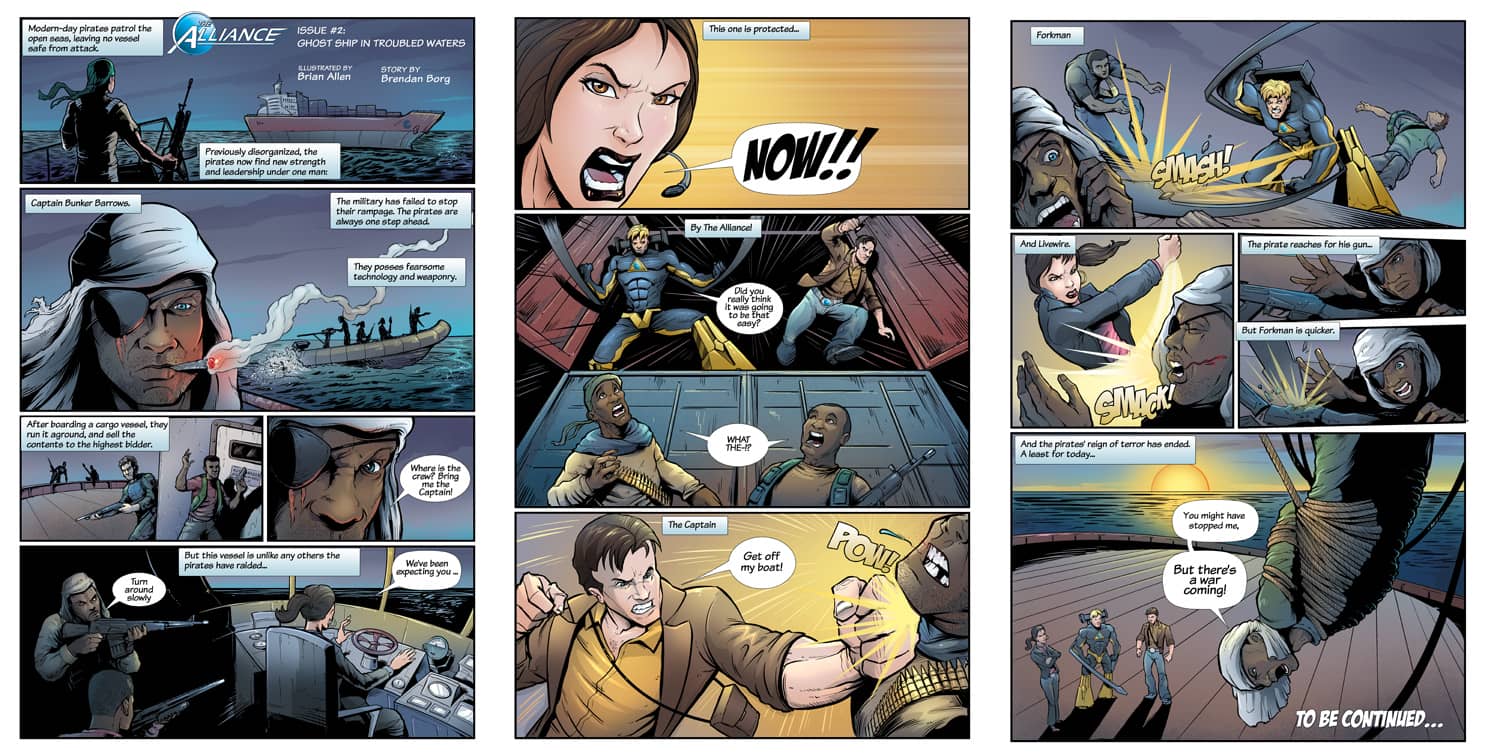
I just finished Issue #2 of a promotional comic series for Consol Alliance, a shipping company in Australia. Here’s a step-by-step look into the complicated process of how I create comic book art.
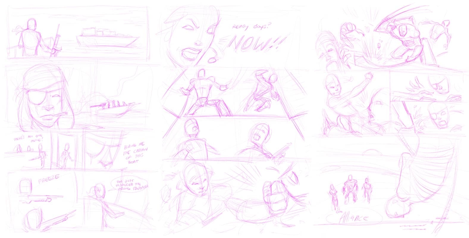
Step 1: Rough Pencils
After reading the script, I initially do a very loose drawing of the characters and scenes in each panel. I work in Manga Studio EX 4 with a Cintiq tablet. At this stage, I’m mostly concerned with the layout of the page, and not any details. Although it looks pretty rough, this is one of the most time-consuming stages for me, because it’s so important to get it right, because it literally serves as the foundation of everything that follows. I usually get an OK from the client at this stage before moving forward.
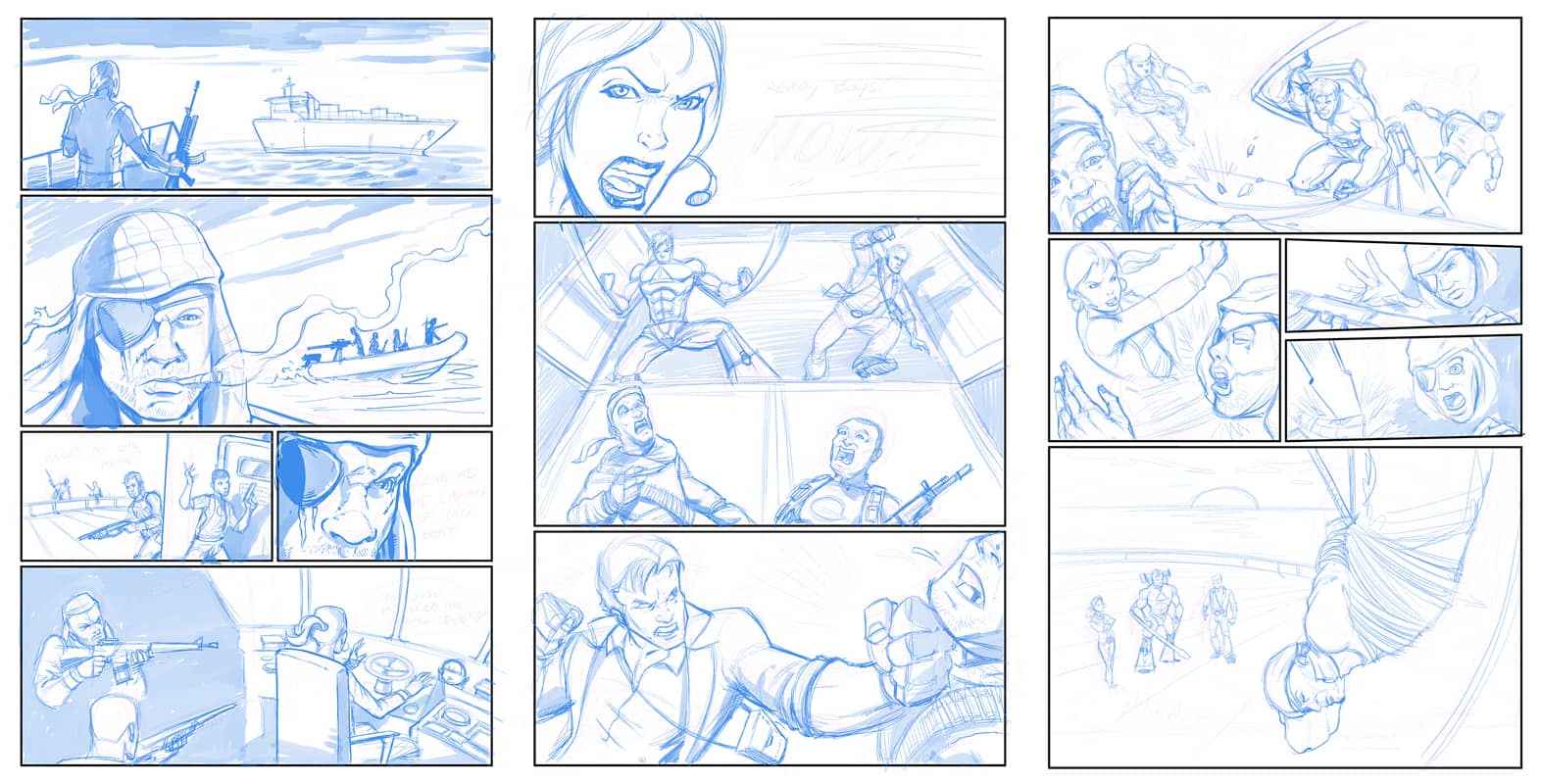
Step 2: Pencils
On a new layer, I go back in and draw the details of everything. This is another time-consuming process. I normally spend some time gathering photo reference for complicated angles. For this story, I also spent some time researching modern day pirates. I tried to reflect the look here of a juxtaposed band of misfits from all different backgrounds. Their weapons and clothing are all quite different from each other as well – there’s no dress code here.
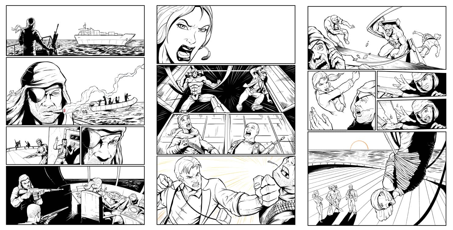
Step 3: Inking
Of all the steps in the process, I find inking the most time-consuming. But it’s also the most mindless. I usually turn my brain off and the TV on. I ink in Manga Studio EX 4. I normally keep a second window open with a small area zoomed into 100%. That way I can see the part of the page I’m working on at the actual print size – this prevents me from zooming in to far, and working on details that won’t end up being visible when printed.
Step 4: Flats
So here’s my least favorite stage of the whole process, but it’s a necessary evil. This is commonly known as “flatting” in the comic book world. It’s the horrible, horrible process of putting in all the flat colors of the different elements. As you can see, I haven’t paid much attention the actual colors of things. The objective is simply to create an image that I can create quick selections of when I do the real color. I do this in Manga Studio EX 4 as well – it has a really smart paint bucket and selection toolset that makes this process much easier than doing it in Photoshop (for me, anyway).
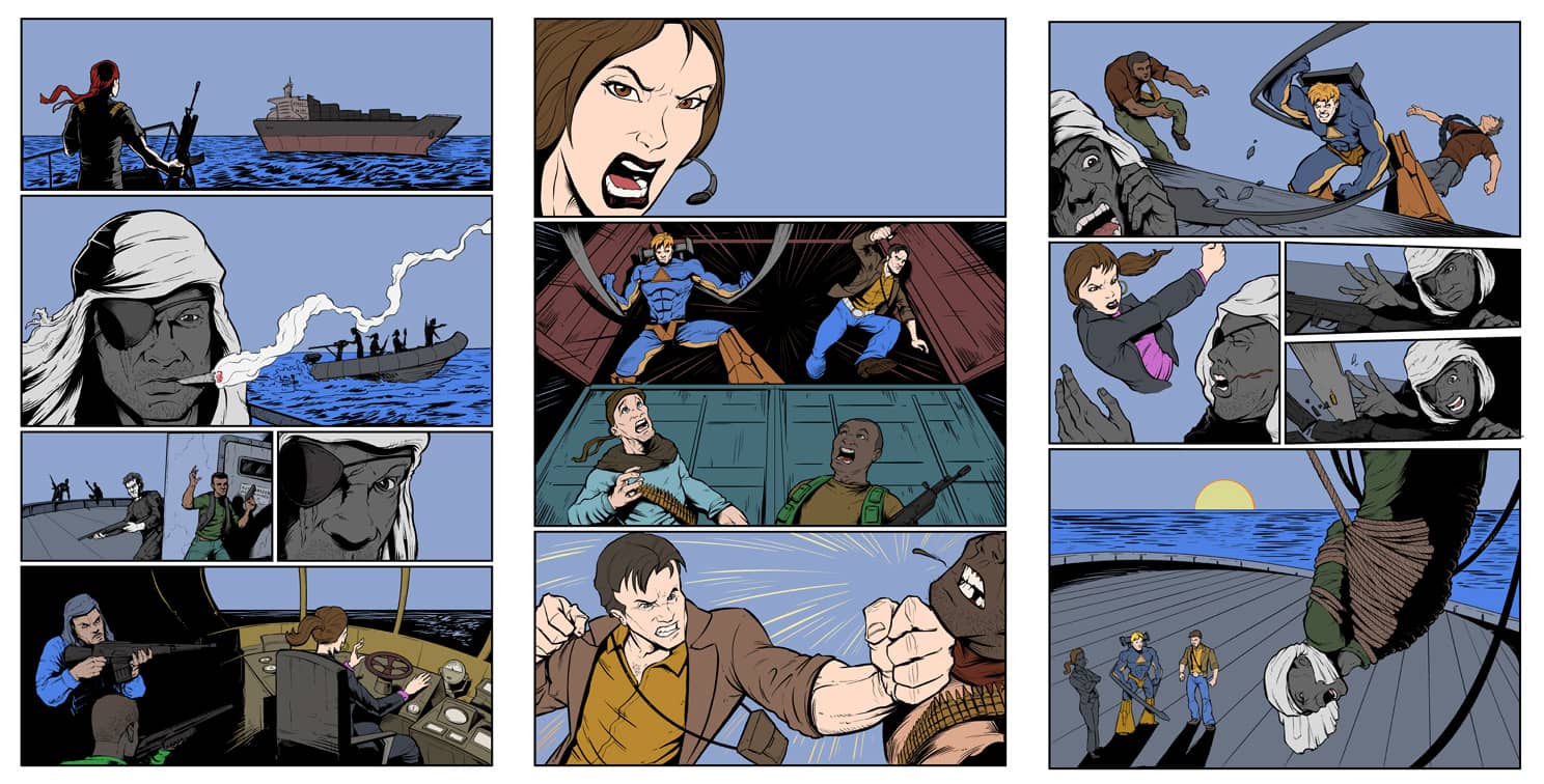
Step 5: Coloring!
This is has become one of my favorite stages, because you can really start to see things coming together. I move my whole workflow to Photoshop by exporting my file from Manga Studio EX (which exports everything perfectly, keeping all my layers intact). I first convert my Flats layer to grayscale, and then make a copy of it (I always lock my Flats layer, otherwise, I will eventually destroy it by mistake). I normally color the background first, to set the mood. Then, I get out my magic wand tool, click on (for example) Livewire’s face, switch to my soft airbrush, and start laying down color. Once everything has been colored, I then go back in with my lasso tool, and start making cuts to put in the hard shadows and highlights. I recently purchased a Razer Nostromo (which is a small ergonomic keyboard for gamers) which has really sped up processes like these, where I’m constantly switching back and fourth between tools.
Step 6: Lettering and Effects
At this point, the pages are finished. This is usually the stage where I realize I didn’t leave enough room for text bubbles, and I panic a little. In Photoshop, I go through and type up the text, and then create a speech bubble around it. Overtime I’ve built up a lot of presets for fonts, bubbles, and styles, so I can move through this stage relatively quickly. And finally, on a new layer above the artwork, I add the effects (such as highlights on the water, and lots of bursts. If there’s time, I do a few knockouts (this is where the black lineart is colored to give the effect of brightness). For this book, I did it only in a few places: the cigarette burning and the rising sun are good examples of this.
And we’re done! Special thanks to my friends at Consol Alliance for making this project happen.
About Flyland Designs:
Flyland Designs is a freelance illustration studio founded in 2006 by illustrator and graphic designer, Brian Allen. With over 10 years of industry experience, Allen has designed mascots, apparel, retail packaging and book and album covers for clients including Hard Rock Café, Jostens, Hasbro, American Greetings and Half Time. Allen’s creative aesthetic attracts children and adults alike. For more information, visit www.flylanddesigns.com.

