I was hired by Strange Kids Club Magazine to illustrated a promotional poster featuring characters from their upcoming magazine. I loved every second of working on this. If you’re strange like me, and born in the 80s, then I don’t need to explain what’s going on here. The concept revolved around a fictional character called Bronarr, Space Barbarian (!) – loosely based on 80s Saturday morning cartoons like Masters of the Universe, as well as camp classic 70s retro sci-fi/fantasy films like Hell Comes To Frogtown.
Client Testimonial:
Simply put, you nailed it!
-Rondal Scott III
Strange Kids Club Magazine, owner
You can view a video of the inking process here:
I was hired by Strange Kids Club Magazine to illustrated a promotional poster featuring characters from their upcoming magazine. I loved every second of working on this. If you’re strange like me, and born in the 80s, then I don’t need to explain what’s going on here. The concept revolved around a fictional character called Bronarr, Space Barbarian (!) – loosely based on 80s Saturday morning cartoons like Masters of the Universe, as well as camp classic 70s retro sci-fi/fantasy films like Hell Comes To Frogtown. To see more of my work, or hire me for freelance projects, please visit my website: www.flylanddesigns.com
I was hired to design this angel and devil logo for apparel and a vehicle wrap for the russefeiring tradition. If you haven’t heard of it, basically russefeiring involves an entire class of Norwegian students renting a bus (a Russebuss), painting every inch of it with really cool street art, and then partying in it night and day for an entire month during graduation. The different classes wear their designs ever where they go as they clash with rival classes. I’ve done a bunch of these now, and really enjoy it.
I was hired to design this angel and devil logo for apparel and a vehicle wrap for the russefeiring tradition. If you haven’t heard of it, basically russefeiring involves an entire class of Norwegian students renting a bus (a Russebuss), painting every inch of it with really cool street art, and then partying in it night and day for an entire month during graduation. The different classes wear their designs ever where they go as they clash with rival classes. I’ve done a bunch of these now, and really enjoy it. To see more of my work, or hire me for freelance projects, please visit my website: www.flylanddesigns.com
https://i0.wp.com/www.flylanddesigns.com/wp-content/uploads/Julian-Russebuss-Logo-thumbnail.jpg?fit=465%2C465&ssl=1465465Brian Allenhttps://www.flylanddesigns.com/wp-content/uploads/FlyLand-Designs-Web-Logo.pngBrian Allen2015-08-20 13:22:002015-08-02 13:22:34Angel and Devil Russebuss Logo
Album cover I illustrated for the Brazilian heavy metal band John Wayne (named after John Wayne Gacy – not the other guy). It was a great pleasure working on this with the band, as they gave me a lot of freedom, and I set upon the design without much planning, and tried to let it flow. This album cover is the first in a set of two albums, that when placed together will form one cohesive image. This album represents the dark side, while the following album will have a similar design, but mirrored, and “lighter.”
Client Testimonial:
We are very happy with your great work!
-Rogerio Torres
John Wayne (Brazilian Heavy Metal Band)
You can purchase the album here:
https://www.facebook.com/BandaJohnWayne
Album cover I illustrated for the Brazilian heavy metal band John Wayne (named after John Wayne Gacy – not the other guy). It was a great pleasure working on this with the band, as they gave me a lot of freedom, and I set upon the design without much planning, and tried to let it flow. This album cover is the first in a set of two albums, that when placed together will form one cohesive image. This album represents the dark side, while the following album will have a similar design, but mirrored, and “lighter.” To see more of my work, or hire me for freelance projects, please visit my website: www.flylanddesigns.com
https://i0.wp.com/www.flylanddesigns.com/wp-content/uploads/John-Wayne-Album-Cover-Web-Sample.jpg?fit=699%2C700&ssl=1700699Brian Allenhttps://www.flylanddesigns.com/wp-content/uploads/FlyLand-Designs-Web-Logo.pngBrian Allen2015-08-18 13:19:262015-08-02 13:21:15Dark Skull Album Cover for Brazilian Heavy Metal Band John Wayne
I created this t-shirt and logo design of a dog-fighting Spitfire airplane with a real shark’s mouth for apparel and vehicle wrap for the russefeiring tradition. If you haven’t heard of it, basically it involves an entire class of Norwegian students renting a bus (a Russebuss), painting every inch of it with really cool street art, and then partying in it night and day for an entire month during graduation. The different classes wear their designs ever where they go as they clash with rival classes. It’s cool to be a part of it, in the best way I know how!
Client Testimonial:
It was a pleasure working with you!
-Martin Semb
I created this t-shirt and logo design of a dog-fighting Spitfire airplane with a real shark’s mouth for apparel and vehicle wrap for the russefeiring tradition. If you haven’t heard of it, basically it involves an entire class of Norwegian students renting a bus (a Russebuss), painting every inch of it with really cool street art, and then partying in it night and day for an entire month during graduation. The different classes wear their designs ever where they go as they clash with rival classes. It’s cool to be a part of it, in the best way I know how!
https://i0.wp.com/www.flylanddesigns.com/wp-content/uploads/Spitfire-Russebuss-Logo.jpg?fit=700%2C700&ssl=1700700Brian Allenhttps://www.flylanddesigns.com/wp-content/uploads/FlyLand-Designs-Web-Logo.pngBrian Allen2015-08-16 13:18:342015-08-02 13:21:48Dog-fighting Spitfire Logo Design for Russefeiring
This is an illustration I created recently of a client’s boat in a coastal scene with a big marlin jumping out of the water. The design was set up for full-color direct-to-garment printing. I tried to handle the waves and water in my own style and played with adding a lot of detail and color variation.
Client Testimonial:
Once again thank you for all your hard work and effort and I’m sure we will be doing more work in the future.
-Merton Oxha
This is an illustration I created recently of a client’s boat in a coastal scene with a big marlin jumping out of the water. The design was set up for full-color direct-to-garment printing. I tried to handle the waves and water in my own style and played with adding a lot of detail and color variation. To see more of my work, or hire me for freelance projects, please visit my website: www.flylanddesigns.com
Illustration of an angry Firefighter leprechaun wielding a fire axe on a maltese cross I illustrated for a St. Patrick’s Day Parade. This design is available for licensing for apparel and other uses. Please contact flylanddesigns@gmail.com for information. Set up for Direct-To-Garment printing, or full-color simulated process silk-screen.
Illustration of an angry Firefighter leprechaun weilding a fire axe on a maltese cross illustrated for a St. Patrick’s Day Parade. This design is available for licensing for apparel and other uses. Please contact flylanddesigns@gmail.com for information. Set up for Direct-To-Garment printing, or full-color simulated process silk-screen.
This illustration was for a private commission for a fan’s husband (I believe as an anniversary present). She needed a large illustration to fit on two facing panels in a hallway, and wanted it to be fun and creepy at the same time. We came up with this idea of drawing a giant killer bee wielding a chainsaw in a ruined city as bystanders flee in fear. I chose colors that would compliment the existing scheme in their home. She was thrilled with how it turned out. I printed them out on two large 36 inch square panels. I’m thinking about making stickers of the chainsaw-bee.
Client Testimonial:
We just got them in the mail yesterday and they look FANTASTIC! I can’t wait to get them in a frame!
-Katie Boyle
Parts of this illustration are available for licensing here:
This illustration was for a private commission for a fan’s husband (I believe as an anniversary present). She needed a large illustration to fit on two facing panels in a hallway, and wanted it to be fun and creepy at the same time. We came up with this idea of drawing a giant killer bee wielding a chainsaw in a ruined city as bystanders flee in fear. I chose colors that would compliment the existing scheme in their home. She was thrilled with how it turned out. I printed them out on two large 36 inch square panels. I’m thinking about making stickers of the chainsaw-bee. To see more of my work, or hire me for freelance projects, please visit my website: www.flylanddesigns.com
Here’s a video of how to ink for a laser-cut skateboard.
I was recently hired to conceptualize and illustrate a team of Superhero zombies to be laser-engraved into skateboards by Revenga (www.revengaskateboards.com).
While designing, I also had to structure the design so the layout could be changed to fit a T-Shirt as well. I made sure to keep the characters masked on separate layers, that way moving them around at the end was relatively easy.
We also created a silk-screen color version for boards and shirts, using around 6 colors.
Thanks for watching, please post any questions in the comments.
https://i0.wp.com/www.flylanddesigns.com/wp-content/uploads/IMG_20150506_091636-700px.jpg?fit=700%2C700&ssl=1700700Brian Allenhttps://www.flylanddesigns.com/wp-content/uploads/FlyLand-Designs-Web-Logo.pngBrian Allen2015-08-10 12:06:062015-08-16 16:20:51How to ink zombies for a laser-cut skateboard in Manga Studio
I created this mascot and logo design for a team of drag-racer’s new line of merchandise and apparel. The client wanted a tough, dark, militant mascot character that could later be drawn in other situations and shenanigans. We went through a few sketches at the beginning that were a bit too light, and eventually arrived at RAD, the skeletal, drag-racing warrior you see before you! The mascot and logo was prepared for both limited color silk-screening and full-color printing, to maximize the usage.
Client Testimonial:
If you were closer, I’d hug you!!! We absolutely love it.
-Steve Kanner
Commando Racing Gear
I created this mascot and logo design for a team of drag-racer’s new line of merchandise and apparel. The client wanted a tough, dark, militant mascot character that could later be drawn in other situations and shenanigans. We went through a few sketches at the beginning that were a bit too light, and eventually arrived at RAD, the skeletal, drag-racing warrior you see before you! The mascot and logo was prepared for both limited color silk-screening and full-color printing, to maximize the usage. To see more of my work, or hire me for freelance projects, please visit my website: www.flylanddesigns.com
https://i0.wp.com/www.flylanddesigns.com/wp-content/uploads/FULL_COLOR_Logo-700px.jpg?fit=581%2C700&ssl=1700581Brian Allenhttps://www.flylanddesigns.com/wp-content/uploads/FlyLand-Designs-Web-Logo.pngBrian Allen2015-08-08 13:47:432015-08-02 13:48:12Mascot Logo Design for Commando Racing Gear
I created this illustration of a skeleton with a sledgehammer for a new apparel brand showcasing the work of DIY television personalities, called The Reno Life. I tried to add a lot of my own style to the skeleton, and keep it tough while not scaring the kiddies away. We did a female version as well – and I found drawing skeletons to look female is a bit challenging when you don’t have many… parts…. to work with. This design was set up for full-color direct-to-garment printing.
I created this illustration of a skeleton with a sledgehammer for a new apparel brand showcasing the work of DIY television personalities, called The Reno Life. I tried to add a lot of my own style to the skeleton, and keep it tough while not scaring the kiddies away. We did a female version as well – and I found drawing skeletons to look female is a bit challenging when you don’t have many… parts…. to work with. This design was set up for full-color direct-to-garment printing. To see more of my work, or hire me for freelance projects, please visit my website: www.flylanddesigns.com
This is a very detailed illustrated album cover I created for the heavy metal band called DemonHead. The idea was to have a troubled kid rolling a 12-sided die that causes catastrophe behind him. With each roll bring a different type of destruction. I tried to have fun with it and cram in as much chaos as I could.
Client Testimonial:
Thanks so much for the work I think it came out really well and will look awesome. It was a pleasure working with you. Couldn’t be happier with the end result!
-Dave Lowes, DemonHead
You can purchase the album here:
https://demonheadaus.bandcamp.com/releases
Check out this speed-painting tutorial on how this artwork was inked:
Check out this speed-painting tutorial on how the artwork was colored:
This is a very detailed illustrated album cover I created for the heavy metal band called DemonHead. The idea was to have a troubled kid rolling a 12-sided die that causes catastrophe behind him. With each roll bring a different type of destruction. I tried to have fun with it and cram in as much chaos as I could. This is a very detailed illustrated album cover I created for the heavy metal band called DemonHead. The idea was to have a troubled kid rolling a 12-sided die that causes catastrophe behind him. With each roll bring a different type of destruction. I tried to have fun with it and cram in as much chaos as I could. To see more of my work, or hire me for freelance projects, please visit my website: www.flylanddesigns.com
The anti-phishing and computer technicians at Phishlure hired me to create their new logo. They wanted to use an evil-looking anglerfish as their mascot, symbolizing the nasty habits hackers use to lure in their innocent customers. I really wanted to color this in a non-traditional way and use a pretty wild color scheme, and wanted to really add a lot of nastiness to the angler. I provided the logo in several different color schemes – all the way from a simple one-color logo, to a vibrant full-color version.
The anti-phishing and computer technicians at Phishlure hired me to create their new logo. They wanted to use an evil-looking anglerfish as their mascot, symbolizing the nasty habits hackers use to lure in their innocent customers. I really wanted to color this in a non-traditional way and use a pretty wild color scheme, and wanted to really add a lot of nastiness to the angler. I provided the logo in several different color schemes – all the way from a simple one-color logo, to a vibrant full-color version. To see more of my work, or hire me for freelance projects, please visit my website: www.flylanddesigns.com
https://i0.wp.com/www.flylanddesigns.com/wp-content/uploads/Phishlure_Logo_Full_Color-700px.jpg?fit=700%2C700&ssl=1700700Brian Allenhttps://www.flylanddesigns.com/wp-content/uploads/FlyLand-Designs-Web-Logo.pngBrian Allen2015-08-04 13:37:262015-08-02 13:37:59Angry Angler Fish Logo Design
I was recently hired by Ring Thip to reinvent their packaging for their Thai Tea. They wanted a bolder and more contemporary design, as they make a push to reach more retail markets.
I found this project to be very challenging, because the subject matter was so different, and I had limited space to make an impact.
Each flavor will have a different illustration emerging from the ring.
I was recently hired by Ring Thip to reinvent their packaging for their Thai Tea. They wanted a bolder and more contemporary design, as they make a push to reach more retail markets. I created the label for their showcase Thai Tea product, as well as labels for the rest of their line. I found this project to be very challenging, because the subject matter was so different, and I had limited space to make an impact. Each flavor will have a different illustration emerging from the ring.
I was hired to illustrated this custom website background for a sports review outlet called 2BC. The client wanted a detailed illustration of a huge hockey fight in an arena. The illustration was set up so that the different hockey players and refs in the brawl could move along with the content of the site, independently of the background. I created the artwork in Manga Studio, and colored it in Adobe Photoshop.
I was hired to illustrate this T-Shirt design for one of my favorite clients, Darkhorse Fightwear, for their new line of MMA apparel. The design was set up for silk-screen using three colors, and illustrated in Manga Studio and Adobe Photoshop. The design was inspired by a previous illustration I created a few years ago – it was fun to revisit it and test out some new skills while illustrating it. The design features a skull in the center with wings and chains surrounding.
Bluechip Athletics hired me to design and illustrate graphics for their Aggression apparel line for wrestlers. The first design was this evil gargoyle perched on a rooftop in a storm. Since the wrestling singlets are printed with dye-sublimation, I could design in full-color, and cover every inch of the fabric.
I created this full graphic wrap for a company that manufactures office scanning equipment in conjunction with Twist Creative Parners. The client wanted to wrap their hummer in a design that would attract attention, and make their product look cool. We came up with the idea of having an alien invastion blasting a hole through an office cubicle, with the office scanners sitting in a pile of wreckage, perfectly in tact. I drew up two comic book style office characters to tie everything together.
The finished graphics were printed on vinyl and will be wrapped to cover every inch of the black humvee. It was a pleasure working on this!
Custom illustration I created for a bar in the UK called The Parish. We designed their superhero mascot to be present on all their advertising, posters, and signage at the bar. In this poster advertising their food selection, I illustrated the hero lifting a large tray of food for an attractive waitress. It was a lot of fun to draw all the details for the pile of food.
Drawn and inked in Manga Studio, and colored in Adobe Photoshop.
Custom illustration I created for a website splash page and fantasy game. I was asked to draw the game’s heroes, who are infected with a mutating virus, along with their sidekicks: a zombie jaguar and a zombie bear. The client and I invisioned a world where not even the plant-life has escaped being mutated by the zombie virus.
I created this in Manga Studio and Adobe Photoshop.
This is a fun illustration I created of a tiki man riding a dirtbike for the brand Accidental Broadcast. The brand centers around a popular Youtube personality, Kalani Prince, who films the island of Hawaii from the back of his dirtbike.
Kalani gave me a lot of freedom with the design. Since this was the brand’s first design, I thought it would be a good idea to introduce his personality as this Tiki character, with an attractive hula girl hanging tight.
I also designed the a logo to match the design for his brand.
I was hired to illustrate and design this new line of eJuice vaping flavors for Valgous. The client approached me with the idea of having each flavor represented by six different chess pieces. I thought it would be cool to illustrate the labels as if the characters were from a dark, fantasy kingdom.
In addition, I also designed the logo for the series, Valgous: Slayer, and even designed the point-of-purchase display. The series will be distributed and sold to vaping outlets around the country.
We are also planning a line of t-shirts featuring the characters to help promote the new line.
https://www.flylanddesigns.com/wp-content/uploads/FlyLand-Designs-Web-Logo.png00Brian Allenhttps://www.flylanddesigns.com/wp-content/uploads/FlyLand-Designs-Web-Logo.pngBrian Allen2014-12-24 12:29:542014-12-19 12:33:09Wolf Mascot Head Digital Painting
I was recently hired to design a new T-Shirt for the Yellow Stripe Records brand in Portugal. After working with a couple of concepts, we decided on the idea of having a Superhero has gone mad, and destroyed the city he once he protected. Deep! He’s crouched on a pile of wrecked keyboards, speakers, and dj equipment.
This t-shirt was set up for silk-screening, using three colors.
I was hired to illustrate this T-Shirt design for one of my favorite clients, Darkhorse Fightwear, for their new line of MMA apparel. The design was set up for silk-screen using three colors, and illustrated in Manga Studio and Adobe Photoshop. The design was inspired by a previous illustration I created a few years ago – it was fun to revisit it and test out some new skills while illustrating it. The design features a skull in the center with wings and chains surrounding.
Digital painting of a zombie I was commissioned to create for the author Danny King as an avatar and branding identity for his sports blog. I really enjoy making things look creepy and funny at the same time – I tried to pump a lot of personality into the character. I seem to really like drawing people and zombies smoking cigars – not sure why that is. This zombie painting was created in Manga Studio 5, with color adjustments and effects handled in Adobe Photoshop.
I was hired to illustrate and design a series of characters and backgrounds for an e-commerce website. The characters were all cartoon “blockheads” that interact with the hand-drawn user-interface we designed for the website. It was a fun challenge to come up with interesting layouts that didn’t compete with the functionality of the website. This website is still under development – I’ll post the link soon.
https://i0.wp.com/www.flylanddesigns.com/wp-content/uploads/Bid-Blocks-Thumb.jpg?fit=465%2C465&ssl=1465465Brian Allenhttps://www.flylanddesigns.com/wp-content/uploads/FlyLand-Designs-Web-Logo.pngBrian Allen2014-12-02 14:44:302014-11-21 14:54:03Website Background Illustration for e-commerce site
I was hired to create a T-Shirt design for a new apparel brand called Saltopus. I was given only the direction that it had to include angry monkeys. I illustrated a few concept sketches, and the client chose this concept, of evil monkeys emerging from an innocent looking Barrel of Monkeys toy. The shirt was designed to be just one-color, which always poses a challenge. Since I have no highlight or shading color, I really have to pack a lot of detail into the lineart and make sure it reads well from a distance. We are both very happy with how this turned out.
I created this mascot design of a drill sergeant made of rock and mud for Hardcore Muddrun, one of the leading obstacle training courses. The client needed a mascot for their website, apparel, and other branding. We are also working on several different poses, along with an animation in the future. This is probably as close as I will ever get to an actual mud run!
I created this detailed cartoon scene of football fans, cheerleaders, and players in a stadium parking lot for Coolbone It, a company that creates really cool looking customized coolers. The coolers wrap full-color graphics around the entire surface of the cooler, making it a piece of artwork. This design was an incredible challenge, because there were so many characters to draw, and I had to create the design in a way that could be repeated seamlessly on each end, so it could wrap around he cooler. I’m very pleased with how this turned out.
T-Shirt illustration I created as a tribute to one of the greatest films ever made: Dumb and Dumber. The piece is called “Dead and Deader,” and features Harry (Jeff Daniels) and Lloyd (Jim Carey) as decaying zombie corpses.
The t-shirt illustration was set up for silk-screening using 6 colors. It was a challenge to find the right color scheme for all these items (the iconic tuxedos, the worm farm, the Shaggin Wagon) with such limited color. But I’m very happy with how it turned out. I also recorded a speed-painting tutorial for my YouTube channel that I’m excited to share.
Check out this speed-painting tutorial video I created showing the entire illustration process:
Pencil drawing created in Manga Studio 5, using a variation of a pencil brush I purchased from the talented Jonathon Rector. Ray Frenden also makes fantastic pencil brushes that you should check out.
Inks
Ink Work-in-progress
The design is now all inked and ready to color. Coloring is one of the least time-consuming parts of the process for me, but it adds the most to the illustration.
Detail shot of a pretty bird…pretty bird.
Here are a few detail shots of the illustration. I tried to cram as many Dumb and Dumber references that I could into the illustration. Here’s Petey, not looking so good.
Detail image
Detail image
I really enjoyed drawing the Shaggin Wagon – I hope they bring it back in the sequel.
T-Shirt Mockup
And here is the final illustration! I’m very please with how it turned out. I created two versions: a full-color version, and a silk-screen version. The differences are subtle, but in the silk-screen version, I had to come up with creative ways to create a lot of depth and color using only six colors.
Double-page editorial spread I illustrated for the Canadian DIY magazine HOSS. The illustration features caricatures of DIY celebrities Anitra Mecadon, Jason Cameron, Chris Grundy, Sharon Grech, Jeff Devlin, and Stephen Fanuka finishing a basement.
The magazine prints over a million copies bi-monthly.
Classroom illustrations I created for a brochure for Elsevier, the leading provider of informational publications for medical and scientific audiences. The client needed a series of illustraitons showing how a new book they were publishing can help teachers engage their students more effectively. The illustration was set up in a way that left a lot of empty areas for text and call-outs to be placed without interfereing with the illustration. Digitally drawn and colored in Manga Studio 5.
T-Shirt illustration I created for Spiral Direct of a warrior confronting an evil dragon. I digitally painted this illustration in Adobe Photoshop and Manga Studio 5. This piece was very challenging for me, because of the complex lighting. The client and I went through several revisions, which in the end really improved on the piece. Available from Spiral Direct.
https://i0.wp.com/www.flylanddesigns.com/wp-content/uploads/Spiral-Direct-Dragon-Revised-Thumbnail.jpg?fit=768%2C772&ssl=1772768Brian Allenhttps://www.flylanddesigns.com/wp-content/uploads/FlyLand-Designs-Web-Logo.pngBrian Allen2014-11-10 11:42:392014-10-10 11:47:15Evil Dragon and Knight T-Shirt Design for Spiral Direct
Custom illustration I created of an angry Jaguar head for sports mascots provided by Great Dane Graphics. Since much of my artwork is lineart driven, it’s fun to sometimes deviate from that style and explore digital painting a bit more. It can be tricky to translate my style into digital painting, but I tried my best by giving this jaguar a lot of character and attitude. This design was created in Adobe Photoshop and Manga Studio 5, and will be used for T-Shirts and uniforms. Available for licensing from Great Dane Graphics.
T-Shirt illustration I created for the hip-hop artist Concious Curci of a thug riding a skateboard away from the cops. The T-Shirt illustration was set up for silk-screening with 4 colors to celebrate the release of Corci’s latest album.
Comic book illustration I created for a series of all-over prints for Yoga pants designed for CrossFit. This was a really fun and challenging project, because I had to come up with a design that would look good wrapped around a leg, and seen from all angles.
Custom mascot character design I created for a vinyl wrap for a bus, and other apparel for a club in Norway, depicting an angry gun-toting gangster. The client approached me looking for a character and logo design for their club, and wanted something intimidating but also kind of fun.
I created this graphic for the “Crooks,” and provided the final graphics in different pieces and colors, so they could get as many uses from it as possible.
Zombie apocalypse poster I illustrated for the new Vodka brand, Virus Vodka to celebrate their release. The idea was to show a horde of zombies passing by the people drinking the other brands of vodka, and eating only the girl drinking Virus Vodka – because it just tastes better! I provided the client with signed prints, and animated gifs showing the process of the illustration as material to help them promote the brand and gain interest on social media.
Please drink responsibly during a zombie apocalypse.
Cartoon mascot illustration of a Bear playing playing basketball I created for Great Dane Graphics and their children’s sports line. The graphic will be used for T-Shirts and other products for kids’ sport teams. The client wanted these designs to be fully rendered digital paintings, without lineart, which is not the typical style I work in. I’m happy with how they turned out.
T-Shirt illustration I created of Tennessee Volunteers bloodhound mascot building a brick wall made from its rival teams, for PCI Printing. Set up for Direct-To-Garment printing.
T-Shirt illustration I created for Hard Ride Saloon, featuring a skeleton patriot riding a dire wolf away from a burning Illuminati pyramid. Try saying that three times fast! The client’s idea was to have the patriot character changing the sheep into wolves as he rides past, waving the american flag. This design is 100% ‘Merica!
Superhero character I designed for the Parish Bar in the UK. The character will be used on posters, menus, and advertisements to promote the image of the bar. We have a whole series of these planned in with the hero (and anti-hero, shown here) in different situations.
T-Shirt design I created of an illustrated lion wearing a crown of amber colored wax, for the marijuana-related apparel brand Concentrated Apparel. This design was set up for silk-screening, 4-colors.
T-Shirt design of an illustrated lion wearing a crown of amber colored wax.
Children’s book illustrations I created for a story written by Kelly Dale, co-star of American Restoration on the History Channel.
The story is about a young boy who find his mother’s old broken music box, and with the help of his brothers, sisters, and grandparents sets out to restore the music box before she returns from her business trip.
It was a pleasure working with the author on this book
https://i0.wp.com/www.flylanddesigns.com/wp-content/uploads/Ricky-And-The-Broken-Box-Thumbnail.jpg?fit=800%2C800&ssl=1800800Brian Allenhttps://www.flylanddesigns.com/wp-content/uploads/FlyLand-Designs-Web-Logo.pngBrian Allen2014-10-15 14:35:022014-09-19 14:39:13Ricky And The Broken Box
T-Shirt illustration of a native american warrior with a green horse spirit emerging from his heart, designed for Dark Horse Fightwear. I really like how this design turned out – at first we weren’t sure how to incorporate the horse (the trademark of the brand) into the illustration, and then we came up with this idea of having the horse be an elemental spirit curling around the warrior.
Logo and mascot design I created for a marijuana themed printing business called Kush Canvas. The client asked me to create a friendly character made from a leafy bud. I designed the logo in three different versions: one-color, simple-color, and full-color, so that it could be used in many different applications.
Zombie label illustrations I created for Vaping Sisters’ new line of eJuice flavors. The client gave me the names of the eight flavors, and I had to design and illustrate a different character for each. The labels themselves are only about 2.5 inches tall, so I had to design the characters with a lot of contrast and bright colors so they could be legible at such a small size. The flavors are sold online and in their shop.
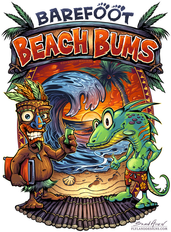
T-Shirt illustration I designed for a restaurant called Big Kahuna Cafe in conjunction with Local T-Shirts. I had a lot of fun with this design – a acgreat theme to be working with during the summer months. The design was created for Direct To Garment printing, so we could really go all out with the colors.
https://i0.wp.com/www.flylanddesigns.com/wp-content/uploads/Big-Kahuna-Burger-Thumbnail.jpg?fit=800%2C800&ssl=1800800Brian Allenhttps://www.flylanddesigns.com/wp-content/uploads/FlyLand-Designs-Web-Logo.pngBrian Allen2014-10-04 13:41:262014-08-04 13:46:32Tiki Man T-Shirt Design For Restaurant
Logo design and website banner I created for the recording studio 340 Records. The design was inspired by the flag for the Virgin Islands, where the studio is located.
https://i0.wp.com/www.flylanddesigns.com/wp-content/uploads/340-Records-Logo-Thumbnail-2.jpg?fit=800%2C800&ssl=1800800Brian Allenhttps://www.flylanddesigns.com/wp-content/uploads/FlyLand-Designs-Web-Logo.pngBrian Allen2014-10-03 13:36:372014-10-02 08:16:23Logo Design for Recording Studio
T-Shirt parody illustration I created of Kermit and Ms. Piggy hitting hard times, entitled “Pig Pimpin.” This was an illustration I created sometime ago, and I always loved the idea, but the execution was kind of flat. I decided to redraw it, and I’m really glad I did.
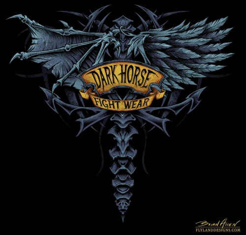
T-Shirt design I created for the MMA apparel company, Dark Horse Apparel, featuring a set of demon and angel wings on the back. I’ve seen T-Shirt designs with wings on the back before that I really liked, so I tried to approach this one by adding my own stylistic input wherever I could. I put most of that into the abstract handling of the “spine” down the back.
This design was set up for silk-screening with 4 colors.
T-Shirt illustration I created of a skeleton riding a chopper through flames for the motorcycle club Celtic Warriors. It’s always a pleasure to work on direct-to-garment T-Shirts, because I don’t have to hold back on colors.
Signed art prints of the design will also be auctioned off to support the client’s local police force, of which he is a member.
Cartoon mascot illustration of a tiger playing basketball I created for Great Dane Graphics and their children’s sports line. The graphic will be used for T-Shirts and other products for kids’ sport teams. The client wanted these designs to be fully rendered digital paintings, without lineart, which is not the typical style I work in. I’m happy with how they turned out.
Cartoon mascot illustration of a bulldog playing basketball I created for Great Dane Graphics and their children’s sports line. The graphic will be used for T-Shirts and other products for kids’ sport teams. The client wanted these designs to be fully rendered digital paintings, without lineart, which is not the typical style I work in. I’m happy with how they turned out.
T-Shirt design I created of a mushroom cloud shaped fire skull for Nuke Proof Tools. The image will be used on banners and T-Shirts for the company’s tradeshows and events. The client had seen a mushroom cloud skull design I did years ago, and wanted something similar. It was fun to go back and work on the same concept, and have the chance to make imrpovements.
T-Shirt design I illustrated of a skeleton with dual airbrushes for the awesome airbrush shop Explicit Airbrush. The client and owner of the shop is an artist himself, so I had a lot of fun as our collective minds grew this illustration. This design is set up for Direct-to-garment printing.
Double-page editorial spread I illustrated for the Canadian DIY magazine HOSS. The magazine features many tv DIY celebrities, and the art director wanted a detailed illustration introducing each of their contributors as caricatures building a house. There were over 18 caricatures that went into this very complex illustration.
The magazine prints over a million copies bi-monthly.
Iron Maiden, and the artist behind their amazing artwork, Derek Riggs, have always been a huge inspiration for everything that I do. So I was super excited when I was hired by Listenable Records to create an illustration tribute to Iron Maiden’s first album, “Killers,” for an upcomming sampler that would be given out at Iron Maiden concerts in Europe. I tried to cram in as much of my own style as I could.