Skull head with evil eyes

This artwork is available for licensing. https://www.flylanddesigns.com/licensing/
Skull head with evil eyes

This artwork is available for licensing. https://www.flylanddesigns.com/licensing/
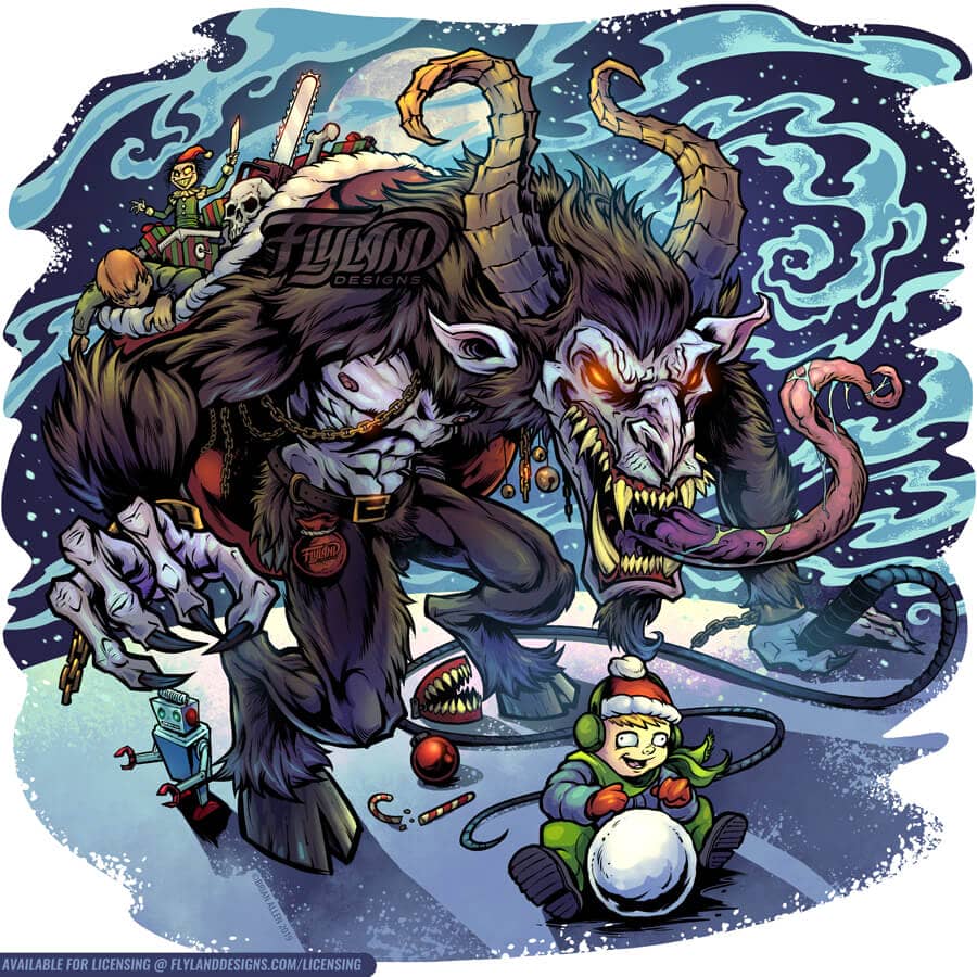
Krampus with his sack of toys coming up behind a child playing in the snow.
I had fun creating this Krampus for my on personal use.
This artwork is available for licensing. https://www.flylanddesigns.com/licensing/
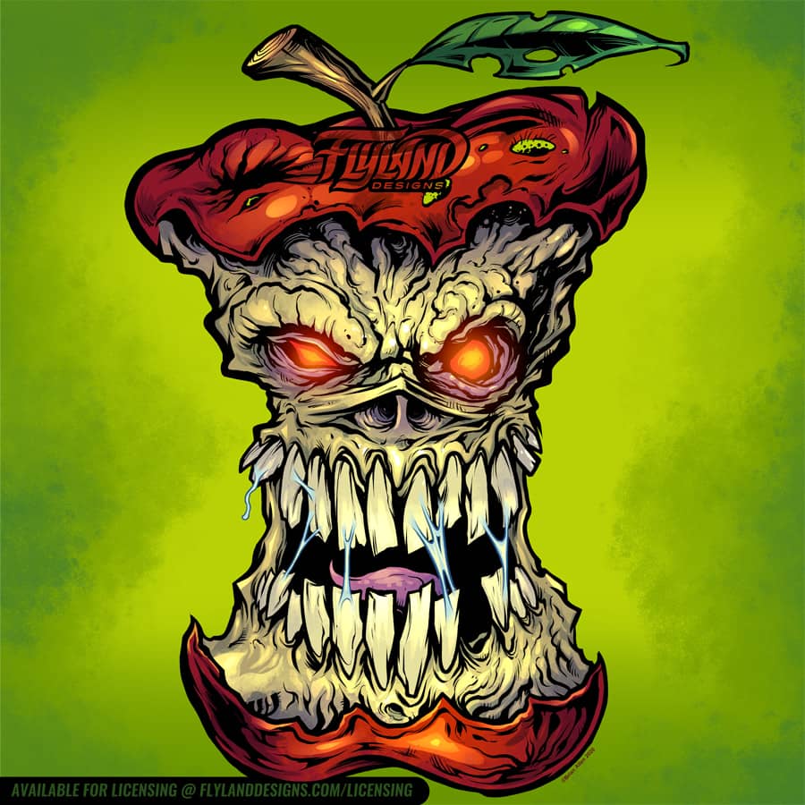
I had such a fun time creating this rotten apple design. I did it in the same style as the evil mushrooms design I did a few years ago.
This design is available for licensing : https://www.flylanddesigns.com/licensing/
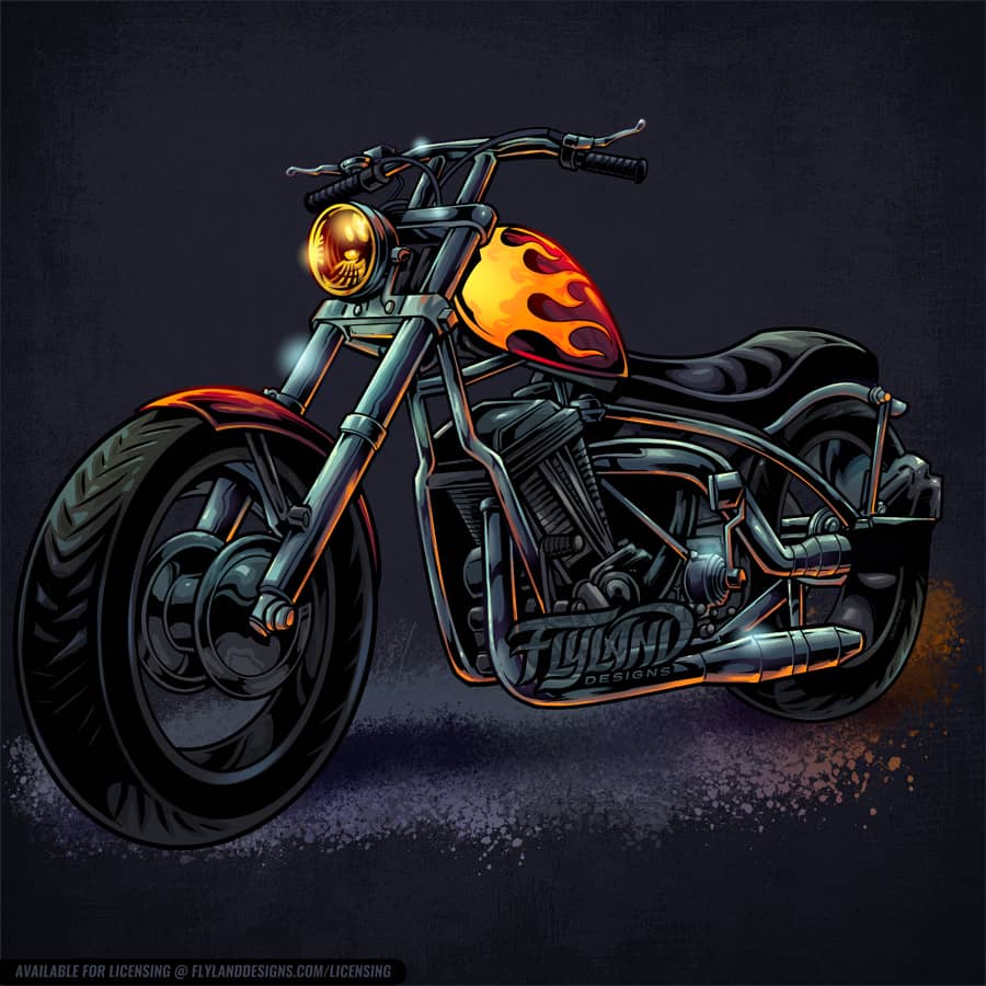
Motorcycle with hotrod flames painted on the gas can
This artwork is available for licensing. https://www.flylanddesigns.com/licensing/
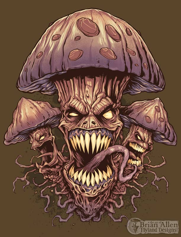


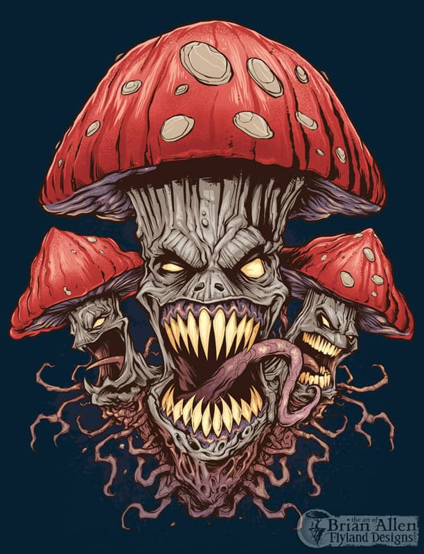
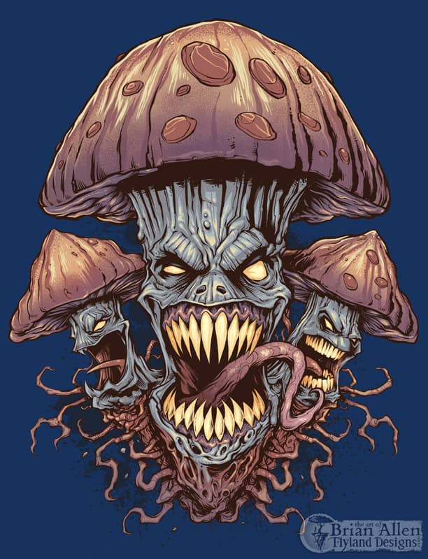
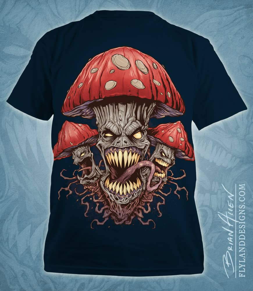
T-Shirt illustration of a pack of wild and evil mushrooms I created for a new apparel brand. I illustrated this in Manga Studio and colored it in Adobe Photoshop. Set up for silk-screening, using four colors.
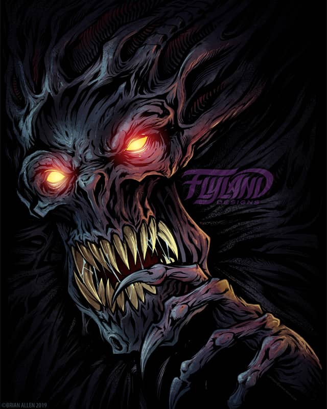
A horrifying creature emerges from the dark, his talons razor sharp and eyes bright.
This artwork is available for licensing at https://www.flylanddesigns.com/licensing/
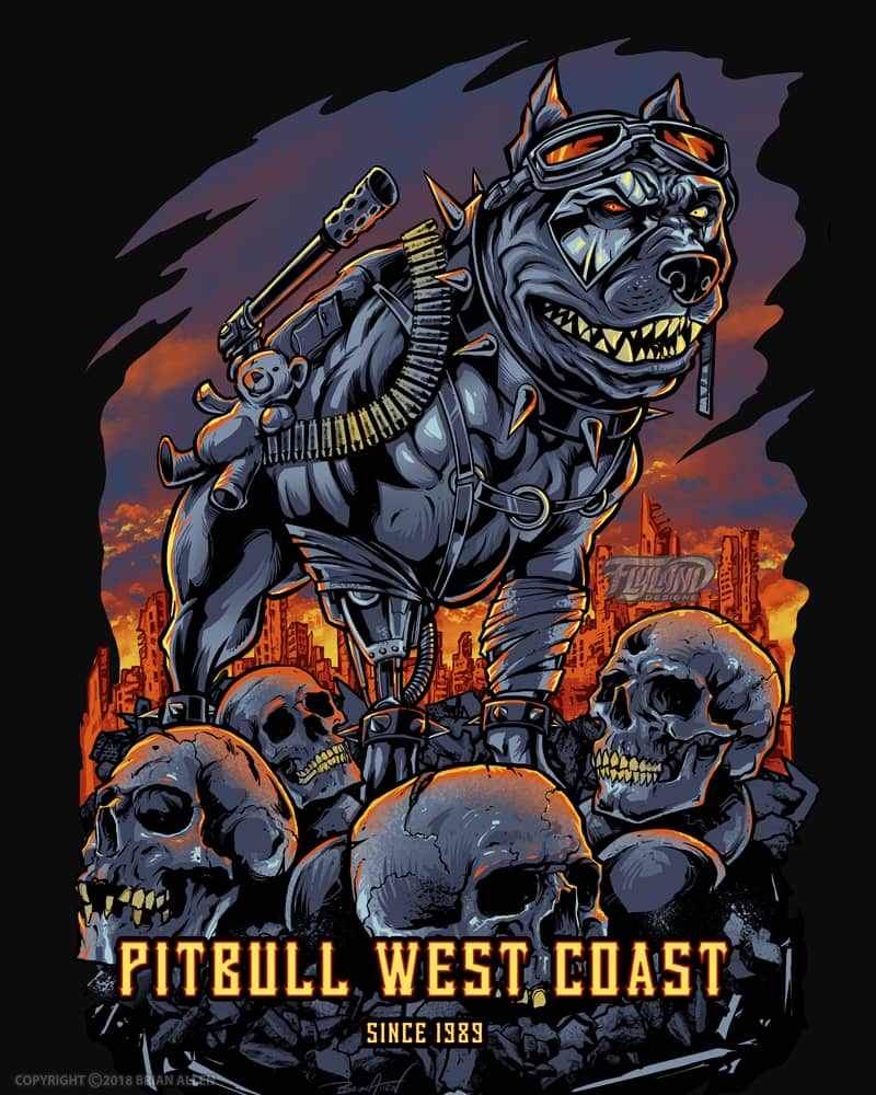
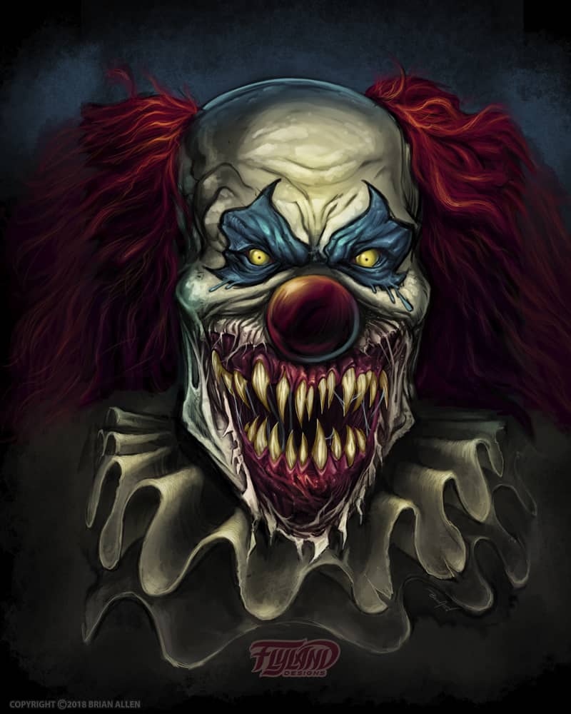
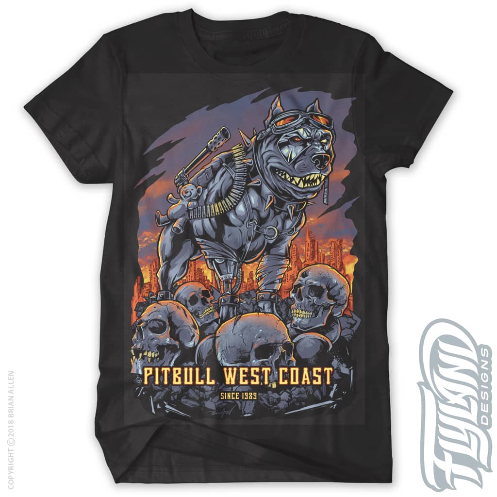
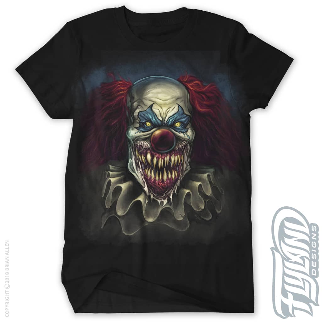
Client:
West Coast Pitbull
Description:
West Coast Pitbull, a huge brand that caters to all things pitbull, hired me to create a series of apparel designs featuring the Pitbull in all his badass glory.
Our second design had me drawing a pitbull skull in a decorative Ace of Spades card design. I decided to add a lot of detail to the skull, but push the other design elements into the background to help it pop out.
The next West Coast Pitbull t-shirt design I created imagines a dark future where humanity’s only hope for survival rests in the paws of cybernetically enhanced Pitbulls designed to hunt out their enemies. I drew this pitbull on a pile of skulls because it just felt right.
I illustrated this crazy and horrifying clown for West Coast Pitbull’s new apparel series. This was a digital painting created in Adobe Photoshop – I decided to leave out all the line art in the design and try to go for a more realistic look.
Client:
Cavity Colors
Description:
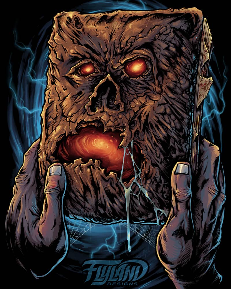
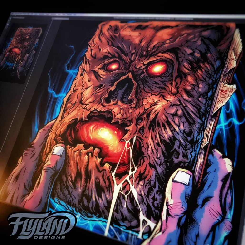
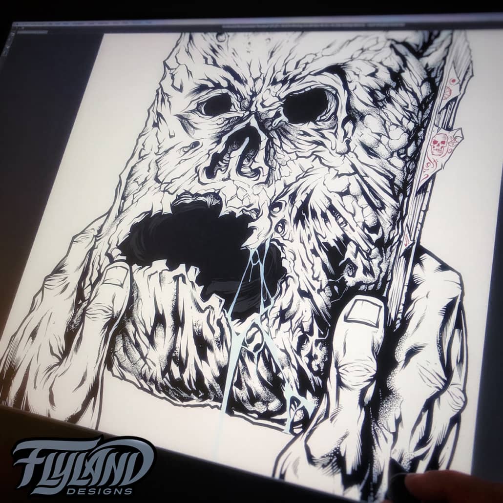
Cavity Colors hired me to create this officially licensed t-shirt illustration of the Book of the Dead, the Necronomicon, from one of my favorite horror movies ever, Evil Dead 2.
I took great care to make the illustration look like the specific book from the movie (the books all look slightly different in all the other movies). I made sure to use limited colors so it would silk-screen nicely. Very happy with how this turned out!
Client Testimonial:
I’m so excited for this design. Looks so good!
-Aaron Crawford
Art Director, Cavity Colors
Client:
Arctic FX
Description:
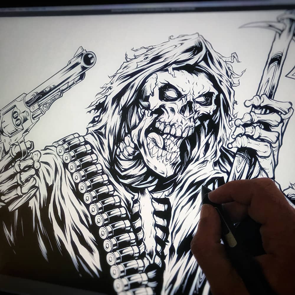
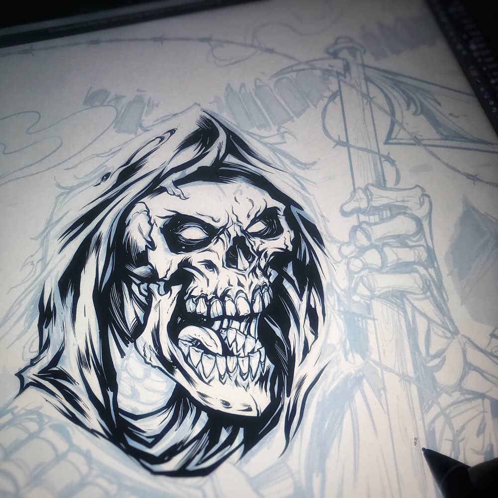
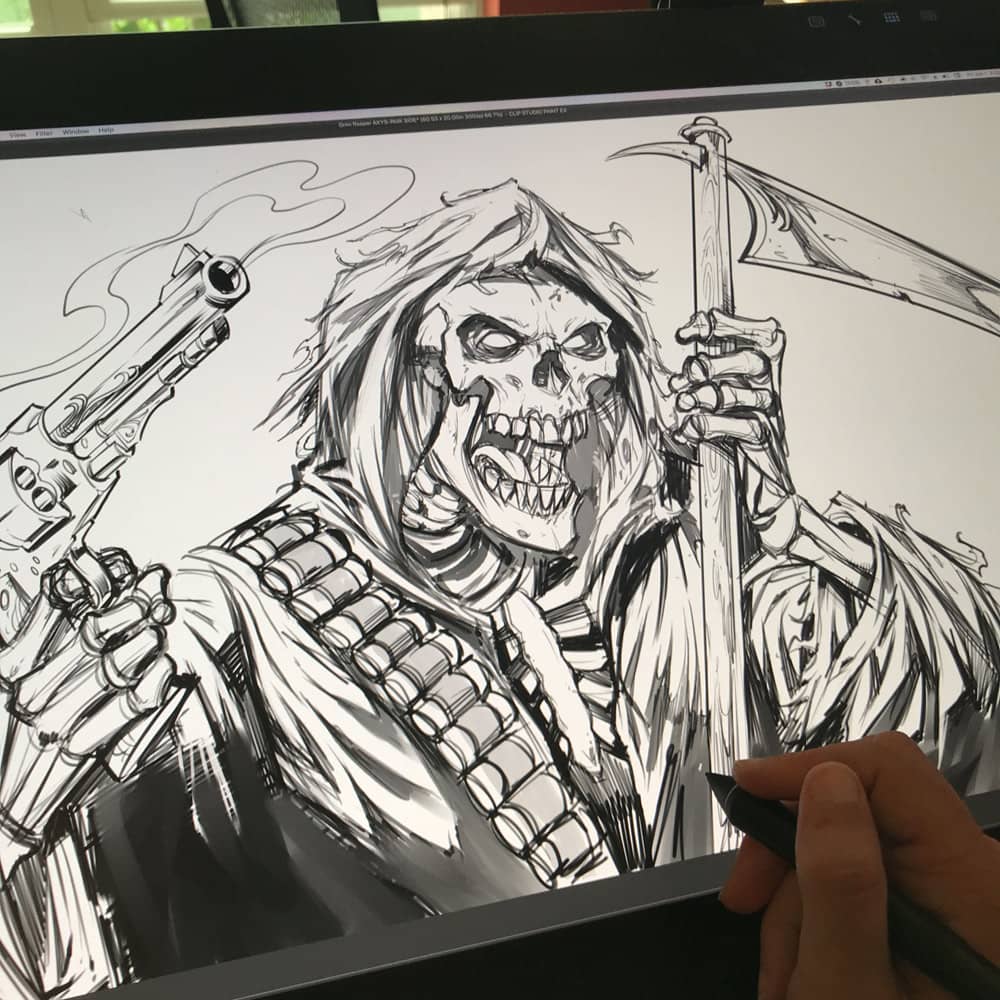
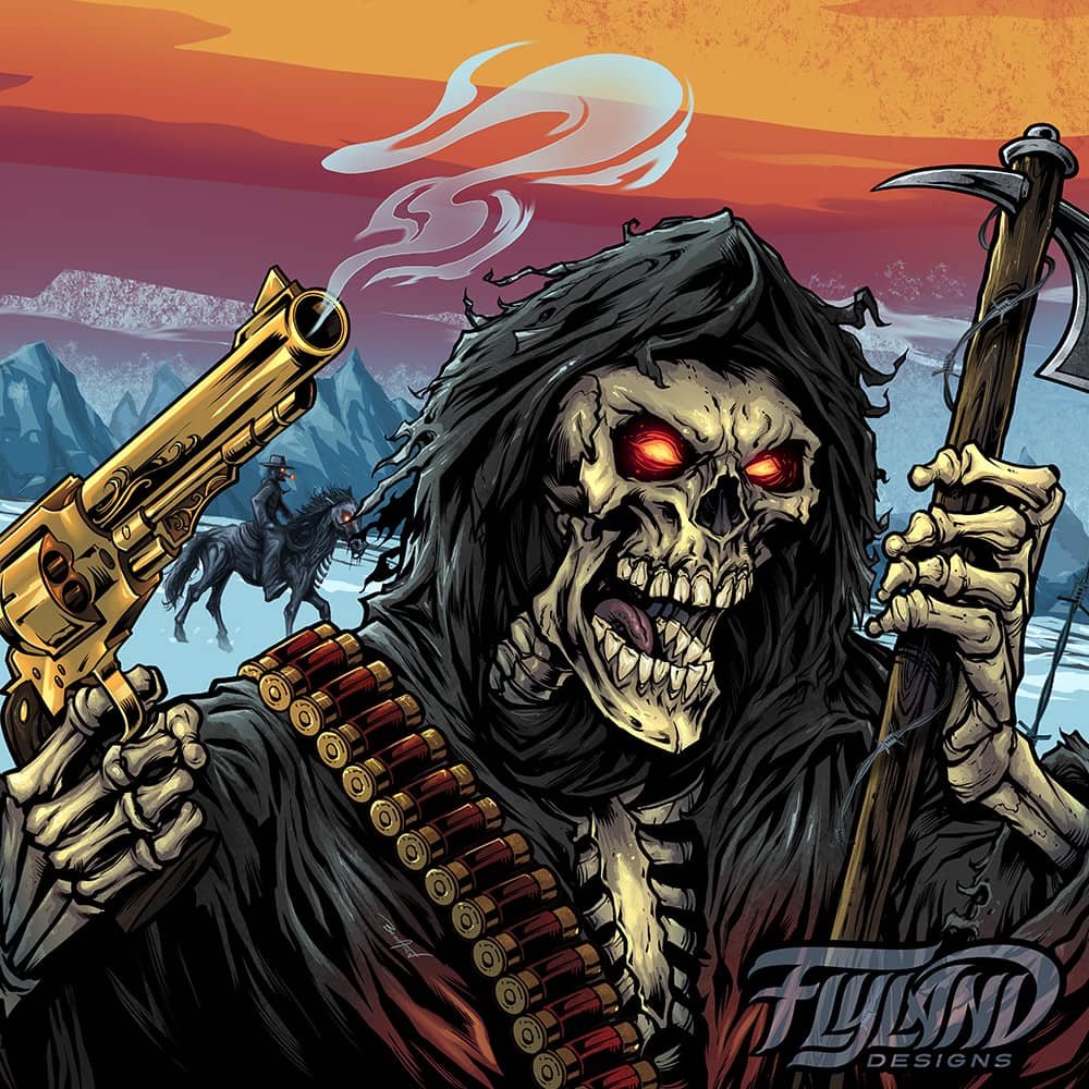
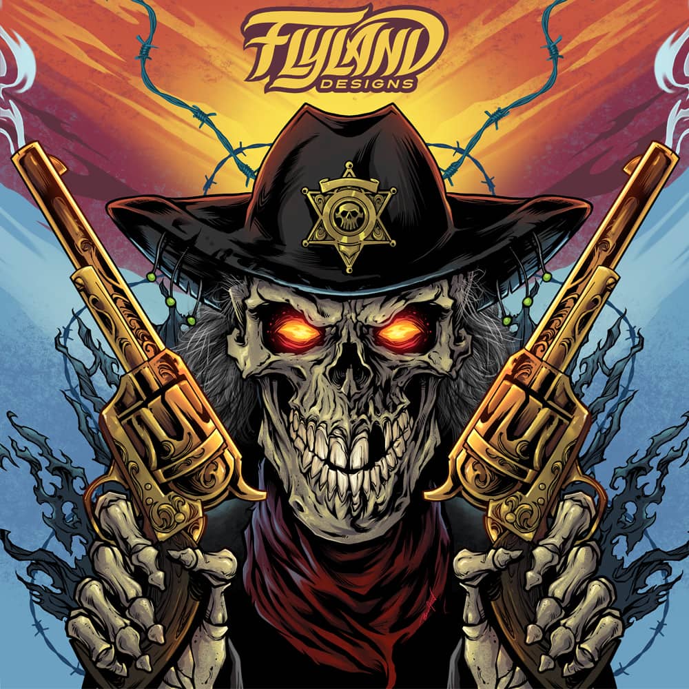
Grim Reaper gunslinger illustration I created for a vinyl graphic wrap for snowmobiles sold by Arctic FX for a new brand they are developing. I illustrated a skeleton gunslinger on the front, and a creepy western-styled Grim Reaper on the sides. I love designing for vehicles, because they are such oddly shaped canvases to fill. The new line of graphics will be branded “FlyLand Designs” in a partnership I was fortunate enough to work out with them. Feeling very privileged to be included in their stable of really skilled artists.
Copyright © 2016 by Brian Allen
Copyright © 2016 by Brian Allen
Copyright © 2016 by Brian Allen

Copyright © 2016 by Brian Allen
Copyright © 2016 by Brian Allen

Copyright © 2016 by Brian Allen
Copyright © 2016 by Brian Allen
Client:
New Hong Kong
Description:
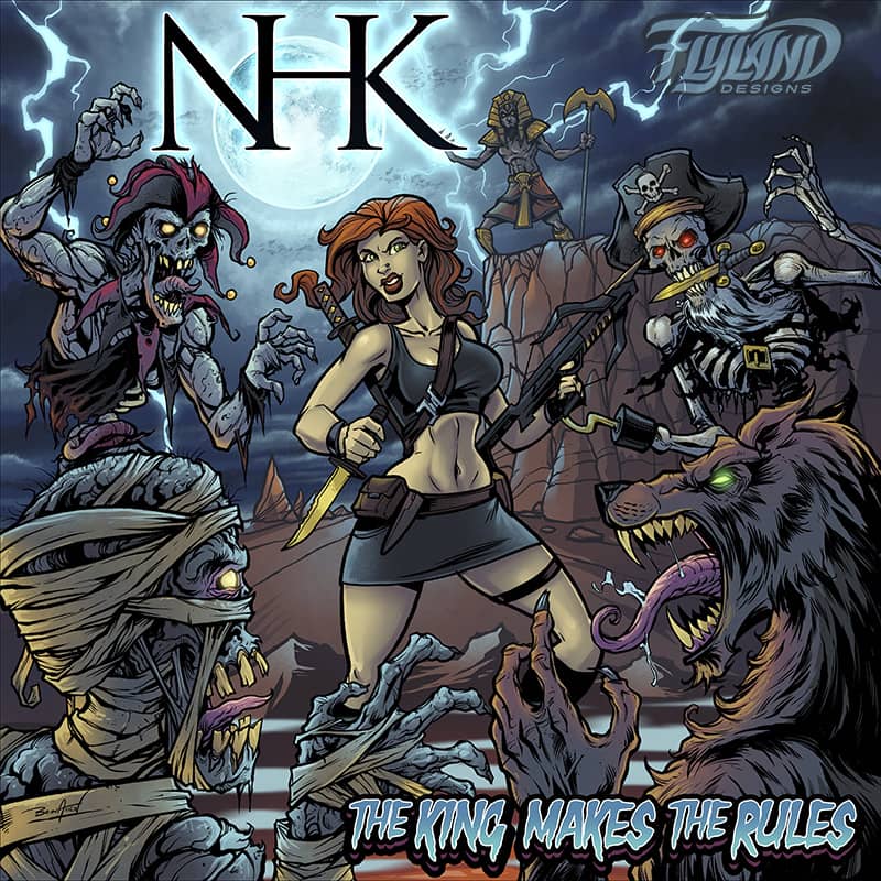
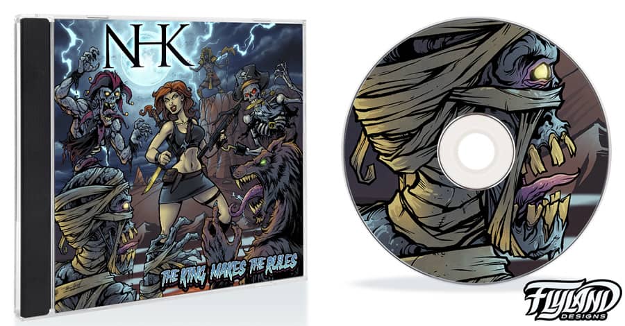
The band New Hong Kong hired me to illustrate their album cover for The King Makes The Rules, showing a bunch of evil monsters sparring with a young vampire hunter.
The band wanted it to be creepy but still fun, so I kept the gore to a minimum and the colors saturated. I illustrated the mummy, werewolf, zombie, and pirate skeleton in a heavy brushed ink style, trying to emulate the amazing Tales from the Crypt covers by Jack Davis. The band was really fun to work with, and the final result ended up fitting their music perfectly.
Client Testimonial:
This looks amazing and everyone loves it. We’re super excited—it turned out amazing as I knew it would.
-Thomas Latronico
NHK, member
Copyright © 2016 by Brian Allen
Copyright © 2016 by Brian Allen
Client:
Ron Clark Academy
Description:
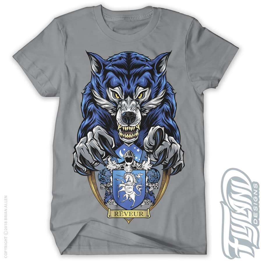
The award-winning charter school, the Ron Clark Academy, hired me to create this apparel design based on one of their school mascots, the wolf.
Nothing about the RCA is ordinary, so they wanted a school t-shirt that looked tough and ferocious, with a lot of detail and color. This design was set up for limited color silk-screening.
Copyright © 2016 by Brian Allen

Copyright © 2016 by Brian Allen
Client:
John Erigo
Description:
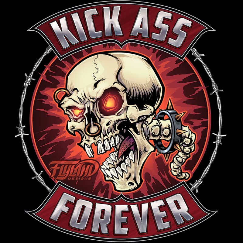
Insane Skull logo I designed for the new Heavy Metal news blog, Kick Ass Forever.
The client asked for something extreme and over-the-top – tough by vibrant and bold. This is what I came up with, and threw in some barbed wire.
Client Testimonial:
Everybody that has seen the logo is like freaking out, total home run man!
Could not have done a better job my man, thanks so much!!!
-John Erigo
Kick Ass Forever
Copyright © 2016 by Brian Allen

Copyright © 2016 by Brian Allen
Client:
Ammannati Band
Description:
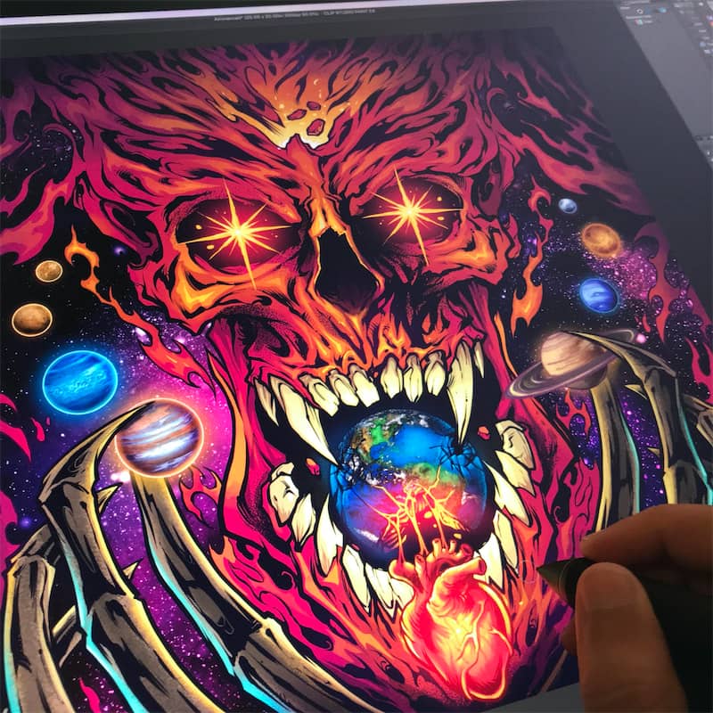
Check out this evil skull emerging from the galaxy to devour the earth, for the band called Ammannait! This is one of my favorite album covers I designed ever! I sketched a bunch of concepts that I thought the band would like ever listening to their music. This one was the simplest, but definitely the strongest. Rather than adding a lot of details, I focused more on the color scheme and a strong layout, and I think it paid off well.
Client Testimonial:
No words, AWESOME! You are the best!!!!
-Damiano
Lead Singer, Ammannati band
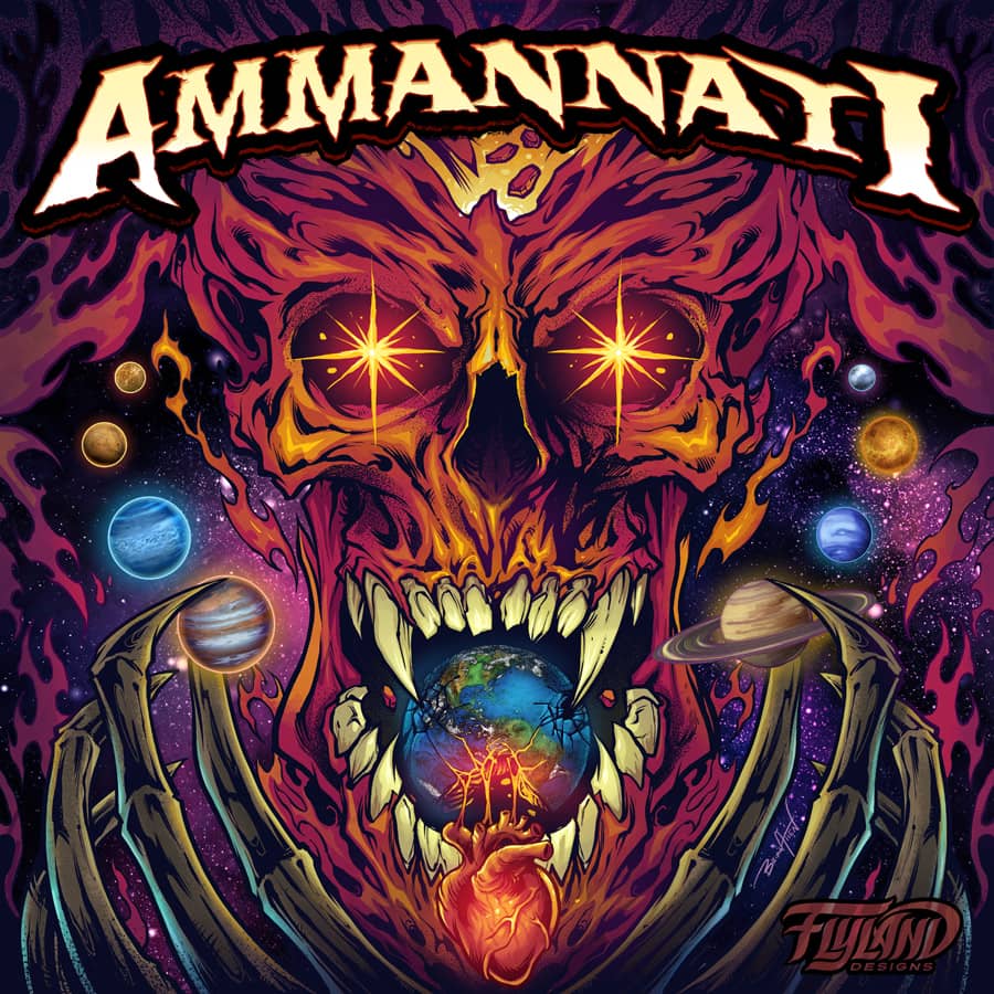

Description:
The design was for apparel and a vehicle wrap for the russefeiring tradition. If you haven’t heard of it, basically russefeiring involves an entire class of Norwegian students renting a bus (a Russebuss), painting every inch of it with really cool street art, and then partying in it night and day for an entire month during graduation. The different classes wear their designs ever where they go as they clash with rival classes. I’ve done a bunch of these now, and really enjoy it.
Client:
Personal
Description:
An evil magical tiki mask surrounded by psychedelic imagery and visions of faraway places and things.
This artwork is available for licensing:
Client:
Personal
Description:
The dark demonic face of a demon monster and his many eyes and horns in front of flaming skulls and a burning city.
This artwork is available for licensing:
Client:
Crimshaw Band
Description:
The heavy metal band Crimshaw commissioned me to illustrate each member of the band as classic movie monsters based on their personalities for their new album.
It’s always such a fun challenge to draw the likenesses of people I’ve never met, just based on a few photographs. Luckily, turning them into savage creatures masks any errors.
Description:
Demonic monster illustration with many eyes and horns grins as a city burns behind him.
The design was for apparel and a vehicle wrap for the russefeiring tradition. If you haven’t heard of it, basically russefeiring involves an entire class of Norwegian students renting a bus (a Russebuss), painting every inch of it with really cool street art, and then partying in it night and day for an entire month during graduation. The different classes wear their designs ever where they go as they clash with rival classes. I’ve done a bunch of these now, and really enjoy it.
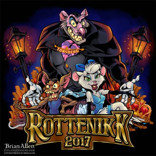
A Illustration of The Great Mouse Detective I did for a Russ group. The design was for apparel and a vehicle wrap for the russefeiring tradition. If you haven’t heard of it, basically russefeiring involves an entire class of Norwegian students renting a bus (a Russebuss), painting every inch of it with really cool street art, and then partying in it night and day for an entire month during graduation. The different classes wear their designs ever where they go as they clash with rival classes. I’ve done a bunch of these now, and really enjoy it.

Copyright © 2016 by Brian Allen
Copyright © 2016 by Brian Allen
A Illustration of The Great Mouse Detective I did for a Russ group.
The design was for apparel and a vehicle wrap for the russefeiring tradition. If you haven’t heard of it, basically russefeiring involves an entire class of Norwegian students renting a bus (a Russebuss), painting every inch of it with really cool street art, and then partying in it night and day for an entire month during graduation. The different classes wear their designs ever where they go as they clash with rival classes. I’ve done a bunch of these now, and really enjoy it.

Copyright © 2016 by Brian Allen
Copyright © 2016 by Brian Allen
Copyright © 2016 by Brian Allen
Copyright © 2016 by Brian Allen
Client:
ODM
Description:
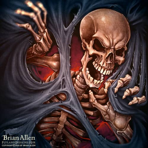
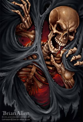
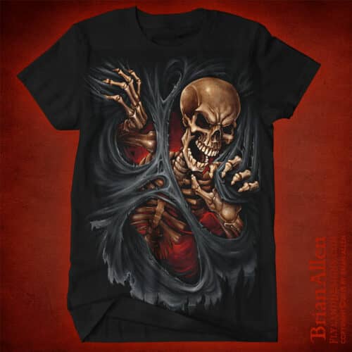
I was hired to create this digital painting of a skeleton ripping through the front of a shirt.
This was a very challenging piece for me, as it’s a departure from my usual lineart style, but I’m happy with how it turned out. The design should hopefully be available in retail outlets like Hot
Client:
Jeff Hardy
Description:
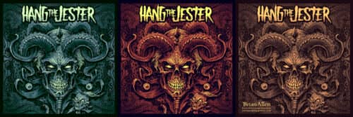
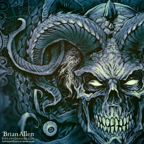
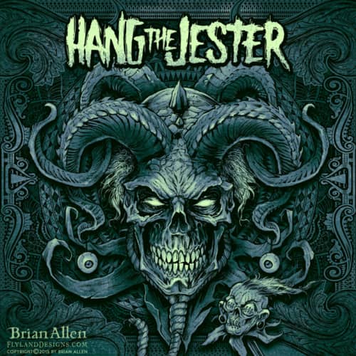
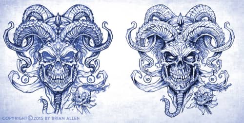
The band Hang The Jester hired me to create this detailed illustration of an evil jester made of a skull and horns for their latest album cover. The band asked me to create something with a very liited color scheme, and a lot of pen and ink detail. Unlike many of my other designs which are often 100% digital, I drew and inked this design on paper with technical pens and a brush.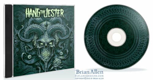
Client:
Sander Nygard
Description:
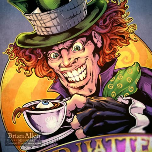
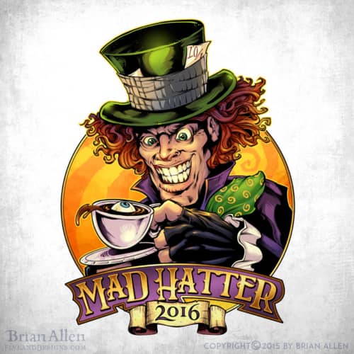
Evil Mad Hatter character illustration I, created for a logo for a Russefeiring team. I thoguht it would be fun to have an eyeball floating in the tea cup. The design will be wrapped on vehicles, printed on apparel, and used on the class’ website. If you haven’t heard of Russefeiring, basically it involves an entire class of Norwegian students renting a bus (a Russebuss), painting every inch of it with really cool street art, and then partying in it night and day for an entire month during graduation. The different classes wear their designs ever where they go as they clash with rival classes. It’s cool to be a part of it, in the best way I know how! Drawn in Manga Studio 5.
Client:
Spiral Direct
Description:
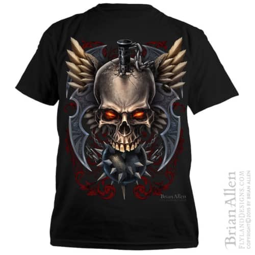
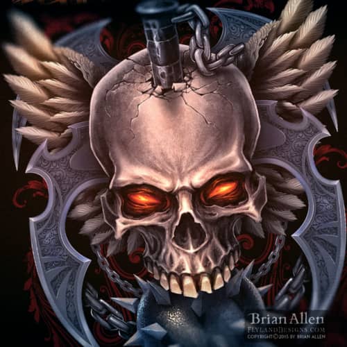
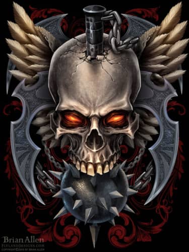
Digitally painted t-shirt illustration of an evil skull with wings and barbaric weapons I created for the dark apparel company Spiral Direct. This was inspired by a similar design I had done in the past, but taken in a more realistic rendering direction. It was a lot of fun exploring the same subject matter in a different style – it’s a great way to discover the limitations and strengths of a particular method.
Client:
Commando Racing Gear
http://commandoracing.com/
Description:
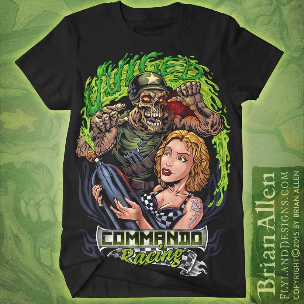
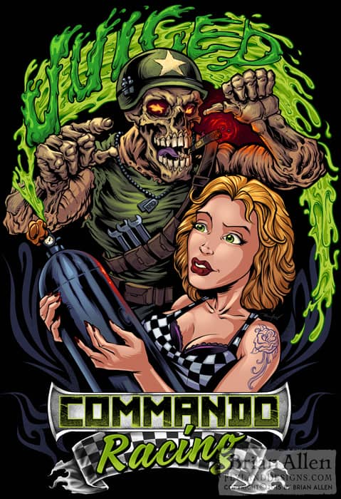
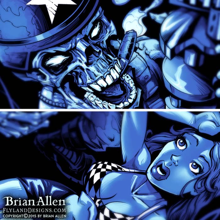
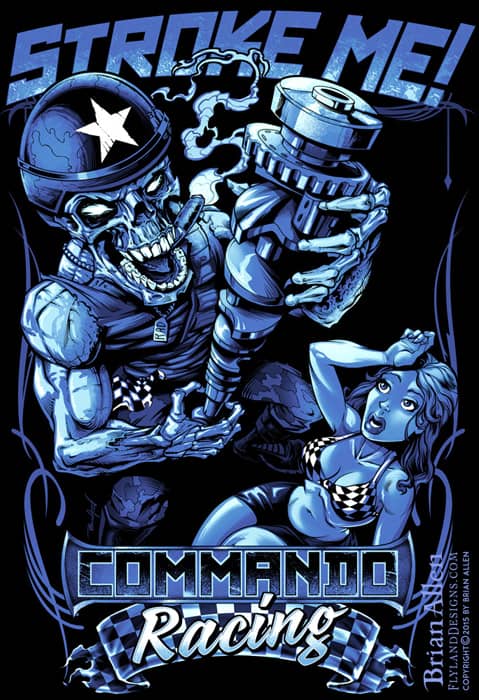
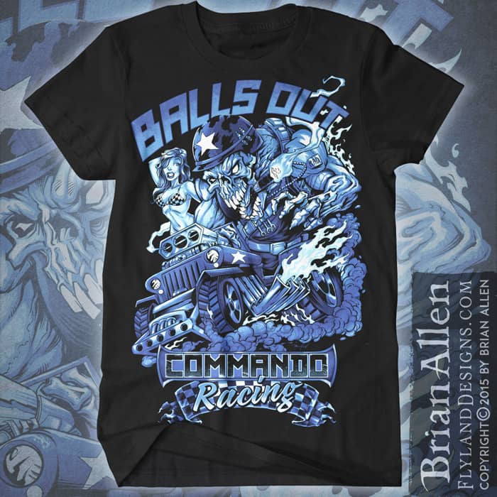
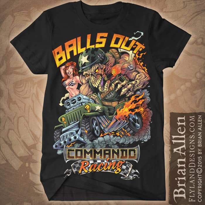
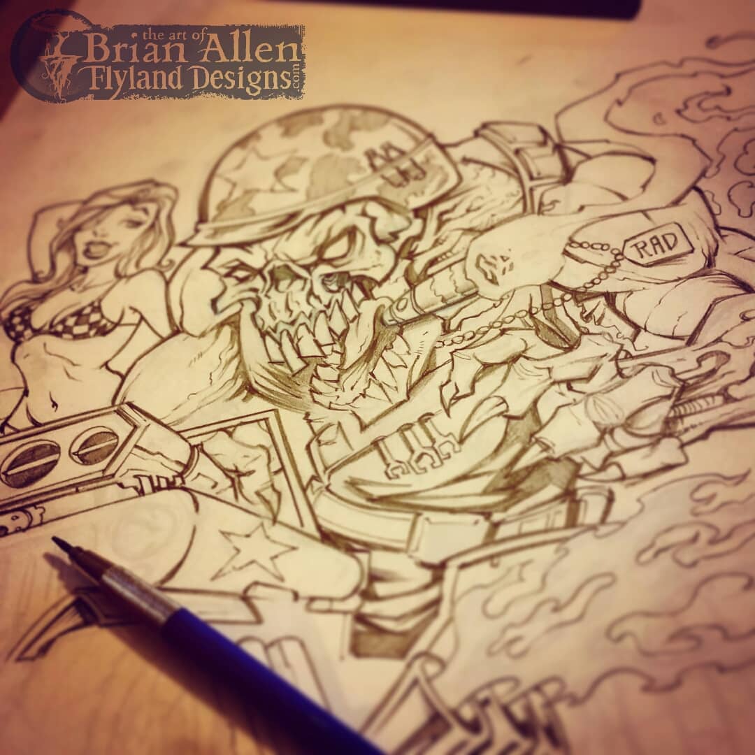
T-Shirt illustration for a racing apparel brand called Commando Racing Gear. I designed the mascot and artwork for this brand, and we created a series of t-shirts showing the mascot skeleton in a bunch of funny situations.
Client Testimonial:
If you were closer, I’d hug you!!! We absolutely love it.
-Steve Kanner
Commando Racing Gear
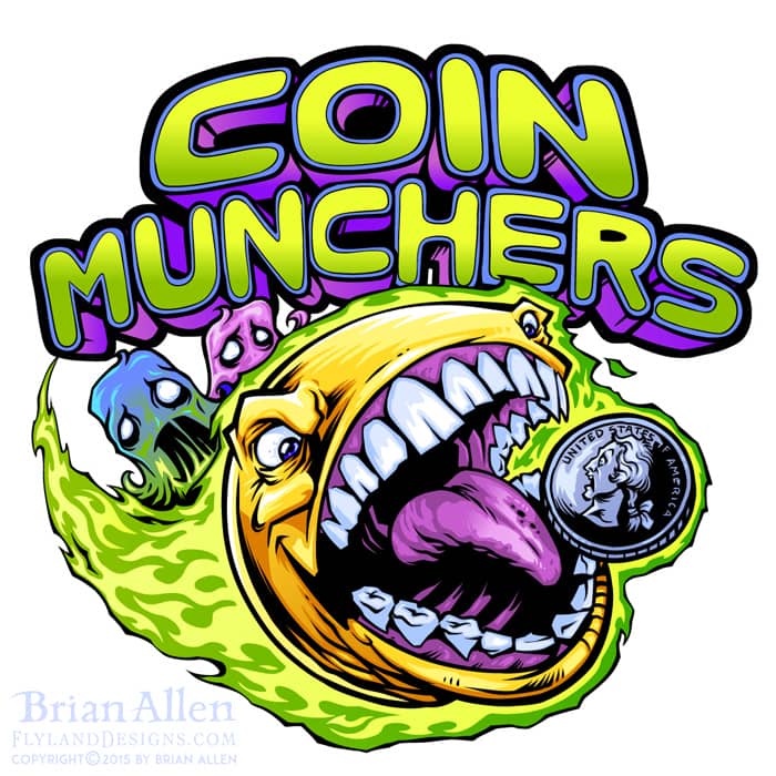
Client:
Coin Munchers Arcade
Description:
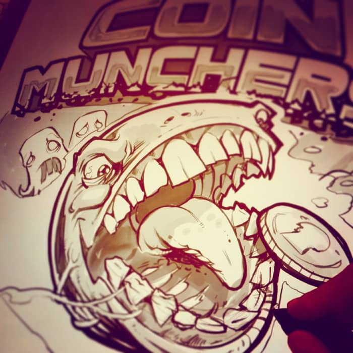
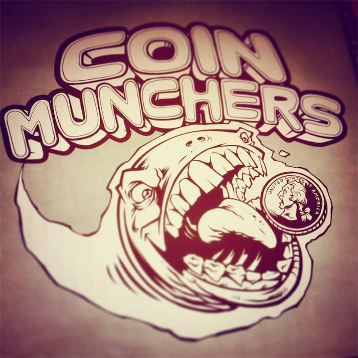
Logo design I created of an evil pac-man for an arcade’s logo design and branding. The client wanted something identifiable to the retro gaming crowd, while putting a hard and extreme edge on the style. I thought it would be fun to turn the lovable yellow disc into a rabid, coin-munching psychopath.
Client:
Lawrence James
Description:
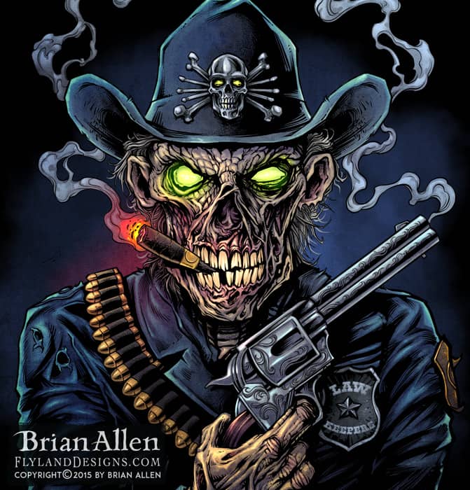
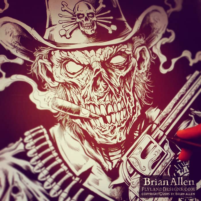
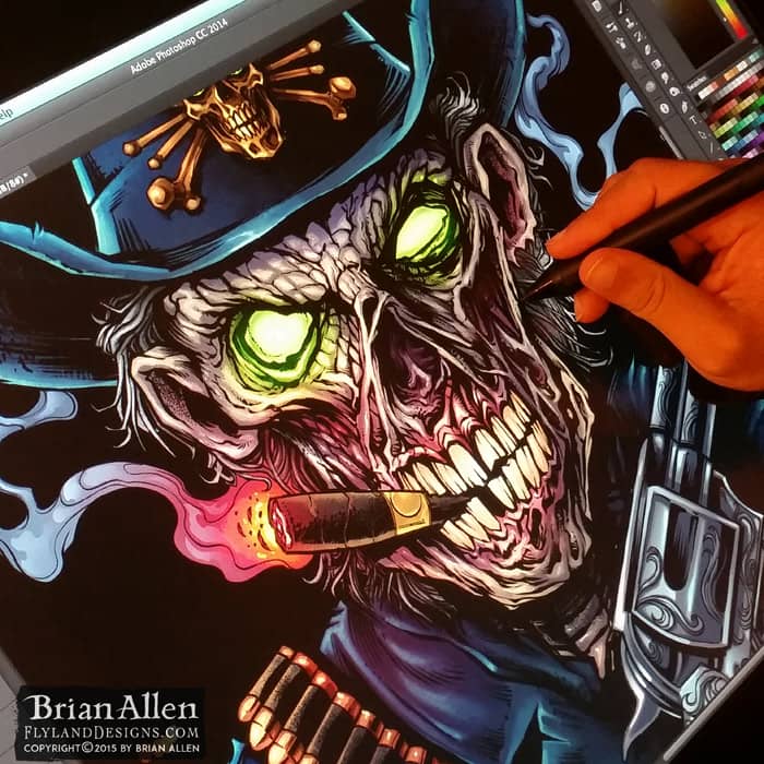
Illustration of a zombie police officer I created in Manga Studio and Adobe Photoshop for a motorcycle club of state troopers for their club seal and apparel. This was based on a similar design I created a couple years ago with a digitally painted zombie gunslinger. It was a lot of fun to revisit the same concept, but in a different style, and with my skills improved a little.
I created this fun t-shirt design for Commando Racing Gear – a hardcore skeleton! We went through a couple different [and equally exciting] designs but eventually settled on this one. I had a lot of fun with this!
Client Testimonial:
If you were closer, I’d hug you!!! We absolutely love it.
-Steve Kanner
Commando Racing Gear
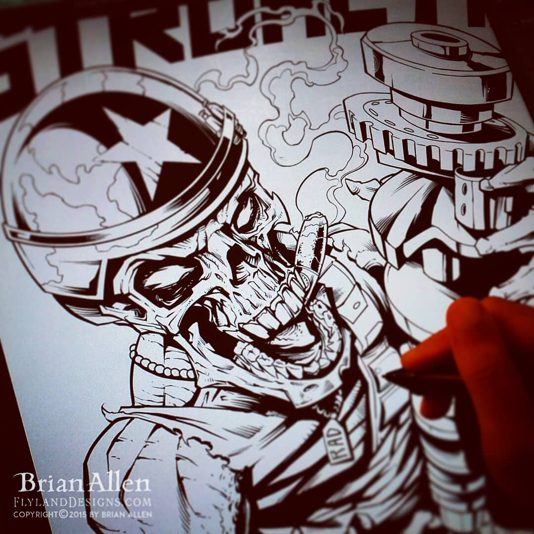
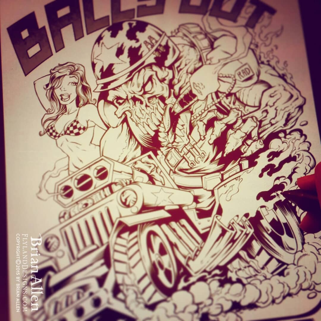
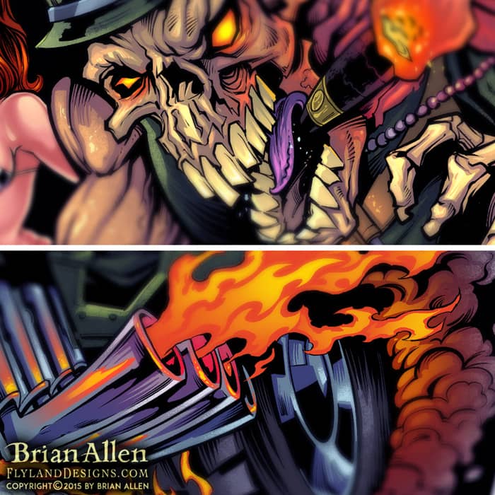
I created this mascot and logo design for a team of drag-racer’s new line of merchandise and apparel. The client wanted a tough, dark, militant mascot character that could later be drawn in other situations and shenanigans. We went through a few sketches at the beginning that were a bit too light, and eventually arrived at RAD, the skeletal, drag-racing warrior you see before you! The mascot and logo was prepared for both limited color silk-screening and full-color printing, to maximize the usage. To see more of my work, or hire me for freelance projects, please visit my website: www.flylanddesigns.com
I created this mascot and logo design for a team of drag-racer’s new line of merchandise and apparel. The client wanted a tough, dark, militant mascot character that could later be drawn in other situations and shenanigans. We went through a few sketches at the beginning that were a bit too light, and eventually arrived at RAD, the skeletal, drag-racing warrior you see before you! The mascot and logo was prepared for both limited color silk-screening and full-color printing, to maximize the usage. To see more of my work, or hire me for freelance projects, please visit my website: www.flylanddesigns.com

I created this mascot and logo design for a team of drag-racer’s new line of merchandise and apparel. The client wanted a tough, dark, militant mascot character that could later be drawn in other situations and shenanigans. We went through a few sketches at the beginning that were a bit too light, and eventually arrived at RAD, the skeletal, drag-racing warrior you see before you! The mascot and logo was prepared for both limited color silk-screening and full-color printing, to maximize the usage. To see more of my work, or hire me for freelance projects, please visit my website: www.flylanddesigns.com
I created this mascot and logo design for a team of drag-racer’s new line of merchandise and apparel. The client wanted a tough, dark, militant mascot character that could later be drawn in other situations and shenanigans. We went through a few sketches at the beginning that were a bit too light, and eventually arrived at RAD, the skeletal, drag-racing warrior you see before you! The mascot and logo was prepared for both limited color silk-screening and full-color printing, to maximize the usage. To see more of my work, or hire me for freelance projects, please visit my website: www.flylanddesigns.com
I created this fun t-shirt design for Commando Racing Gear – a hardcore skeleton! We went through a couple different [and equally exciting] designs but eventually settled on this one. I had a lot of fun with this!
Client Testimonial:
If you were closer, I’d hug you!!! We absolutely love it.
-Steve Kanner
Commando Racing Gear
I created this mascot and logo design for a team of drag-racer’s new line of merchandise and apparel. The client wanted a tough, dark, militant mascot character that could later be drawn in other situations and shenanigans. We went through a few sketches at the beginning that were a bit too light, and eventually arrived at RAD, the skeletal, drag-racing warrior you see before you! The mascot and logo was prepared for both limited color silk-screening and full-color printing, to maximize the usage.
To see more of my work, or hire me for freelance projects, please visit my website: www.flylanddesigns.com
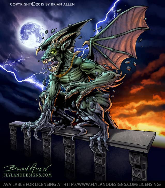
I designed and illustrated this angry gargoyle busting out of its stone skin for a line of ATV and sled wraps put out by 393 Components. It was a challenge to position everything and design it in a way to make the design look interesting on as many different vehicle types and shapes as possible. I kept all the elements in layers so that the design could be modified if necessary to fit different wraps. I needed to make it look as different as possible from a previous gargoyle design I had done, so I came up with the idea of having the gargoyle a green-skinned creature bursting from stone, as if it was coming to life.
It was really cool to be working with graphic decals again for ATVs, because my first full-time position as an artist was at a custom decal shop called XGX Racing.
Client Testimonial:
Just wanted to thank you again for an outstanding job
– 393 Components
Shawn Alexander
This design is available for licensing:
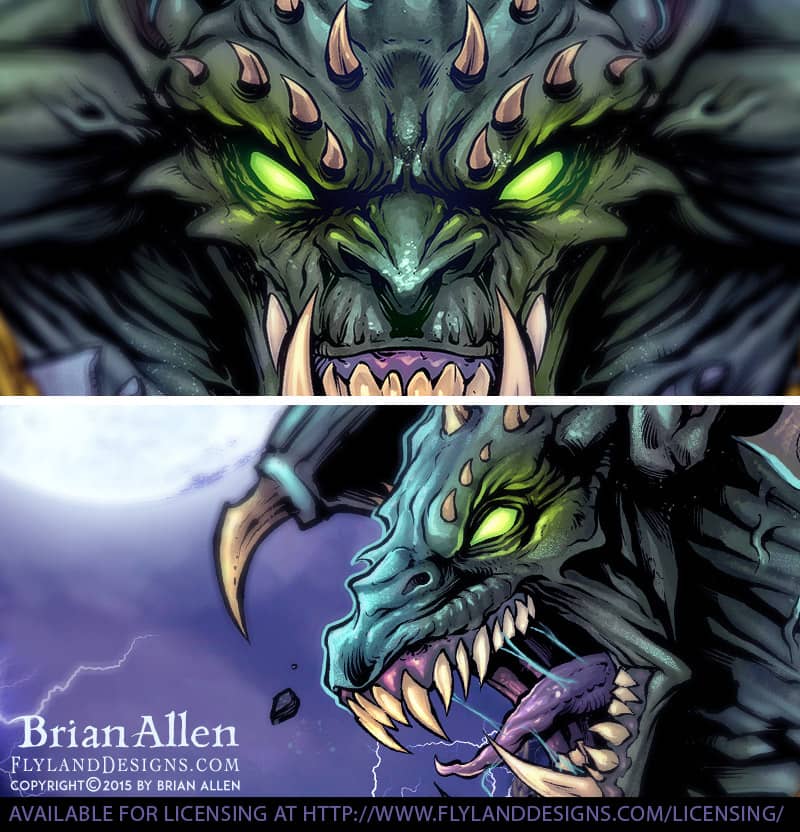
I designed and illustrated this angry gargoyle busting out of its stone skin for a line of ATV and sled wraps put out by 393 Components. It was a challenge to position everything and design it in a way to make the design look interesting on as many different vehicle types and shapes as possible. I kept all the elements in layers so that the design could be modified if necessary to fit different wraps. I needed to make it look as different as possible from a previous gargoyle design I had done, so I came up with the idea of having the gargoyle a green-skinned creature bursting from stone, as if it was coming to life.
It was really cool to be working with graphic decals again for ATVs, because my first full-time position as an artist was at a custom decal shop called XGX Racing.
To see more of my work, or hire me for freelance projects, please visit my website: www.flylanddesigns.com
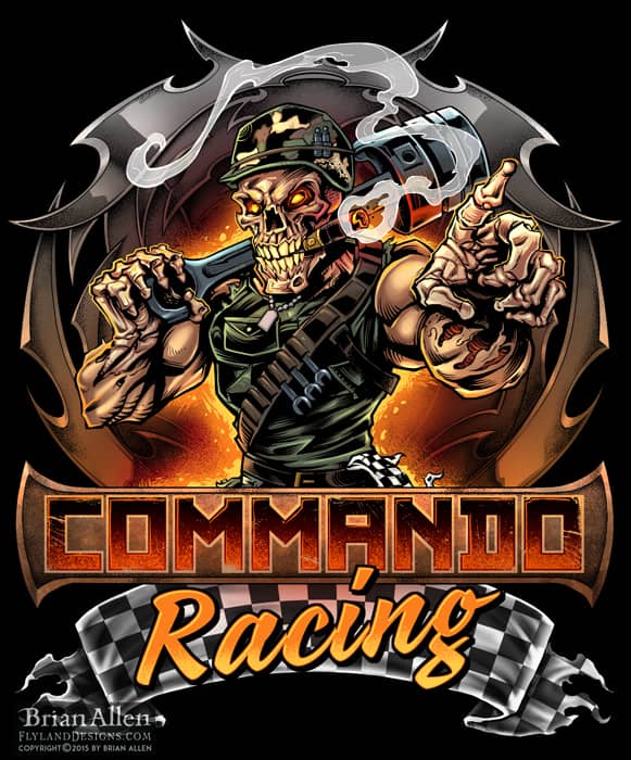
I created this mascot and logo design for a team of drag-racer’s new line of merchandise and apparel. The client wanted a tough, dark, militant mascot character that could later be drawn in other situations and shenanigans. We went through a few sketches at the beginning that were a bit too light, and eventually arrived at RAD, the skeletal, drag-racing warrior you see before you! The mascot and logo was prepared for both limited color silk-screening and full-color printing, to maximize the usage.
Client Testimonial:
If you were closer, I’d hug you!!! We absolutely love it.
-Steve Kanner
Commando Racing Gear

I created this mascot and logo design for a team of drag-racer’s new line of merchandise and apparel. The client wanted a tough, dark, militant mascot character that could later be drawn in other situations and shenanigans. We went through a few sketches at the beginning that were a bit too light, and eventually arrived at RAD, the skeletal, drag-racing warrior you see before you! The mascot and logo was prepared for both limited color silk-screening and full-color printing, to maximize the usage.
To see more of my work, or hire me for freelance projects, please visit my website: www.flylanddesigns.com
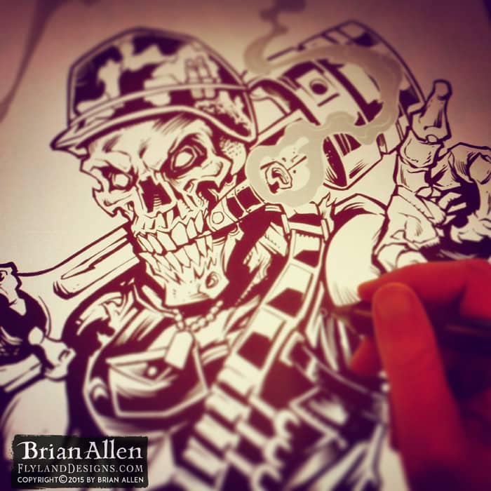
I created this mascot and logo design for a team of drag-racer’s new line of merchandise and apparel. The client wanted a tough, dark, militant mascot character that could later be drawn in other situations and shenanigans. We went through a few sketches at the beginning that were a bit too light, and eventually arrived at RAD, the skeletal, drag-racing warrior you see before you! The mascot and logo was prepared for both limited color silk-screening and full-color printing, to maximize the usage.
To see more of my work, or hire me for freelance projects, please visit my website: www.flylanddesigns.com
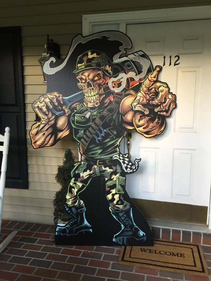
I created this mascot and logo design for a team of drag-racer’s new line of merchandise and apparel. The client wanted a tough, dark, militant mascot character that could later be drawn in other situations and shenanigans. We went through a few sketches at the beginning that were a bit too light, and eventually arrived at RAD, the skeletal, drag-racing warrior you see before you! The mascot and logo was prepared for both limited color silk-screening and full-color printing, to maximize the usage.
To see more of my work, or hire me for freelance projects, please visit my website: www.flylanddesigns.com
I created this mascot and logo design for a team of drag-racer’s new line of merchandise and apparel. The client wanted a tough, dark, militant mascot character that could later be drawn in other situations and shenanigans. We went through a few sketches at the beginning that were a bit too light, and eventually arrived at RAD, the skeletal, drag-racing warrior you see before you! The mascot and logo was prepared for both limited color silk-screening and full-color printing, to maximize the usage.
To see more of my work, or hire me for freelance projects, please visit my website: www.flylanddesigns.com
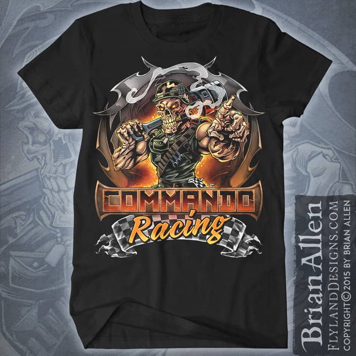
I created this mascot and logo design for a team of drag-racer’s new line of merchandise and apparel. The client wanted a tough, dark, militant mascot character that could later be drawn in other situations and shenanigans. We went through a few sketches at the beginning that were a bit too light, and eventually arrived at RAD, the skeletal, drag-racing warrior you see before you! The mascot and logo was prepared for both limited color silk-screening and full-color printing, to maximize the usage.
To see more of my work, or hire me for freelance projects, please visit my website: www.flylanddesigns.com
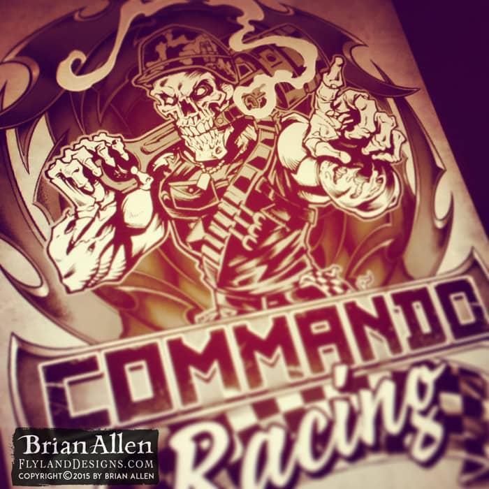
I created this mascot and logo design for a team of drag-racer’s new line of merchandise and apparel. The client wanted a tough, dark, militant mascot character that could later be drawn in other situations and shenanigans. We went through a few sketches at the beginning that were a bit too light, and eventually arrived at RAD, the skeletal, drag-racing warrior you see before you! The mascot and logo was prepared for both limited color silk-screening and full-color printing, to maximize the usage.
To see more of my work, or hire me for freelance projects, please visit my website: www.flylanddesigns.com
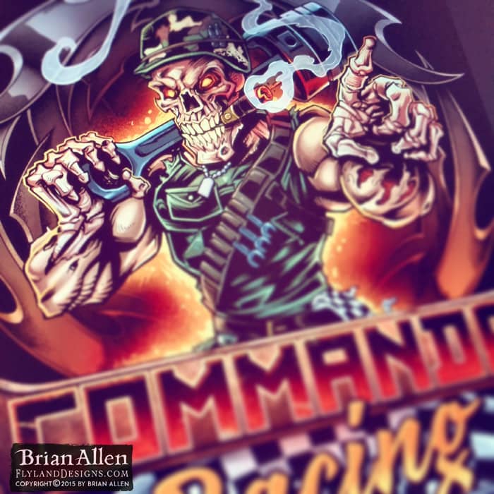
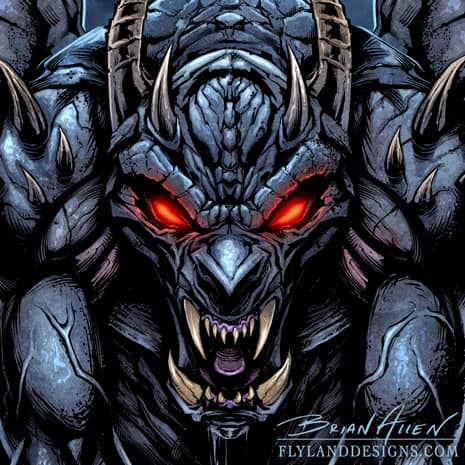
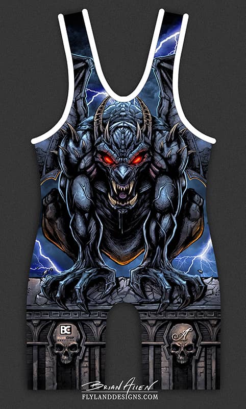

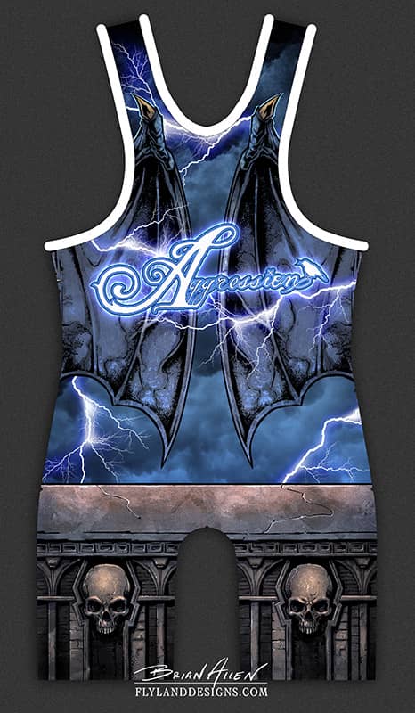
Bluechip Athletics hired me to design and illustrate graphics for their Aggression apparel line for wrestlers. The first design was this evil gargoyle perched on a rooftop in a storm. Since the wrestling singlets are printed with dye-sublimation, I could design in full-color, and cover every inch of the fabric.
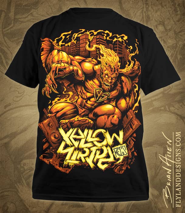
I was recently hired to design a new T-Shirt for the Yellow Stripe Records brand in Portugal. After working with a couple of concepts, we decided on the idea of having a Superhero has gone mad, and destroyed the city he once he protected. Deep! He’s crouched on a pile of wrecked keyboards, speakers, and dj equipment.
This t-shirt was set up for silk-screening, using three colors.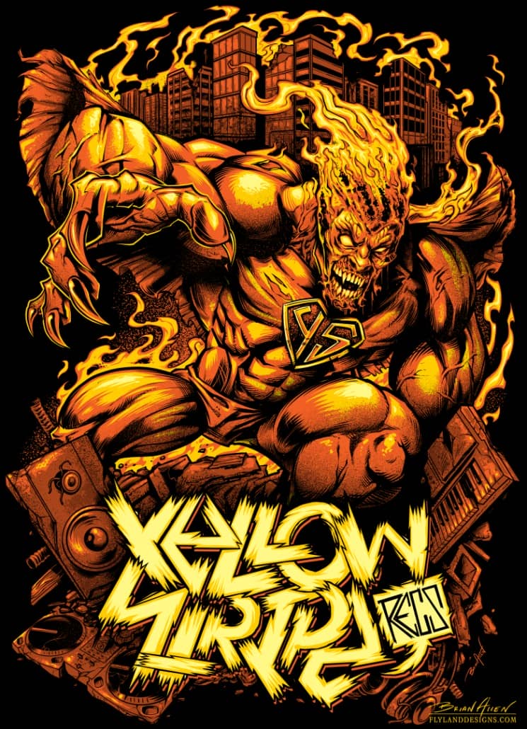
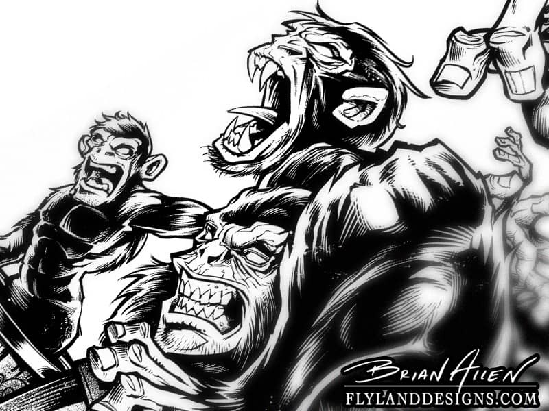
I was hired to create a T-Shirt design for a new apparel brand called Saltopus. I was given only the direction that it had to include angry monkeys. I illustrated a few concept sketches, and the client chose this concept, of evil monkeys emerging from an innocent looking Barrel of Monkeys toy. The shirt was designed to be just one-color, which always poses a challenge. Since I have no highlight or shading color, I really have to pack a lot of detail into the lineart and make sure it reads well from a distance. We are both very happy with how this turned out.




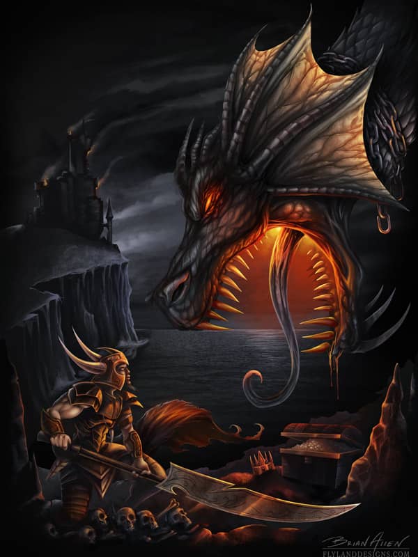
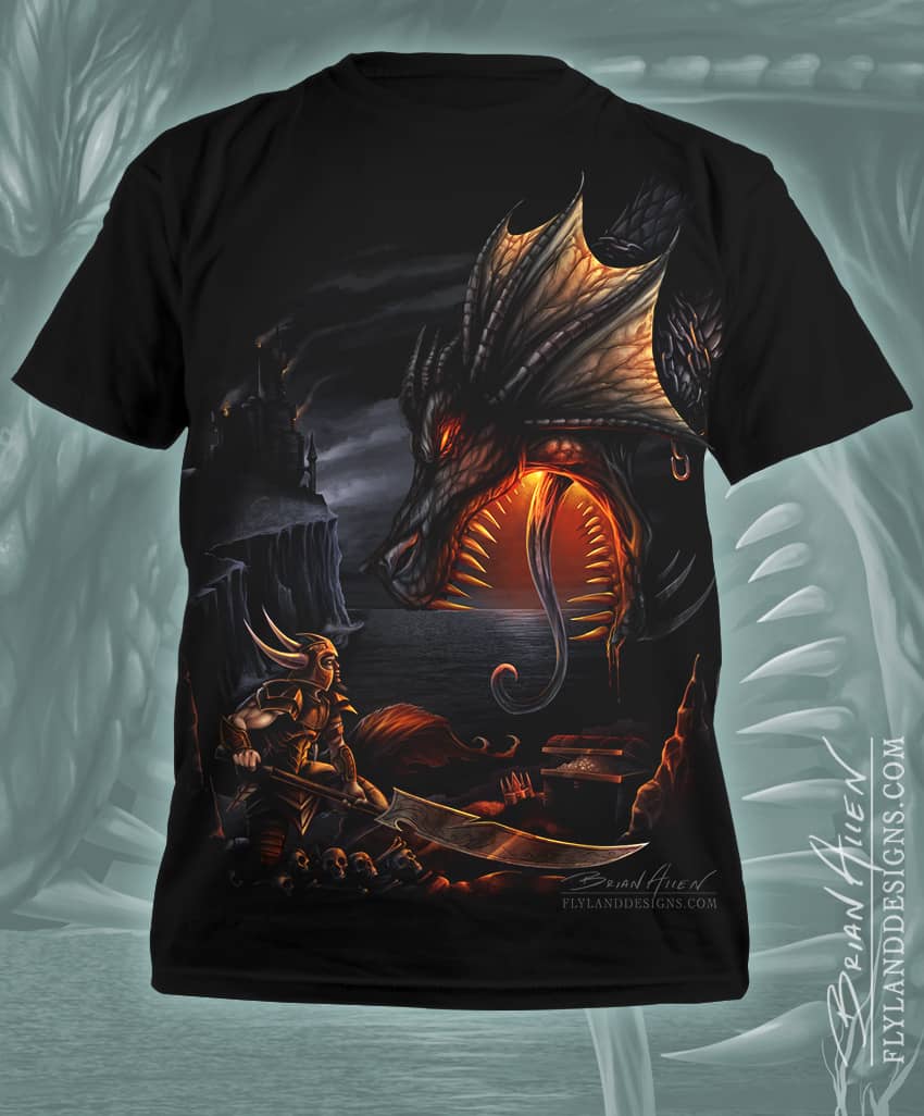
T-Shirt illustration I created for Spiral Direct of a warrior confronting an evil dragon. I digitally painted this illustration in Adobe Photoshop and Manga Studio 5. This piece was very challenging for me, because of the complex lighting. The client and I went through several revisions, which in the end really improved on the piece. Available from Spiral Direct.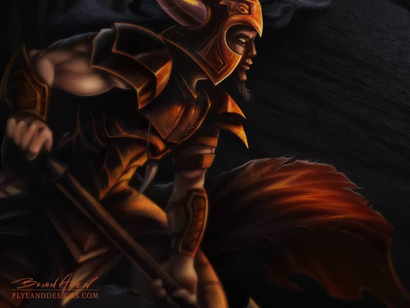
T-Shirt design I created of a mushroom cloud shaped fire skull for Nuke Proof Tools. The image will be used on banners and T-Shirts for the company’s tradeshows and events. The client had seen a mushroom cloud skull design I did years ago, and wanted something similar. It was fun to go back and work on the same concept, and have the chance to make imrpovements.


Morbid Industries
I was hired by Morbid Industries to sketch concepts for new horror masks they will be producing and distributing in Halloween stores this season. The sketches will be used by the scultpors as reference to create the masks. This was a really fun project because the art directors gave me a lot of freedom in creating the creatures.
