I created this custom YouTube banner of the mythical Pandora’s box for a political channel out of the UK, discussing potential economic and political disasters (fun!).
The client wanted something really dark and mysterious, and hand-illustrated, to differentiate himself from similar channels.
Fantasy children’s book I illustrated for author Darius Walker about a family that rides a magical pirate ship bed into a strange world.
This was probably my favorite children’s book to date, because it’s strange and surreal tone really lended itself perfectly to my quirky illustration style. It’s not often that I can illustrate monsters, robots, and pirates in the same book!
https://er97682op5r.exactdn.com/wp-content/uploads/17-Low-Res.jpg?lossy=1&ssl=1800626Brian Allenhttps://er97682op5r.exactdn.com/wp-content/uploads/FlyLand-Designs-Web-Logo.pngBrian Allen2018-08-11 09:15:262023-06-13 17:53:37Magical Fantasy Imaginative Children’s Book Illustrations
Young-adult fantasy book cover I illustrated for author Charon Dunn, illustrating a scene from the book where a school is attacked, and the main characters and mech-suited police officer react in horror.
“Flatting” a piece consists of coloring the basic shapes of the illustration in random, unique colors to differentiate the different elements from each other in order to make quick selections when coloring.
Once finished, you set this Flats layer as a Reference layer in Clip Studio Paint.
Using reference layers makes coloring much faster, because you can use the magic wand tool to select quick masks of certain areas, without having to switch the layer you are working on.
Create a Color Comp
I always experiment with color BEFORE I begin working on the final piece.
Duplicate your document and reduce to 72 dpi.
Gather reference of great color schemes and environments for inspiration.
On a layer set to overlay above all other artwork, experiment with different color schemes.
Quickly (for just about 15 minutes) use a large soft airbrush to block in colors.
Don’t worry about staying in the lines or coloring small portions of the illustration. Just focus on making color choices for the most important parts of the illustration.
Because the image is small, and because you are being very loose and rough, this encourages you to take risks and experiment with color schemes you may not have considered.
Once you’re happy with a color scheme, save the document as a flat jpg.
Load the color scheme into Clip Studio Paint’s SubView pallette.
This will now be a handy pallette you can use when coloring the real thing.
Colors
SETUP
Open up your original document.
Resize your main illustraiton to 300 dpi (previously set at 600 dpi for inking).
Duplicate your Flats Layer and name it Colors (this is the layer you actually paint on), and keep it below your Line Art layer.
Make sure Lock Transparency is turned on to prevent you from painting outside of the layer area and onto the background.
Fill the Colors layer with one solid color
Usually I like to use a desaturated blue with a neutral value.
You don’t want the random colors you used for Flatting to distract you.
Color in background with a solid color behind all other layers.
COLORING
Rough in background colors
It’s important to block them in, because it sets the tone and contrast for the figure.
I used my custom textured watercolor brushes to fill in the background quickly.
Block in colors on character
Attack the Local Colors first. Objects with a Local Colors are things such as an apple, which is generally accepted to be red when shown in white light. Local Colors will still be influenced by the color of the lighting, but identifying them early can help calibrate the color balance of your piece.
Put in large gradient color fades to areas that fade from one color to another.
Use a large soft brush or the gradient tool to put in large color transitions in the piece.
I like to use a soft brush with a little texture in it, so that the color transition blends look more natural.
Add hard edged cast shadows
Set new layer above Colors layer, and set to Multiply
Paint with a very desaturated, light value purple/blue color to paint the hard shadows.
Follow the lineart, and add volume to the forms by hugging the edges with your brush.
Don’t introduce a lot of rendering information at this point. Just paint in some of the midtones – let the line-art do the work for you and just compliment it.
Use hard-edged brushes when cast shadows are more intense.
Add Highlights
The illustration at this point should look rendered, but a little dull and desaturated and a bit flat.
The highlights and rim lights will do the final rendering, and help tell the viewer what to look at.
Zoom in a bit closer now
Merge the Multiply Shadows layer down with the color layer
We will be painting over top of the shadows.
Always be mindful of the direction and color of the lighting.
Use the “Lasso Cut and Gradient” method to color sharp, high-contrast areas.
Make a selection with the lasso tool, and use a soft brush to paint inside that area.
The brush should be touching one edge of the marquee, but the fade should not touch the opposite end.
Add Rim Light around the edges of the figure.
Create new layer above color and line-art
The rim light will be a slightly darker, desaturated shade of the color of the lighting itself
Start with a soft brush around the edges of the form, and then use a harder edged brush with a brighter highlight along the edge.
Finish background
Keep it blurry and less sharp than the foreground figure.
Create glow effects
Add separate layer on top of all artwork and set layer to Screen Blending Mode.
Punch up selected areas of the piece that need to be brighter and in focus.
Use a darker, desaturated color when doing this, and press very softly so you don’t blow out the area and make it too bright.
Lineart Knockouts
“Knockouts” are when you color parts or all of the lineart so it isn’t just black.
This is a really effective way to make areas appear brighter and to make the piece as a whole appear less flat.
Set your line art layer to Lock Transparency to prevent you from painting outside of the lineart.
Find the areas closer to the lightsource, and color the line art with a darker version of that color.
Especially effective on background elements that you want to appear some distance away.
Add Texture
To add character to the piece, use grungy brushes and textures on a layer set to screen, multiply, or overlay (depending on the piece) and lightly paint textures in some areas.
Adjust colors
Take a step back and make final tweaks to the color scheme if needed
Make slections with your Flats layer, and use Edit>Tonal Correction> Hue/Saturation to adjust colors.
Add Atmospheric Effects
Create a new “Effects” layer above all others.
To add even more depth to your piece, find areas of your figure that would be farther back, and lightly paint over them with the color of the background.
This creates the illusion that more atmosphere is between you and the object, and pushes it into the background, similar to the way mountain ranges appear to have less and less contrast as they go back farther into the distance.
And we’re done!
Thank you so much for following my tutorial. If you have any questions, please feel free to comment on my YouTube videos.
https://er97682op5r.exactdn.com/wp-content/uploads/16x9-Video-Frame_0000_Color.jpg?lossy=1&ssl=110801920Brian Allenhttps://er97682op5r.exactdn.com/wp-content/uploads/FlyLand-Designs-Web-Logo.pngBrian Allen2016-11-08 16:34:212016-11-08 16:34:21Tutorial 3 of 3 – How To Color Artwork in Clip Studio Paint (Manga Studio 5)
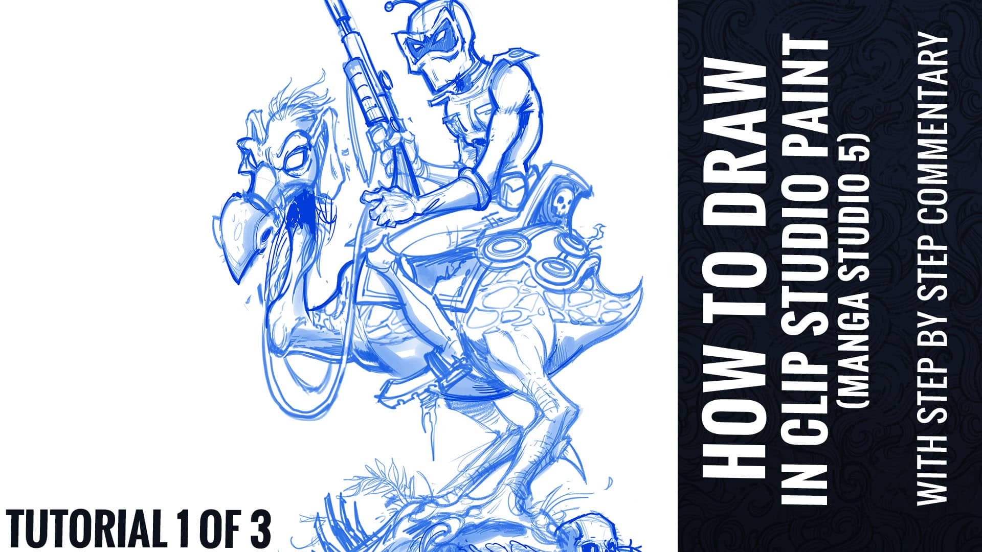
For this tutorial, I decided to create a tribute illustration to one of my favorite animated movies, Wizards by Ralph Bakshi. I chose to illustrate the iconic poster from the movie, featuring the character Peace. I thought a rendering my own stylistic approach to an existing piece of artwork would be a great vehicle for a tutorial, because the foundation has already been set, and we can focus instead on the technique.
Ralph Baksi’s original classic poster art.
Tribute illustration we will be creating in this tutorial.
TUTORIAL 1 0f 3 – PENCILING
Document Setup
I set up most documents at 300 dpi 20×20.
It’s very important that anything you are hoping to print be set up at 300 dpi. 72 dpi will print out pixelated, and will get too distorted if you ever need to increase the size.
Create a New Window and shrink it to about 25% the size of your main window.
This is a smaller live preview of your image that will help you keep an eye on your composition as a whole.
VIEW>ROTATE/INVERT>Flip horizontal window.
This will help you spot errors by having a view of your illustration mirrored.
Better than photoshop because you’re not actually flipping the artwork, just the view of it, without m
Set up separate layer groups for the sketch, pencils, inks (with pre-made action)
Encourages me to take the time to rough and plan the piece first
The Layer Color effect of each group is set to magenta, non-photo blue, and black respectively, so everything I draw in those layers will appear as that color.
TOOLS
Full list of tools https://www.flylanddesigns.com/faq-for-artists/
Wacom Cintiq 24HD
iMac 5K 27”
Nostromo Razer Gamepad
For keyboard shortcuts
Gather Reference
Do plenty of research before you start drawing
Especially technical items that you may not have drawn before
Getting them right adds a lot to your piece
Do research on settings, environments, and lighting
Gather inspiration for color schemes and styles
You often won’t take essential risks unless you see that it’s been successful in another piece
Encourages you to try things you wouldn’t have otherwise
Reference is a tool
Don’t become overly dependant on it, but don’t go without it either.
Do not copy – use only for inspiration
Drawing the Thumbnail sketch
Stay way zoomed out
This will help you focus on just the overall shape of the design and avoid getting sucked into detail work
Focus on skeletal structure and main shapes
Make sure that your figure has a strong sillhouette
This means, if your character was filled entirely with black, you should still be able to differentiate it’s parts, and it should look interesteding. If it looks like a big blob, you may need to make adjustments.
Pencils
Turn your thumbnail opacity down
Begin drawing in the Pencils Layer group
Flesh out the details and shapes, making sure to use a lot of circles and curved strokes.
This drawing can still be really rough – main details will be accomplished in the inking stage.
Don’t focus on the style of the lines yet, or line weights – just focus on the outlines of the different shapes.
Once you have cleaned up your pencil drawing and constucted the main shapes, go in with hard pencil and clean up details
You do not need to trace over everything – just the focus points that need work.
This drawing is only a guid to help you in the inking stage. So you can skip over parts that you think you can handle confidently in the ink stage.
Shading layer
Quickly rough in the mid tones with a broad shading brush on a layer above set to Multiply.
https://er97682op5r.exactdn.com/wp-content/uploads/16x9-Video-Frame_0002_Pencil.jpg?lossy=1&ssl=110801920Brian Allenhttps://er97682op5r.exactdn.com/wp-content/uploads/FlyLand-Designs-Web-Logo.pngBrian Allen2016-11-03 12:59:082018-05-03 11:27:47How To Draw in Clip Studio Paint (Manga Studio 5) Tutorial Part 1 of 3 – With Full Commentary
A fantasy author hired me to create this book cover illustration of his characters for his youth fantasy series of the Green Knight.
I love the challenge of designing characters from just a brief outline of a story.The client asked me to create this in a softer pencil and digital painting style which is pretty different from my line-art driven style.Real happy with how this turned out.
https://er97682op5r.exactdn.com/wp-content/uploads/Childrens_Book_Fantasy_Cover4-Low-Res.jpg?lossy=1&ssl=1700700Brian Allenhttps://er97682op5r.exactdn.com/wp-content/uploads/FlyLand-Designs-Web-Logo.pngBrian Allen2016-09-12 11:23:042016-08-30 12:44:51Green Knight Fantasy Book Cover
Young-adult fantasy book cover I illustrated for author Charon Dunn, featuring a collection of steam-punk inspired dystopian characters.The cover illustration shows the heroes making an escape as their ship is attacked by a fleet of mechanized mutant jelly-fish.
This is a book cover I created for a series of fantasy/horror novels featuring a the strong female lead Allison Hewitt. She goes on adventures slaying zombies with her trusty hatchet. The cover was really fun to work on, because the author loved my style and wanted the cover to have a pop art/ serial horror magazine look.
I wanted to create a an illustration as a sample to try to get work from young-adult fantasy book publishers, a market that I’d like to do more work in. I chose a scene with an adventurer in an Aztec-like jungle temple so I could draw some funny and creepy totems – and I even got to sneak a skull in there too! I like to try different styles and themes whenever I can – keeps things from getting stale. I’m happy with how this turned out, and would like to do more in this genre.
I wanted to create a an illustration as a sample to try to get work from young-adult fantasy book publishers, a market that I’d like to do more work in. I chose a scene with an adventurer in an Aztec-like jungle temple so I could draw some funny and creepy totems – and I even got to sneak a skull in there too! I like to try different styles and themes whenever I can – keeps things from getting stale. I’m happy with how this turned out, and would like to do more in this genre. To see more of my work, or hire me for freelance projects, please visit my website: www.flylanddesigns.com
I was hired by Strange Kids Club Magazine to illustrated a promotional poster featuring characters from their upcoming magazine. I loved every second of working on this. If you’re strange like me, and born in the 80s, then I don’t need to explain what’s going on here. The concept revolved around a fictional character called Bronarr, Space Barbarian (!) – loosely based on 80s Saturday morning cartoons like Masters of the Universe, as well as camp classic 70s retro sci-fi/fantasy films like Hell Comes To Frogtown.
Client Testimonial:
Simply put, you nailed it!
-Rondal Scott III
Strange Kids Club Magazine, owner
You can view a video of the inking process here:
I was hired by Strange Kids Club Magazine to illustrated a promotional poster featuring characters from their upcoming magazine. I loved every second of working on this. If you’re strange like me, and born in the 80s, then I don’t need to explain what’s going on here. The concept revolved around a fictional character called Bronarr, Space Barbarian (!) – loosely based on 80s Saturday morning cartoons like Masters of the Universe, as well as camp classic 70s retro sci-fi/fantasy films like Hell Comes To Frogtown. To see more of my work, or hire me for freelance projects, please visit my website: www.flylanddesigns.com
T-Shirt illustration I created for Spiral Direct of a warrior confronting an evil dragon. I digitally painted this illustration in Adobe Photoshop and Manga Studio 5. This piece was very challenging for me, because of the complex lighting. The client and I went through several revisions, which in the end really improved on the piece. Available from Spiral Direct.
https://er97682op5r.exactdn.com/wp-content/uploads/Spiral-Direct-Dragon-Revised-Thumbnail.jpg?lossy=1&ssl=1772768Brian Allenhttps://er97682op5r.exactdn.com/wp-content/uploads/FlyLand-Designs-Web-Logo.pngBrian Allen2014-11-10 11:42:392014-10-10 11:47:15Evil Dragon and Knight T-Shirt Design for Spiral Direct
Cover illustration I created for a work of fiction by Jan Ferrigan for young readers. The story is about a group of young adventurers trekking through the national parks, meeting magic creatures along the way.