
© Brian Allen 2020


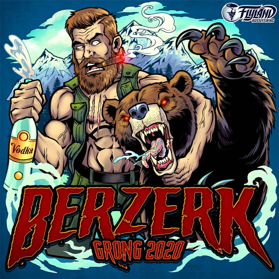
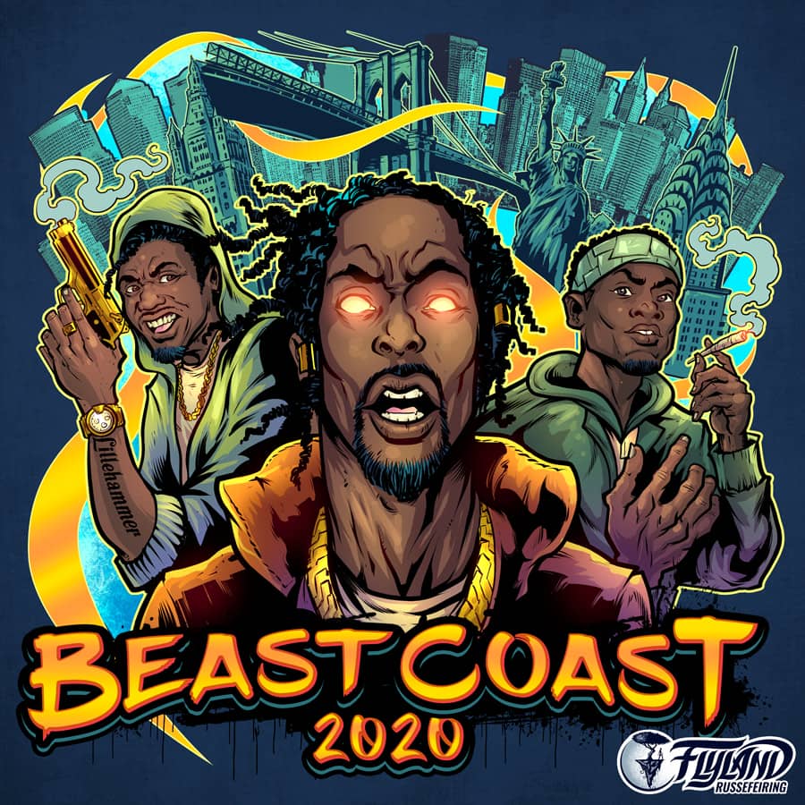
This was a logo I designed for a Russ group featuring Beast Coast an American Hip Hop group that is based out of Brooklyn, New York.
The design was for apparel and a vehicle wrap for the russefeiring tradition. If you haven’t heard of it, basically russefeiring involves an entire class of Norwegian students renting a bus (a Russebuss), painting every inch of it with really cool street art, and then partying in it night and day for an entire month during graduation. The different classes wear their designs ever where they go as they clash with rival classes. I’ve done a bunch of these now, and really enjoy it. To see more of my work, or hire me for freelance projects, please visit my website: www.flylanddesigns.com
Astrothunder was a logo I design for a Russ group featuring an eagle flying through a galactic storm with its talons stretched out.
The design was for apparel and a vehicle wrap for the russefeiring tradition. If you haven’t heard of it, basically russefeiring involves an entire class of Norwegian students renting a bus (a Russebuss), painting every inch of it with really cool street art, and then partying in it night and day for an entire month during graduation. The different classes wear their designs ever where they go as they clash with rival classes. I’ve done a bunch of these now, and really enjoy it. To see more of my work, or hire me for freelance projects, please visit my website: www.flylanddesigns.com

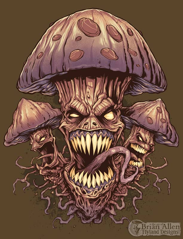


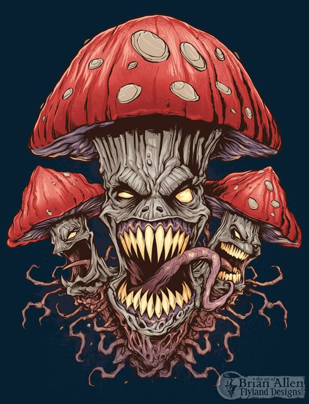
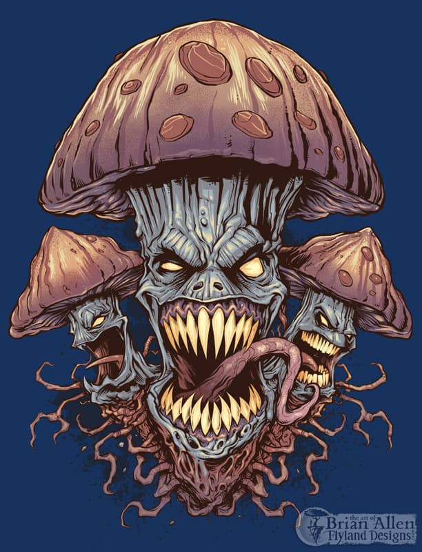
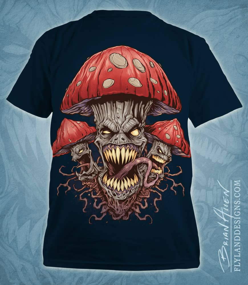
T-Shirt illustration of a pack of wild and evil mushrooms I created for a new apparel brand. I illustrated this in Manga Studio and colored it in Adobe Photoshop. Set up for silk-screening, using four colors.
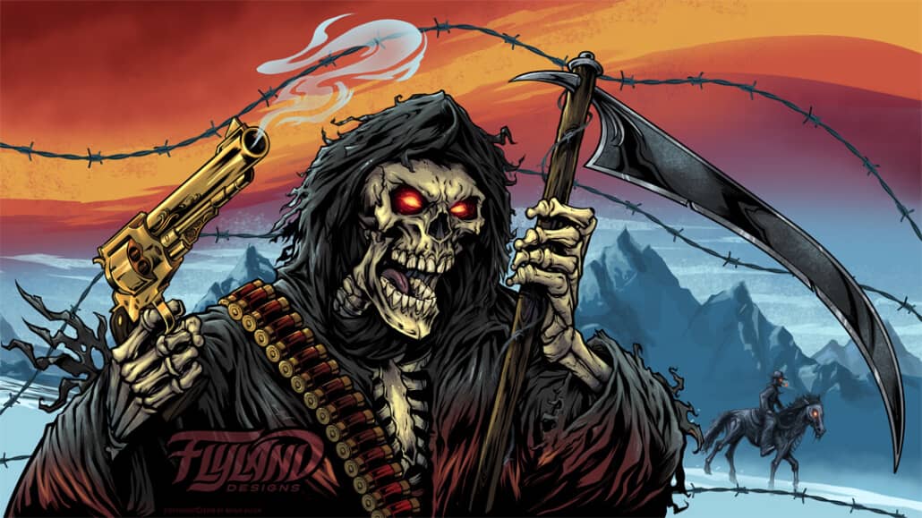
An undead gunslinger with a cigar glares behind the smoke of two pistols.
This artwork is available for licensing at https://www.flylanddesigns.com/licensing/
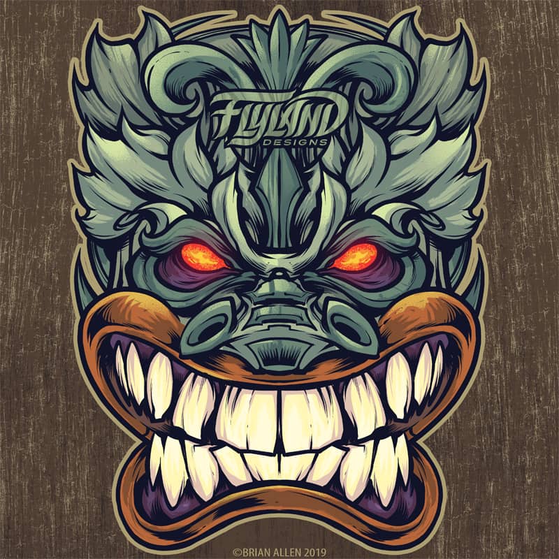

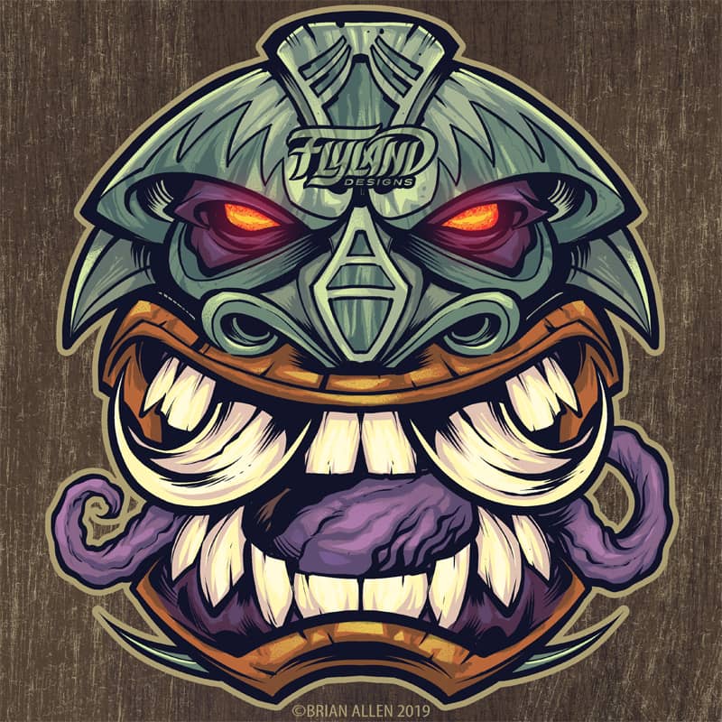

Various tiki totem designs in
This artwork is available for licensing at https://www.flylanddesigns.com/licensing/
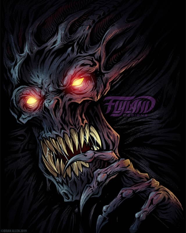
A horrifying creature emerges from the dark, his talons razor sharp and eyes bright.
This artwork is available for licensing at https://www.flylanddesigns.com/licensing/
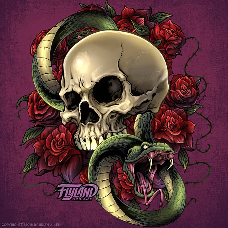
A skull with a snake and roses in the background.
This artwork is available for licensing at https://www.flylanddesigns.com/licensing/
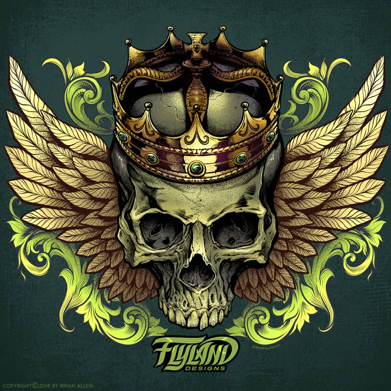
Crowned Skull with Wings.
This artwork is available for licensing at https://www.flylanddesigns.com/licensing/

A skull with roses and wings.
This artwork is available for licensing at https://www.flylanddesigns.com/licensing/

The infamous Medusa from Greek mythology dons a
This artwork is available for licensing at https://www.flylanddesigns.com/licensing/

Military zombies on board a helicopter battle on even after death. Explosions rain down from the sky.
This artwork is available for licensing at https://www.flylanddesigns.com/licensing/
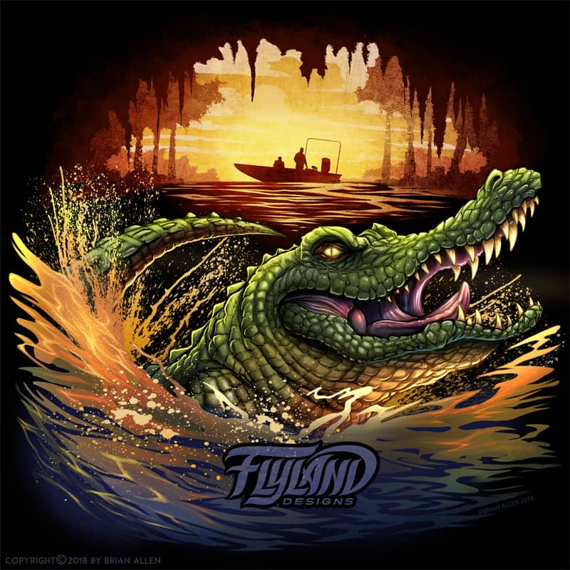
A ferocious alligator in the deep swamps– a fishing boat is in the background against a hazy sunset.
This artwork is available for licensing at https://www.flylanddesigns.com/licensing/
Client:
Personal
Description:
A marijuana pot leaf, but each branch of the leaf is made up of a different entity, such as a skull, tentacles and wings.
This artwork is available for licensing:
Client:
Dominic Boshell – 2BC Sports
Description:
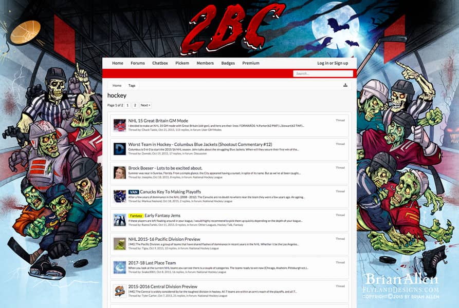
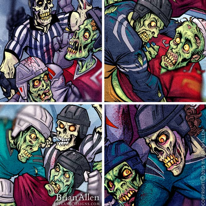
Hockey fight of ghouls and zombies for a halloween themed website background I illustrated for 2BC Sports’ website. I was recently hired to modify a previous illustration I had made for the website’s background – changing all the characters from normal human hockey players to zombies, to celebrate the halloween season. The client wanted a detailed illustration of a huge hockey fight in an arena. The illustration was set up so that the different hockey players and refs in the brawl could move along with the content of the site, independently of the background. I created the artwork in Manga Studio, and colored it in Adobe Photoshop.
Client Testimonial:
Thank you for an awesome job once again!
-Dominic Boshell
Owner, 2BC Sports
You can view the website here:
http://2bcsports.com/
Client:
Adrenaline Vapors
Description:
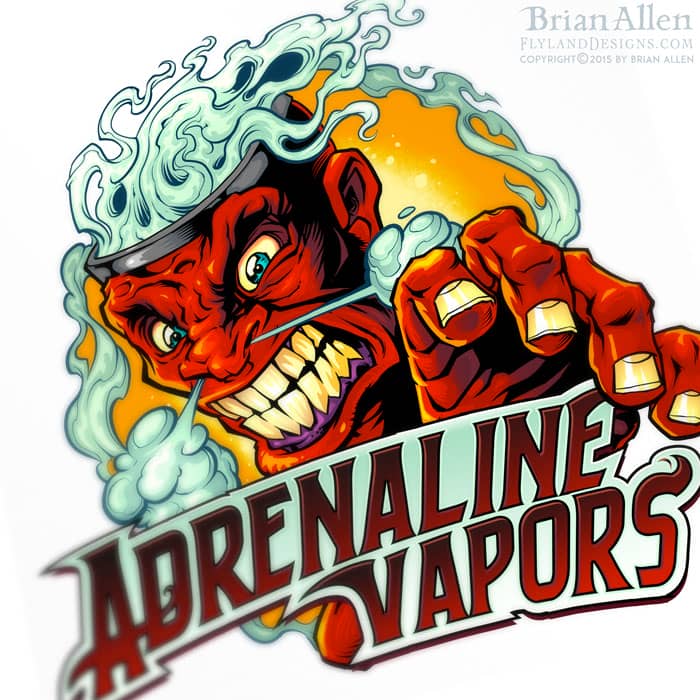
Mascot and logo design of a big angry face for packaging design I created for the vaping eJuice brand, Adrenaline Vapors. My client contacted me with only the name of their business established, , and wanted an identifiable mascot and logo that could be printed on packaging. I provided a series of rough sketches, moving forward with this concept of an angry face with smoke coming from his head. After several color iterations, the client chose this color scheme which they thought showed up really nicely on the packaging.
Client Testimonial:
People love the artwork you did for me! Thank you again. I couldn’t be happier!
-Adrenaline Vapors
Position

Client:
Arian Assadi
Description:
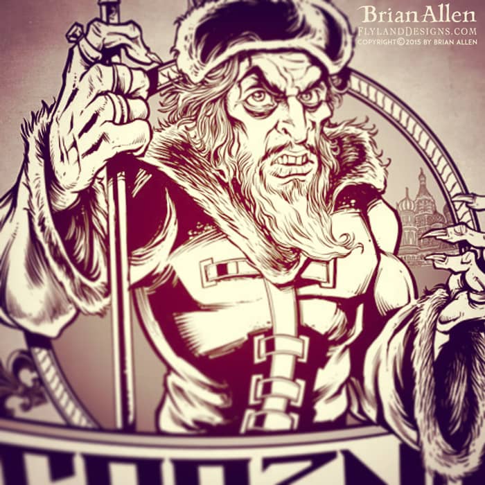
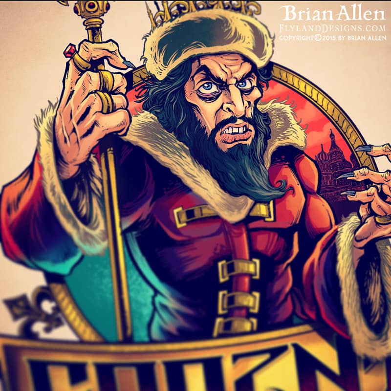
Character design of Ivan The Terrible I created for a Russ Bus logo for apparel and a vehicle wrap. If you haven’t heard of Russefeiring, basically it involves an entire class of Norwegian students renting a bus (a Russebuss), painting every inch of it with really cool street art, and then partying in it night and day for an entire month during graduation. The different classes wear their designs ever where they go as they clash with rival classes. It’s cool to be a part of it, in the best way I know how!
Client:
Bar Rags
Description:
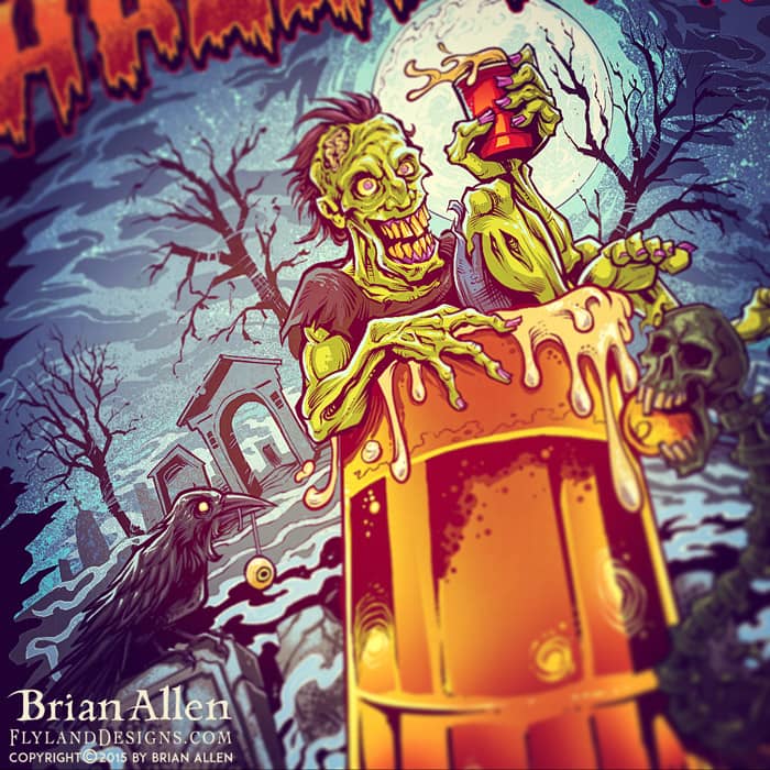
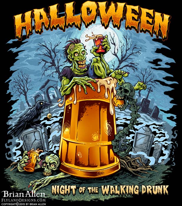
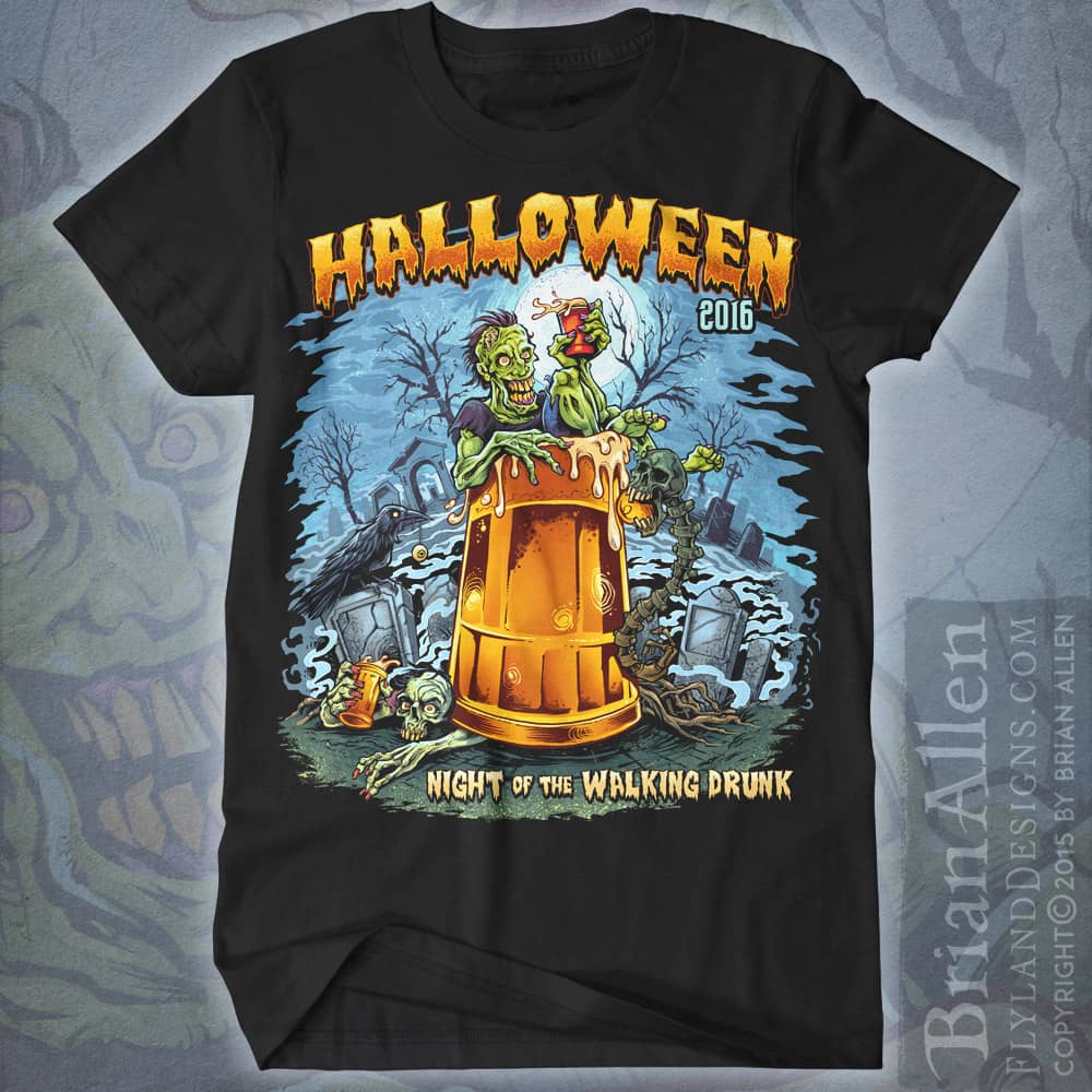
T-Shirt design I create for Bar Rags, featuring a drunk zombie lounging inside a giant beer mug in a graveyard, titled “Night of the Walking Drunk.” I had a lot of fun with this design, playing with a creepy, but light-hearted style. We created this just in time for their halloween catalog.
This design is available for licensing (for uses other than apparel):
Client:
Bogardpress
Description:
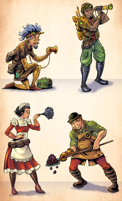
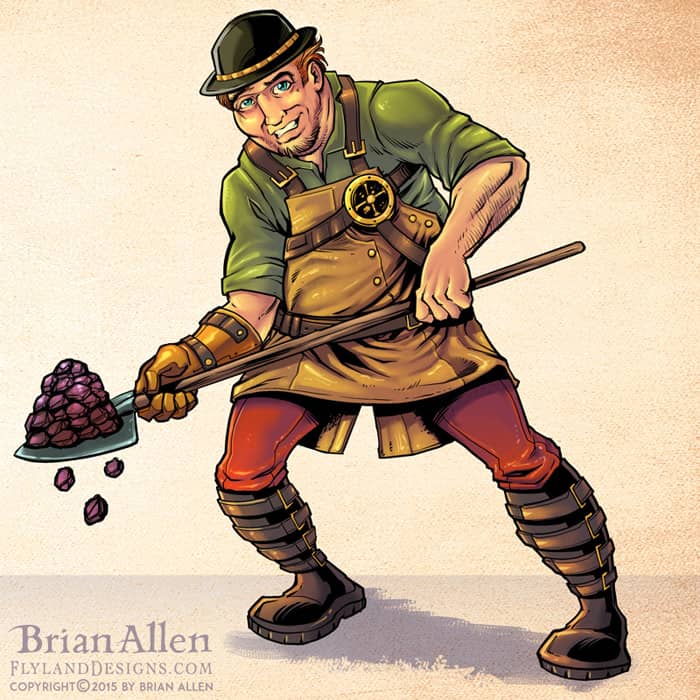
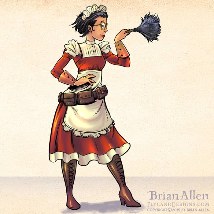
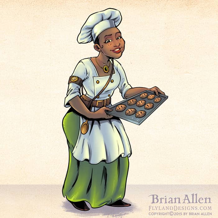
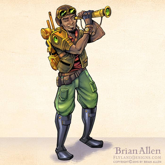
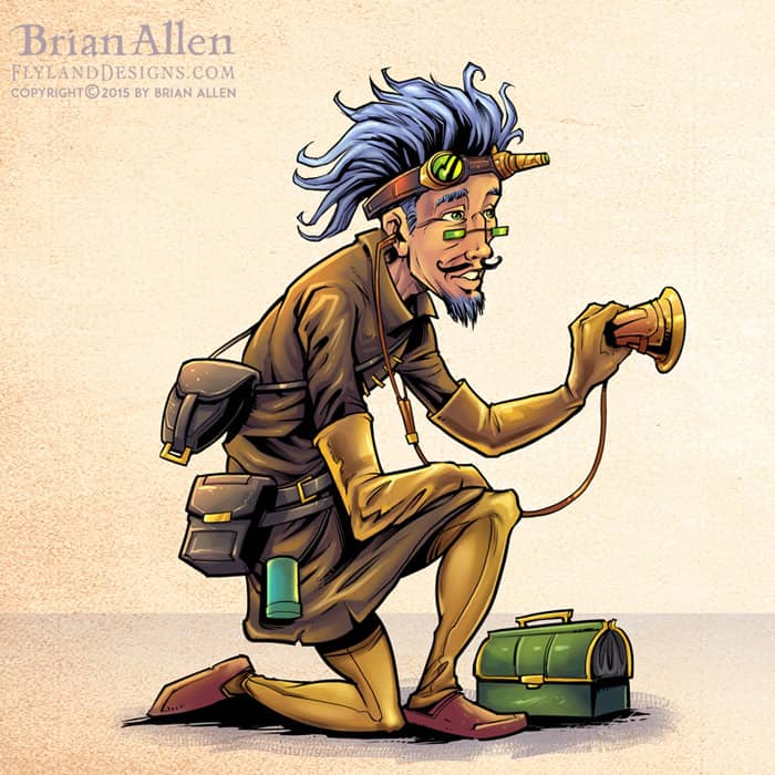
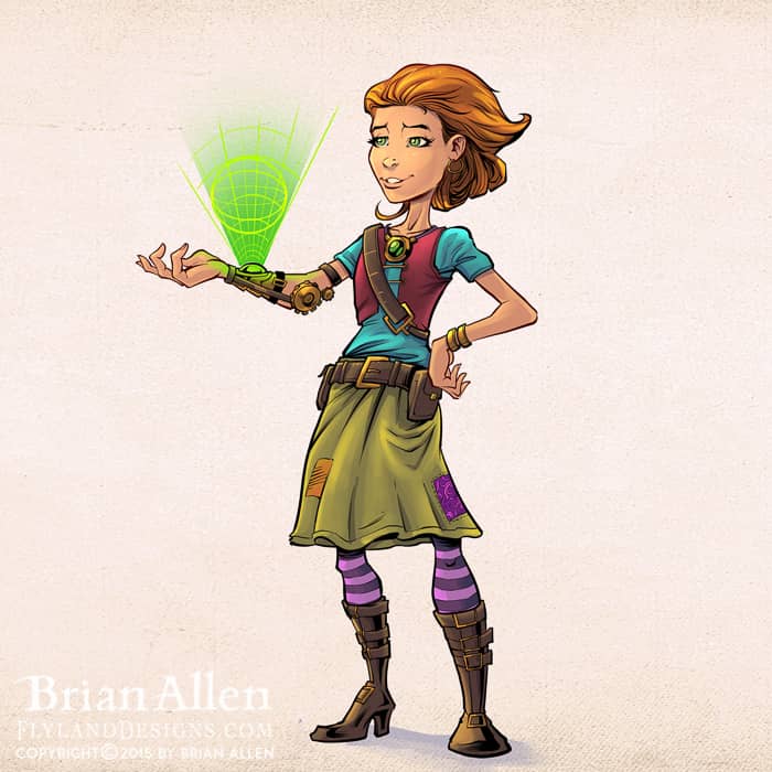
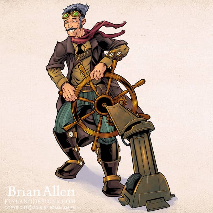
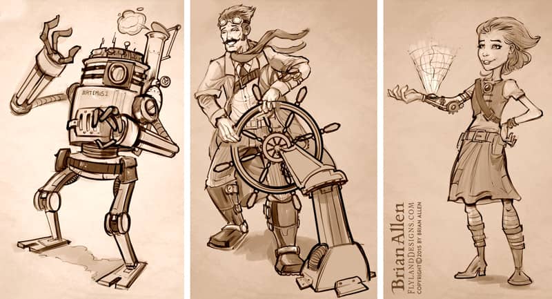
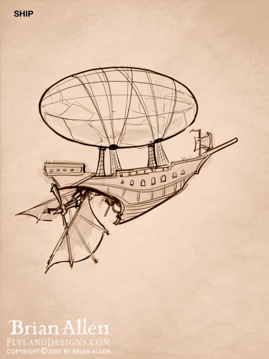
I created these concept illustrations of a steampunk family of adventurers for an educational publisher called Bogardpress. The character designs will be used to illustrate their educational materials and lessons. Each year the team uses a different theme and concept to tie their lessons together. I really enjoyed the whole process, from developing the characters in sketches, to coloring and rendering the final versions. I tried to add a bit of style into the characters to keep them from becoming generic. I especially enjoyed creating the robot character.
Client Testimonial:
Everyone was very happy with what you have done. Very impressed.
-Shawn Blase
Bogardpress
Client:
Bryce Anderson
Description:
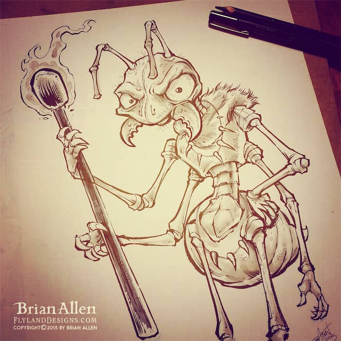
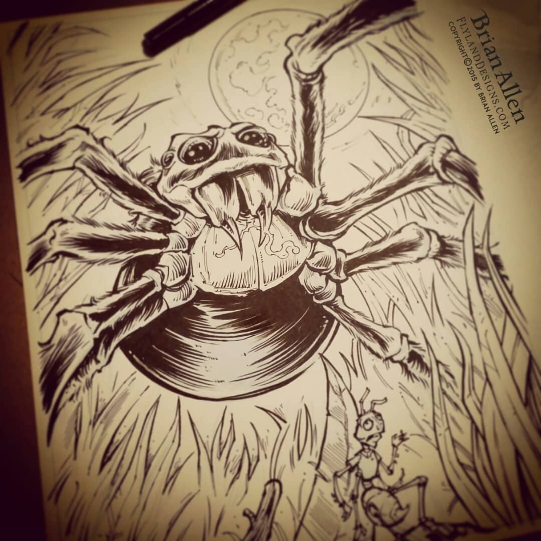
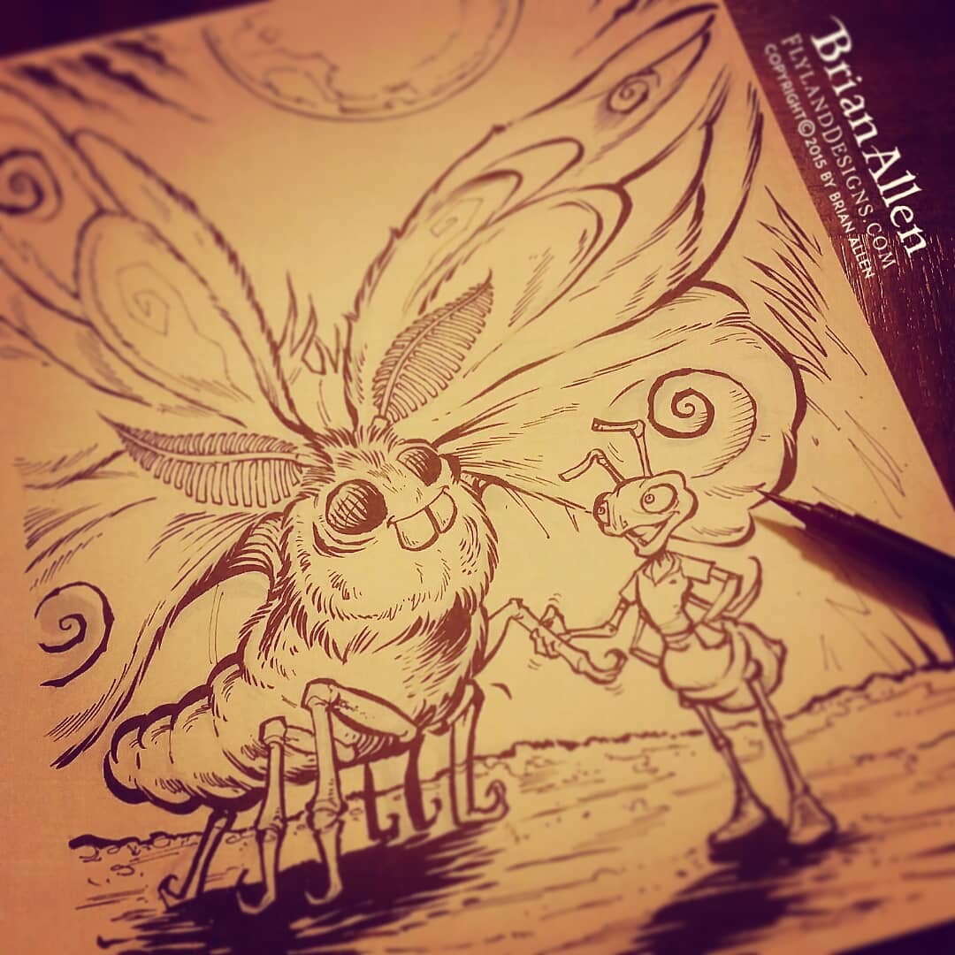
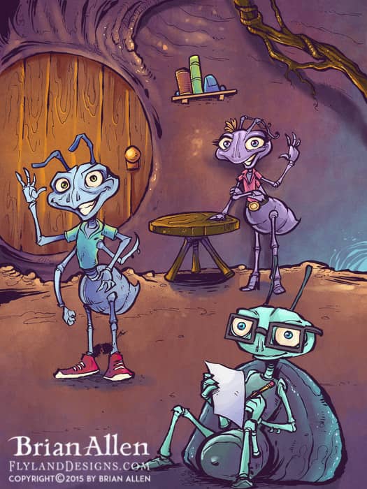
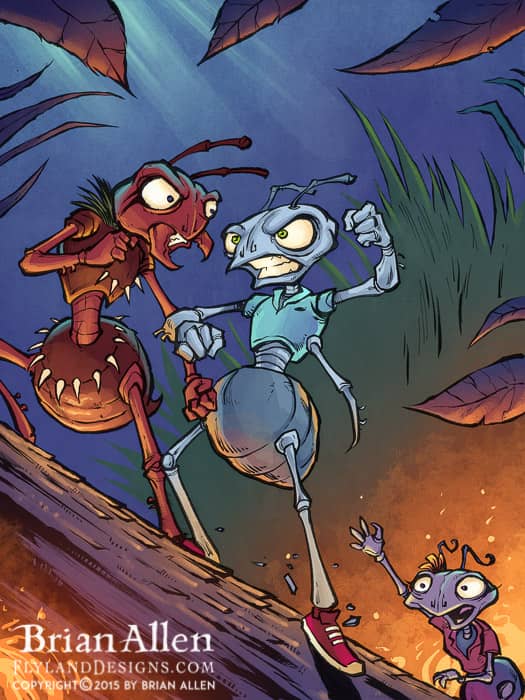
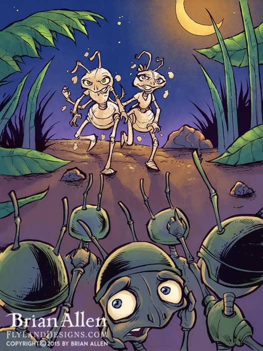
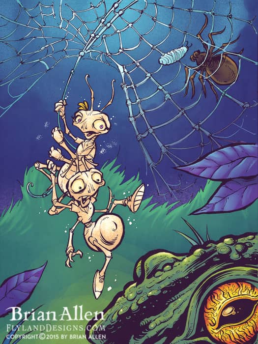
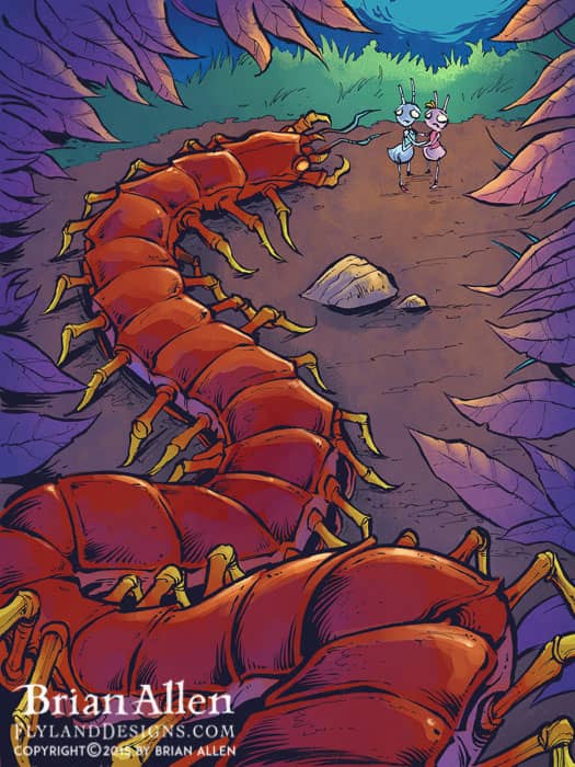
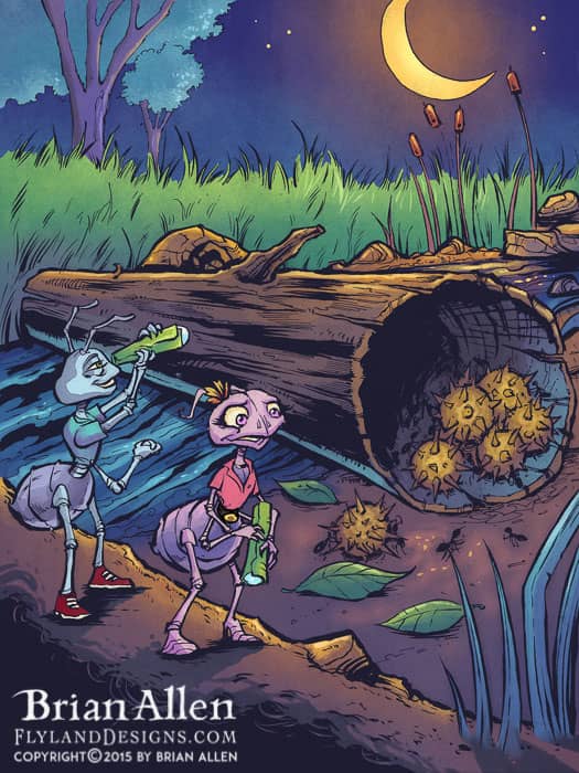
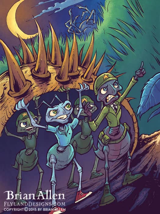
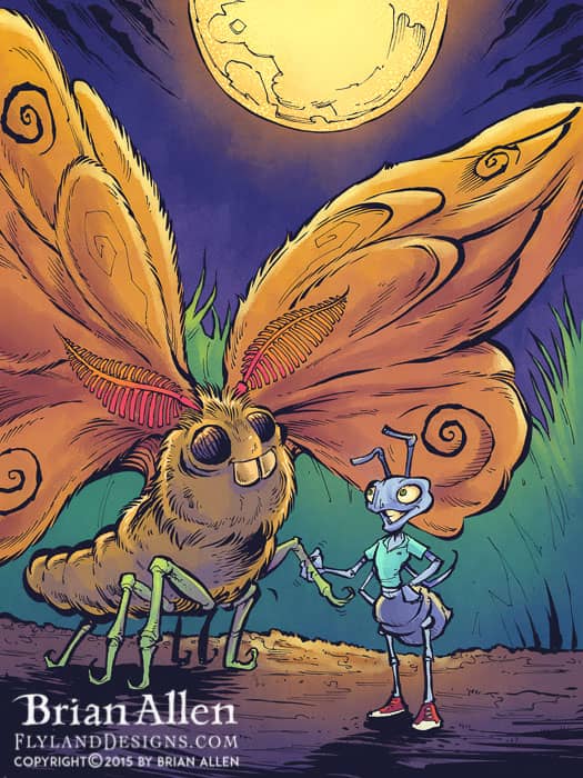
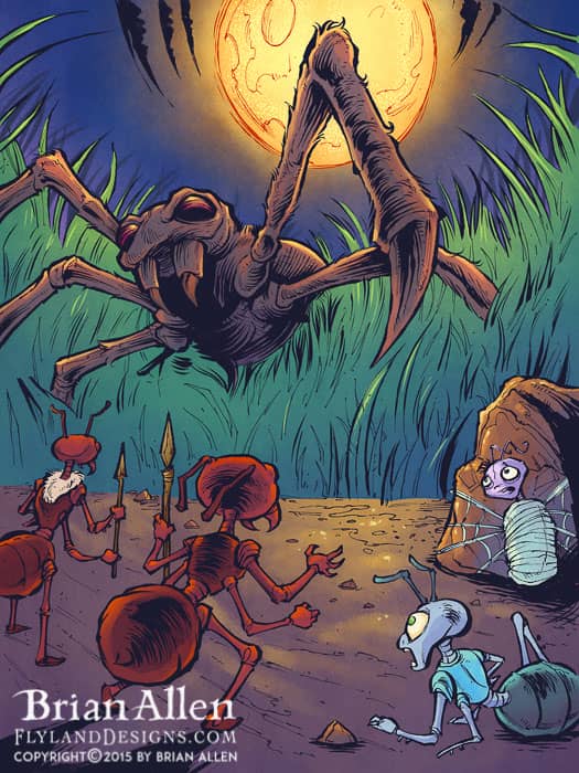
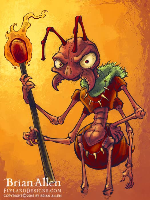
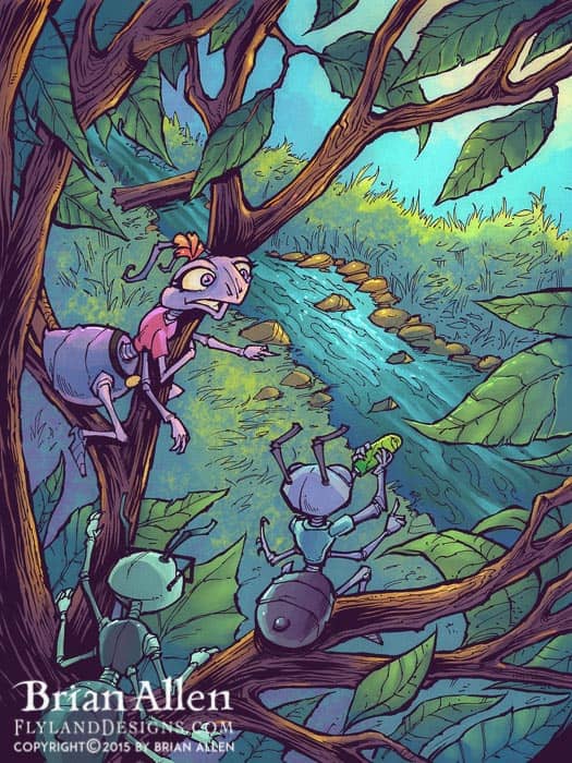
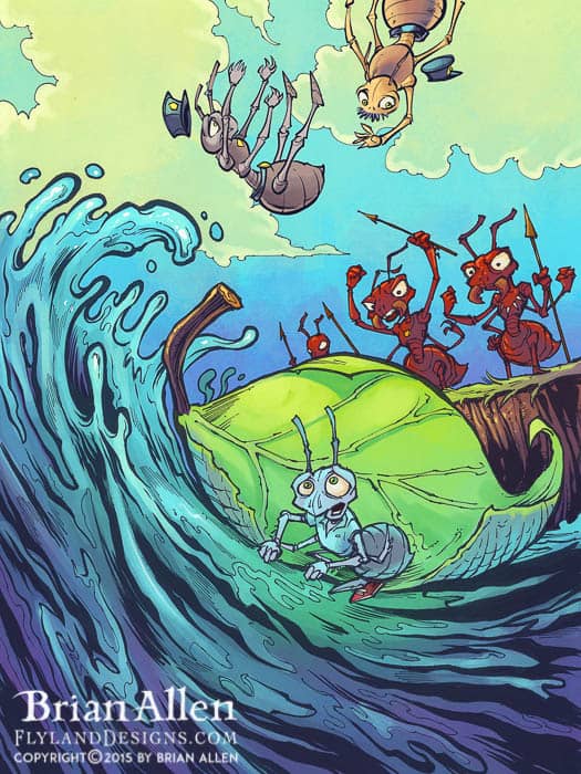
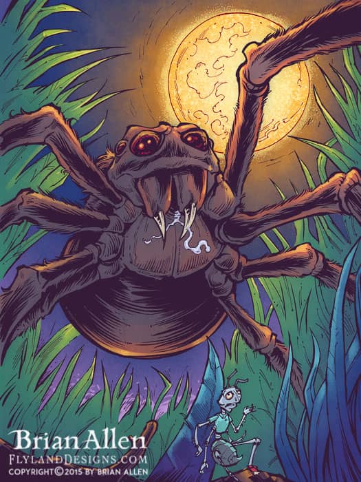
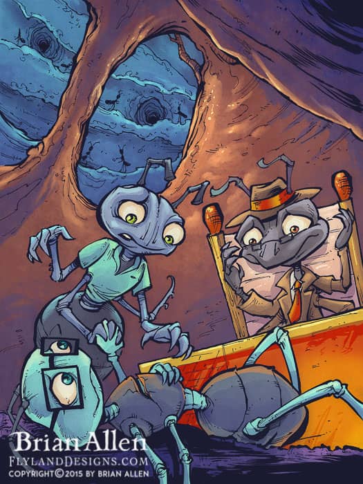
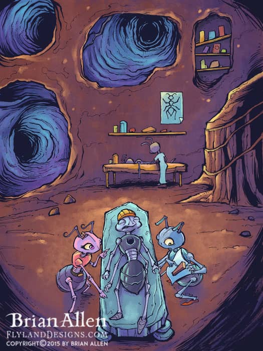
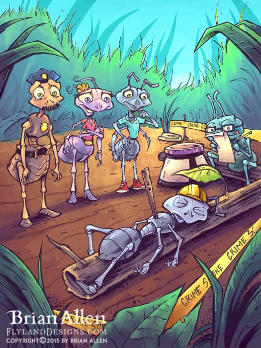
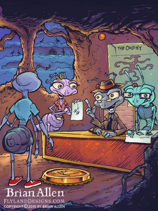
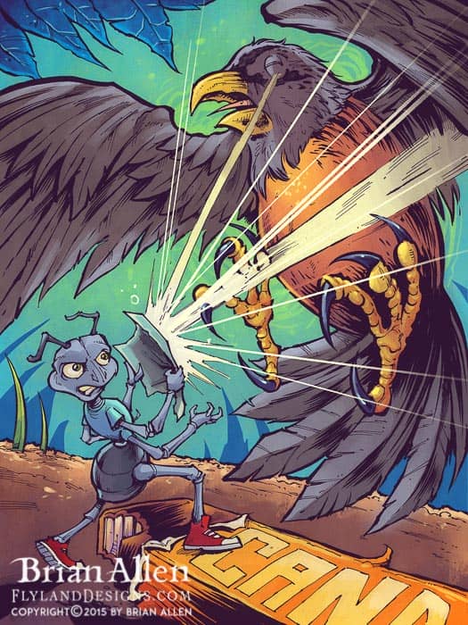
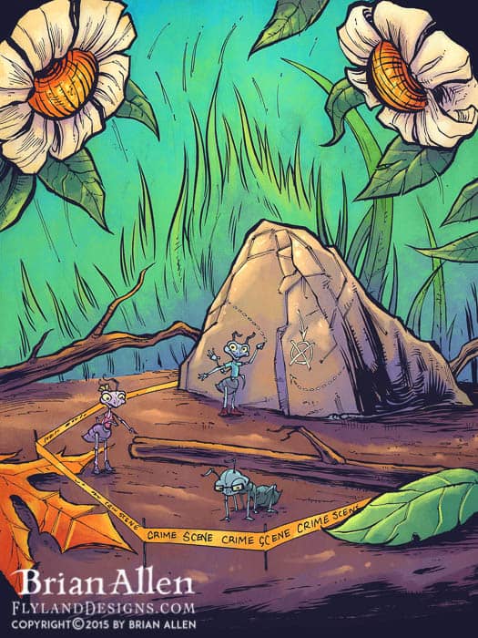
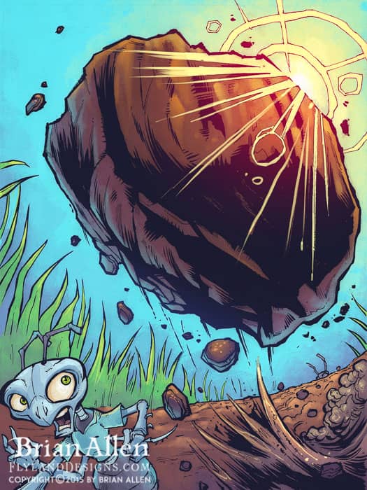
Children’s Book illustrations about ant detectives solving a crime the I created for a new young adult story by Bryce Anderson, called Ant CSI. I had the pleasure of illustrating over 20 pages for this really cool book about a colony of ants battling against an army of devious fire ants. With the client’s help, I conceptualized and designed all the characters, and illustrated the pages in pen and ink, and then colored them in Manga Studio and Adobe Photoshop.
Client Testimonial:
Your illustrations are outstanding, and your choice of colors are fantastic. Many, many thanks again for working on this- I’m grateful for what you’ve done.
-Bryce Anderson
Ant CSI, Creator
\
Client:
Commando Racing Gear
http://commandoracing.com/
Description:
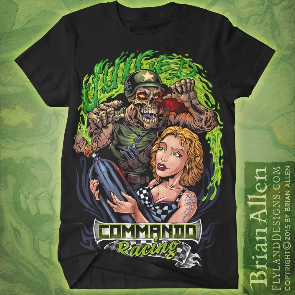
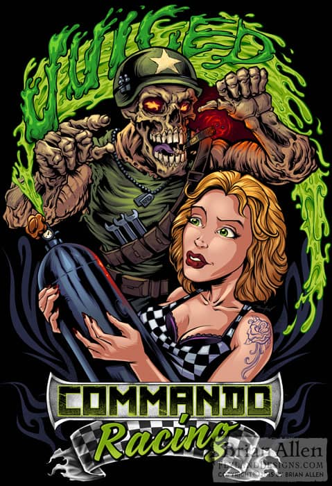
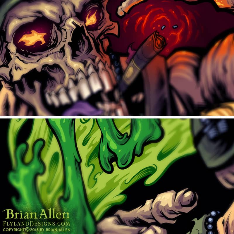
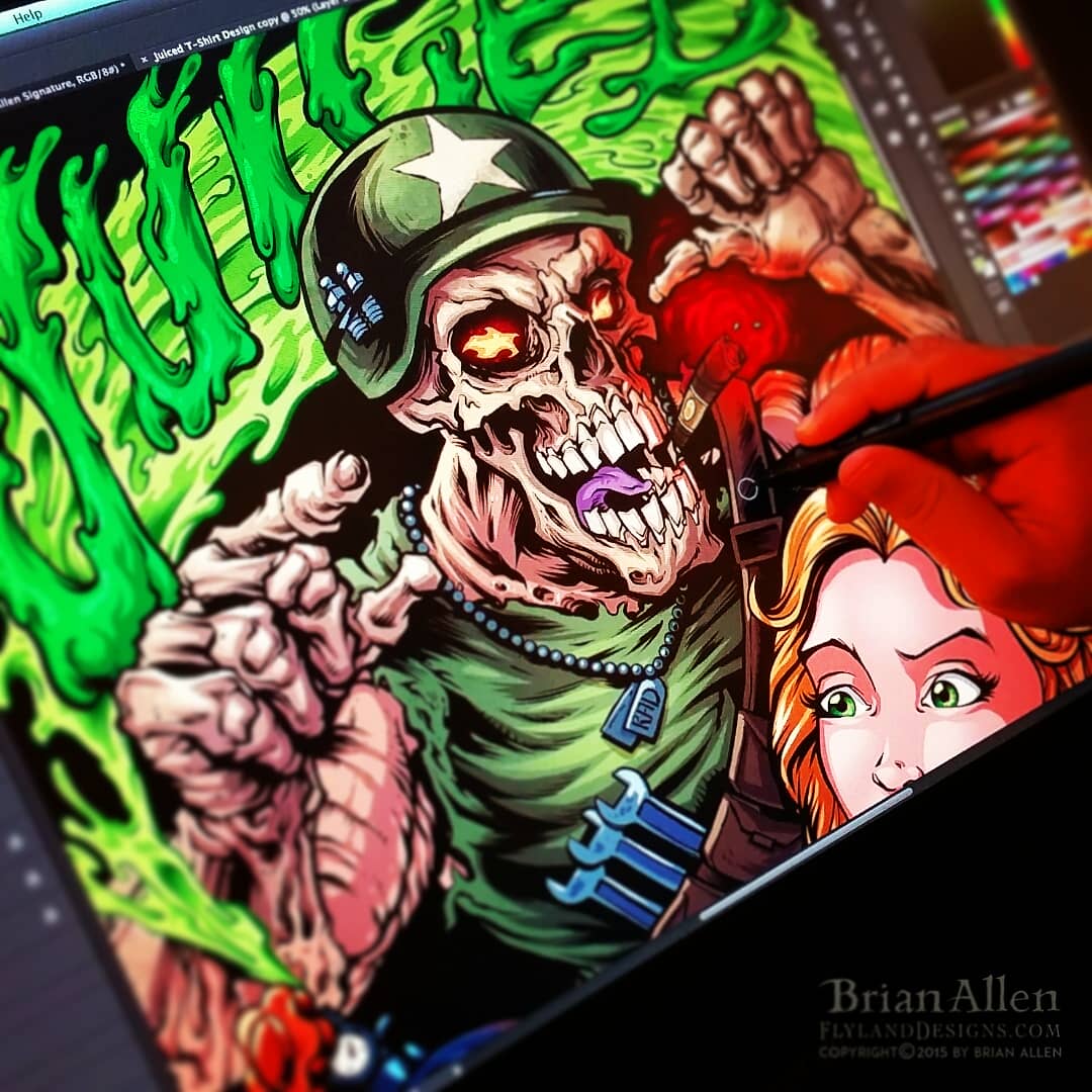
T-Shirt illustration for a racing apparel brand called Commando Racing Gear. I designed the mascot and artwork for this brand, and we created a series of t-shirts showing the mascot skeleton in a bunch of funny situations.
Client Testimonial:
If you were closer, I’d hug you!!! We absolutely love it.
-Steve Kanner
Commando Racing Gear
Client:
eSmoke
Description:
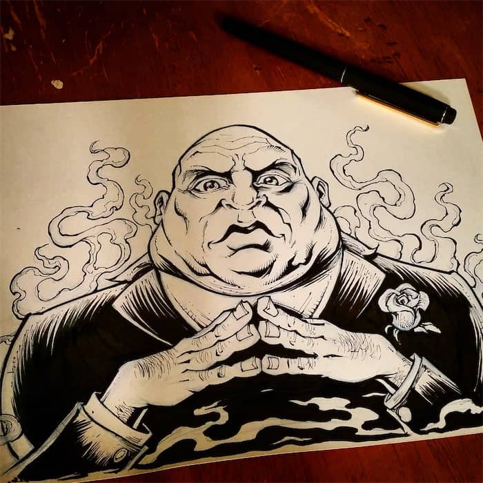
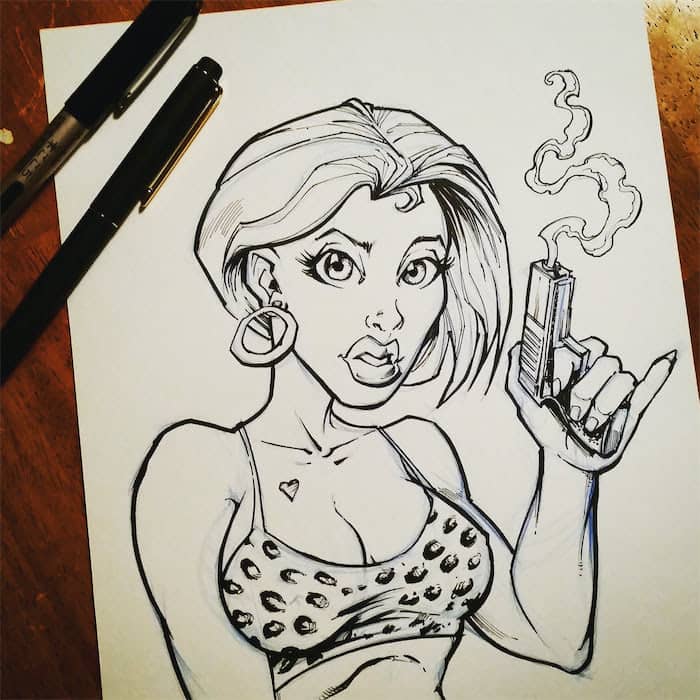
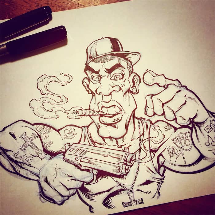
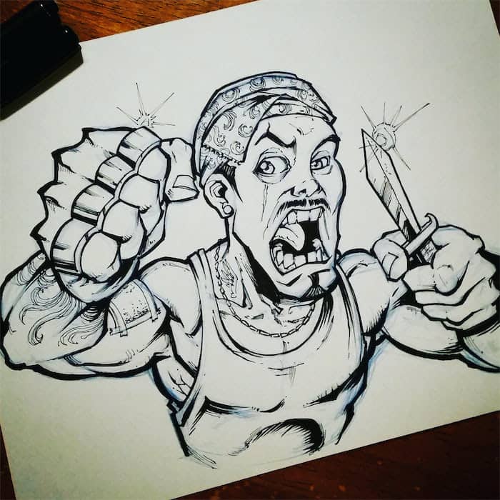
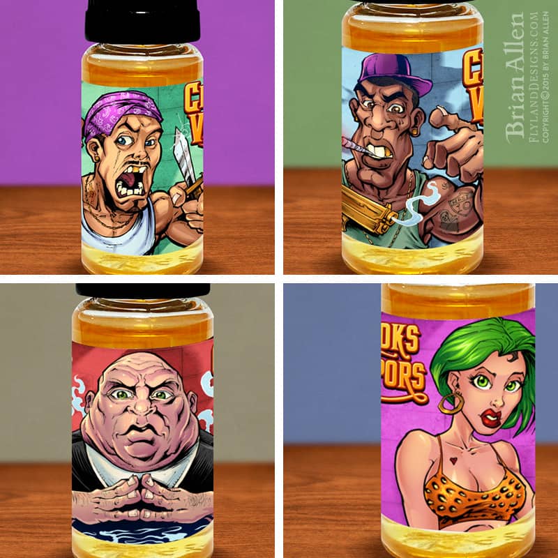
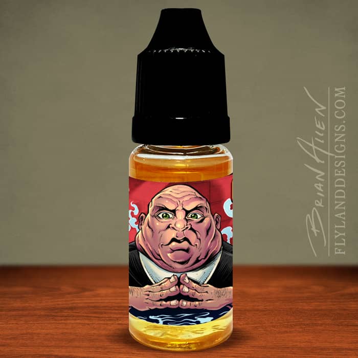
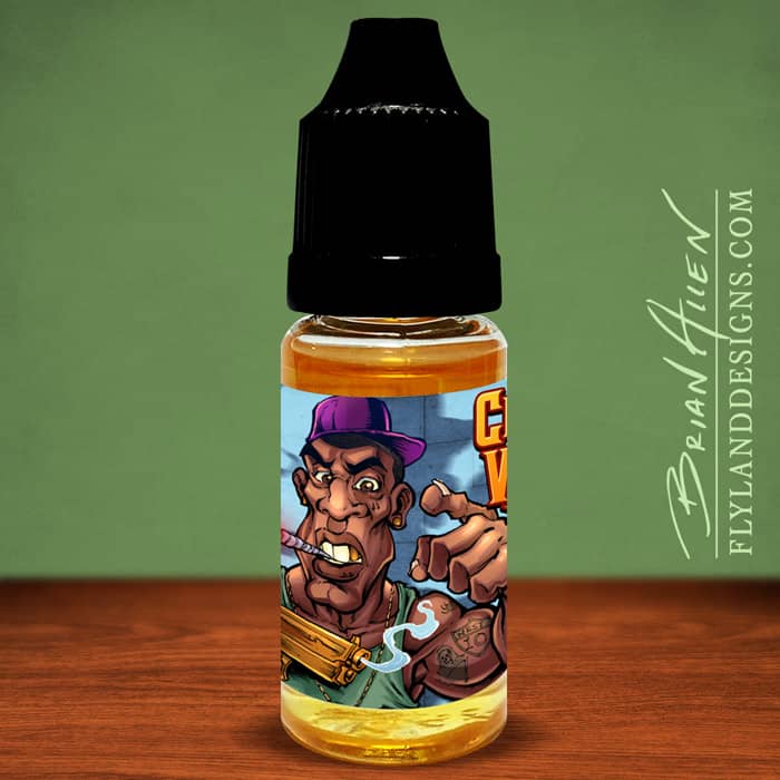
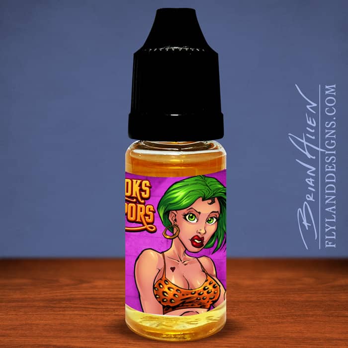
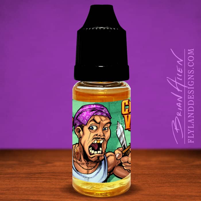
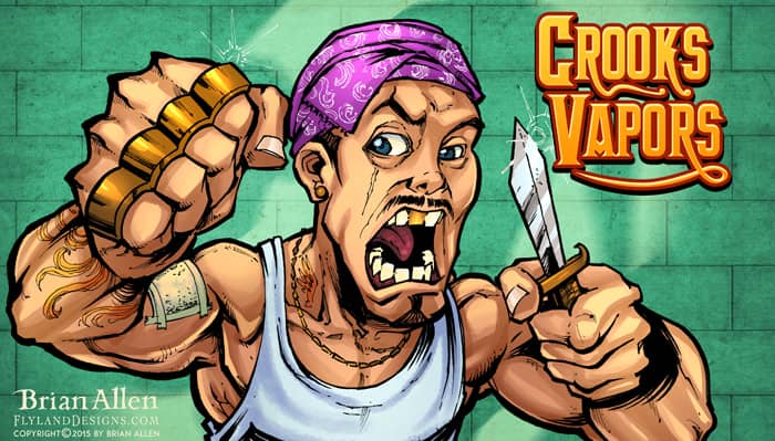
This is a series of character designs of crooks and criminals I illustrated for a line of vaping labels for a series of eJuice sold by Crooks Vapors.
The client gave me complete freedom in choosing a different criminal caricature for each of the four label designs. I drew the characters in pen and ink, and colored them in Adobe Photoshop.


Client:
Coin Munchers Arcade
Description:
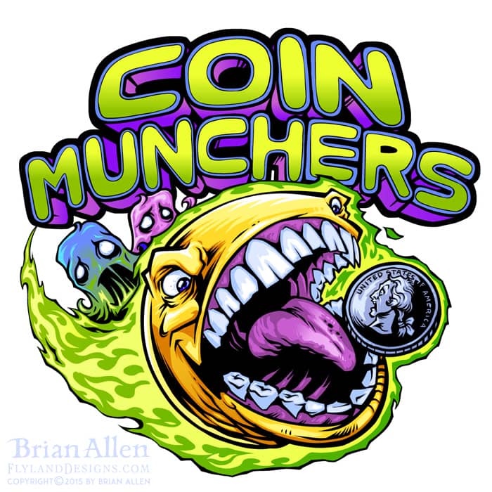
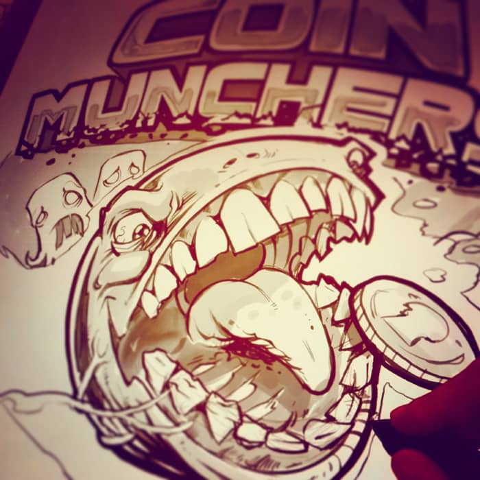
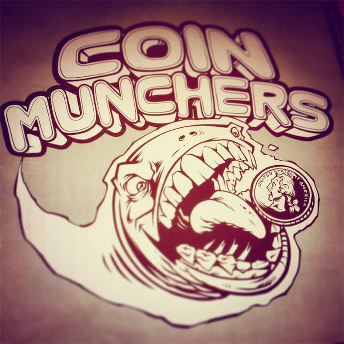
Logo design I created of an evil pac-man for an arcade’s logo design and branding. The client wanted something identifiable to the retro gaming crowd, while putting a hard and extreme edge on the style. I thought it would be fun to turn the lovable yellow disc into a rabid, coin-munching psychopath.
Client:
Great Lakes T-Shirt Company
Description:
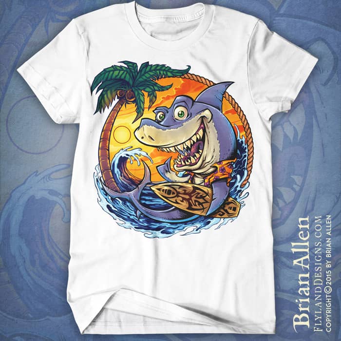
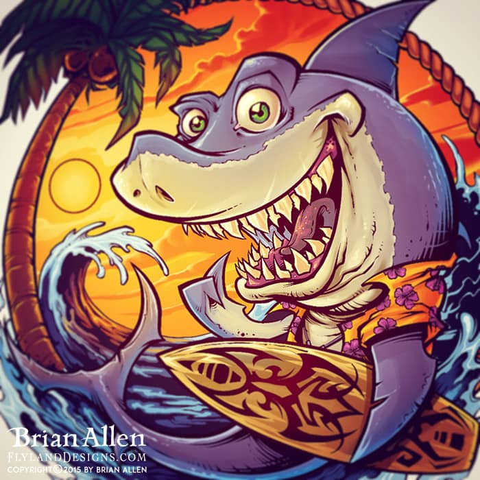
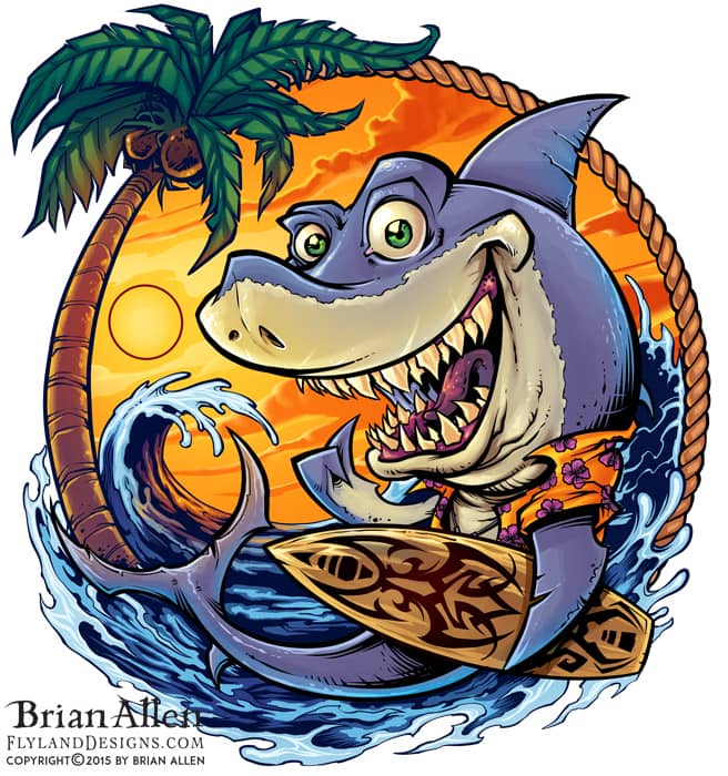
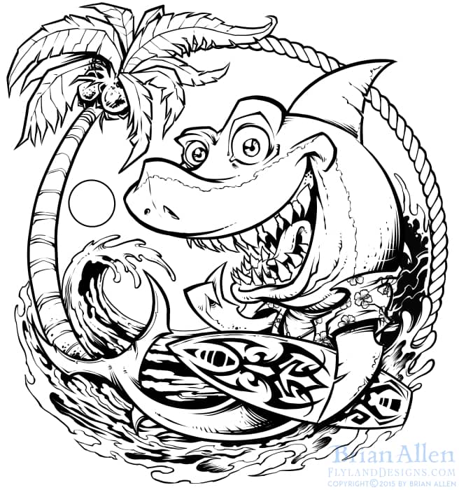
I created this t-shirt illustration of a surfing cartoon shark for a children’s line of beach themed clothing. The shirt uses special inks that only appear in the sunlight – so when indoors, the shirt appears as just the lineart. Once you take the shirt outside, the colors magically appear. It’s a really cool effect.
Client Testimonial:
Looks great, Look forward to getting it printed!
-Matt Whelpton
Great Lakes T-Shirt Company
This design is available for licensing (but not for apparel)
Client:
Lawrence James
Description:
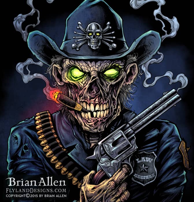
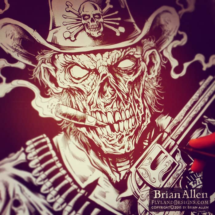
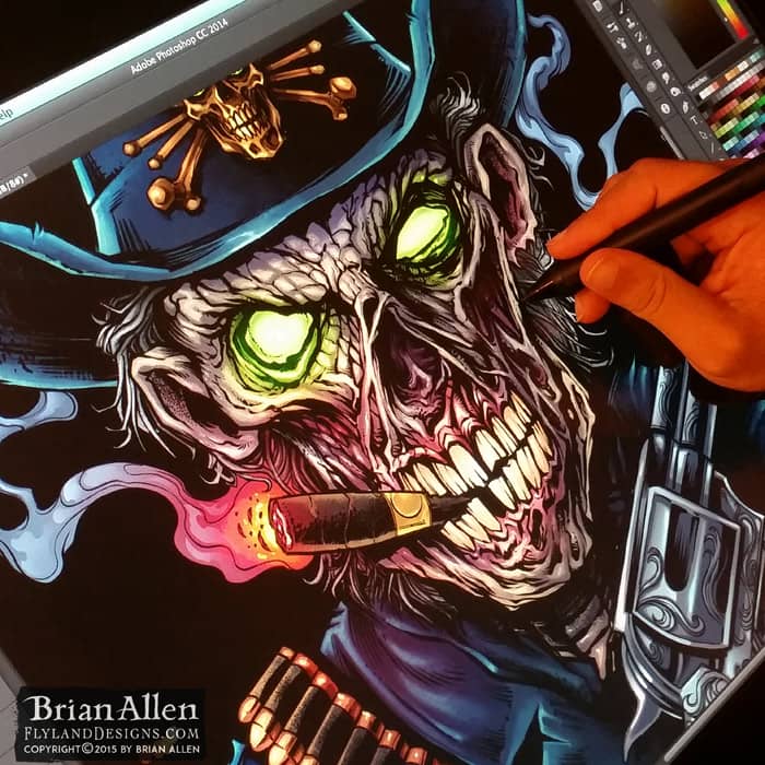
Illustration of a zombie police officer I created in Manga Studio and Adobe Photoshop for a motorcycle club of state troopers for their club seal and apparel. This was based on a similar design I created a couple years ago with a digitally painted zombie gunslinger. It was a lot of fun to revisit the same concept, but in a different style, and with my skills improved a little.
Client:
M.A.S. Productions
Description:
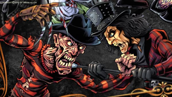
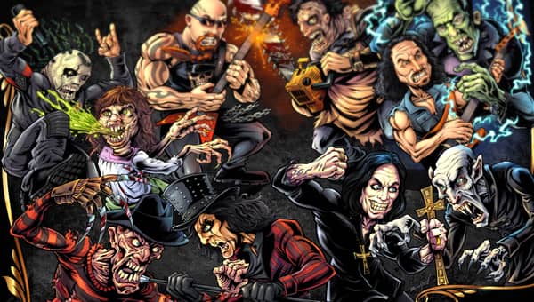
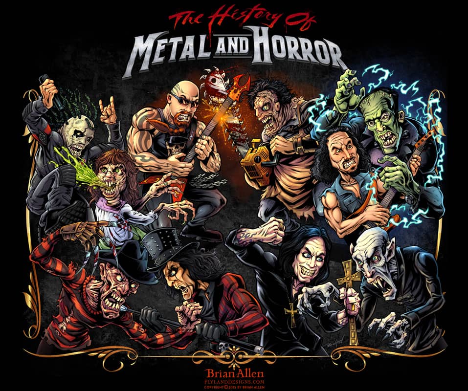
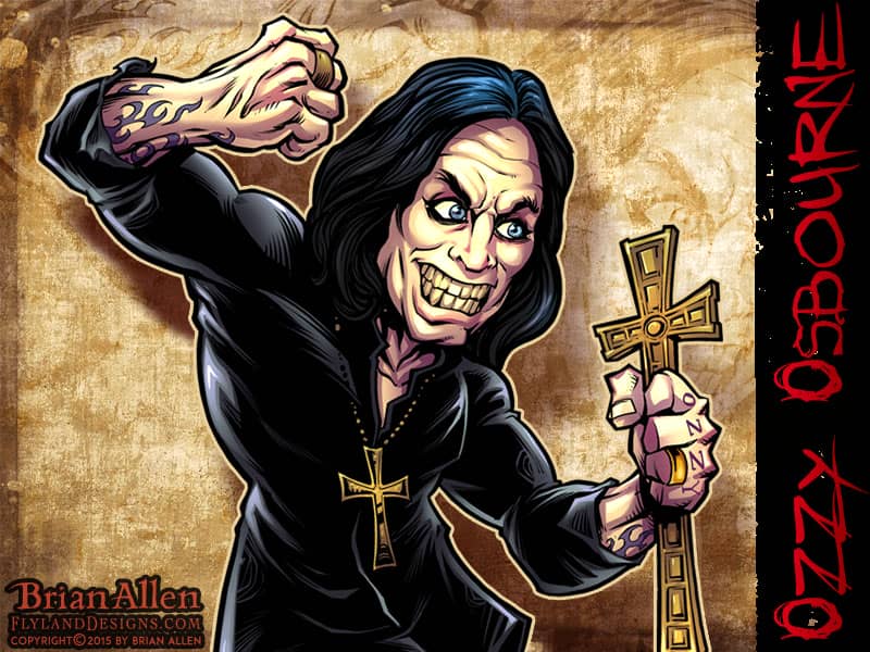
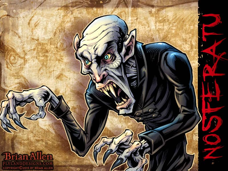
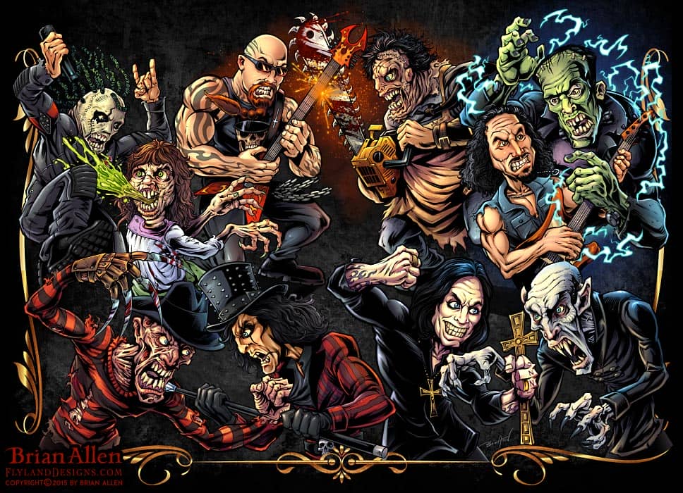
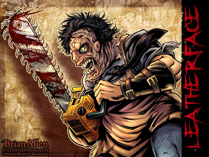
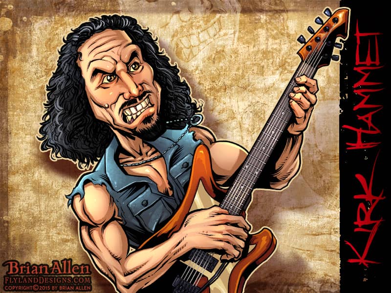
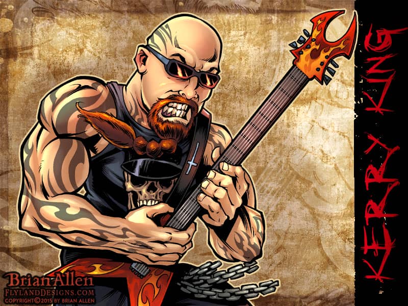
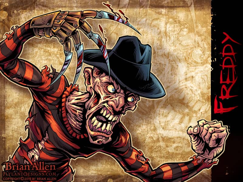
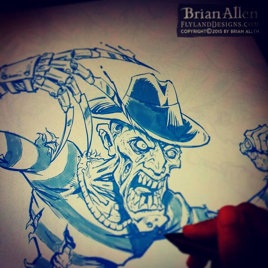
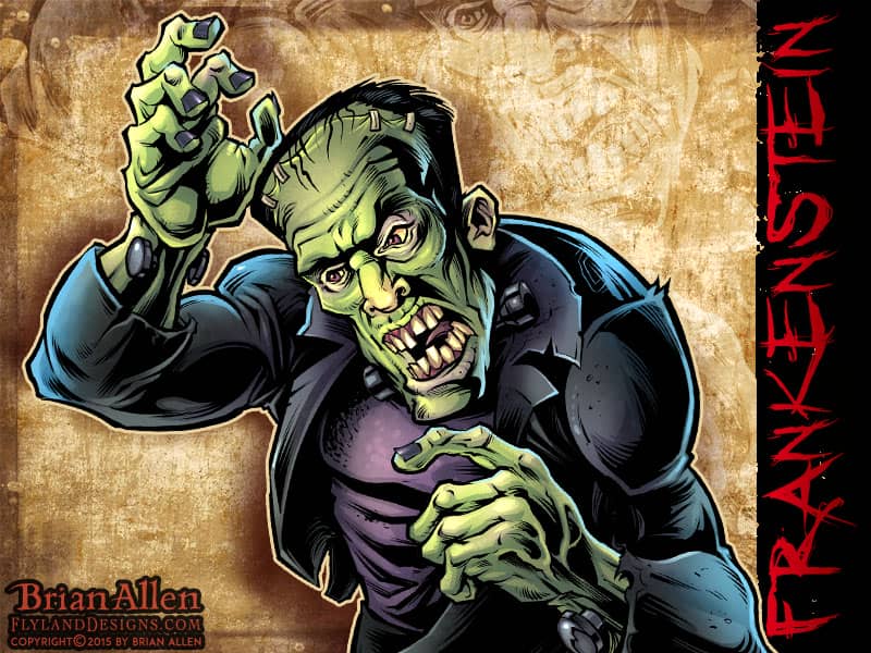
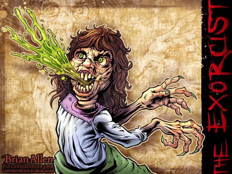
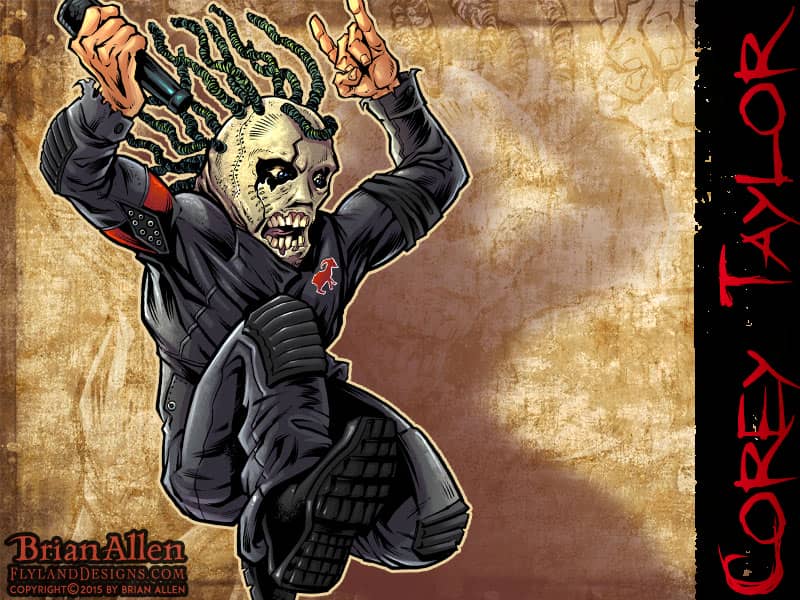
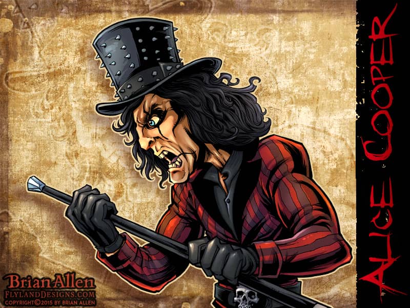
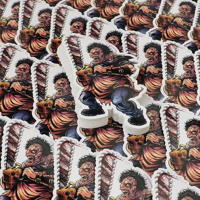
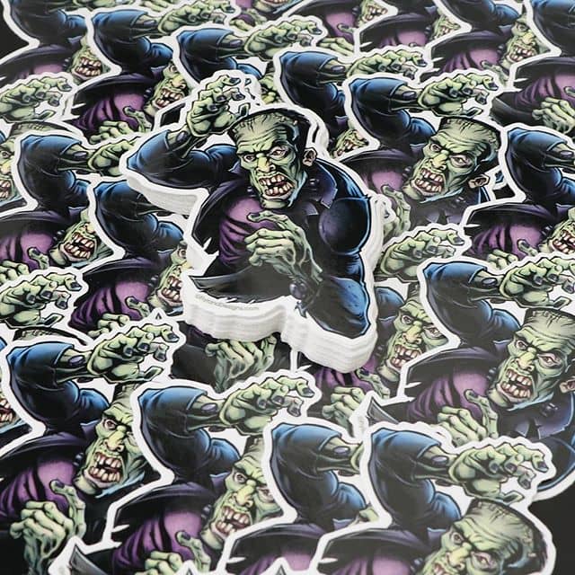
I illustrated this dark detailed illustration of an epic battle between Freddy, Leatherface, Nosferatu, The Excorsist, Frankenstein, Kirk Hammet, Ozzy, Alice Cooper, Corey Taylor, and more for a documentary on the history of Metal and Horror.
I was hired by Producer Mike Schiff of M.A.S. Productions to create an illustration of some of the most iconic figures in horror and heavy metal engaging in an epic battle. The image was used to promote a documentary they produced which explores the history of heavy metal music, horror films, and how the two genres have merged together over time.
The documentary features interviews with Alice Cooper, Kirk Hammett, Corey Taylor, plus a ton of other heavy metal stars, along with huge names in the horror industry. It was so great getting the chance to illustrate these iconic figures, including Freddy, Leatherface, Nosferatu, Ozzy, Alice Cooper, Kirk Hammet, and more. Pieces of the illustration were also used for an animation promoting the documentary.
Client Testimonial:
Incredible job on this. I knew you’d create something amazing , and holy crap is this good.
-Mike Schiff
Mas Productions
See clips from the documentary here:
http://www.metalhorror.com/
Support their Iniegogo campaign:
https://www.indiegogo.com/projects/the-history-of-metal-and-horror#/story
YouTube Video:
Purchase Die-Cut Stickers of the Design:
Client:
Tom Malzacher
Description:
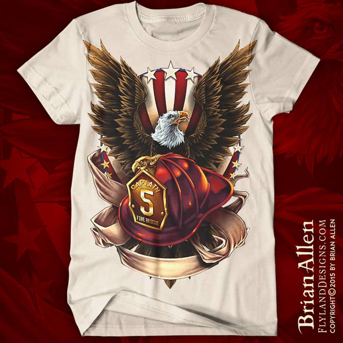
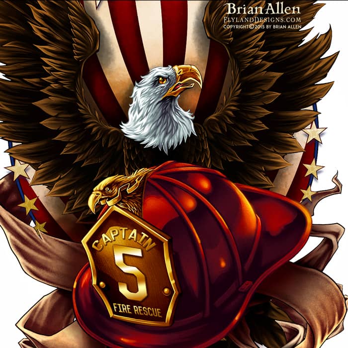
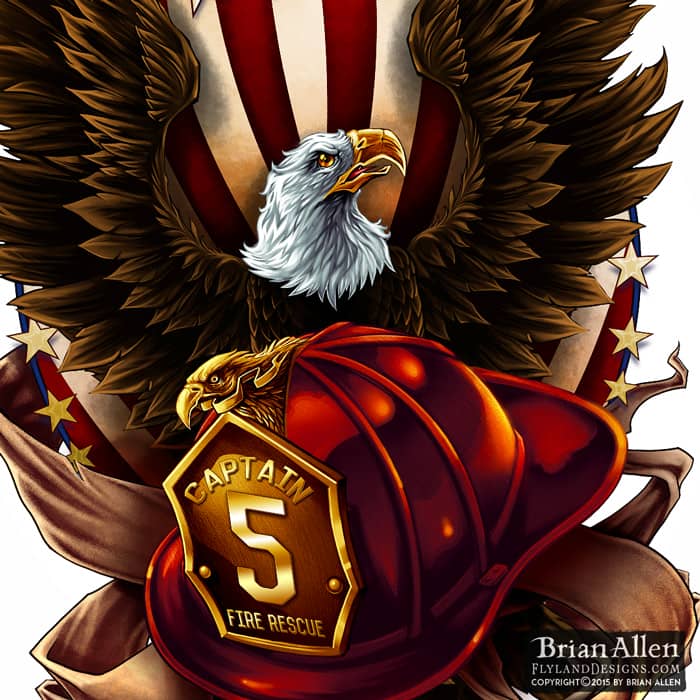
T-Shirt illustration of an American Bald Eagle and a fire-fighter helmet I created for a brand of apparel for fire-fighters. I set up this design for full-color printing, and kept everything in separate layers so we could customize the design in the future for each troop of firemen who purchase the shirt. I chose to illustrate this in a more realistic style than I typically do, and we’re really happy with how it turned out.
Client:
Unik Sovaj (Wild and Crazy)
Description:
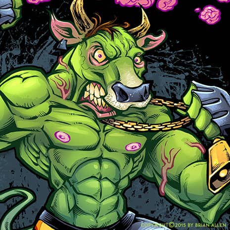
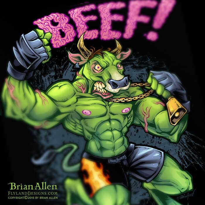
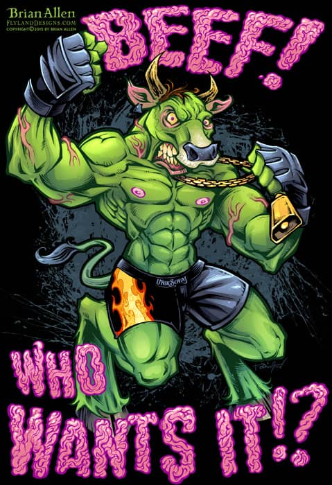
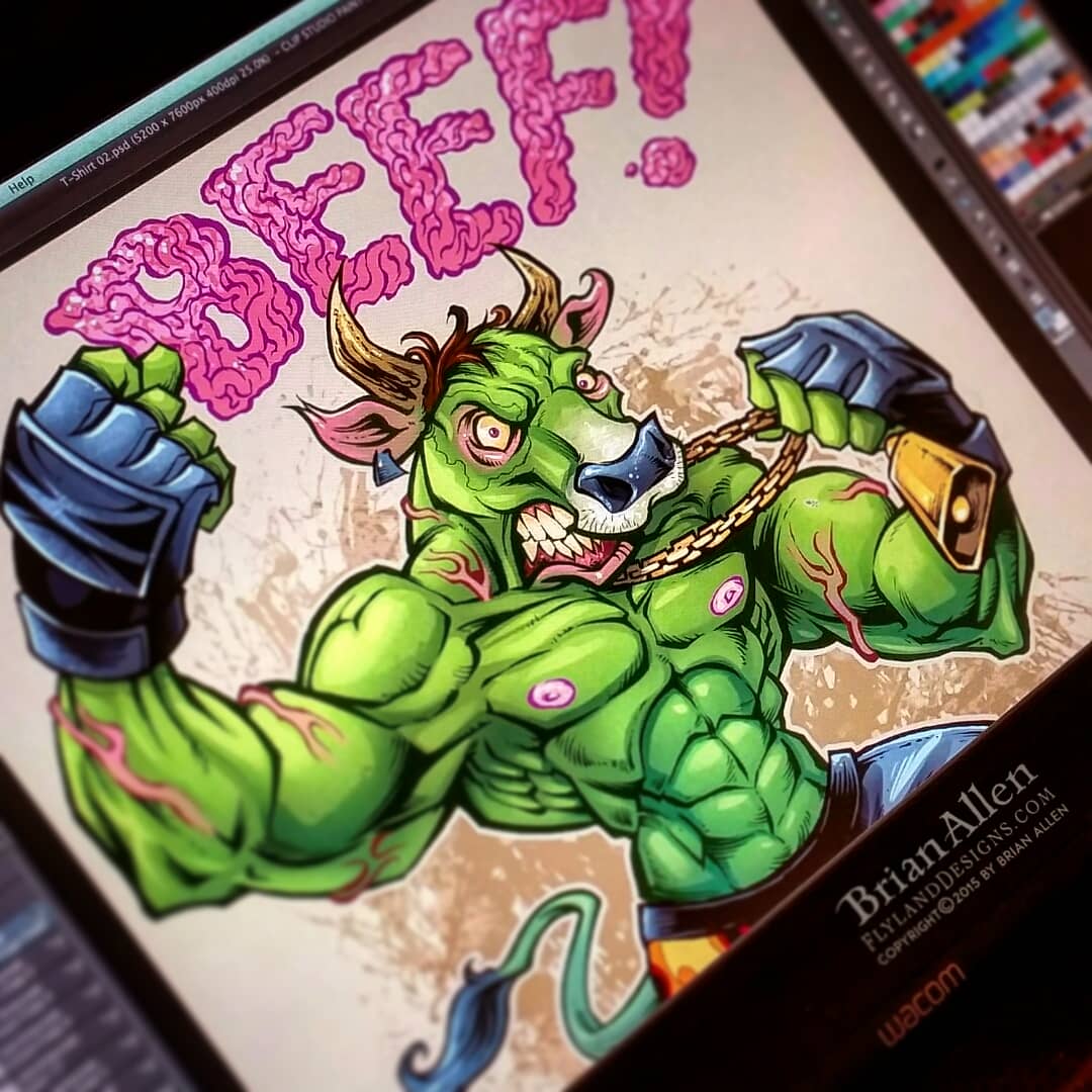
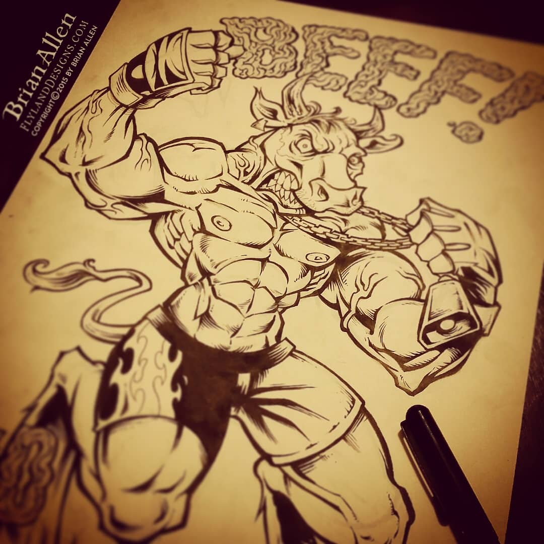
T-Shirt illustration of a mad cow MMA fighter in fight shorts I created for the apparel brand Unik Sovaj.
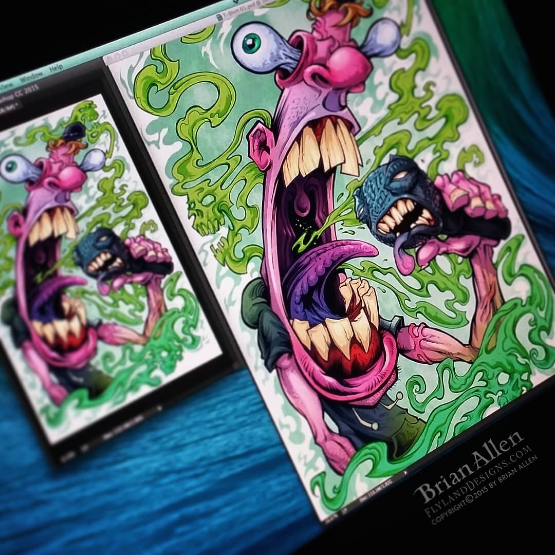
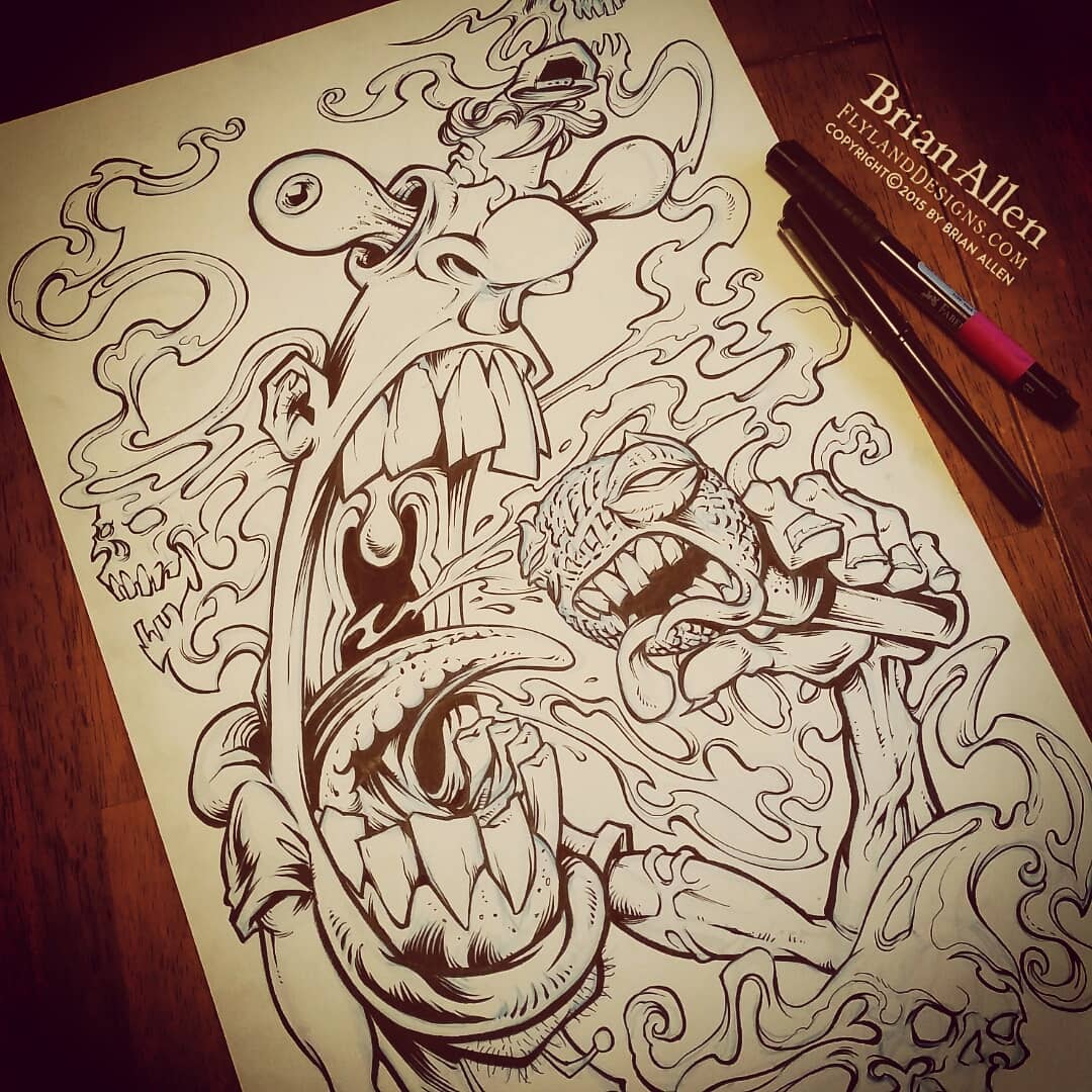
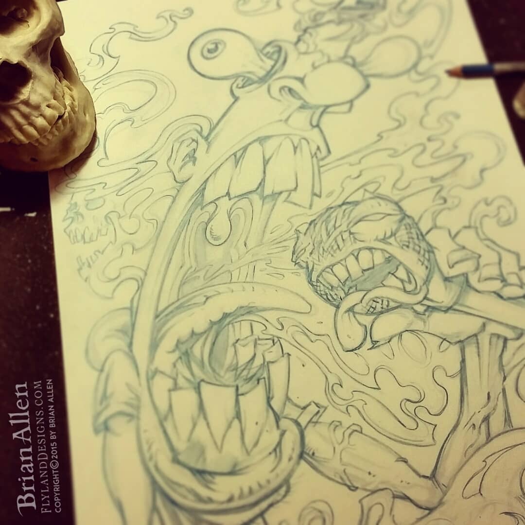
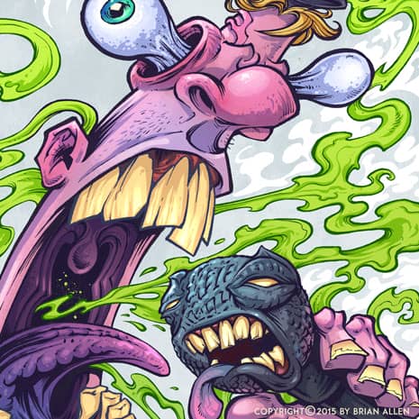
T-Shirt illustration of a hip-hop singer gripping a mic spewing bad breath fumes I created for a hip-hop apparel brand called Unik Sovaj.
I created these two wild and unique t-shirt designs for the hip-hop apparel brand Unik Sovaj. The illustrations were set up for full-color printing. The client had a few rough ideas, but really wanted to see what I came up with when totally unrestrained. I also created a fresh new logo type for the brand.
Client Testimonial:
You have really out done yourself this time!!!!!!! WE LOVE IT!!!!
-Dominic Mann
Unik Sovaj, Creator



Client:
Weed Enforcer
Description:
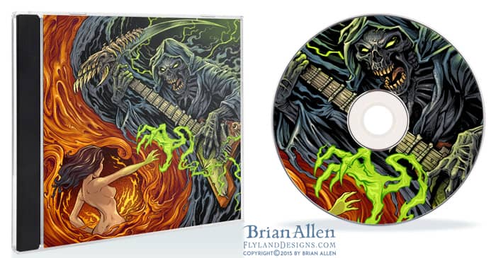
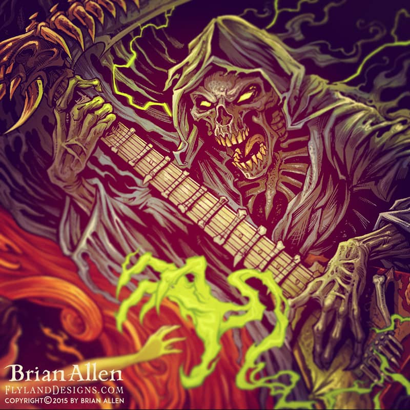
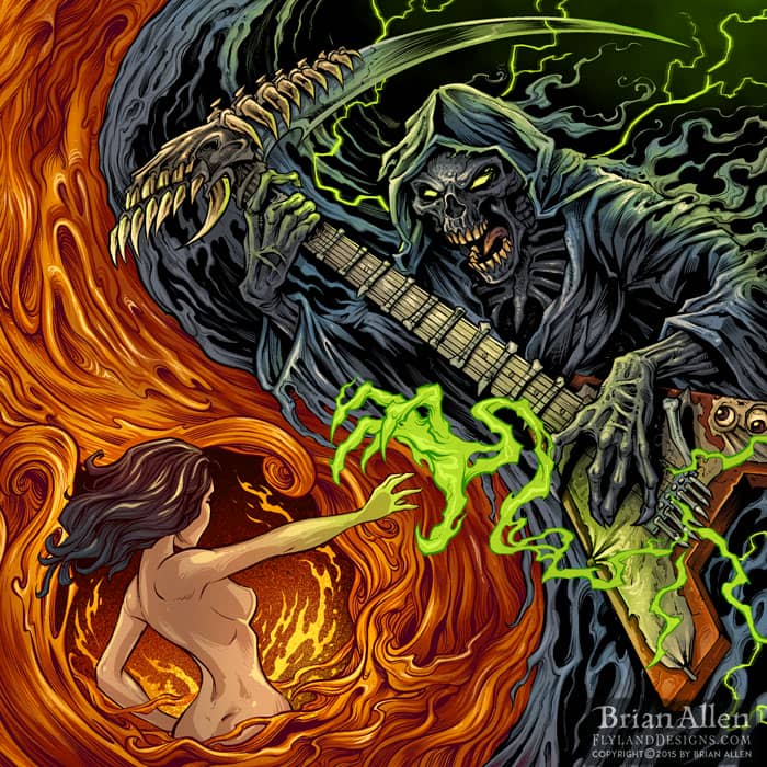
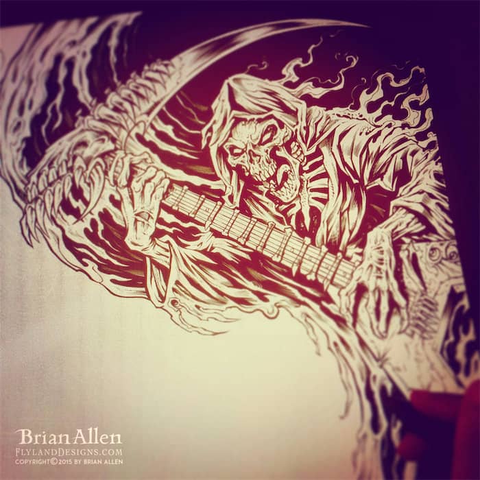
This design is meant to subtly resemble a yin and yang, as the grim reaper reaches out to a woman emerging from a swirling portal to hell. I had a great time working with the creative people behind the music on this album, and I’m really happy with how this turned out.
Client Testimonial:
“Hey, i’m going to say a word i never thought i’d say…PERF
-Allan Edward
Weed Enforcer
You can purchase signed prints of this artwork here:
https://www.flylanddesigns.com/shop/
Client:
Wendy Knuth
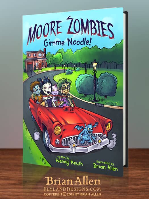
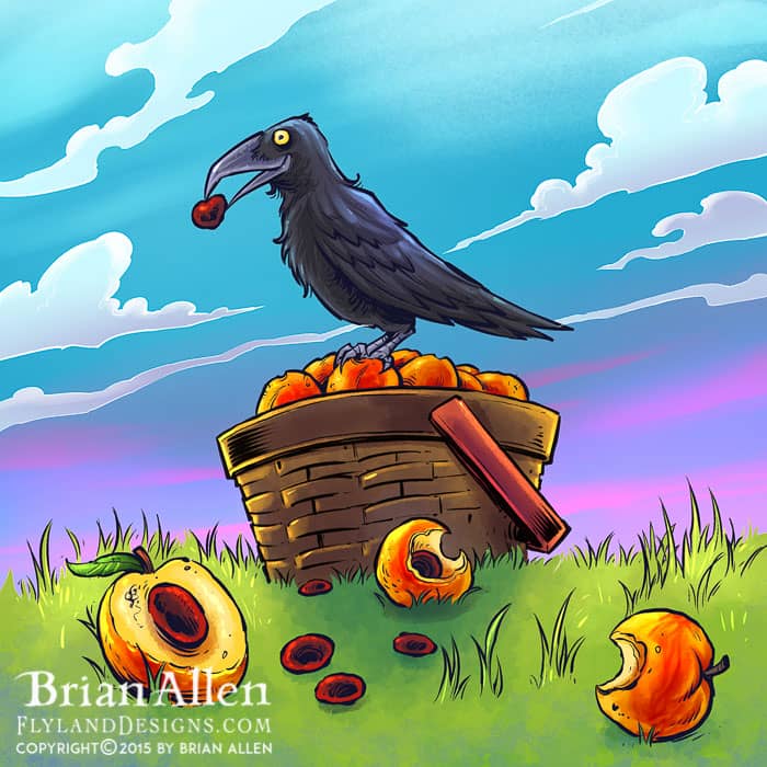
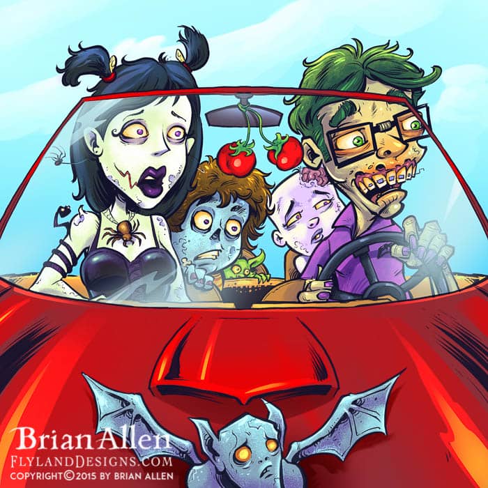
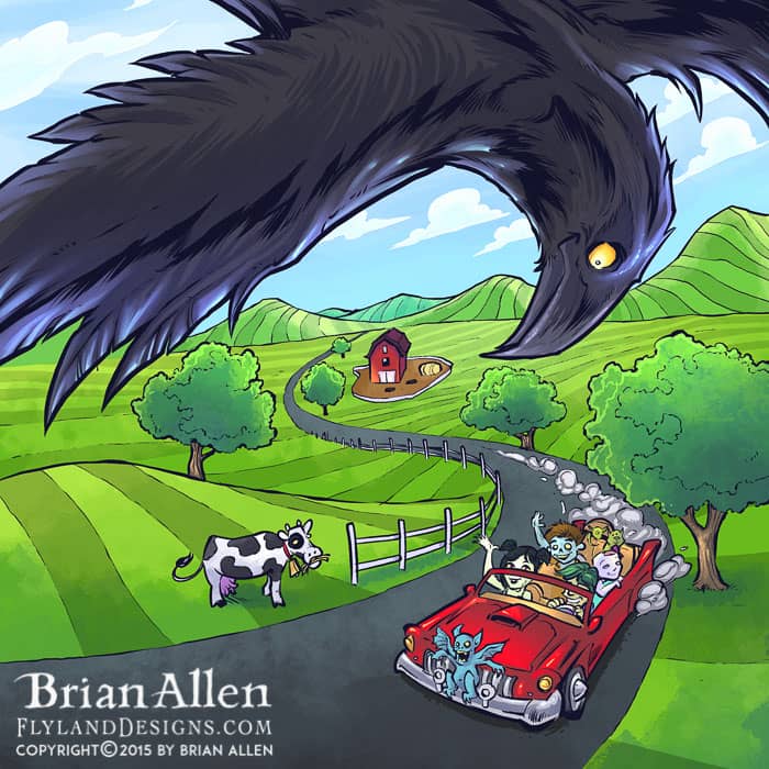
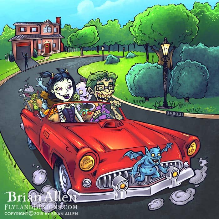
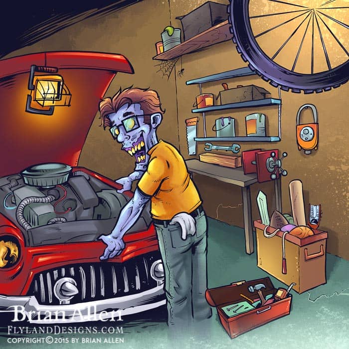
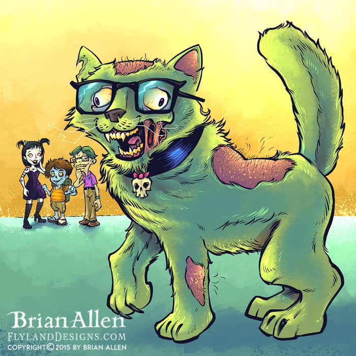
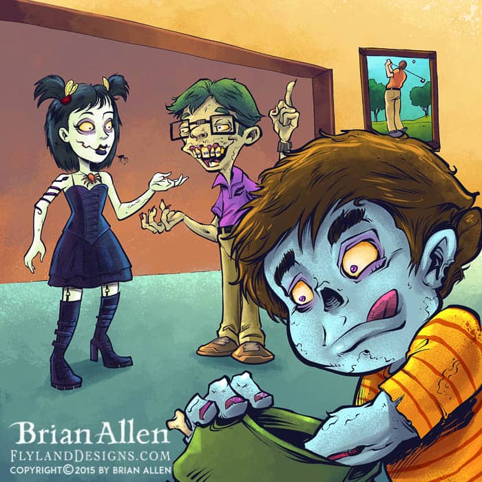
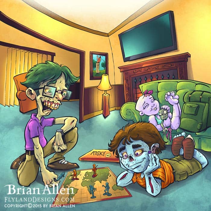
The 2nd book in a chidren’s book series about Zombies I illustrated for Wendy Knuth. I’m very proud of this 32 page story featuring a whole family of creepy but fun zombies driving around town and getting into trouble. I had a lot of fun drawing zombies in a very different way than I typically do. Can’t wait to read this to my kids!
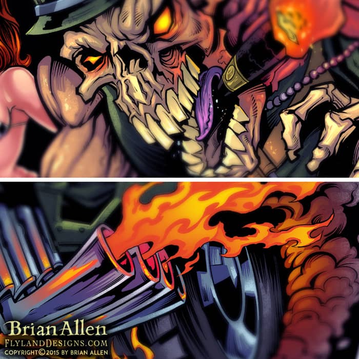
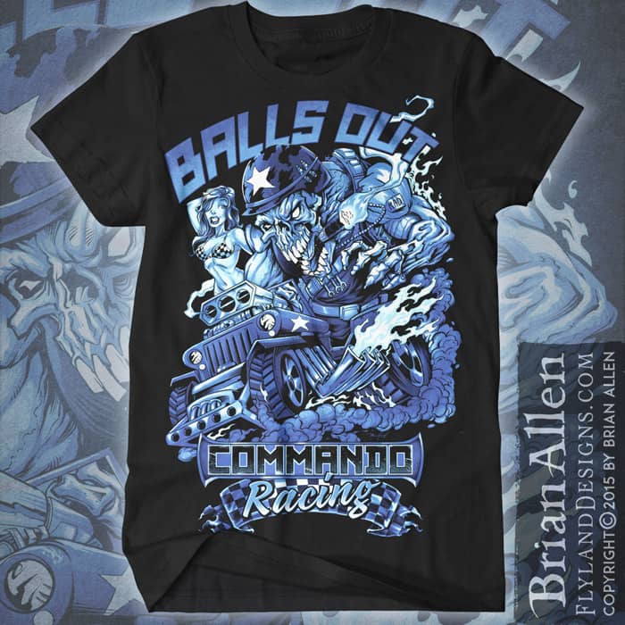
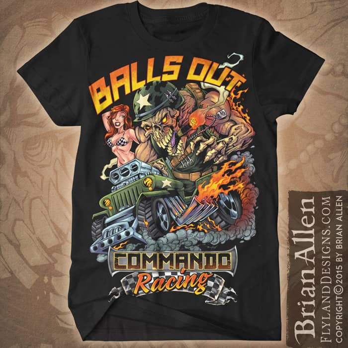
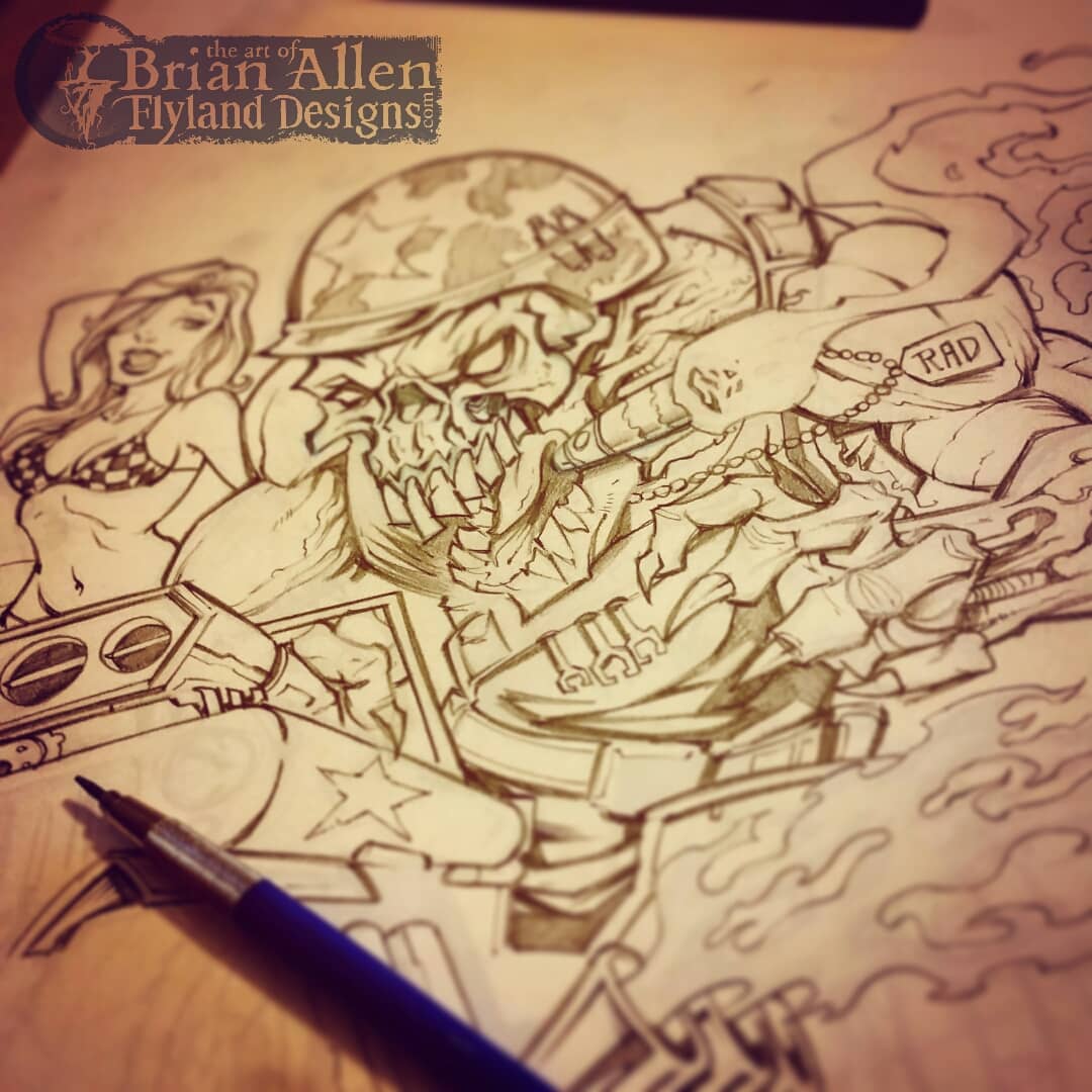
I created this fun t-shirt design for Commando Racing Gear – a hardcore skeleton! We went through a couple different [and equally exciting] designs but eventually settled on this one. I had a lot of fun with this!
Client Testimonial:
If you were closer, I’d hug you!!! We absolutely love it.
-Steve Kanner
Commando Racing Gear
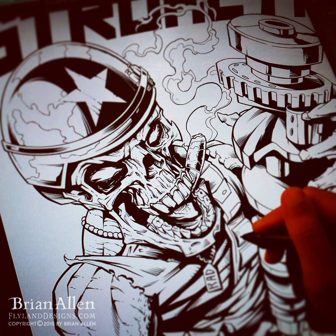
I created this mascot and logo design for a team of drag-racer’s new line of merchandise and apparel. The client wanted a tough, dark, militant mascot character that could later be drawn in other situations and shenanigans. We went through a few sketches at the beginning that were a bit too light, and eventually arrived at RAD, the skeletal, drag-racing warrior you see before you! The mascot and logo was prepared for both limited color silk-screening and full-color printing, to maximize the usage. To see more of my work, or hire me for freelance projects, please visit my website: www.flylanddesigns.com
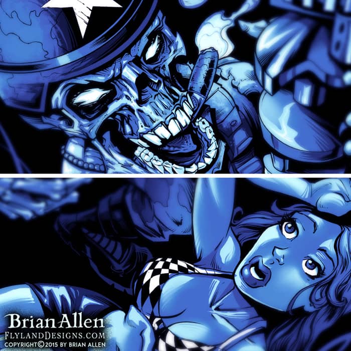
I created this mascot and logo design for a team of drag-racer’s new line of merchandise and apparel. The client wanted a tough, dark, militant mascot character that could later be drawn in other situations and shenanigans. We went through a few sketches at the beginning that were a bit too light, and eventually arrived at RAD, the skeletal, drag-racing warrior you see before you! The mascot and logo was prepared for both limited color silk-screening and full-color printing, to maximize the usage. To see more of my work, or hire me for freelance projects, please visit my website: www.flylanddesigns.com

I created this mascot and logo design for a team of drag-racer’s new line of merchandise and apparel. The client wanted a tough, dark, militant mascot character that could later be drawn in other situations and shenanigans. We went through a few sketches at the beginning that were a bit too light, and eventually arrived at RAD, the skeletal, drag-racing warrior you see before you! The mascot and logo was prepared for both limited color silk-screening and full-color printing, to maximize the usage. To see more of my work, or hire me for freelance projects, please visit my website: www.flylanddesigns.com
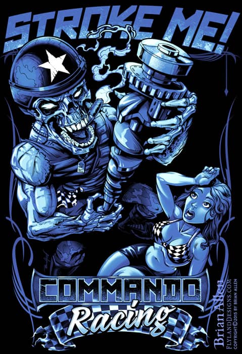
I created this mascot and logo design for a team of drag-racer’s new line of merchandise and apparel. The client wanted a tough, dark, militant mascot character that could later be drawn in other situations and shenanigans. We went through a few sketches at the beginning that were a bit too light, and eventually arrived at RAD, the skeletal, drag-racing warrior you see before you! The mascot and logo was prepared for both limited color silk-screening and full-color printing, to maximize the usage. To see more of my work, or hire me for freelance projects, please visit my website: www.flylanddesigns.com
I created this fun t-shirt design for Commando Racing Gear – a hardcore skeleton! We went through a couple different [and equally exciting] designs but eventually settled on this one. I had a lot of fun with this!
Client Testimonial:
If you were closer, I’d hug you!!! We absolutely love it.
-Steve Kanner
Commando Racing Gear
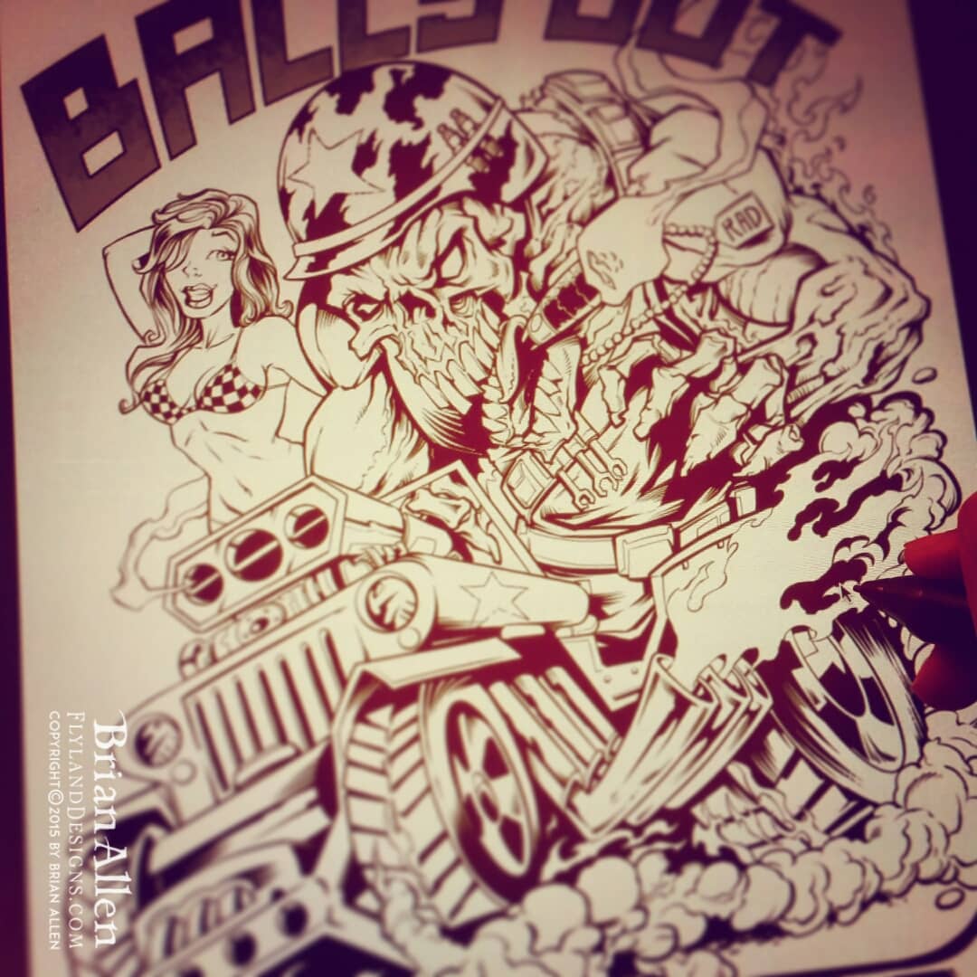
I created this mascot and logo design for a team of drag-racer’s new line of merchandise and apparel. The client wanted a tough, dark, militant mascot character that could later be drawn in other situations and shenanigans. We went through a few sketches at the beginning that were a bit too light, and eventually arrived at RAD, the skeletal, drag-racing warrior you see before you! The mascot and logo was prepared for both limited color silk-screening and full-color printing, to maximize the usage.
To see more of my work, or hire me for freelance projects, please visit my website: www.flylanddesigns.com
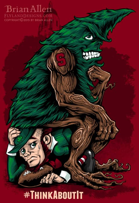
I was hired by an apparel brand creating a series of T-Shirts featuring the unofficial football mascot of Stanford, the Stanford Tree! I was asked to design the mascot sitting in a pose inspired by The Thinker, with the rock replaced by a crumpled Notre Dame mascot. If you want a drawing challenge, try making a tree look mean. It’s not easy! Trees are usually pretty pleasant.
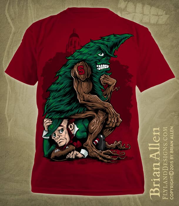
I was hired by an apparel brand creating a series of T-Shirts featuring the unofficial football mascot of Stanford, the Stanford Tree! I was asked to design the mascot sitting in a pose inspired by The Thinker, with the rock replaced by a crumpled Notre Dame mascot. If you want a drawing challenge, try making a tree look mean. It’s not easy! Trees are usually pretty pleasant.
To see more of my work, or hire me for freelance projects, please visit my website: www.flylanddesigns.com
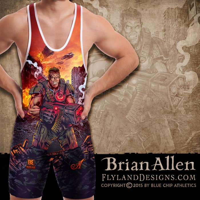
All-over-print dye-sublimated wrestling singlet design I created for BlueChip wrestling. This design was inspired by futurustic combat like in Gears of War. We created this future soldier character standing in front of a ruined cityscape. I reached out to a talented digital painter named Luciano Fleitas to help me with the background because I was in a crunch. I’m really happy with how this came together.
I created this as part of a series of wrestling singlet designs for BlueChip’s summer catalog. The designs will also be available on fight shorts. I find it so enjoyable working with dye sublimation, because the color and detail reproduction is fantastic, and I don’t have to worry about the head-scratching that comes from working with silk-screen.
Client Testimonial:
Thank you very much, I think everything turned out great!
-Andy Michaels
BlueChip Athletics
You can purchase the design on a singlet here:
http://www.bluechipwrestling.com/

All-over-print dye-sublimated wrestling singlet design I created for BlueChip wrestling. This design was inspired by futurustic combat like in Gears of War. We created this future soldier character standing in front of a ruined cityscape. I reached out to a talented digital painter named Luciano Fleitas to help me with the background because I was in a crunch. I’m really happy with how this came together.
I created this as part of a series of wrestling singlet designs for BlueChip’s summer catalog. The designs will also be available on fight shorts. I find it so enjoyable working with dye sublimation, because the color and detail reproduction is fantastic, and I don’t have to worry about the head-scratching that comes from working with silk-screen.
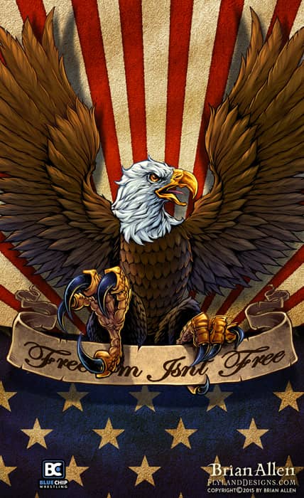
All-over-print dye-sublimated wrestling singlet design I created for BlueChip wrestling. This design was for their patriotic catalog, featuring a big angry eagle clutching a banner in front of a textured American Flag. I tried to give it a lot of depth, and fit a lot of different singlet sizes.
I created this as part of a series of wrestling singlet designs for BlueChip’s summer catalog. The designs will also be available on fight shorts. I find it so enjoyable working with dye sublimation, because the color and detail reproduction is fantastic, and I don’t have to worry about the head-scratching that comes from working with silk-screen.
Client Testimonial:
Thank you very much, I think everything turned out great!
-Andy Michaels
BlueChip Athletics
You can purchase the design on a singlet here:
http://www.bluechipwrestling.com/

All-over-print dye-sublimated wrestling singlet design I created for BlueChip wrestling. This design was for their patriotic catalog, featuring a big angry eagle clutching a banner in front of a textured American Flag. I tried to give it a lot of depth, and fit a lot of different singlet sizes.
I created this as part of a series of wrestling singlet designs for BlueChip’s summer catalog. The designs will also be available on fight shorts. I find it so enjoyable working with dye sublimation, because the color and detail reproduction is fantastic, and I don’t have to worry about the head-scratching that comes from working with silk-screen.
All-over-print dye-sublimated wrestling singlet design I created for BlueChip wrestling. The design is meant to be a reimagining of the classic bold shapes and pin striping that is common in singlets. I tried to give it a lot of depth, and keep it very customizable to different team colors.
I created this as part of a series of wrestling singlet designs for BlueChip’s summer catalog. The designs will also be available on fight shorts. I find it so enjoyable working with dye sublimation, because the color and detail reproduction is fantastic, and I don’t have to worry about the head-scratching that comes from working with silk-screen.
Client Testimonial:
Thank you very much, I think everything turned out great!
-Andy Michaels
BlueChip Athletics
You can purchase the design on a singlet here:
http://www.bluechipwrestling.com/
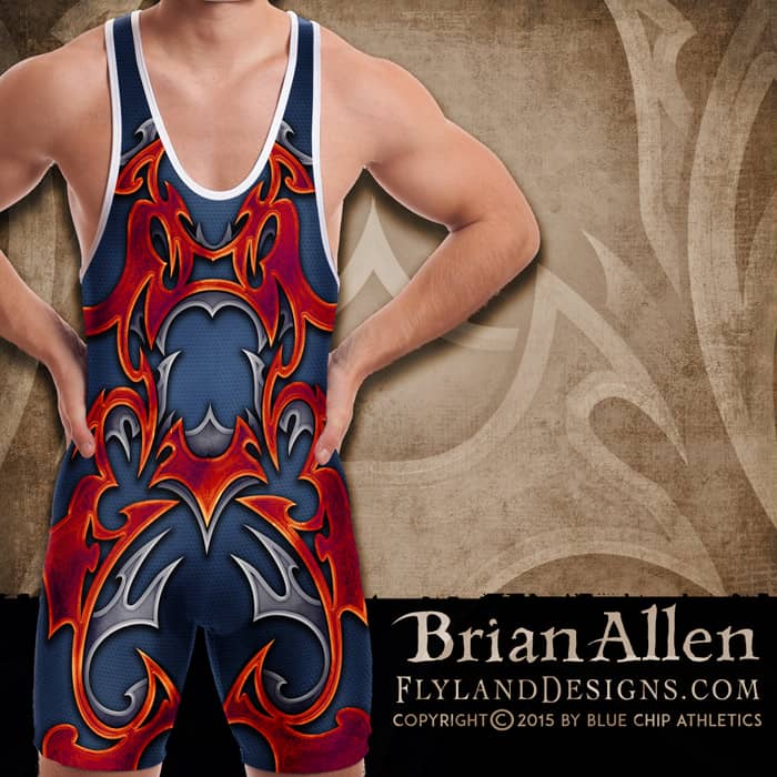
All-over-print dye-sublimated wrestling singlet design I created for BlueChip wrestling. The design is meant to be a reimagining of the classic bold shapes and pin striping that is common in singlets. I tried to give it a lot of depth, and keep it very customizable to different team colors.
I created this as part of a series of wrestling singlet designs for BlueChip’s summer catalog. The designs will also be available on fight shorts. I find it so enjoyable working with dye sublimation, because the color and detail reproduction is fantastic, and I don’t have to worry about the head-scratching that comes from working with silk-screen.
Client Testimonial:
Thank you very much, I think everything turned out great!
-Andy Michaels
BlueChip Athletics
You can purchase the design on a singlet here:
http://www.bluechipwrestling.com/
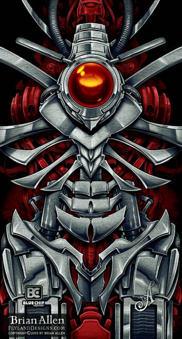
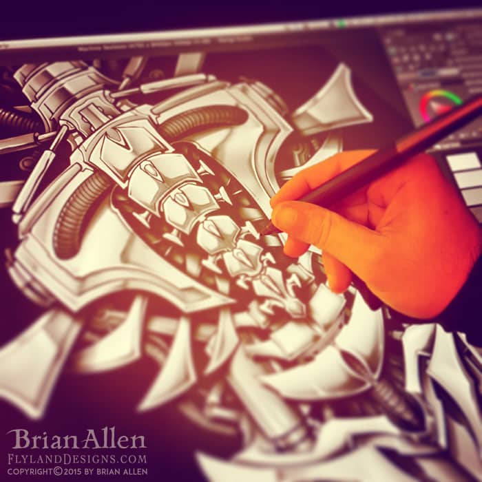
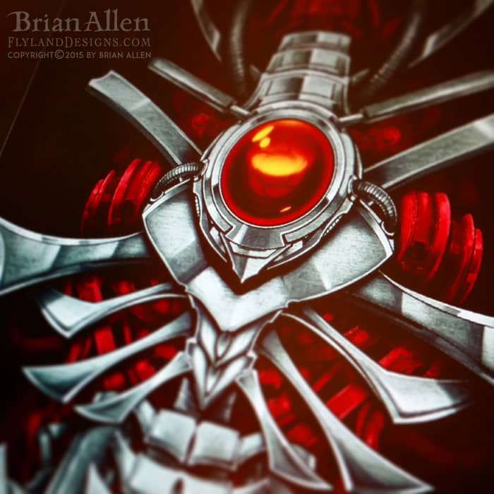
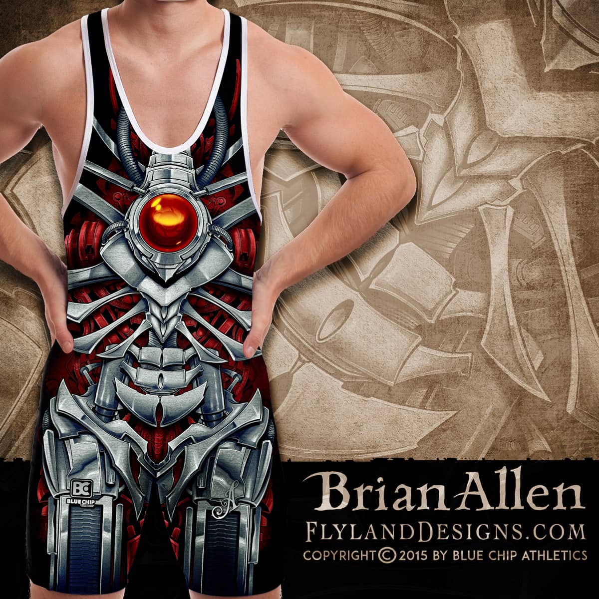
All-over-print dye-sublimated wrestling singlet design I created for BlueChip wrestling. The design was meant to look like a mechanized machine skeleton, and is layered in a way that it can be easily customized for different team colors. I tried to give it a lot of depth, and fit a lot of different singlet sizes.
I created this as part of a series of wrestling singlet designs for BlueChip’s summer catalog. The designs will also be available on fight shorts. I find it so enjoyable working with dye sublimation, because the color and detail reproduction is fantastic, and I don’t have to worry about the head-scratching that comes from working with silk-screen.
To see more of my work, or hire me for freelance projects, please visit my website: www.flylanddesigns.com
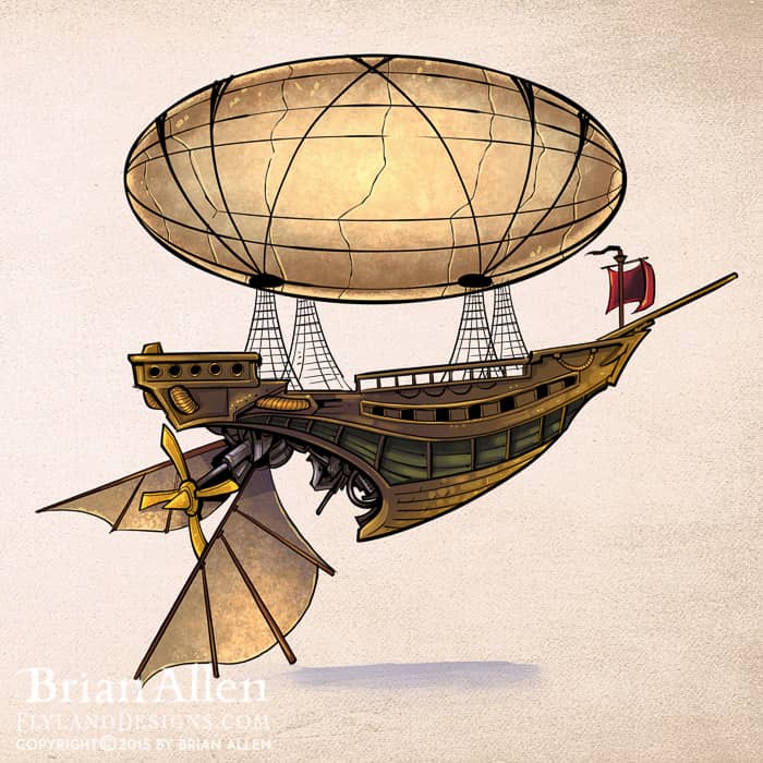
I created these concept illustrations of a steampunk family of adventurers for an educational publisher called Bogardpress. The character designs will be used to illustrate their educational materials and lessons. Each year the team uses a different theme and concept to tie their lessons together. I really enjoyed the whole process, from developing the characters in sketches, to coloring and rendering the final versions. I tried to add a bit of style into the characters to keep them from becoming generic. I especially enjoyed creating the robot character.
Client Testimonial:
Everyone was very happy with what you have done. Very impressed.
-Shawn Blase
Bogardpress

I created these concept illustrations of a steampunk family of adventurers for an educational publisher called Bogardpress. The character designs will be used to illustrate their educational materials and lessons. Each year the team uses a different theme and concept to tie their lessons together. I really enjoyed the whole process, from developing the characters in sketches, to coloring and rendering the final versions. I tried to add a bit of style into the characters to keep them from becoming generic. I especially enjoyed creating the robot character.
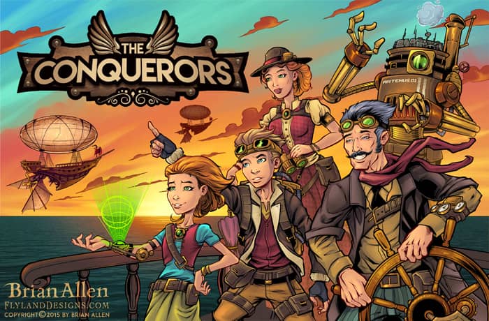
I created these concept illustrations of a steampunk family of adventurers for an educational publisher called Bogardpress. The character designs will be used to illustrate their educational materials and lessons. Each year the team uses a different theme and concept to tie their lessons together. I really enjoyed the whole process, from developing the characters in sketches, to coloring and rendering the final versions. I tried to add a bit of style into the characters to keep them from becoming generic. I especially enjoyed creating the robot character.
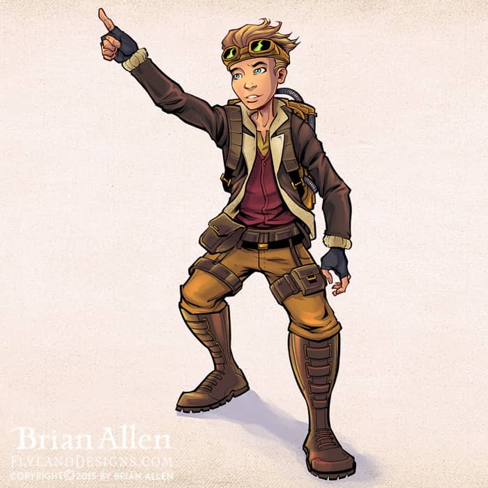
I created these concept illustrations of a steampunk family of adventurers for an educational publisher called Bogardpress. The character designs will be used to illustrate their educational materials and lessons. Each year the team uses a different theme and concept to tie their lessons together. I really enjoyed the whole process, from developing the characters in sketches, to coloring and rendering the final versions. I tried to add a bit of style into the characters to keep them from becoming generic. I especially enjoyed creating the robot character.
I created these concept illustrations of a steampunk family of adventurers for an educational publisher called Bogardpress. The character designs will be used to illustrate their educational materials and lessons. Each year the team uses a different theme and concept to tie their lessons together. I really enjoyed the whole process, from developing the characters in sketches, to coloring and rendering the final versions. I tried to add a bit of style into the characters to keep them from becoming generic. I especially enjoyed creating the robot character.
I created these concept illustrations of a steampunk family of adventurers for an educational publisher called Bogardpress. The character designs will be used to illustrate their educational materials and lessons. Each year the team uses a different theme and concept to tie their lessons together. I really enjoyed the whole process, from developing the characters in sketches, to coloring and rendering the final versions. I tried to add a bit of style into the characters to keep them from becoming generic. I especially enjoyed creating the robot character.
I created these concept illustrations of a steampunk family of adventurers for an educational publisher called Bogardpress. The character designs will be used to illustrate their educational materials and lessons. Each year the team uses a different theme and concept to tie their lessons together. I really enjoyed the whole process, from developing the characters in sketches, to coloring and rendering the final versions. I tried to add a bit of style into the characters to keep them from becoming generic. I especially enjoyed creating the robot character.
I created these concept illustrations of a steampunk family of adventurers for an educational publisher called Bogardpress. The character designs will be used to illustrate their educational materials and lessons. Each year the team uses a different theme and concept to tie their lessons together. I really enjoyed the whole process, from developing the characters in sketches, to coloring and rendering the final versions. I tried to add a bit of style into the characters to keep them from becoming generic. I especially enjoyed creating the robot character.
I created these concept illustrations of a steampunk family of adventurers for an educational publisher called Bogardpress. The character designs will be used to illustrate their educational materials and lessons. Each year the team uses a different theme and concept to tie their lessons together. I really enjoyed the whole process, from developing the characters in sketches, to coloring and rendering the final versions. I tried to add a bit of style into the characters to keep them from becoming generic. I especially enjoyed creating the robot character.
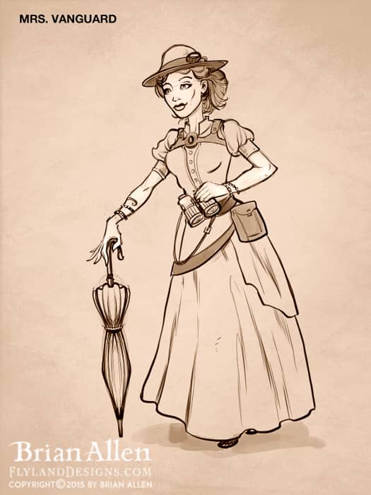
I created these concept illustrations of a steampunk family of adventurers for an educational publisher called Bogardpress. The character designs will be used to illustrate their educational materials and lessons. Each year the team uses a different theme and concept to tie their lessons together. I really enjoyed the whole process, from developing the characters in sketches, to coloring and rendering the final versions. I tried to add a bit of style into the characters to keep them from becoming generic. I especially enjoyed creating the robot character.
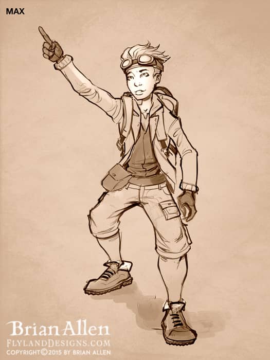
I created these concept illustrations of a steampunk family of adventurers for an educational publisher called Bogardpress. The character designs will be used to illustrate their educational materials and lessons. Each year the team uses a different theme and concept to tie their lessons together. I really enjoyed the whole process, from developing the characters in sketches, to coloring and rendering the final versions. I tried to add a bit of style into the characters to keep them from becoming generic. I especially enjoyed creating the robot character.
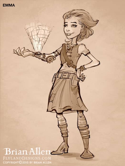
I created these concept illustrations of a steampunk family of adventurers for an educational publisher called Bogardpress. The character designs will be used to illustrate their educational materials and lessons. Each year the team uses a different theme and concept to tie their lessons together. I really enjoyed the whole process, from developing the characters in sketches, to coloring and rendering the final versions. I tried to add a bit of style into the characters to keep them from becoming generic. I especially enjoyed creating the robot character.
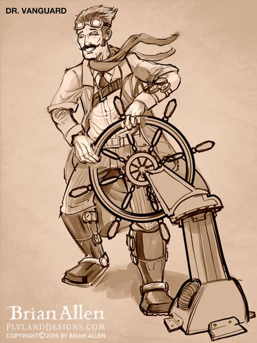
I created these concept illustrations of a steampunk family of adventurers for an educational publisher called Bogardpress. The character designs will be used to illustrate their educational materials and lessons. Each year the team uses a different theme and concept to tie their lessons together. I really enjoyed the whole process, from developing the characters in sketches, to coloring and rendering the final versions. I tried to add a bit of style into the characters to keep them from becoming generic. I especially enjoyed creating the robot character.
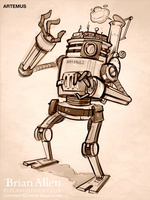
I created these concept illustrations of a steampunk family of adventurers for an educational publisher called Bogardpress. The character designs will be used to illustrate their educational materials and lessons. Each year the team uses a different theme and concept to tie their lessons together. I really enjoyed the whole process, from developing the characters in sketches, to coloring and rendering the final versions. I tried to add a bit of style into the characters to keep them from becoming generic. I especially enjoyed creating the robot character.

I created these concept illustrations of a steampunk family of adventurers for an educational publisher called Bogardpress. The character designs will be used to illustrate their educational materials and lessons. Each year the team uses a different theme and concept to tie their lessons together. I really enjoyed the whole process, from developing the characters in sketches, to coloring and rendering the final versions. I tried to add a bit of style into the characters to keep them from becoming generic. I especially enjoyed creating the robot character.
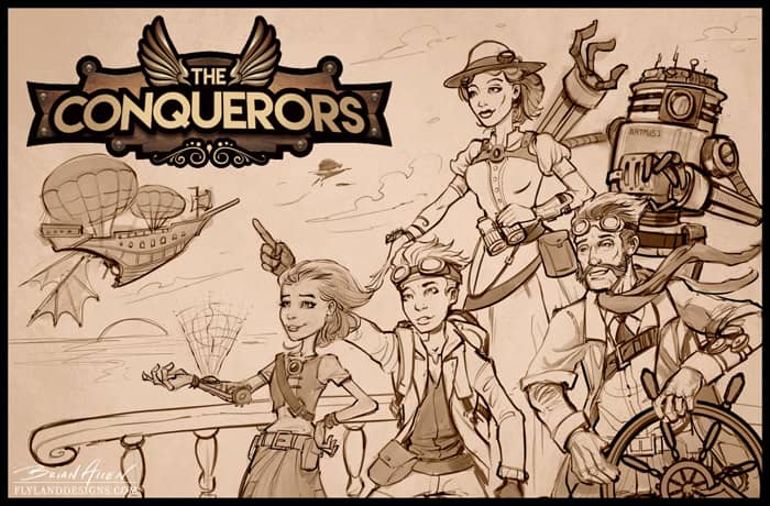
I created these concept illustrations of a steampunk family of adventurers for an educational publisher called Bogardpress. The character designs will be used to illustrate their educational materials and lessons. Each year the team uses a different theme and concept to tie their lessons together. I really enjoyed the whole process, from developing the characters in sketches, to coloring and rendering the final versions. I tried to add a bit of style into the characters to keep them from becoming generic. I especially enjoyed creating the robot character.
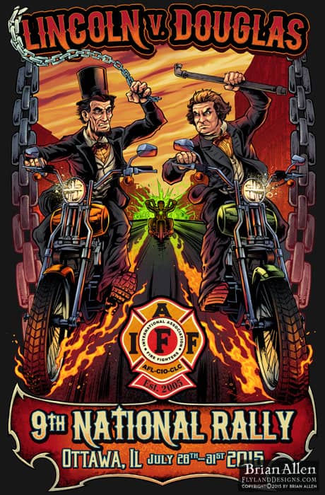
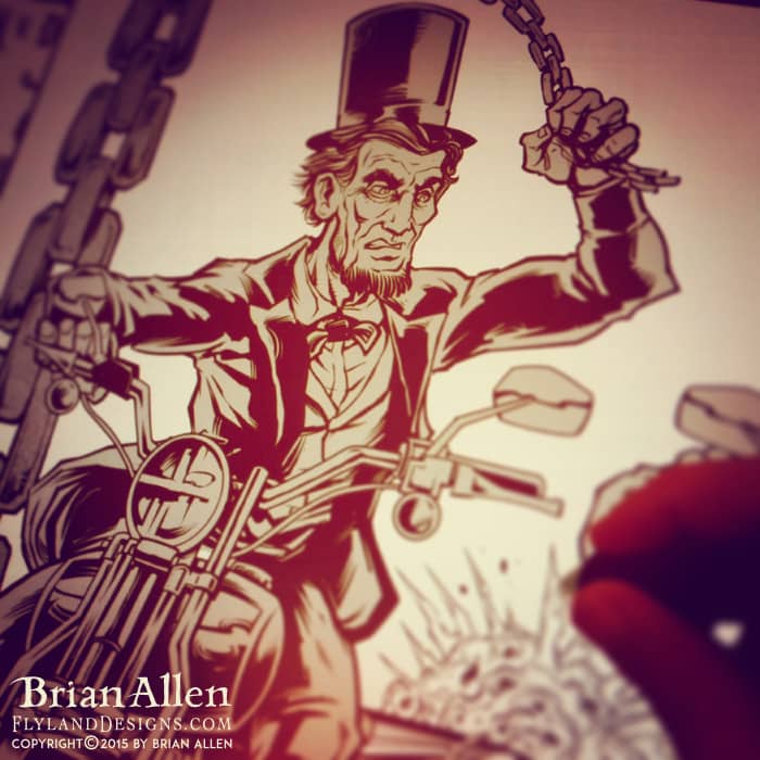
The IAFF recently commissioned me to create a poster for an upcoming rally in Ottawa, IL, the location of the historical Lincoln v. Douglas debates. I thought it would be fun to draw Lincoln and Douglas speeding through time on two motorcycles swinging chains and pipes at each other. I’m a historian at heart. The IAFF Motorcycle Group mascot is seen far back in the historic streets of Ottawa.
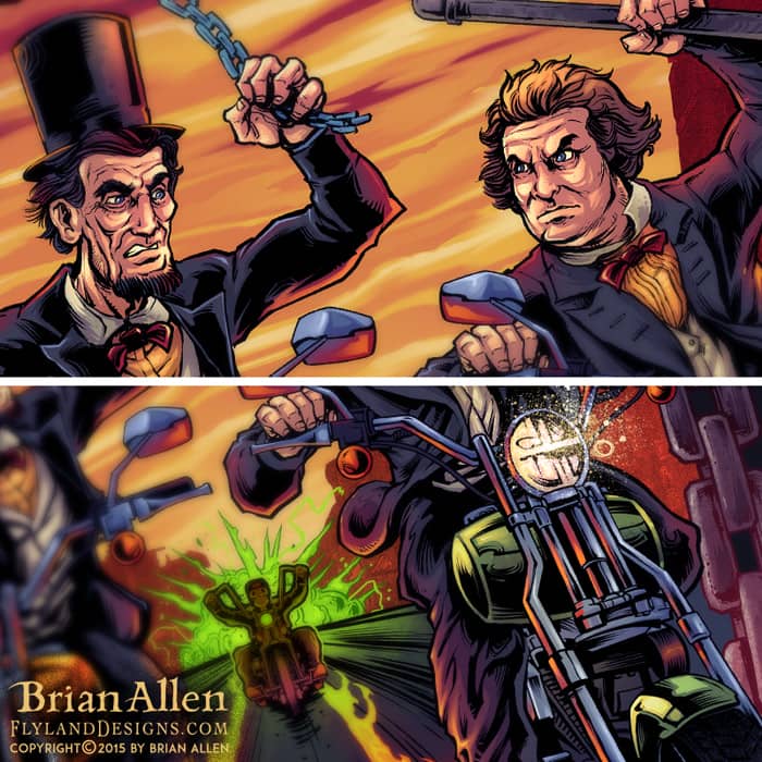
The IAFF recently commissioned me to create a poster for an upcoming rally in Ottawa, IL, the location of the historical Lincoln v. Douglas debates. I thought it would be fun to draw Lincoln and Douglas speeding through time on two motorcycles swinging chains and pipes at each other. I’m a historian at heart. The IAFF Motorcycle Group mascot is seen far back in the historic streets of Ottawa.
To see more of my work, or hire me for freelance projects, please visit my website: www.flylanddesigns.com
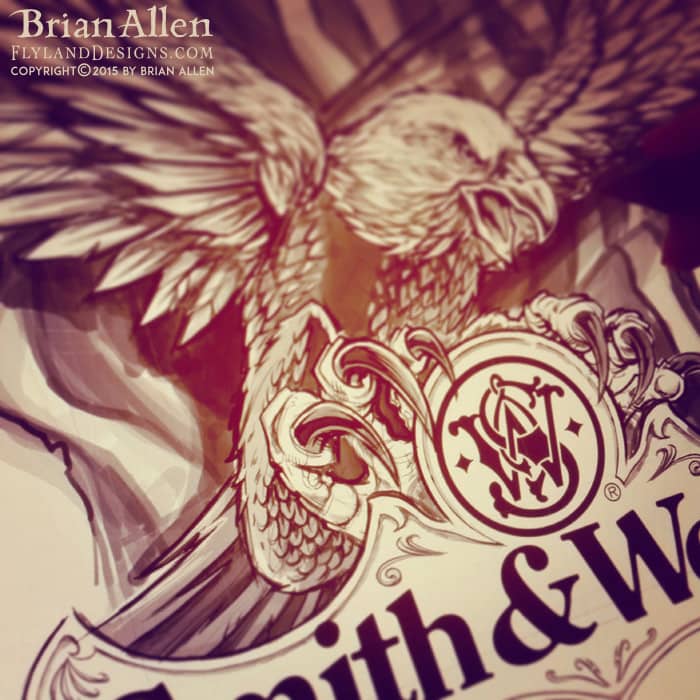
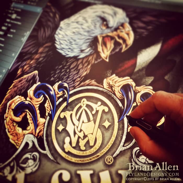
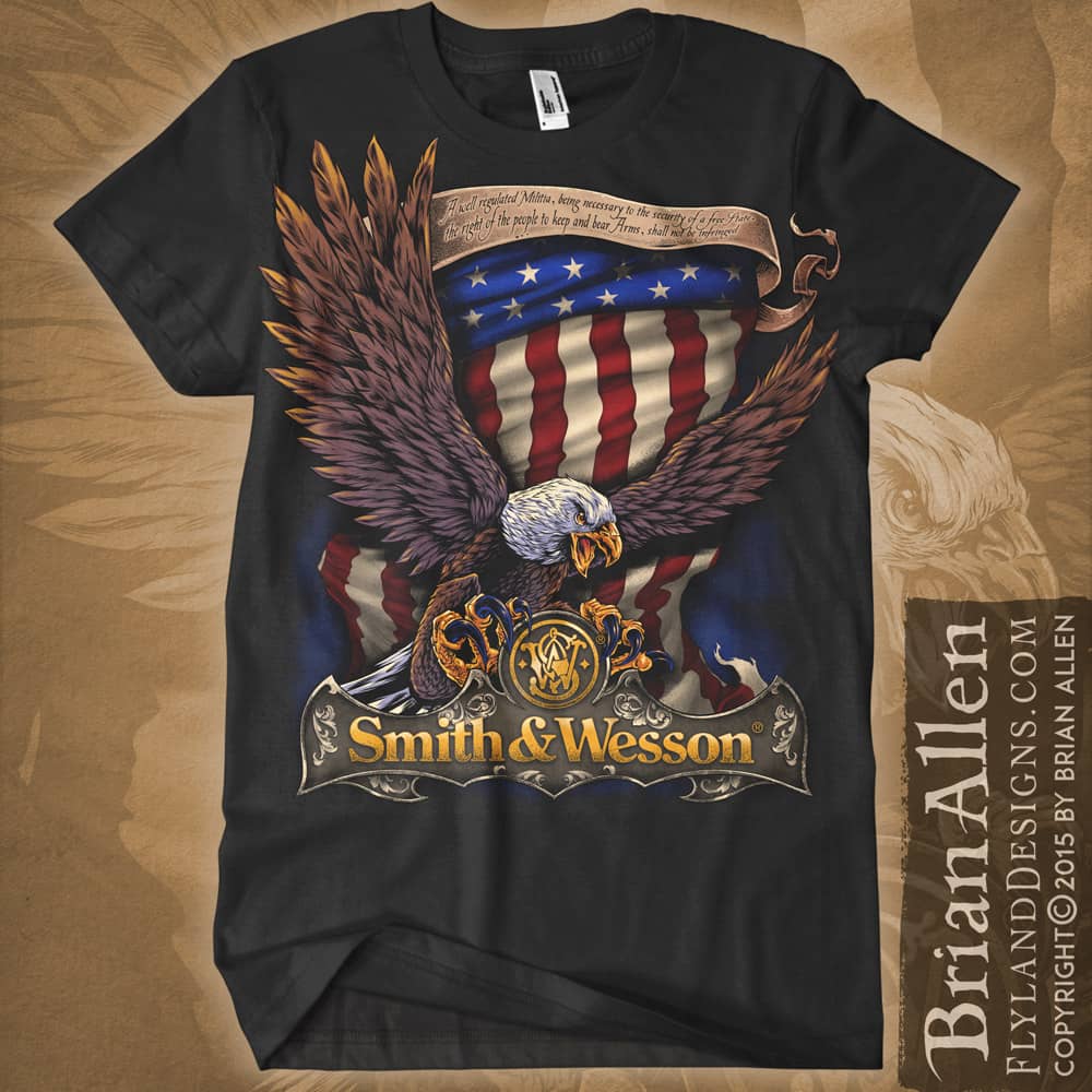
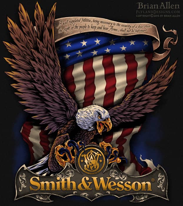
I was thrilled to be hired to create artwork for a new line of apparel for Smith & Wesson, featuring silk-screen illustrations of big angry eagles. It was a really fun challenge drawing the eagles, which I’ve always found difficult. Need to invest in a pet eagle for reference. The designs all needed to stay under six colors, which is always a challenge as soon as you introduce an american flag into the design (which eats up three colors right away). I used halftones wherever I could to limit the total number of colors.
The designs will be available in Smith & Wesson’s catalog, as well as in many retailers, such as Cabela’s.
To see more of my work, or hire me for freelance projects, please visit my website: www.flylanddesigns.com
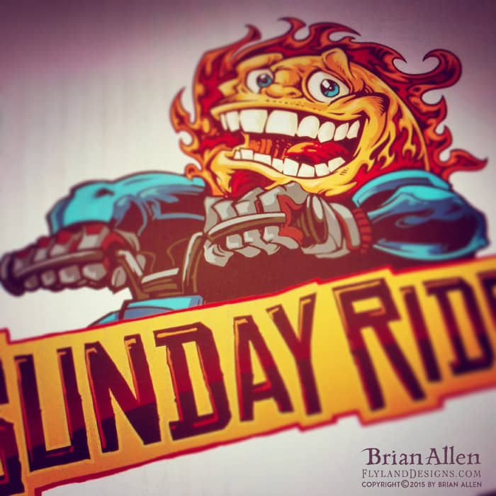
I was recently commissioned to design the logo and mascot for a William Kahuna, a YouTube personality that films his adventures dirt-biking through Hawaii. The brand was called Sunday Rides, and we came up with this fun sun character to be his logo for merchandise and branding. I tried to inject a lot of William’s laid-back and fun-loving personality into it.
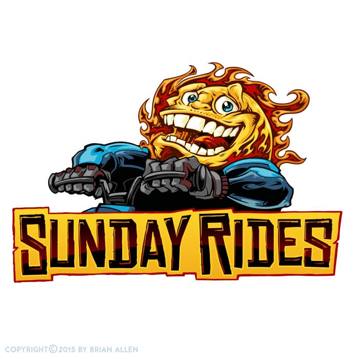
I was recently commissioned to design the logo and mascot for a William Kahuna, a YouTube personality that films his adventures dirt-biking through Hawaii. The brand was called Sunday Rides, and we came up with this fun sun character to be his logo for merchandise and branding. I tried to inject a lot of William’s laid-back and fun-loving personality into it.
To see more of my work, or hire me for freelance projects, please visit my website: www.flylanddesigns.com
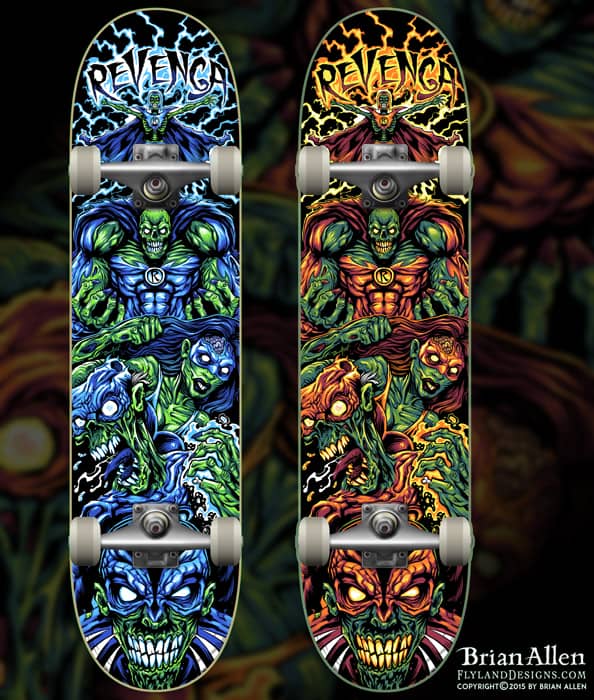
I was recently hired to conceptualize and illustrate a team of Superhero zombies to be laser-engraved into skateboards by Revenga. It was challenging to pump a ton of detail in the board, while making sure to keep the lines bold enough as to not cause much trouble in the engraving process.
While designing, I also had to structure the design so the layout could be changed to fit a T-Shirt as well. I made sure to keep the characters masked on separate layers, that way moving them around at the end was relatively easy.
We also created a silk-screen color version for boards and shirts, using around 6 colors.
Client Testimonial:
They look just as amazing! Everyone is giving compliments about the graphic because it’s very cool!
-Martina Ieffa
Revenga Skateboards
You can purchase it here:
http://www.revengaskateboards.com
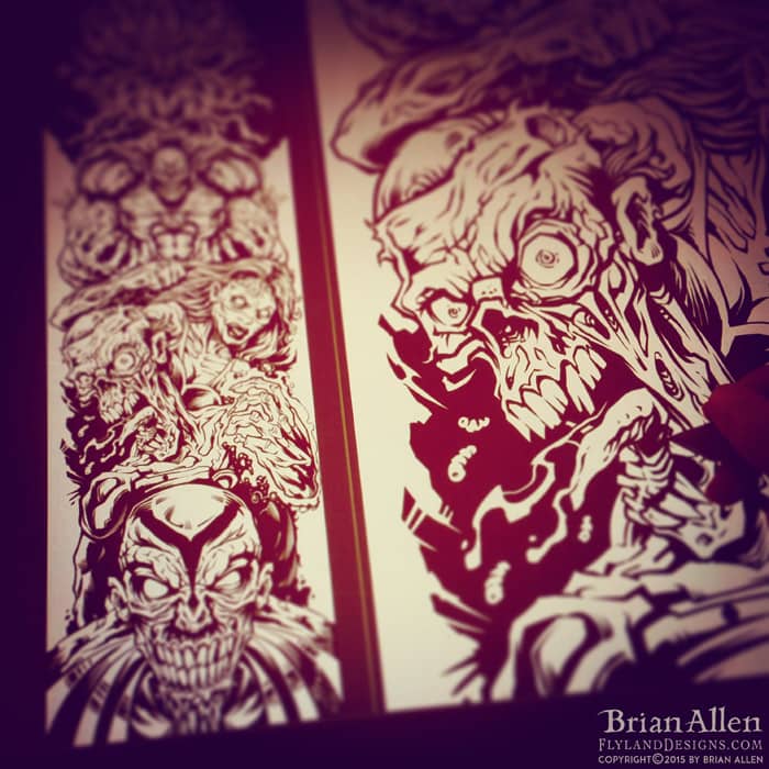
I was recently hired to conceptualize and illustrate a team of Superhero zombies to be laser-engraved into skateboards by Revenga. It was challenging to pump a ton of detail in the board, while making sure to keep the lines bold enough as to not cause much trouble in the engraving process.To see more of my work, or hire me for freelance projects, please visit my website: www.flylanddesigns.com
I was recently hired to conceptualize and illustrate a team of Superhero zombies to be laser-engraved into skateboards by Revenga. It was challenging to pump a ton of detail in the board, while making sure to keep the lines bold enough as to not cause much trouble in the engraving process.To see more of my work, or hire me for freelance projects, please visit my website: www.flylanddesigns.com

I was recently hired to conceptualize and illustrate a team of Superhero zombies to be laser-engraved into skateboards by Revenga. It was challenging to pump a ton of detail in the board, while making sure to keep the lines bold enough as to not cause much trouble in the engraving process.To see more of my work, or hire me for freelance projects, please visit my website: www.flylanddesigns.com

I was recently hired to conceptualize and illustrate a team of Superhero zombies to be laser-engraved into skateboards by Revenga. It was challenging to pump a ton of detail in the board, while making sure to keep the lines bold enough as to not cause much trouble in the engraving process.To see more of my work, or hire me for freelance projects, please visit my website: www.flylanddesigns.com

I was recently hired to conceptualize and illustrate a team of Superhero zombies to be laser-engraved into skateboards by Revenga. It was challenging to pump a ton of detail in the board, while making sure to keep the lines bold enough as to not cause much trouble in the engraving process.To see more of my work, or hire me for freelance projects, please visit my website: www.flylanddesigns.com
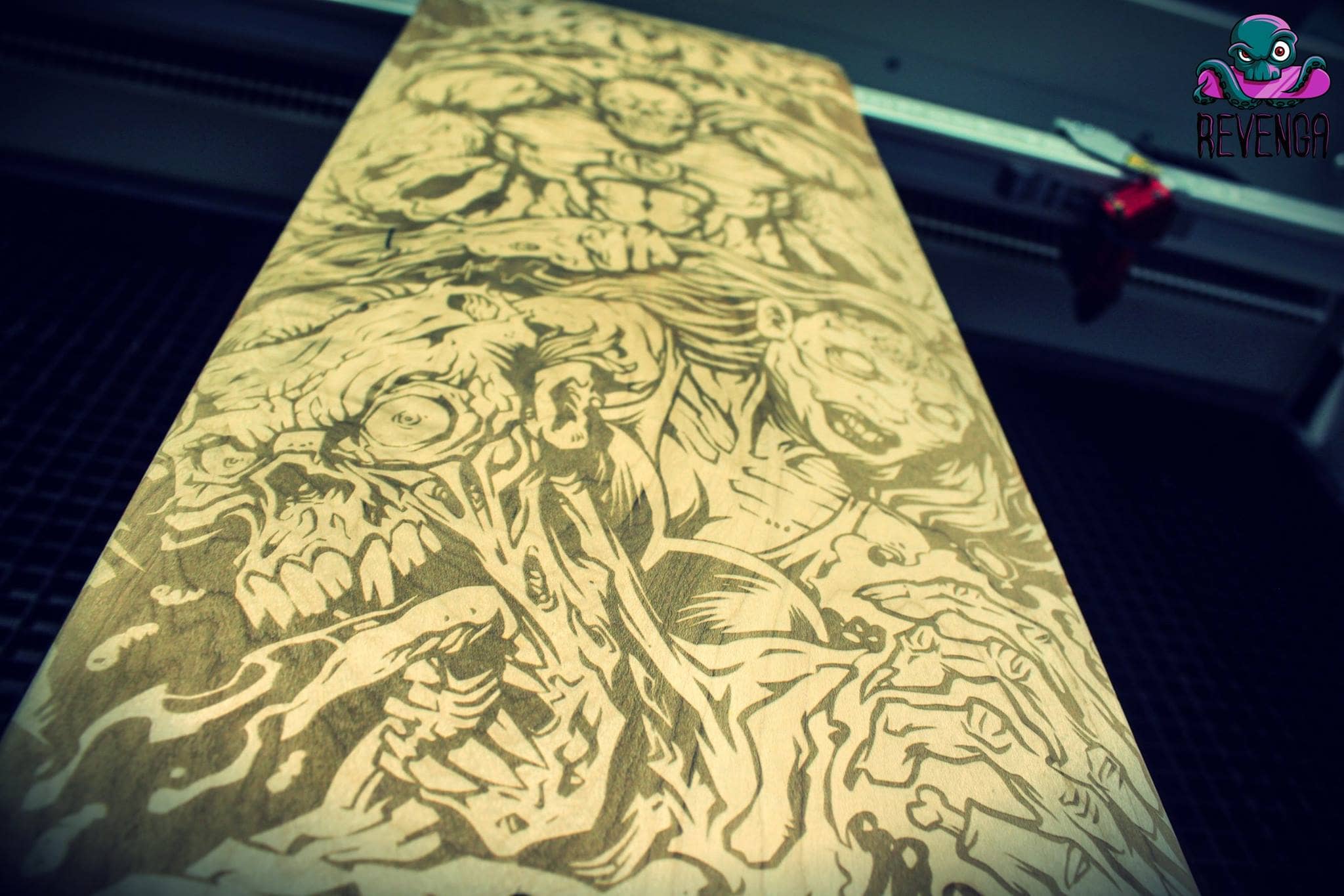
I was recently hired to conceptualize and illustrate a team of Superhero zombies to be laser-engraved into skateboards by Revenga. It was challenging to pump a ton of detail in the board, while making sure to keep the lines bold enough as to not cause much trouble in the engraving process.To see more of my work, or hire me for freelance projects, please visit my website: www.flylanddesigns.com
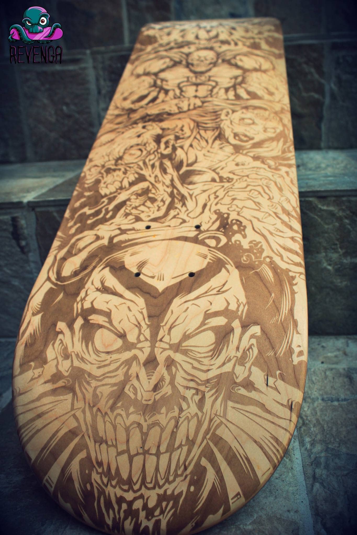
I was recently hired to conceptualize and illustrate a team of Superhero zombies to be laser-engraved into skateboards by Revenga. It was challenging to pump a ton of detail in the board, while making sure to keep the lines bold enough as to not cause much trouble in the engraving process.To see more of my work, or hire me for freelance projects, please visit my website: www.flylanddesigns.com

I was recently hired to conceptualize and illustrate a team of Superhero zombies to be laser-engraved into skateboards by Revenga. It was challenging to pump a ton of detail in the board, while making sure to keep the lines bold enough as to not cause much trouble in the engraving process.To see more of my work, or hire me for freelance projects, please visit my website: www.flylanddesigns.com
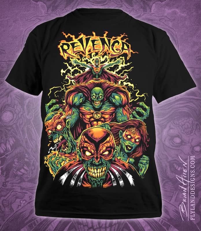
I was recently hired to conceptualize and illustrate a team of Superhero zombies to be laser-engraved into skateboards by Revenga. It was challenging to pump a ton of detail in the board, while making sure to keep the lines bold enough as to not cause much trouble in the engraving process.To see more of my work, or hire me for freelance projects, please visit my website: www.flylanddesigns.com

I was recently hired to conceptualize and illustrate a team of Superhero zombies to be laser-engraved into skateboards by Revenga. It was challenging to pump a ton of detail in the board, while making sure to keep the lines bold enough as to not cause much trouble in the engraving process.To see more of my work, or hire me for freelance projects, please visit my website: www.flylanddesigns.com
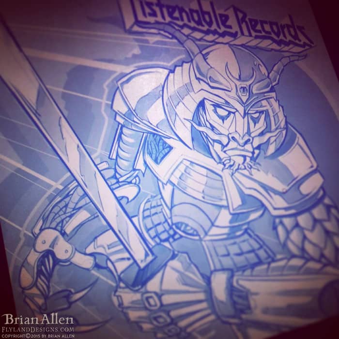
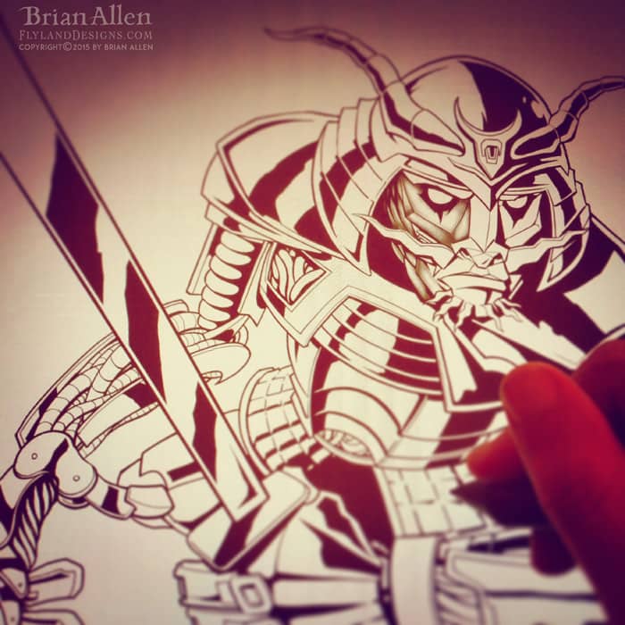
Always a pleasure working with my friends at Listenable Records. For this year’s sampler featuring the labels best tracks, we chose to pay tribute to the classic Defenders of the Faith album cover from Judas Priest. I thought it would be cool to draw a samurai in the same art style and color scheme as that record, and really give it a nice retro theme, with bright primary colors. Really dig the way this came out – might make a great sticker.
Client Testimonial:
I love it, colours are perfect , there’s a vintage feel too in the logo and overall colours, it’s great!
-Laurent Merle
Listenable Records
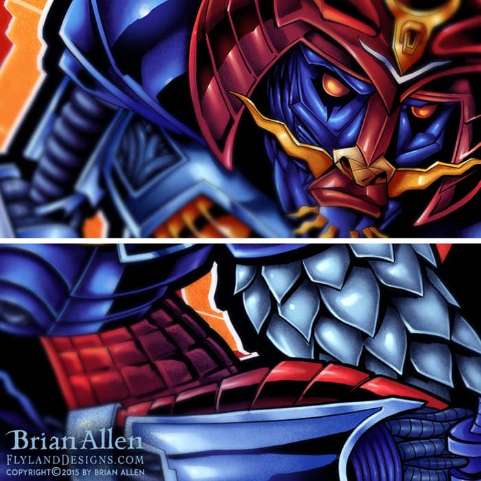
Always a pleasure working with my friends at Listenable Records. For this year’s sampler featuring the labels best tracks, we chose to pay tribute to the classic Defenders of the Faith album cover from Judas Priest. I thought it would be cool to draw a samurai in the same art style and color scheme as that record, and really give it a nice retro theme, with bright primary colors. Really dig the way this came out – might make a great sticker.
To see more of my work, or hire me for freelance projects, please visit my website: www.flylanddesigns.com
This is a detailed series of illustrations I created for a children’s book teaching kids about construction. Each double-page spread was packed with animal characters, vehicles, tools, and activities. The book challenges kids to hunt out objects and solve problems within the illustration, so I had to draw everything in a way that certain elements were intentionally hard to find. I had a lot of fun with this, because I had a lot of freedom to design the characters and draw them in my style.
Client Testimonial:
….turned out great! Awesome job!
-Chris Kane
Animal Kingdom Construction Co.
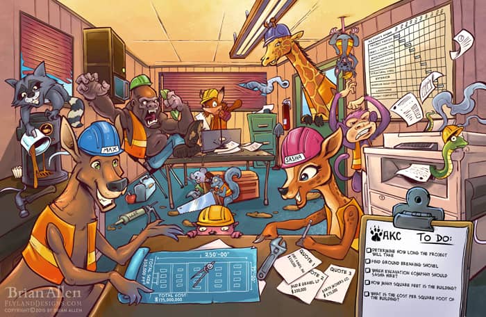
This is a detailed series of illustrations I created for a children’s book teaching kids about construction. Each double-page spread was packed with animal characters, vehicles, tools, and activities. The book challenges kids to hunt out objects and solve problems within the illustration, so I had to draw everything in a way that certain elements were intentionally hard to find. I had a lot of fun with this, because I had a lot of freedom to design the characters and draw them in my style.
To see more of my work, or hire me for freelance projects, please visit my website: www.flylanddesigns.com
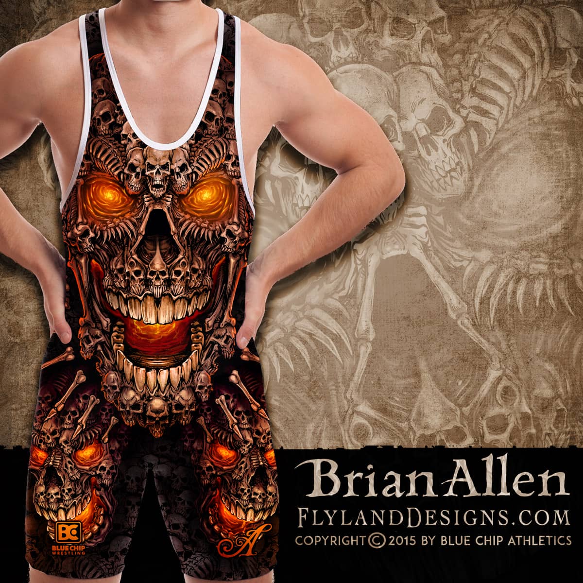
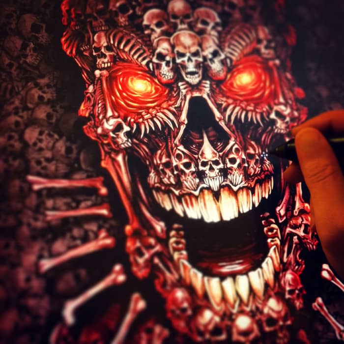
All-over-print dye-sublimated wrestling singlet design I created for BlueChip wrestling. This design is easily my favorite in the seires, and also the most time-consuming. I illustrated these giant skulls made up of probably a hundred smaller skulls, and lit the whole thing up by their glowing eyes. It was challenging, but I’m thrilled with how it turned out.
I created this as part of a series of wrestling singlet designs for BlueChip’s summer catalog. The designs will also be available on fight shorts. I find it so enjoyable working with dye sublimation, because the color and detail reproduction is fantastic, and I don’t have to worry about the head-scratching that comes from working with silk-screen.
Client Testimonial:
Thank you very much, I think everything turned out great!
-Andy Michaels
BlueChip Athletics
You can purchase the design on a singlet here:
http://www.bluechipwrestling.com/

All-over-print dye-sublimated wrestling singlet design I created for BlueChip wrestling. This design is easily my favorite in the seires, and also the most time-consuming. I illustrated these giant skulls made up of probably a hundred smaller skulls, and lit the whole thing up by their glowing eyes. It was challenging, but I’m thrilled with how it turned out.
I created this as part of a series of wrestling singlet designs for BlueChip’s summer catalog. The designs will also be available on fight shorts. I find it so enjoyable working with dye sublimation, because the color and detail reproduction is fantastic, and I don’t have to worry about the head-scratching that comes from working with silk-screen. To see more of my work, or hire me for freelance projects, please visit my website: www.flylanddesigns.com
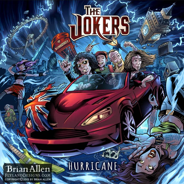
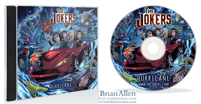
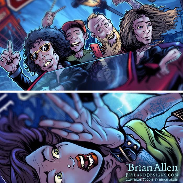
This is a fun album cover illustration I created for a hard rock band called the Jokers for their new album, Hurricane. The idea was to have the band in a classic-looking car flying through the air to their next gig, and causing a hurricane behind them, destroying London below them. I tried to hide a lot of detail into the design swirling around them in the hurricane, like roadies, amps, guitars, and british artifacts. The band needed the album art in a really short amount of time, but we pulled it off in time, and they were quite happy with the result.
Client Testimonial:
…it all looks amazing, we are really really happy with the final product.
-Paul Hurst
The Jokers
This is a fun album cover illustration I created for a hard rock band called the Jokers for their new album, Hurricane. The idea was to have the band in a classic-looking car flying through the air to their next gig, and causing a hurricane behind them, destroying London below them. I tried to hide a lot of detail into the design swirling around them in the hurricane, like roadies, amps, guitars, and british artifacts. The band needed the album art in a really short amount of time, but we pulled it off in time, and they were quite happy with the result.
To see more of my work, or hire me for freelance projects, please visit my website: www.flylanddesigns.com
Description:
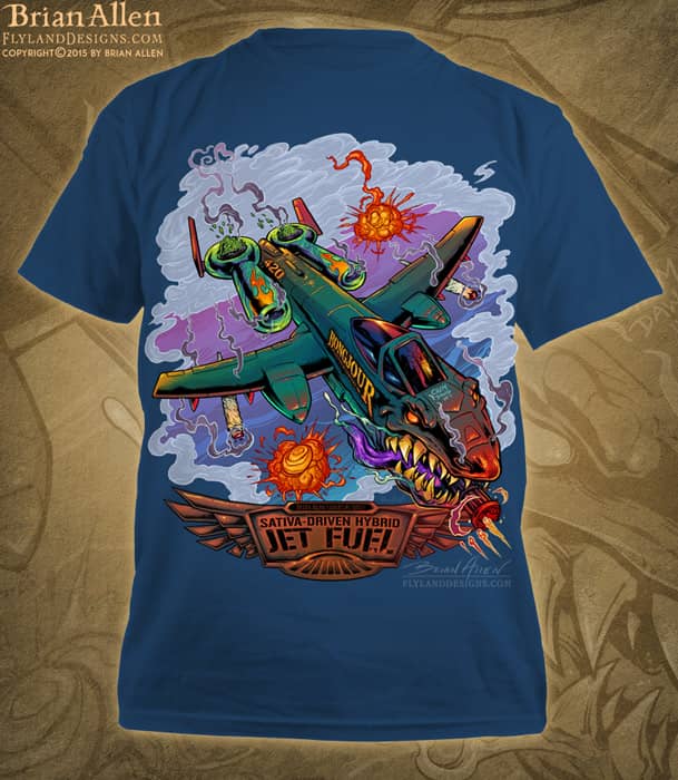
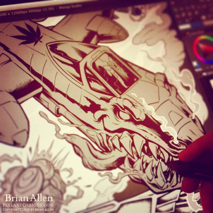
T-Shirt illustration I created of a crazed A-10 Thunderbolt warplane come to life in a dog-fight. This was done for a series of shirts celebrating different marijuana strains. The shirt is printed on 100% hemp, and available in a variety of groovy colors.
It was a pleasure working with the folks at #Bongjour. They gave me a lot of freedom with the design, and I’m really happy with how it turned out. Set up for direct-to-garment, full-color printing.
You can purchase the shirt here:
http://www.bongjour.com/

T-Shirt illustration I created of a crazed A-10 Thunderbolt warplane come to life in a dog-fight. This was done for a series of shirts celebrating different marijuana strains. The shirt is printed on 100% hemp, and available in a variety of groovy colors.
It was a pleasure working with the folks at #Bongjour. They gave me a lot of freedom with the design, and I’m really happy with how it turned out. Set up for direct-to-garment, full-color printing.
To see more of my work, or hire me for freelance projects, please visit my website: www.flylanddesigns.com
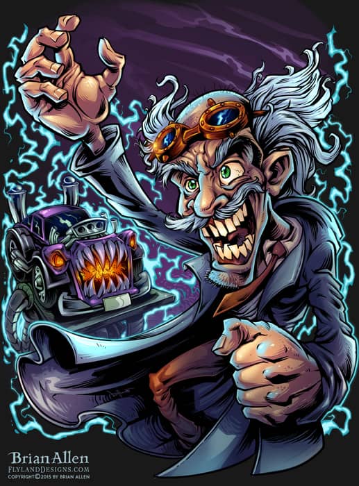
I created this mad scientist character for an auto-repair shop whose specialty is custom built choppers and hotrods. The brand wanted a dark but playful design that illustrated them as a blend of mechanic and mad scientist. I thought it would be cool to show a frankenstein-ed hotrod on the operating table behind the mad scientist, as he raises his creation up to the lightning. This design was created for direct-to-garment printing.
Client Testimonial:
Testimonial
-Client Name
Position
This design is available for licensing:

I created this mad scientist character for an auto-repair shop whose specialty is custom built choppers and hotrods. The brand wanted a dark but playful design that illustrated them as a blend of mechanic and mad scientist. I thought it would be cool to show a frankenstein-ed hotrod on the operating table behind the mad scientist, as he raises his creation up to the lightning. This design was created for direct-to-garment printing.
To see more of my work, or hire me for freelance projects, please visit my website: www.flylanddesigns.com
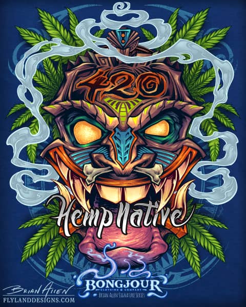
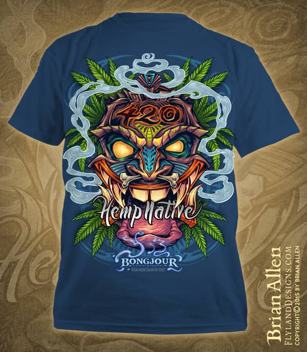
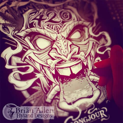
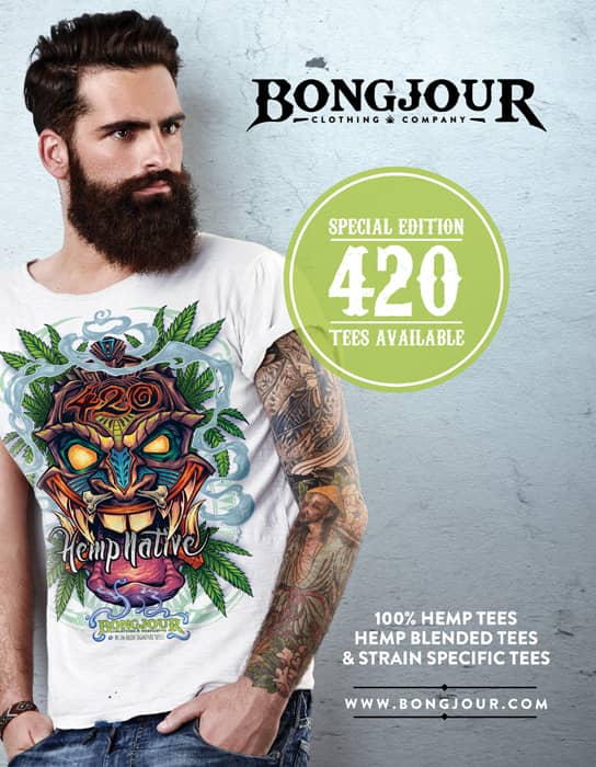
T-Shirt illustration I created of an evil Tiki man surrounded by smoke and pot leaves for the Hemp apparel brand Bongjour. The shirt is printed on 100% hemp, and available in a variety of groovy colors.
It was a pleasure working with the folks at #Bongjour. They gave me a lot of freedom with the design, and I’m really happy with how it turned out. Set up for direct-to-garment, full-color printing.
You can purchase the shirt here:
http://www.bongjour.com/product/hemp-native-apparel/
To see a process video of me inking this design, visit my YouTube channel:
To see a process video of how I colored this design, please visit:
T-Shirt illustration I created of an evil Tiki man surrounded by smoke and pot leaves for the Hemp apparel brand Bongjour. The shirt is printed on 100% hemp, and available in a variety of groovy colors.
It was a pleasure working with the folks at #Bongjour. They gave me a lot of freedom with the design, and I’m really happy with how it turned out. Set up for direct-to-garment, full-color printing.
To see more of my work, or hire me for freelance projects, please visit my website: www.flylanddesigns.com
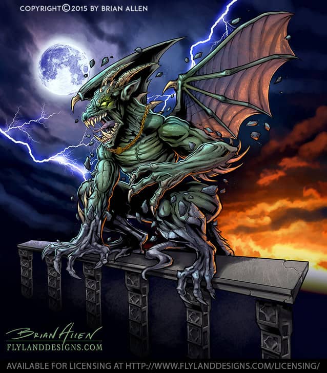
I designed and illustrated this angry gargoyle busting out of its stone skin for a line of ATV and sled wraps put out by 393 Components. It was a challenge to position everything and design it in a way to make the design look interesting on as many different vehicle types and shapes as possible. I kept all the elements in layers so that the design could be modified if necessary to fit different wraps. I needed to make it look as different as possible from a previous gargoyle design I had done, so I came up with the idea of having the gargoyle a green-skinned creature bursting from stone, as if it was coming to life.
It was really cool to be working with graphic decals again for ATVs, because my first full-time position as an artist was at a custom decal shop called XGX Racing.
Client Testimonial:
Just wanted to thank you again for an outstanding job
– 393 Components
Shawn Alexander
This design is available for licensing:
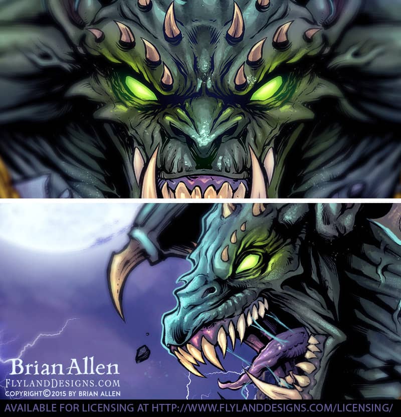
I designed and illustrated this angry gargoyle busting out of its stone skin for a line of ATV and sled wraps put out by 393 Components. It was a challenge to position everything and design it in a way to make the design look interesting on as many different vehicle types and shapes as possible. I kept all the elements in layers so that the design could be modified if necessary to fit different wraps. I needed to make it look as different as possible from a previous gargoyle design I had done, so I came up with the idea of having the gargoyle a green-skinned creature bursting from stone, as if it was coming to life.
It was really cool to be working with graphic decals again for ATVs, because my first full-time position as an artist was at a custom decal shop called XGX Racing.
To see more of my work, or hire me for freelance projects, please visit my website: www.flylanddesigns.com
This is a T-Shirt illustration I created for a new brand called The Reno Life, which celebrates and promotes the work of several DIY TV personalities. The illustration features caricatures of DIY celebrities Anitra Mecadon, Jason Cameron, Chris Grundy, Jeff Devlin, and Stephen Fanuka on the beach. It was a challenge to fit all of these characters into such a tight space, while still keeping them recognizable.

This is a T-Shirt illustration I created for a new brand called The Reno Life, which celebrates and promotes the work of several DIY TV personalities. The illustration features caricatures of DIY celebrities Anitra Mecadon, Jason Cameron, Chris Grundy, Jeff Devlin, and Stephen Fanuka on the beach. It was a challenge to fit all of these characters into such a tight space, while still keeping them recognizable.
To see more of my work, or hire me for freelance projects, please visit my website: www.flylanddesigns.com
I wanted to create a an illustration as a sample to try to get work from young-adult fantasy book publishers, a market that I’d like to do more work in. I chose a scene with an adventurer in an Aztec-like jungle temple so I could draw some funny and creepy totems – and I even got to sneak a skull in there too! I like to try different styles and themes whenever I can – keeps things from getting stale. I’m happy with how this turned out, and would like to do more in this genre.
This design is available for licensing:

I wanted to create a an illustration as a sample to try to get work from young-adult fantasy book publishers, a market that I’d like to do more work in. I chose a scene with an adventurer in an Aztec-like jungle temple so I could draw some funny and creepy totems – and I even got to sneak a skull in there too! I like to try different styles and themes whenever I can – keeps things from getting stale. I’m happy with how this turned out, and would like to do more in this genre.
To see more of my work, or hire me for freelance projects, please visit my website: www.flylanddesigns.com
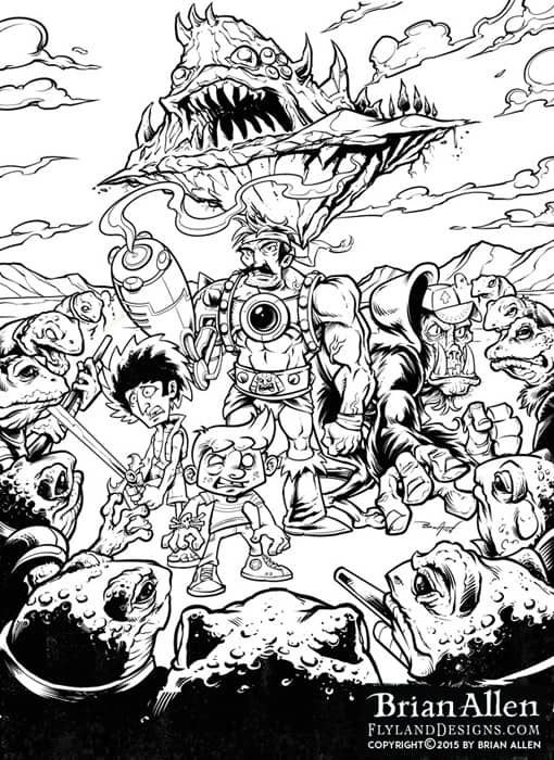
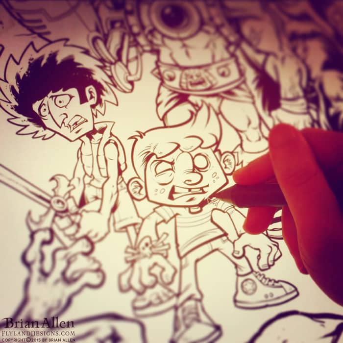
I was hired by Strange Kids Club Magazine to illustrated a promotional poster featuring characters from their upcoming magazine. I loved every second of working on this. If you’re strange like me, and born in the 80s, then I don’t need to explain what’s going on here. The concept revolved around a fictional character called Bronarr, Space Barbarian (!) – loosely based on 80s Saturday morning cartoons like Masters of the Universe, as well as camp classic 70s retro sci-fi/fantasy films like Hell Comes To Frogtown.
Client Testimonial:
Simply put, you nailed it!
-Rondal Scott III
Strange Kids Club Magazine, owner
You can view a video of the inking process here:
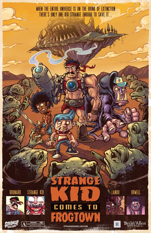
I was hired by Strange Kids Club Magazine to illustrated a promotional poster featuring characters from their upcoming magazine. I loved every second of working on this. If you’re strange like me, and born in the 80s, then I don’t need to explain what’s going on here. The concept revolved around a fictional character called Bronarr, Space Barbarian (!) – loosely based on 80s Saturday morning cartoons like Masters of the Universe, as well as camp classic 70s retro sci-fi/fantasy films like Hell Comes To Frogtown.
To see more of my work, or hire me for freelance projects, please visit my website: www.flylanddesigns.com
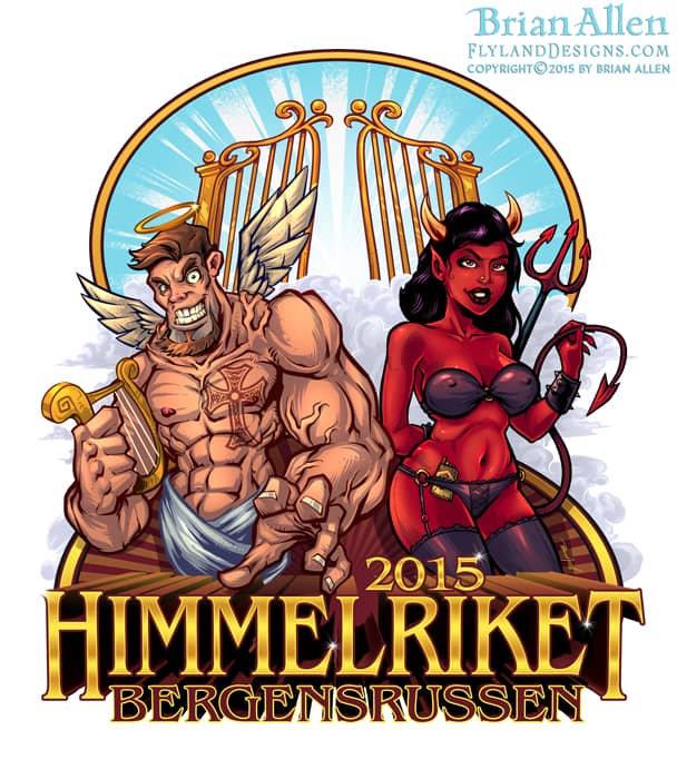
I was hired to design this angel and devil logo for apparel and a vehicle wrap for the russefeiring tradition. If you haven’t heard of it, basically russefeiring involves an entire class of Norwegian students renting a bus (a Russebuss), painting every inch of it with really cool street art, and then partying in it night and day for an entire month during graduation. The different classes wear their designs ever where they go as they clash with rival classes. I’ve done a bunch of these now, and really enjoy it.
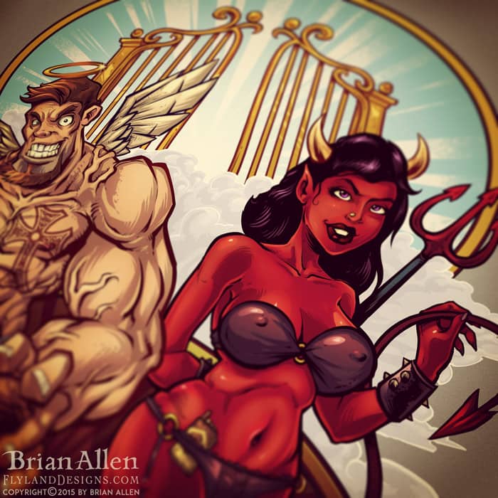
I was hired to design this angel and devil logo for apparel and a vehicle wrap for the russefeiring tradition. If you haven’t heard of it, basically russefeiring involves an entire class of Norwegian students renting a bus (a Russebuss), painting every inch of it with really cool street art, and then partying in it night and day for an entire month during graduation. The different classes wear their designs ever where they go as they clash with rival classes. I’ve done a bunch of these now, and really enjoy it.
To see more of my work, or hire me for freelance projects, please visit my website: www.flylanddesigns.com
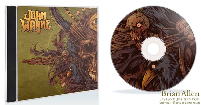
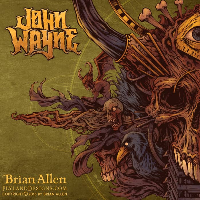
Album cover I illustrated for the Brazilian heavy metal band John Wayne (named after John Wayne Gacy – not the other guy). It was a great pleasure working on this with the band, as they gave me a lot of freedom, and I set upon the design without much planning, and tried to let it flow. This album cover is the first in a set of two albums, that when placed together will form one cohesive image. This album represents the dark side, while the following album will have a similar design, but mirrored, and “lighter.”
Client Testimonial:
We are very happy with your great work!
-Rogerio Torres
John Wayne (Brazilian Heavy Metal Band)
You can purchase the album here:
https://www.facebook.com/BandaJohnWayne
Album cover I illustrated for the Brazilian heavy metal band John Wayne (named after John Wayne Gacy – not the other guy). It was a great pleasure working on this with the band, as they gave me a lot of freedom, and I set upon the design without much planning, and tried to let it flow. This album cover is the first in a set of two albums, that when placed together will form one cohesive image. This album represents the dark side, while the following album will have a similar design, but mirrored, and “lighter.”
To see more of my work, or hire me for freelance projects, please visit my website: www.flylanddesigns.com
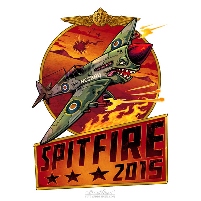
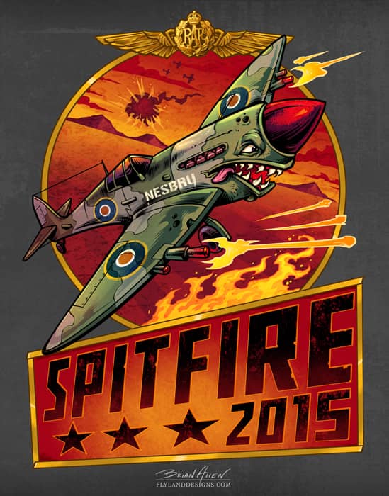
I created this t-shirt and logo design of a dog-fighting Spitfire airplane with a real shark’s mouth for apparel and vehicle wrap for the russefeiring tradition. If you haven’t heard of it, basically it involves an entire class of Norwegian students renting a bus (a Russebuss), painting every inch of it with really cool street art, and then partying in it night and day for an entire month during graduation. The different classes wear their designs ever where they go as they clash with rival classes. It’s cool to be a part of it, in the best way I know how!
Client Testimonial:
It was a pleasure working with you!
-Martin Semb
I created this t-shirt and logo design of a dog-fighting Spitfire airplane with a real shark’s mouth for apparel and vehicle wrap for the russefeiring tradition. If you haven’t heard of it, basically it involves an entire class of Norwegian students renting a bus (a Russebuss), painting every inch of it with really cool street art, and then partying in it night and day for an entire month during graduation. The different classes wear their designs ever where they go as they clash with rival classes. It’s cool to be a part of it, in the best way I know how!
I created this t-shirt and logo design of a dog-fighting Spitfire airplane with a real shark’s mouth for apparel and vehicle wrap for the russefeiring tradition. If you haven’t heard of it, basically it involves an entire class of Norwegian students renting a bus (a Russebuss), painting every inch of it with really cool street art, and then partying in it night and day for an entire month during graduation. The different classes wear their designs ever where they go as they clash with rival classes. It’s cool to be a part of it, in the best way I know how!

I created this t-shirt and logo design of a dog-fighting Spitfire airplane with a real shark’s mouth for apparel and vehicle wrap for the russefeiring tradition. If you haven’t heard of it, basically it involves an entire class of Norwegian students renting a bus (a Russebuss), painting every inch of it with really cool street art, and then partying in it night and day for an entire month during graduation. The different classes wear their designs ever where they go as they clash with rival classes. It’s cool to be a part of it, in the best way I know how!
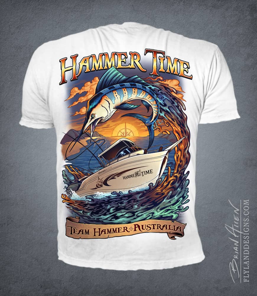
This is an illustration I created recently of a client’s boat in a coastal scene with a big marlin jumping out of the water. The design was set up for full-color direct-to-garment printing. I tried to handle the waves and water in my own style and played with adding a lot of detail and color variation.
This design is available for licensing:
Client Testimonial:
Once again thank you for all your hard work and effort and I’m sure we will be doing more work in the future.
-Merton Oxha
This is an illustration I created recently of a client’s boat in a coastal scene with a big marlin jumping out of the water. The design was set up for full-color direct-to-garment printing. I tried to handle the waves and water in my own style and played with adding a lot of detail and color variation. To see more of my work, or hire me for freelance projects, please visit my website: www.flylanddesigns.com
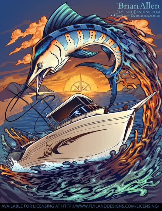
This is an illustration I created recently of a client’s boat in a coastal scene with a big marlin jumping out of the water. The design was set up for full-color direct-to-garment printing. I tried to handle the waves and water in my own style and played with adding a lot of detail and color variation. To see more of my work, or hire me for freelance projects, please visit my website: www.flylanddesigns.com
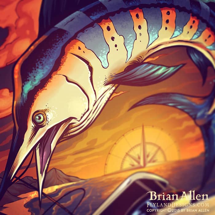
This is an illustration I created recently of a client’s boat in a coastal scene with a big marlin jumping out of the water. The design was set up for full-color direct-to-garment printing. I tried to handle the waves and water in my own style and played with adding a lot of detail and color variation. To see more of my work, or hire me for freelance projects, please visit my website: www.flylanddesigns.com
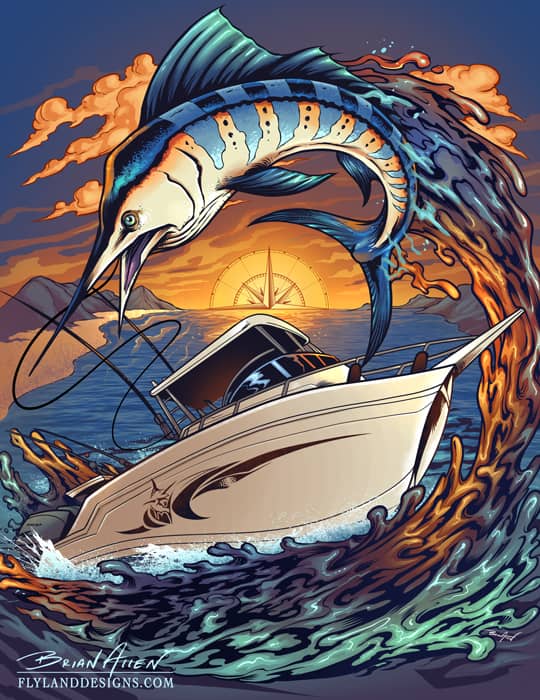
This is an illustration I created recently of a client’s boat in a coastal scene with a big marlin jumping out of the water. The design was set up for full-color direct-to-garment printing. I tried to handle the waves and water in my own style and played with adding a lot of detail and color variation. To see more of my work, or hire me for freelance projects, please visit my website: www.flylanddesigns.com
Illustration of an angry Firefighter leprechaun wielding a fire axe on a maltese cross I illustrated for a St. Patrick’s Day Parade. This design is available for licensing for apparel and other uses. Please contact flylanddesigns@gmail.com for information. Set up for Direct-To-Garment printing, or full-color simulated process silk-screen.
This design is available for licensing:

Illustration of an angry Firefighter leprechaun weilding a fire axe on a maltese cross illustrated for a St. Patrick’s Day Parade. This design is available for licensing for apparel and other uses. Please contact flylanddesigns@gmail.com for information. Set up for Direct-To-Garment printing, or full-color simulated process silk-screen.