Tag Archive for: how to

Over 110 new Volume 2 Custom bru


TUTORIAL 3 0f 3 – COLORING

VIDEO 3:  https://youtu.be/10FCEL_Nv90

    1. Flats

      1. “Flatting” a piece consists of coloring the basic shapes of the illustration in random, unique colors to differentiate the different elements from each other in order to make quick selections when coloring.
      2. Once finished, you set this Flats layer as a Reference layer in Clip Studio Paint.
        1. Using reference layers makes coloring much faster, because you can use the magic wand tool to select quick masks of certain areas, without having to switch the layer you are working on.
    2. Create a Color Comp

      1. I always experiment with color BEFORE I begin working on the final piece.
      2. Duplicate your document and reduce to 72 dpi.
      3. Gather reference of great color schemes and environments for inspiration.
      4. On a layer set to overlay above all other artwork, experiment with different color schemes.
      5. Quickly (for just about 15 minutes) use a large soft airbrush to block in colors.
        1. Don’t worry about staying in the lines or coloring small portions of the illustration.  Just focus on making color choices for the most important parts of the illustration.
      6. Because the image is small, and because you are being very loose and rough, this encourages you to take risks and experiment with color schemes you may not have considered.
      7. Once you’re happy with a color scheme, save the document as a flat jpg.
      8. Load the color scheme into Clip Studio Paint’s SubView pallette.
        1. This will now be a handy pallette you can use when coloring the real thing.
    3. Colors


  • SETUP


        1. Open up your original document.
        2. Resize your main illustraiton to 300 dpi (previously set at 600 dpi for inking).
        3. Duplicate your Flats Layer and name it Colors (this is the layer you actually paint on), and keep it below your Line Art layer.
          1. Make sure Lock Transparency is turned on to prevent you from painting outside of the layer area and onto the background.
        4. Fill the Colors layer with one solid color
          1. Usually I like to use a desaturated blue with a neutral value.
          2. You don’t want the random colors you used for Flatting to distract you.
        5. Color in background with a solid color behind all other layers.


  • COLORING


        1. Rough in background colors
          1. It’s important to block them in, because it sets the tone and contrast for the figure.
          2. I used my custom textured watercolor brushes to fill in the background quickly.
        2. Block in colors on character
          1. Attack the Local Colors first.  Objects with a Local Colors are things such as an apple, which is generally accepted to be red when shown in white light.  Local Colors will still be influenced by the color of the lighting, but identifying them early can help calibrate the color balance of your piece.
        3. Put in large gradient color fades to areas that fade from one color to another.
          1. Use a large soft brush or the gradient tool to put in large color transitions in the piece.
          2. I like to use a soft brush with a little texture in it, so that the color transition blends look more natural.
        4. Add hard edged cast shadows
          1. Set new layer above Colors layer, and set to Multiply
          2. Paint with a very desaturated, light value purple/blue color to paint the hard shadows.
          3. Follow the lineart, and add volume to the forms by hugging the edges with your brush.
          4. Don’t introduce a lot of rendering information at this point.  Just paint in some of the midtones – let the line-art do the work for you and just compliment it.
          5. Use hard-edged brushes when cast shadows are more intense.
        5. Add Highlights
          1. The illustration at this point should look rendered, but a little dull and desaturated and a bit flat.
          2. The highlights and rim lights will do the final rendering, and help tell the viewer what to look at.
          3. Zoom in a bit closer now
          4. Merge the Multiply Shadows layer down with the color layer
            1. We will be painting over top of the shadows.
          5. Always be mindful of the direction and color of the lighting.

        6. Use the “Lasso Cut and Gradient” method to color sharp, high-contrast areas.
          1. Make a selection with the lasso tool, and use a soft brush to paint inside that area.  
          2. The brush should be touching one edge of the marquee, but the fade should not touch the opposite end.
        7. Add Rim Light around the edges of the figure.
          1. Create new layer above color and line-art
          2. The rim light will be a slightly darker, desaturated shade of the color of the lighting itself
          3. Start with a soft brush around the edges of the form, and then use a harder edged brush with a brighter highlight along the edge.
        8. Finish background
          1. Keep it blurry and less sharp than the foreground figure.
        9. Create glow effects
          1. Add separate layer on top of all artwork and set layer to Screen Blending Mode.
          2. Punch up selected areas of the piece that need to be brighter and in focus.
          3. Use a darker, desaturated color when doing this, and press very softly so you don’t blow out the area and make it too bright.


  • Lineart Knockouts


          1. “Knockouts” are when you color parts or all of the lineart so it isn’t just black.
          2. This is a really effective way to make areas appear brighter and to make the piece as a whole appear less flat.
          3. Set your line art layer to Lock Transparency to prevent you from painting outside of the lineart.
          4. Find the areas closer to the lightsource, and color the line art with a darker version of that color.
          5. Especially effective on background elements that you want to appear some distance away.


  • Add Texture


        1. To add character to the piece, use grungy brushes and textures on a layer set to screen, multiply, or overlay (depending on the piece) and lightly paint textures in some areas.
      1. Adjust colors
        1. Take a step back and make final tweaks to the color scheme if needed
        2. Make slections with your Flats layer, and use Edit>Tonal Correction> Hue/Saturation to adjust colors.
      2. Add Atmospheric Effects
        1. Create a new “Effects” layer above all others.
        2. To add even more depth to your piece, find areas of your figure that would be farther back, and lightly paint over them with the color of the background.
        3. This creates the illusion that more atmosphere is between you and the object, and pushes it into the background, similar to the way mountain ranges appear to have less and less contrast as they go back farther into the distance.

And we’re done!

Thank you so much for following my tutorial.  If you have any questions, please feel free to comment on my YouTube videos.

Brushes used:

If you would like to purchase any of the brushes I used in this tutorial, they are available at http://ClipStudioPaintBrushes.com

Follow Brian and check out more of his work:

https://www.flylanddesigns.com

Follow me on Facebook:

https://www.facebook.com/brianallen.flylanddesigns

On Instagram:

http://instagram.com/flylanddesigns_brian_allen

On YouTube:

https://www.youtube.com/user/flylanddesigns

Over 110 new Volume 2 Custom bru

TUTORIAL 2 0f 3 – INKING


VIDEO 2:  https://youtu.be/r6kHk6nG2Io

    1. Inking

      1. Setup
        1. Lower opacity on blue line pencils layer so you can just barely see it.


  • Change resolution of document to 600 dpi


          1. Makes linework sharper and more expressive
        1. Change shortcuts so you can quickly access your inking tools
          1. I have a shortcut on my mouse reel to quickly change between my two favorite inking brushes – one for outlines, and one for details.
      1. Warm up
        1. Create a new practice layer
        2. Begin by setting aside 15 minutes or so where you just start inking different parts of the illustration and experiementing with different brushes and strokes.
        3. This layer will be deleted when it’s time to begin.  Having a practice layer can take a lot of pressure of you in the beginning, and really helps you loosen up before diving in.
      2. Start with outlines and keylines
        1. Avoid focusing on rendering or detail in the beginning
        2. Just outline the outside of all the basic shapes and forms.
      3. Fill in large areas of black first
        1. Saves time by filling the piece quickly and preventing you from mistakintly rendering things that are in deep shadow.
        2. Helps build forms quickly
        3. Helps you keep your piece balanced and with an appealing contrast from the foundation
      4. Using the curve tool, elliptical rulers, and perspective rulers when neccessary.
        1. Use this in situations  when you would traditionally use a ruler, french curve, or other stencil tool when drawing traditionally on paper.
        2. Don’t try to force it freehand!  What are you trying to prove!?
      5. Avoid Zooming in too close
        1. I generally try not to zoom in more than 50% of the illustration, or put another way, 1.5 to 2X the actual size of the printed illustration.
        2. You’re going to waste time and you might be in danger of muddying up the illustration with details that are too closely packed together.
      6. Ink with the coloring method in mind
        1. High Rendering with Color:  Use fewer, thinner lines if you plan on doing a lot of rendering and shading in the coloring stage.
          1. Allow space for them to be seen.
          2. Better for cartoonish work
          3. Let the lines suggest and outline the form only.
        2. High Rendering with Ink:  Use more, thicker, and more detailed lines if you plan on letting the inks do the work of rendering.
          1. Great for t-shirt and comic book artwork.
          2. Saves a lot of time in the coloring stage.
      7. Create quick strokes to give them life and avoid a shaky hand.
      8. Move your arm at the elbow like a seismograph drawing lines on paper.
      9. Push and pull the lines in the direction that hugs the form.
        1. Like an object in a wind tunnel, imagine the ink lines flowing around the form.
      10. Use stippling and/or textured brushes sparingly to add life and variation to the artwork


  • When you are about 75% done, Turn off pencil layer once key lines are drawn.


      1. This allows you to see the piece anew, without the pencil layer.
      2. You will discover mistakes at this point, and discover areas that need more rendering.
      3. If you wait until the end to turn this layer off, it may interfere with your overall contrast of the piece.


Go To Part 2 of 3 - Inking

Next I’ll show you how I ink artwork in Manga Studio 5 (Clip Studio Paint)


Brushes used:

If you would like to purchase any of the brushes I used in this tutorial, they are available at http://ClipStudioPaintBrushes.com

Follow Brian and check out more of his work:

https://www.flylanddesigns.com

Follow me on Facebook:

https://www.facebook.com/brianallen.flylanddesigns

On Instagram:

http://instagram.com/flylanddesigns_brian_allen

On YouTube:

https://www.youtube.com/user/flylanddesigns

Over 110 new Volume 2 Custom bru

The Artwork:

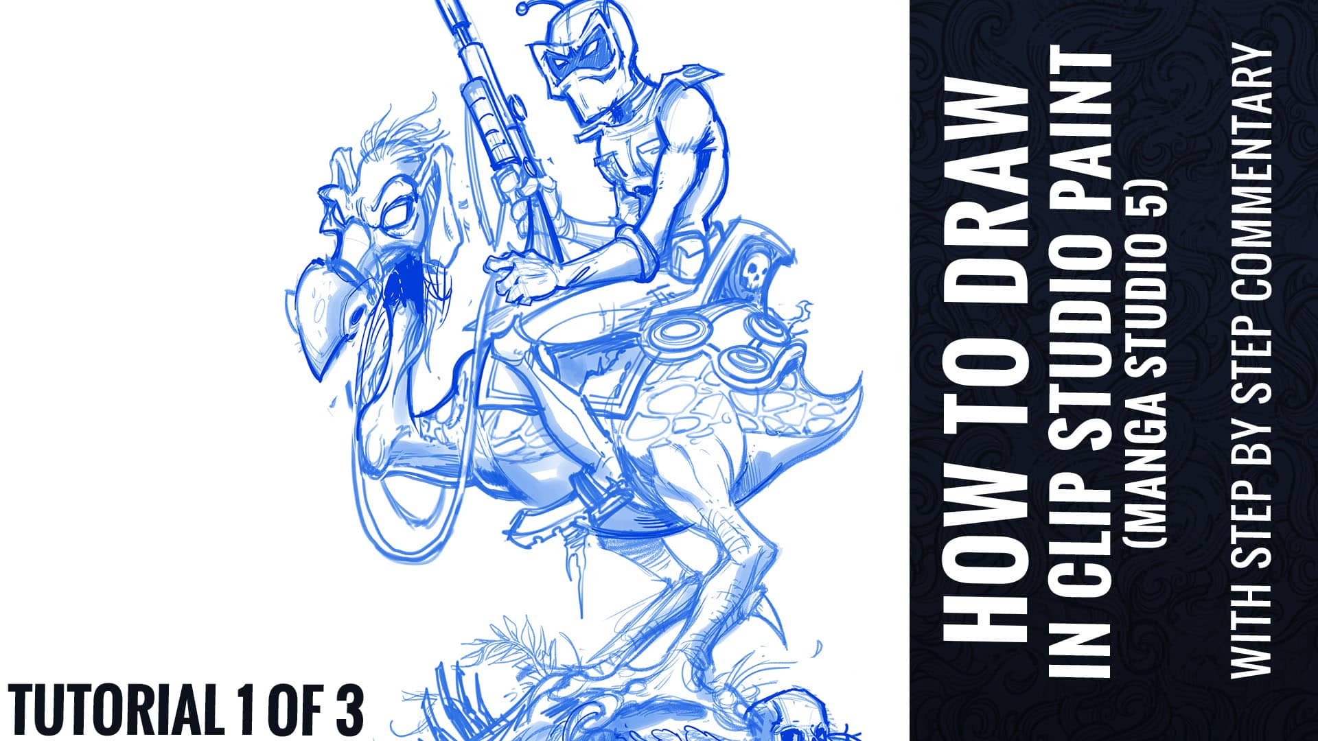
For this tutorial, I decided to create a tribute illustration to one of my favorite animated movies, Wizards by Ralph Bakshi.  I chose to illustrate the iconic poster from the movie, featuring the character Peace.  I thought a rendering my own stylistic approach to an existing piece of artwork would be a great vehicle for a tutorial, because the foundation has already been set, and we can focus instead on the technique.

Ralph Baksi’s original classic poster art. Tribute illustration we will be creating in this tutorial.

TUTORIAL 1 0f 3 – PENCILING

    1. Document Setup

      1. I set up most documents at 300 dpi 20×20.  
        1. It’s very important that anything you are hoping to print be set up at 300 dpi.  72 dpi will print out pixelated, and will get too distorted if you ever need to increase the size.
      2. Create a New Window and shrink it to about 25% the size of your main window.
        1. This is a smaller live preview of your image that will help you keep an eye on your composition as a whole.  
      3. VIEW>ROTATE/INVERT>Flip horizontal window.
        1. This will help you spot errors by having a view of your illustration mirrored.
        2. Better than photoshop because you’re not actually flipping the artwork, just the view of it, without m
      4. Set up separate layer groups for the sketch, pencils, inks (with pre-made action)
        1. Encourages me to take the time to rough and plan the piece first
        2. The Layer Color effect of each group is set to magenta, non-photo blue, and black respectively, so everything I draw in those layers will appear as that color.


  • TOOLS
  • Full list of tools https://www.flylanddesigns.com/faq-for-artists/
  • Wacom Cintiq 24HD
  • iMac 5K 27”
  • Nostromo Razer Gamepad


          1. For keyboard shortcuts
    1. Gather Reference

      1. Do plenty of research before you start drawing
        1. Especially technical items that you may not have drawn before
        2. Getting them right adds a lot to your piece
        3. Do research on settings, environments, and lighting
      2. Gather inspiration for color schemes and styles
        1. You often won’t take essential risks unless you see that it’s been successful in another piece
        2. Encourages you to try things you wouldn’t have otherwise
      3. Reference is a tool
        1. Don’t become overly dependant on it, but don’t go without it either.
        2. Do not copy – use only for inspiration


  • Drawing the Thumbnail sketch


      1. Stay way zoomed out
        1. This will help you focus on just the overall shape of the design and avoid getting sucked into detail work
      2. Focus on skeletal structure and main shapes
      3. Make sure that your figure has a strong sillhouette
        1. This means, if your character was filled entirely with black, you should still be able to differentiate it’s parts, and it should look interesteding.  If it looks like a big blob, you may need to make adjustments.
    1. Pencils

      1. Turn your thumbnail opacity down
      2. Begin drawing in the Pencils Layer group
      3. Flesh out the details and shapes, making sure to use a lot of circles and curved strokes.
      4. This drawing can still be really rough – main details will be accomplished in the inking stage.
      5. Don’t focus on the style of the lines yet, or line weights – just focus on the outlines of the different shapes.
      6. Once you have cleaned up your pencil drawing and constucted the main shapes, go in with hard pencil and clean up details
        1. You do not need to trace over everything – just the focus points that need work.
      7. This drawing is only a guid to help you in the inking stage.  So you can skip over parts that you think you can handle confidently in the ink stage.


  • Shading layer


Quickly rough in the mid tones with a broad shading brush on a layer above set to Multiply.

Go To Part 2 of 3 - Inking

Next I’ll show you how I ink artwork in Manga Studio 5 (Clip Studio Paint)

How to digitally ink and color an album cover design in Manga Studio 5 (Clip Studio Paint) featuring the Grim Reaper.

This design is meant to subtly resemble a yin and yang, as the grim reaper reaches out to a woman emerging from a swirling portal to hell. I had a great time working with the creative people behind the music on this album, and I’m really happy with how this turned out.

–Created with custom Manga Studio brushes available from:


I was recently interviewed by Profile Tree on what it’s like to be a freelance graphic designs and illustrator.

Please check out the interview if you’re interested in learning a bit more about me, or if you’re an aspiring freelancer trying to decide if freelancing is right for you.

https://www.profiletree.com/blogs/brian-allen

Special thanks for Profile Tree!


I just finished Issue #2 of a promotional comic series for Consol Alliance, a shipping company in Australia. Here’s a step-by-step look into the complicated process of how I create comic book art.

Read more